It's the simplest of colors but, as anyone who has set off on a quest for the perfect beige-neutral can attest, also one of the trickiest ones to get right.
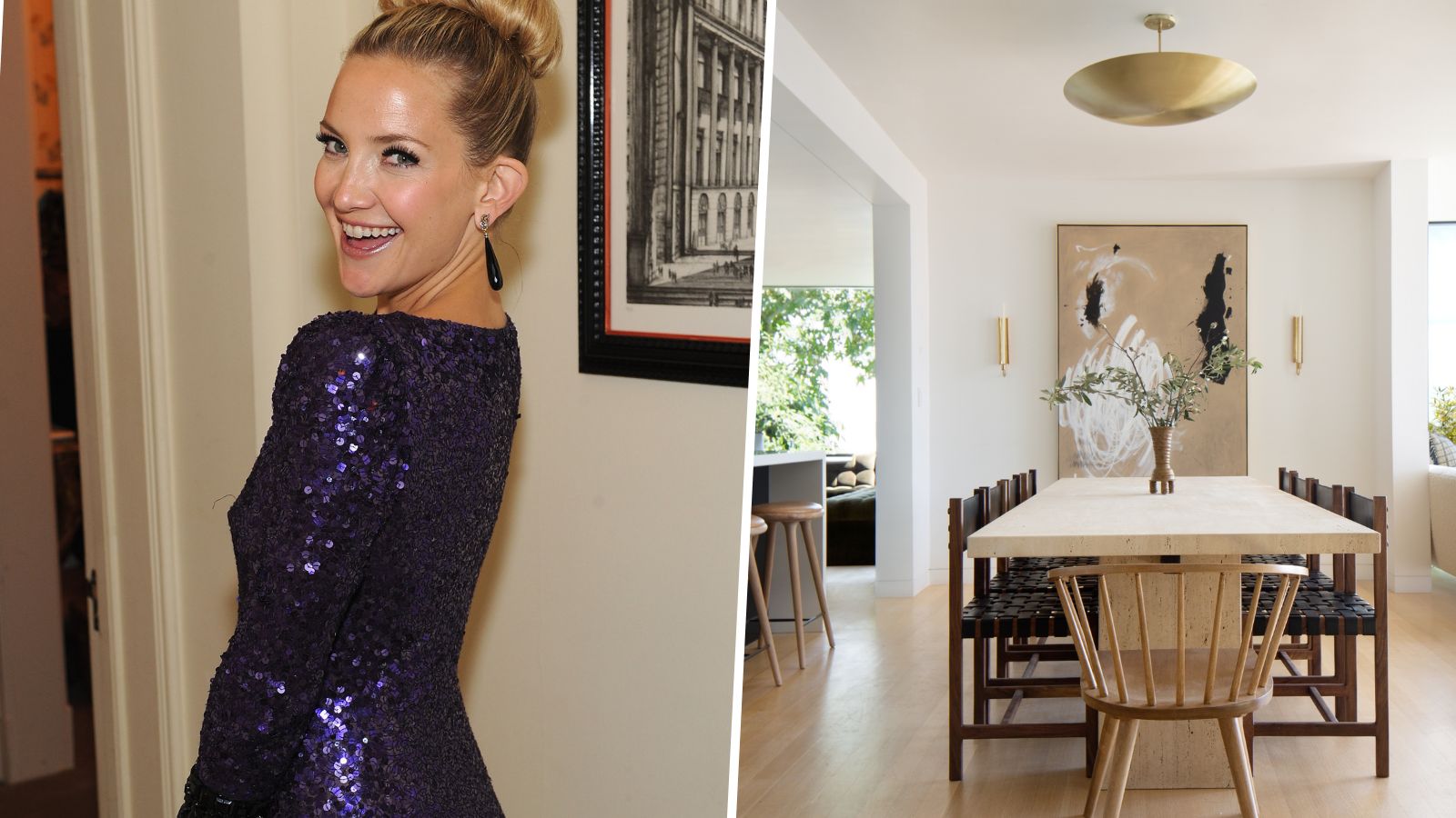
If you hadn't heard, the trend for 'quiet luxury' and beige interiors has infiltrated not only our fashion tastes but also our home interiors. It's a movement that personifies simplicity and refinement, creating serene, calming spaces that reflect a sense of sophistication without ostentation. Now, more than ever, we seek comfort in our homes, so it is pleasing to see actor Kate Hudson embracing this, in our opinion, timeless interior design trend.
The easiest way to achieve this look, as Kate Hudson has done, is to mimic colors from nature. Decorating with these new neutrals, inspired by colors from the natural world, adds a gentle and soothing touch to interiors that can be layered with textures and tones to ebb and flow with the seasons.
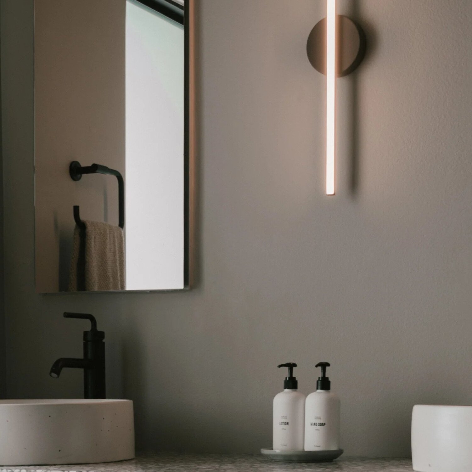
Using an off-white or natural palette is all about adding depth and contrast in different layers and textures, says Jane Landino, creative head of the studio at Taylor Howes. ‘To make a neutral palette feel designed and considered it’s important to include textural elements and pockets of interest, albeit neutral ones.
You could even throw in unexpected splashes of color, even if they come through your fashion choices, like Kate has done, below.
Another great way to decorate with neutrals is to use varying tones from the same color palette to create flow and dynamism. In this home, Kate Hudson keeps things interesting with subtle hints of taupe, off-white, and greige, as well as beige.
The power of a neutral color palette to add warmth and elegance to a room should not be underestimated. A soft scheme of harmonious neutrals creates a reflective backdrop to the ever-changing light of the seasons.
When putting together a layered, neutral scheme remember that warmer shades, such as creams, work well with cooler ones, including light grays. Senior designer at Crown Paint, Justyna Korczynska suggests; 'adding colors such as a soft green on baseboards next to a neutral-colored wall, which is interesting and imaginative without being overpowering or too much of a contrast.’
Siobhan McFadden of Studio Homestead advises to ‘always be wary of which white you pick to accompany your wall color. Avoid brilliant white on the ceiling and choose a complementary tone. It’s a lovely considered look to choose a slightly darker white than the walls for your woodwork. This creates the illusion of a brighter space.’
Shop Kate Hudson's look
Decorating every room in neutrals can create a feeling of seamless calm in a home. It’s a lovely considered look that isn't too difficult to recreate in your own home. Plus, this harmonious yet luxury color palette will create the illusion of a brighter space.
If you're not quite ready to forgo gray, why not try the color and tone of the moment, instead? This warm, gray-beige can skew taupe depending on the light.
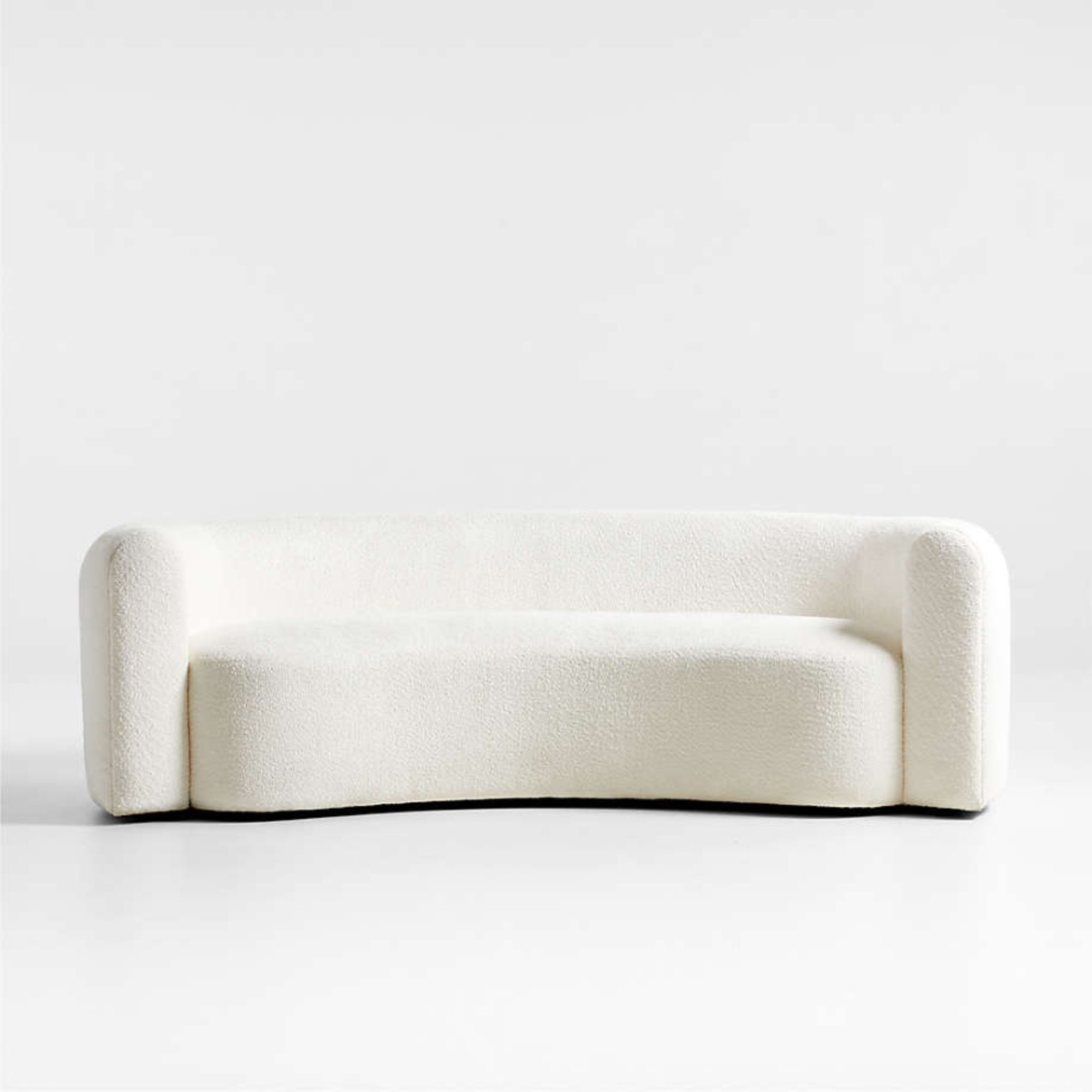
Created by interior designer Leanne Ford, this curvaceous sofa is the perfect 'kidney bean' shape that continues to be so sought-after among designers.
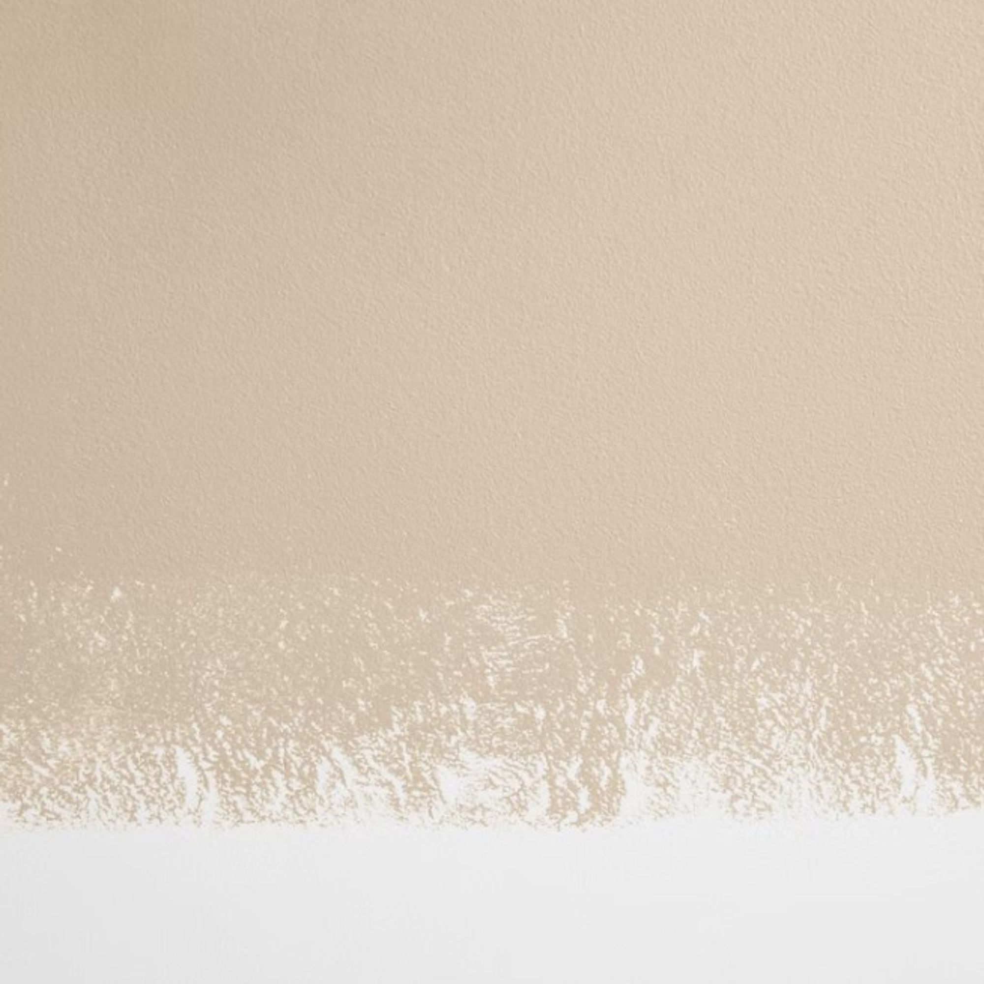
This tranquil, mid-tone classic tan beige is warm minimalism perfection.