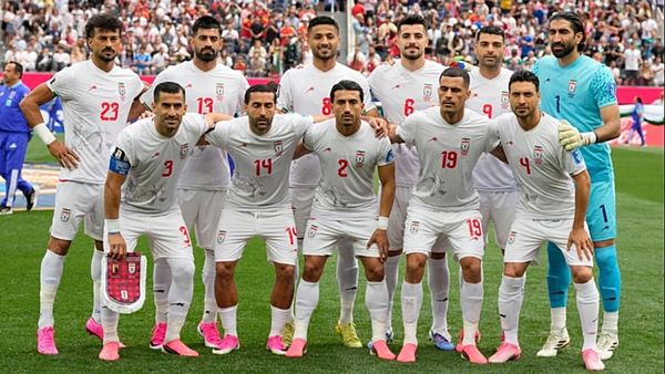
The primary kit, white with a star print, will be worn only by the US women to start. Dubbed the “Brilliant Kit,” the marketing pitch says it’s a “tribute to the trailblazers who have shaped soccer and inspired generations. Star details are drawn directly from iconic past WNT kits, fused with a modern silhouette to reflect the optimism, leadership, and evolution of the game.” Does the kit accomplish this, to you?
I appreciate Nike saying the modern silhouette is reflecting all of those very nice-sounding buzzwords and not just “we put this design on one of our current kit models instead of reproducing shirt sizes from 1999 because no one wants to run around in baggy polyester any more.” Are the star details from past USWNT that are referenced supposed to be the stars they got from winning World Cups? If so, that’s a good flex. Unfortunately, the biggest visual reference this one conjures to me is the ‘94 men’s denim kit (which the women did not wear – the USWNT and USMNT designs didn’t match up until a couple decades later). I like the retro feel of it all and so that look-back-at-the-past direction succeeds. I can do without the rest of the blurb. AS
I think it does accomplish all that, though I imagine most, including myself, would say the most clear comparison is to the 1994 men’s World Cup kit. It’s got the same denim blue and a patchwork of stars. Though this time the stars look much less clip art-inspired. JF
This kit absolutely feels like a tribute to past generations of American soccer. On that front, they knocked it out of the park. The stars definitely draw the mind more immediately to the men’s 1994 World Cup kits, though, as opposed to any star-laden WNT kits. That said, the women are the only ones with stars above their crest, so it makes sense for them to have a star-spangled jersey. MS
I mean … it’s a white US home kit. I don’t know that they’re necessarily paying tribute to anything as much as they’re maintaining tradition. And that’s fine! Tradition is good. The kit is good. I appreciate that they’re trying something different within the relatively narrow bounds of “majority white.” I’m not sure who is going to be moved over the line from “don’t like it” to “want to buy it” once they hear that the stars reference past US kits (which, as the others point out, feels like much more of a nod to men’s kits of the past than anything). AA
Would you wear it? Why or why not?
I’m on the fence, if I’m being honest. It’s a good swing at taking the white home kits and trying something different with them, but the texture of the shirt and overlapping star pattern feels more like patriotic napkins my mom would buy for a Fourth of July picnic than a shirt I really want to wear. I feel as if they’re ultimately just fine, but not something I’d want to spend money on. AS
Yes, but I’d keep it reserved for match days. JF
This kit has July barbecue written all over it. Highly wearable, but definitely more of a statement piece compared to the away version. MS
This is the perfect example of a kit I would buy or wear depending on the memories that are made with it on the field. I think it’ll be easy to wear it proudly if the US does relatively well. If the Emma Hayes era takes a drastic and unforeseen turn for the worse … maybe not. AA
The away kit – the “Heartbeat Kit” – was created to honor the fans, “the ever-growing, passionate community behind US Soccer … Designed with a heritage-meets-streetstyle aesthetic, the Heartbeat Kit channels the pulse of the soccer nation.” Does any of that seem apparent to you in this kit?
Heritage meets streetstyle. Farm-to-table fashion. I can practically taste the heirloom synthetic cotton used to spin these threads. And what is it that channels the pulse of the soccer nation? Pinstripes, baby! As a person that really loved the royal blue with white pinstripes USMNT kit from a long time ago, I’m down with rehashing that concept. But I’m going to need a map to figure out how we got from the kit design to this description of it. It’s another retro callback, so I guess that’s where the “heritage” parts comes in? But they’ve lost me with the rest of it. This is channeling the streetstyle soccer pulse of a nation only if said nation is located inside of an Old Navy. AS
I don’t know how it “channels the pulse of soccer nation” but it is one of the most street-wearable kits US Soccer has released. Even the US Soccer crest and Nike logo feel unobtrusive and integrated into the design. JF
I think the “heritage-meets-street style” approach comes through here. There’s America-themed stripes, a pleasing mix of red and blues shades, and a design that is sleek and fashionable. MS
When I think of “the pulse of the soccer nation” and the “growing, passionate community” behind US soccer, I think of something a little chaotic, loud, rough-and-tumble. I don’t get any of that from this kit, which to my eyes is very refined and under control. If anything, the home kit says “passionate” to me far more than this one. AA
Would you wear it? Why or why not?
Nah. The alternating colors of the pinstripes aren’t doing it for me and I don’t really like navy as a base color for the secondaries as it stands. It feels simultaneously too drab and too busy. Generally, I want a kit to either commit to either being clean with some nice details (like the centennial kits), or go fully brash and loud (the ‘21 stadium kits). This kit feels like it tries to do both, and ends up hitting neither target. AS
Every so often a kit comes along that I buy without a player name and number so I can wear it out on any occasion, this is one of those. JF
For sure. This one’s both eye-catching but versatile. I think you’d get a lot of good wear out of it, in a variety of settings. MS
Definitely. As others point out, this one seems to be designed specifically to be worn in a non-game context, and it succeeds in that goal. AA
Overall, where would you rank this collection in the pantheon of US kits?
I don’t like the secondaries, but the primaries are fine and the US has taken much worse swings. If the design hotstreak for the men between 2006 and 2012 is near the top of my US collection rankings, and stuff like the 2011 “medical scrubs” women’s kits or those 2015 secondaries that looks like a bottle of antifreeze are on the bottom, then these are pretty middling, all things considered. Don’t love ‘em, don’t hate ‘em. I’ll feel fine watching them on TV and not needing to wear them myself. AS
It’s top notch. Perhaps due to nostalgia I’m partial to the USMNT 2010 World Cup kits and the spiritual sequel of the 2011 aways, which improved on color. Another favorite are the 2013 US Soccer centennial kits with their vintage crest. These new kits fall right behind those. JF
They’re both easy on the eye, but haven’t earned best-ever status just yet. I’d put them toward the top but short of my all-time favorites (I’m a Waldo loyalist with special places in my heart for the 2019 women’s kit and those ‘94 World Cup denim things) for now. MS
I think they’re certainly in the top half, maybe the top quarter. They thread the needle nicely by trying new things while maintaining tradition, and I feel like the designs will look decent in the stands and on the field. Whether they move up or down, again, will depend on the memories made in the next couple years. AA