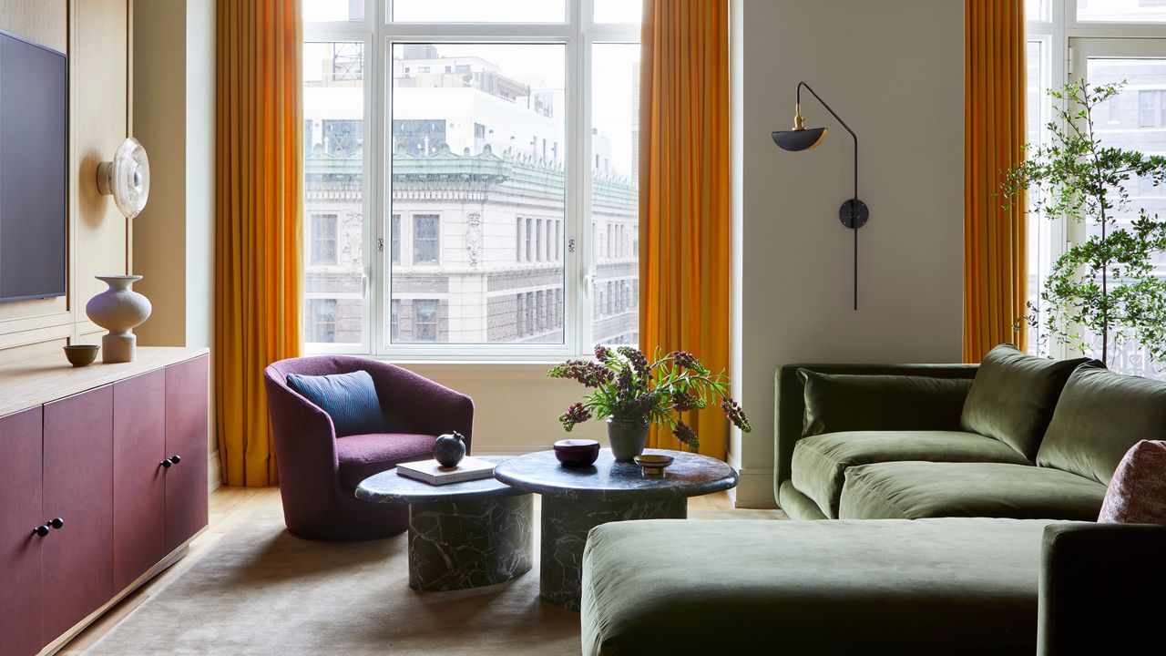
If there’s a sweet spot between classic Upper West Side style and liveable contemporary design, then this Manhattan family home, renovated by Rachel Sherman of Rachel Sloane Interiors for first-time homeowners, has found it.
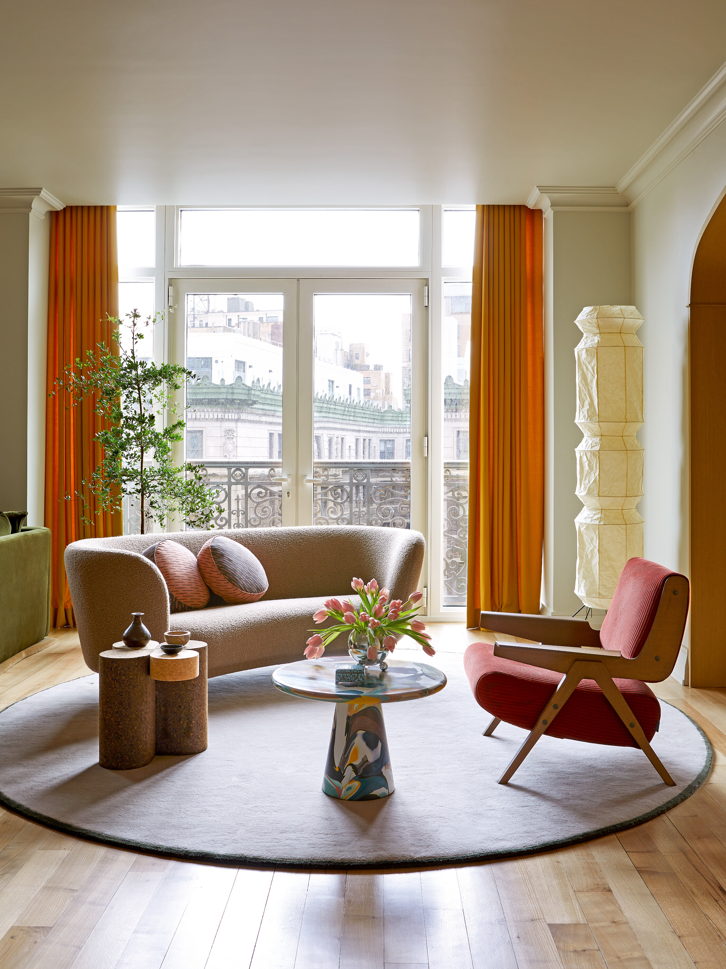
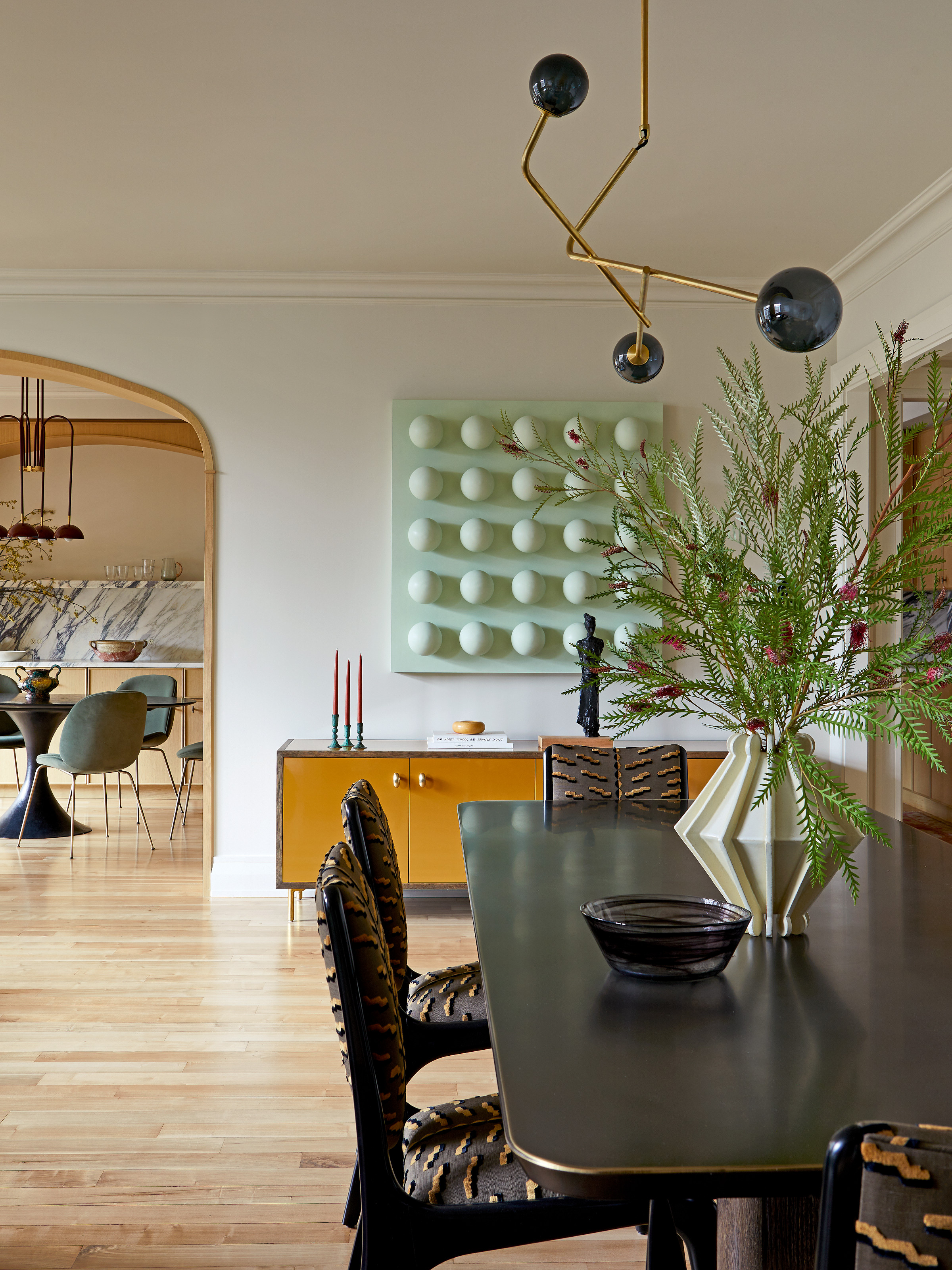
The lateral apartment, although a new build, echoes the graceful architectural detailing of neighboring pre-war properties, but with a one-of-a-kind edge. In this modern home, gracious archways are lined in oak; joinery is clean and graphic and the artwork is just as likely to be a sculptural chair as a traditional wall-mounted piece.
"We wanted our home to honor the spirit of the neighborhood: not too modern, nor too traditional, but a timeless mix of both," says one half of the couple that lives here with their two young daughters.
"This was the first place we had bought, and the aim was for it to feel unique — nothing cookie-cutter or overly trendy — using colors, textures and materials that felt distinct to us."
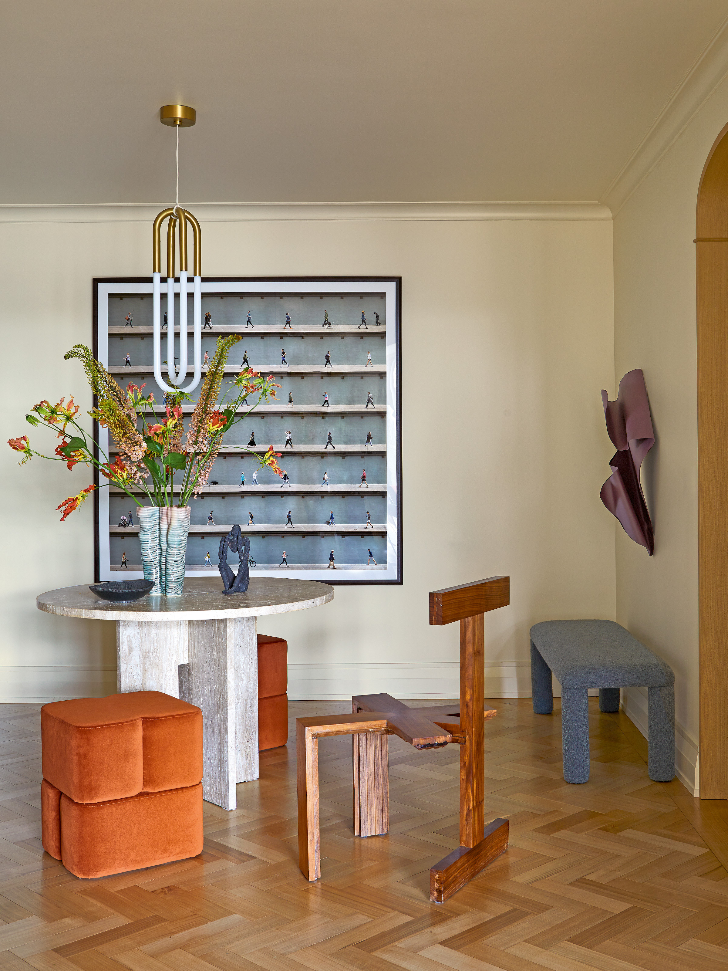
That dream was realized with the help of interior designer Rachel Sherman, known for her focus on composition — a skill she believes she picked up at Ralph Lauren during the early days of her career.
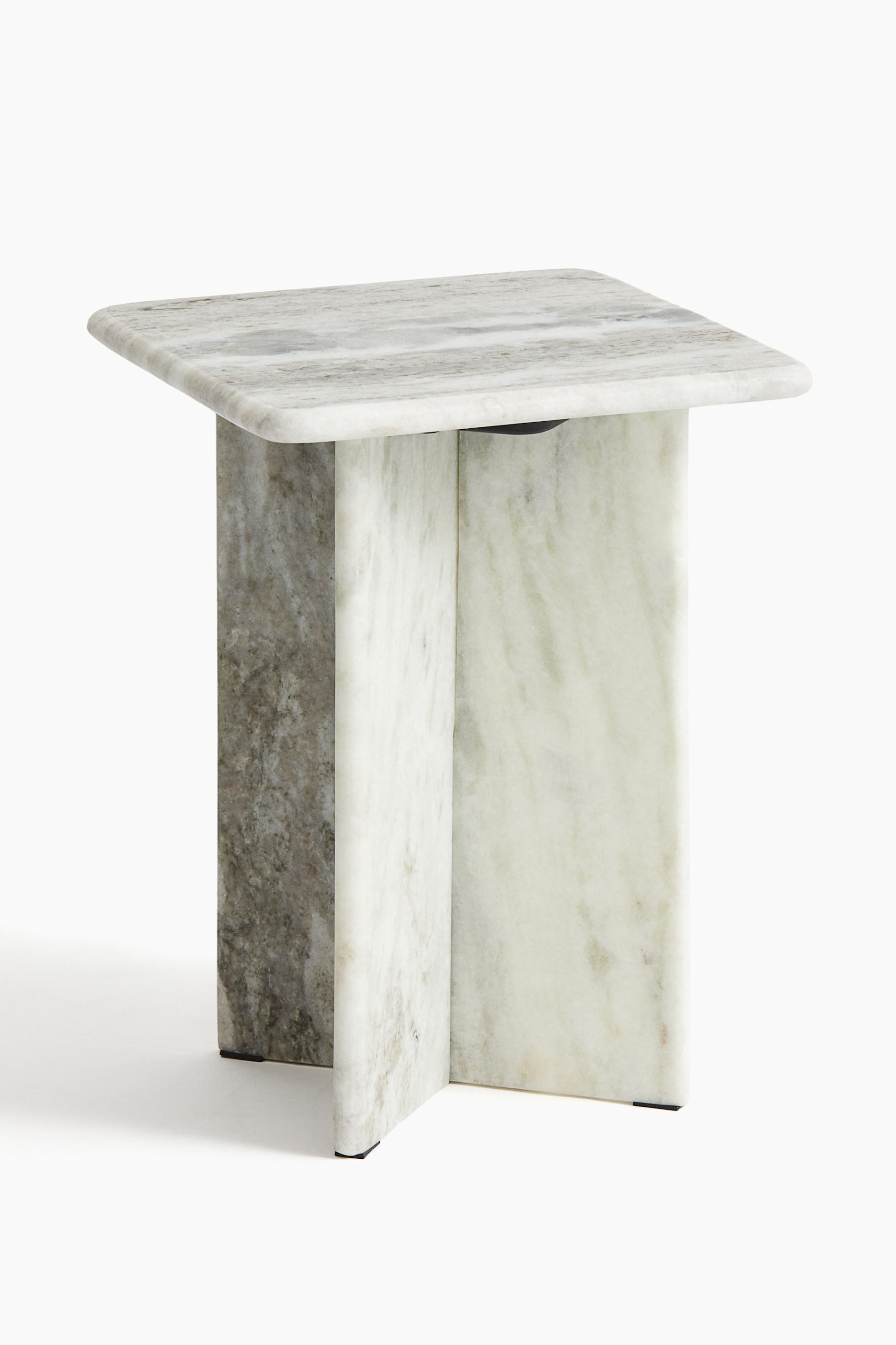
If you don't have room for a marble hallway table, how about this side table version from H&M Home?
The owners fell for the apartment two years ago, impressed by its "generous light, thoughtful layout, and strong foundation." Despite those attributes, its configuration needed a little revision to better suit the demands of family life.
"I guess we took old-world ideas and applied them in a new-world setting," says Rachel, "meaning that it was about maintaining a sense of grace and attention to detail, but opening the space a little to create a modern home."
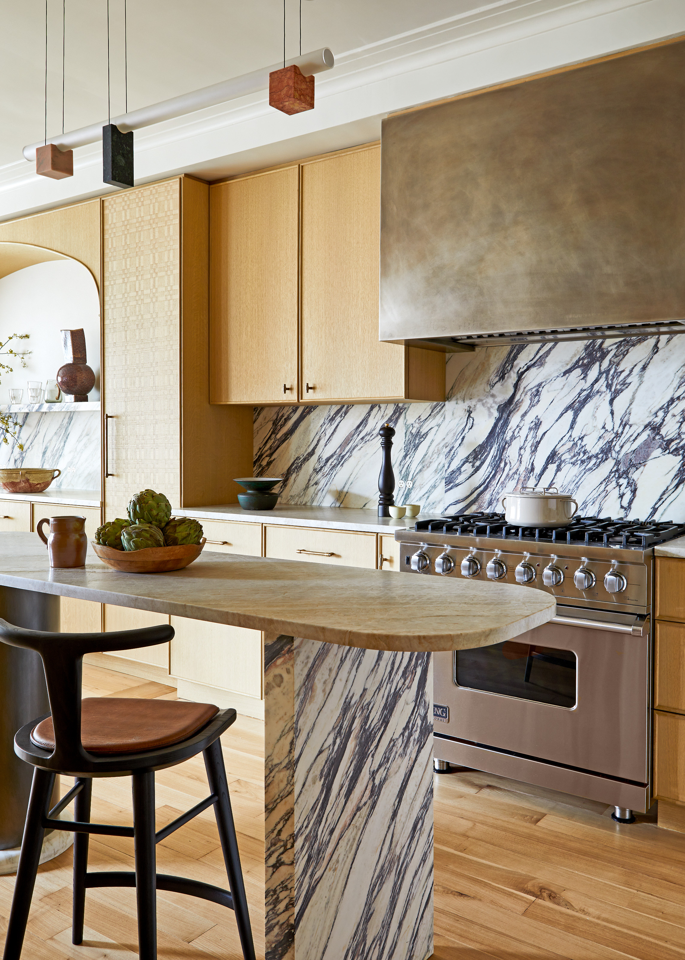
To that end, the kitchen-diner, originally two rooms, was turned into one long space, the main bedroom was relocated to the opposite corner of the apartment, creating a generous primary suite, while out of the original principal bedroom, a guest room and study were born.
Metal cabinets are an unexpected twist in this scheme — and this USM media unit will achieve a similar playful contrast.
Those tweaks were not without challenges. "Once we opened up a few walls, we discovered a handful of unexpected angles and curves in the hallways," says the owner.
"Rachel found clever ways to celebrate those quirks: she designed arches to mirror existing and a curved dresser in our bedroom that perfectly fits an angled wall. Those decisions ended up being some of our favorite design features — they give the home so much personality and cohesion."
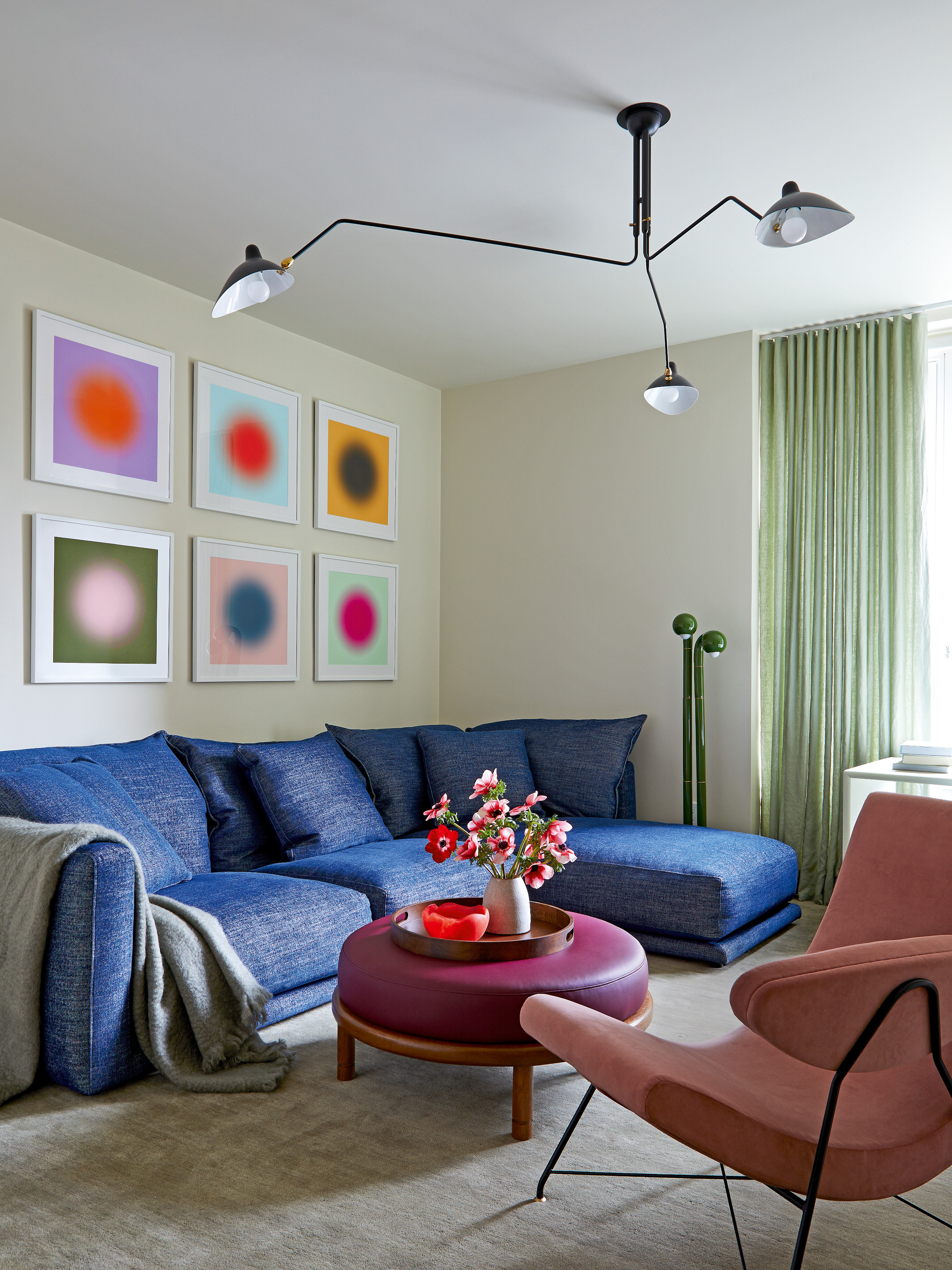
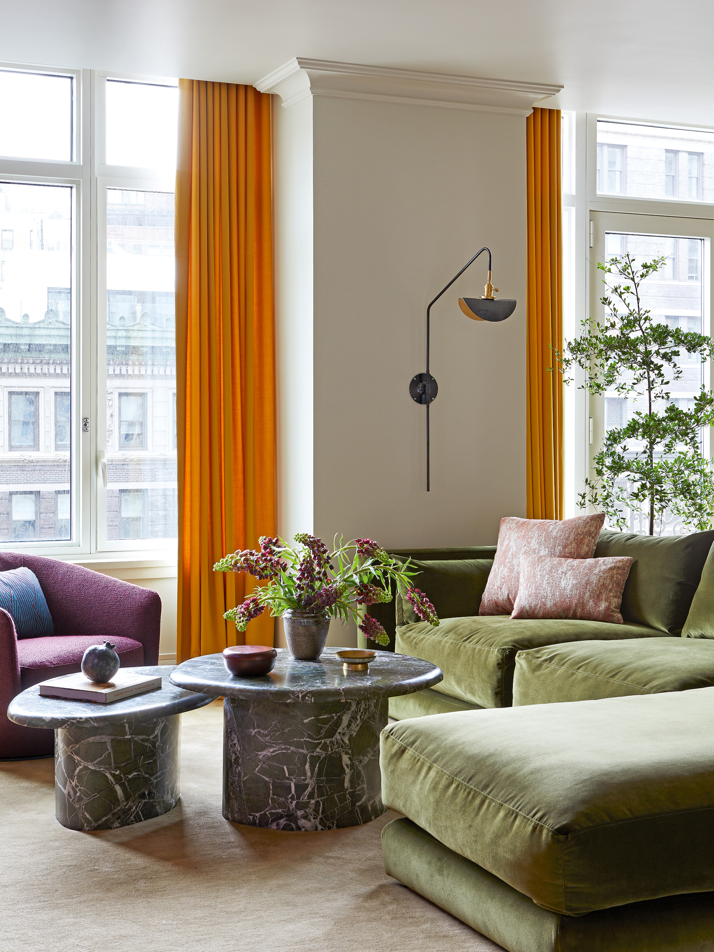
A key element is the successful zoning of the main living space, delineated into lounging, formal entertaining, and dining. "It was about creating a balance between form and function — beautiful furniture and art that could coexist with the daily rhythm of family life," the owner explains.
"Comfort and warmth were priorities, but so was durability. We wanted a space where our girls could do homework at the counter one moment and where we could host a dinner party the next."
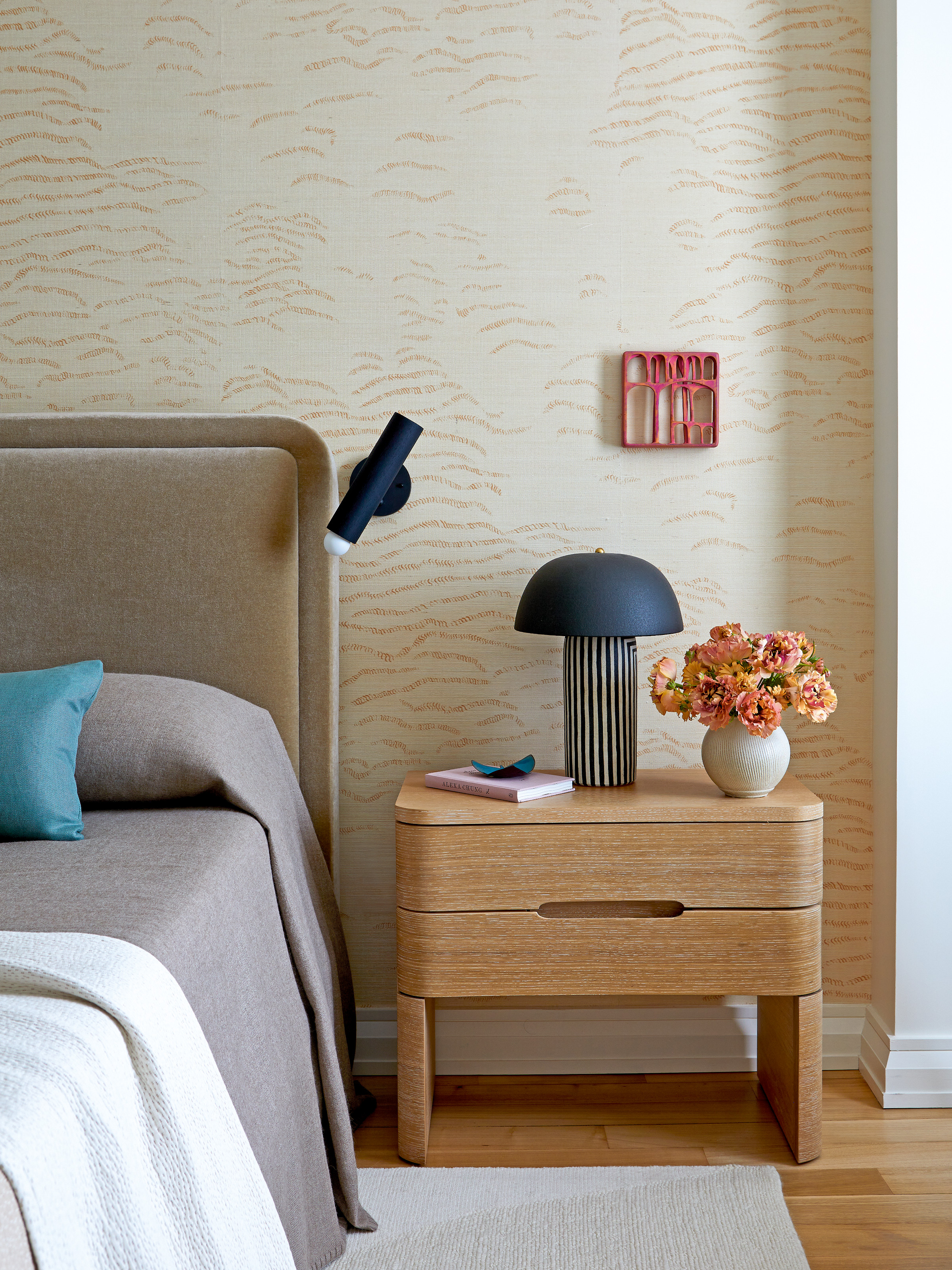
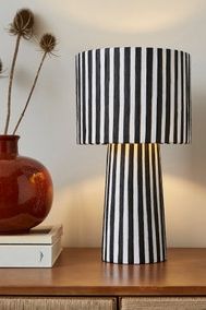
Obsessed with how the striped table lamp stands out on this nightstand, we're now coveting this easy-on-the-wallet alternative from Dunelm.
Despite its grown-up vibe, this is very much a family home. Corners have been rounded off, fabrics are stain-resistant, and, as Rachel points out, color can hide a multitude of sins, as well as being inherently joyful.
"The apartment perfectly supports the way we live," says the owner. "The kids have their own zones, we have a quiet retreat of our own, and the main living space brings everyone together.
"Our mornings often start in the kitchen, with jazz playing, pancakes on the griddle, and our dog, Roberta, circling for crumbs. Evenings are usually spent in the family room watching movies, reading, or playing cards. It’s a relaxed, happy rhythm — and the space feels made for it. It’s everything we hoped for and more."
For more inspiring home tours and design ideas, subscribe to the Livingetc newsletter, and all the latest will be delivered directly to your inbox.