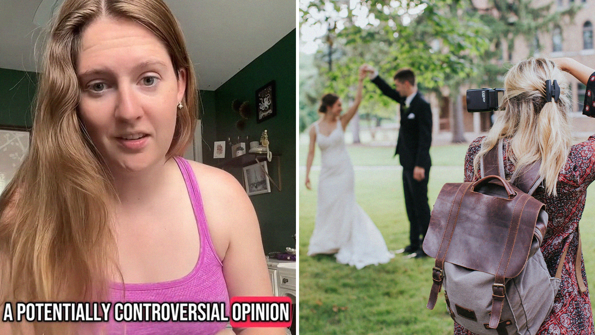
A wedding photographer shared one huge tip that could help save some guests from looking bad in photos. In a video with over 300,000 views, Carly Forrest (@carlyforrestphotography), a photographer based in Charleston, explained that butter yellow is simply too close to white to be a good option as a guest.
“Stop wearing butter yellow to weddings,” she said. “Stop. I know that it’s the color of the summer, and that everyone loves it, and you can wear it anywhere else you want. It is too close to white.”
It’s not too close to white in person, but it is in photos
One of the reasons that Forrest made her PSA regarding wedding attire was because lighter pastels and colors like cream or “butter yellow” can get lighter in images than in person. While Butter yellow is the color of the summer, it’s not a great color for a wedding guest. Wedding photographers often edit and augment photos, brightening them up after the event using programs like Adobe Lightroom.
“If your photographer is not editing exactly true to color, it could come out looking white,” Forrest said. For that reason, it’s better to wear colors that are clearly not white, or aren’t soft and muted like pastels.
Flash will generally make things look incredibly bright, so that’s another reason not to wear “butter yellow.”
“If you get flash pointed directly at you, it’s gonna look white,” Forrest added.
@Bigtexashairgirl agreed in the comments, saying, “Just say no to pastels at weddings in general. They all lean toward white in photos.”
Commenters weigh in
Some commenters disagreed, both on what “butter yellow” means and on wedding traditions and customs.
@Allison said, “People need to stop being so dramatic about the color white at weddings.”
Other commenters replied to @Allison in disagreement, saying “I dont think it’s dramatic… It’s not a big ask when you’re aware of a tradition to just respect it.”
Forrest showed off two examples of what “butter yellow” looks like in her original video, but one of the examples came off as cream to some responders.
One replier noted, “Butter yellow is darker than that. That’s straight up cream,” regarding the second dress in the clip.
@carlyforrestphotography #weddingphotographer #bridetobe #bridetok #butteryellow #weddingguest #weddingguestdress #greenscreen ♬ original sound – Carly Forrest Photography
Overall, though, most people agreed that pastels can be a difficult choice for a wedding.
The Mary Sue has reached out to Carly Forrest for comment.
Have a tip we should know? [email protected]