White is a timeless color, it works in any space, with any style. Its versatility is why it's reigned as the go-to paint for decades. But as the mood in interiors shifts away from safe to something more characterful and personal, white is undeniably being replaced by bolder colors and patterns.
Of course, white walls are a very popular choice for kitchens, since you want this space to outlast any fleeting trends. But we are frequently seeing bolder, warmer, more interesting kitchen color ideas as we start to approach this space more like the softer rooms of the home.
As Helen Shaw, Director of Marketing (International) at Benjamin Moore, says, 'Although the ‘go-to’ paint color for kitchen walls is often a white or off white, opting for a bolder color is a great way of creating a personal statement in the heart of the home.'
Whether it's a trendy butter yellow feature wall or color-drenching your walls in a soft pink, these five white wall kitchen alternatives will set the tone and inspire your next redesign.
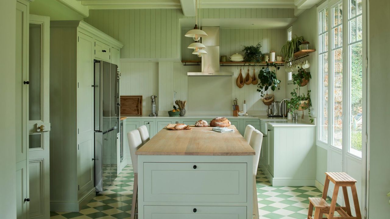
1. Taupe
You might like the subtlety of white, but many other neutral paints feel just as timeless and much warmer. Instead of going for the obvious stark white or cream-infused white, a rich taupe is the perfect way to spruce up any empty wall without going too bold, as seen in this deVOL kitchen.
Lauren Saab, founder of Saab Studios, explains, 'Taupe delivers the clean backdrop people want from white but with an earthy undertone that brings warmth. Taupe wraps a kitchen in warmth without ever feeling heavy.'
Stray from white kitchen ideas by incorporating lighter-toned browns instead. Interior designer Kelly Neely agrees that taupe makes a wonderful alternative to white on kitchen walls. 'The best white alternatives are naturals such as taupe, beige, gray, or wood. These tones are versatile enough to go with any other kitchen color scheme you'd like to incorporate, but still neutral.'
Warmer than white but still neutral, Edgecomb Gray is a clever choice for a kitchen wall if you're looking for depth and timelessness.
Classic and sophisticated, Briarwood by Benjamin Moore is a lasting choice if you're looking to bring a touch of color into the home while retaining a sense of tradition.
Swap out the white paint for Farrow & Ball's Jitney. It's a warm taupe with mushroom undertones, the perfect choice for framing a kitchen without overwhelming.
2. Warm oranges
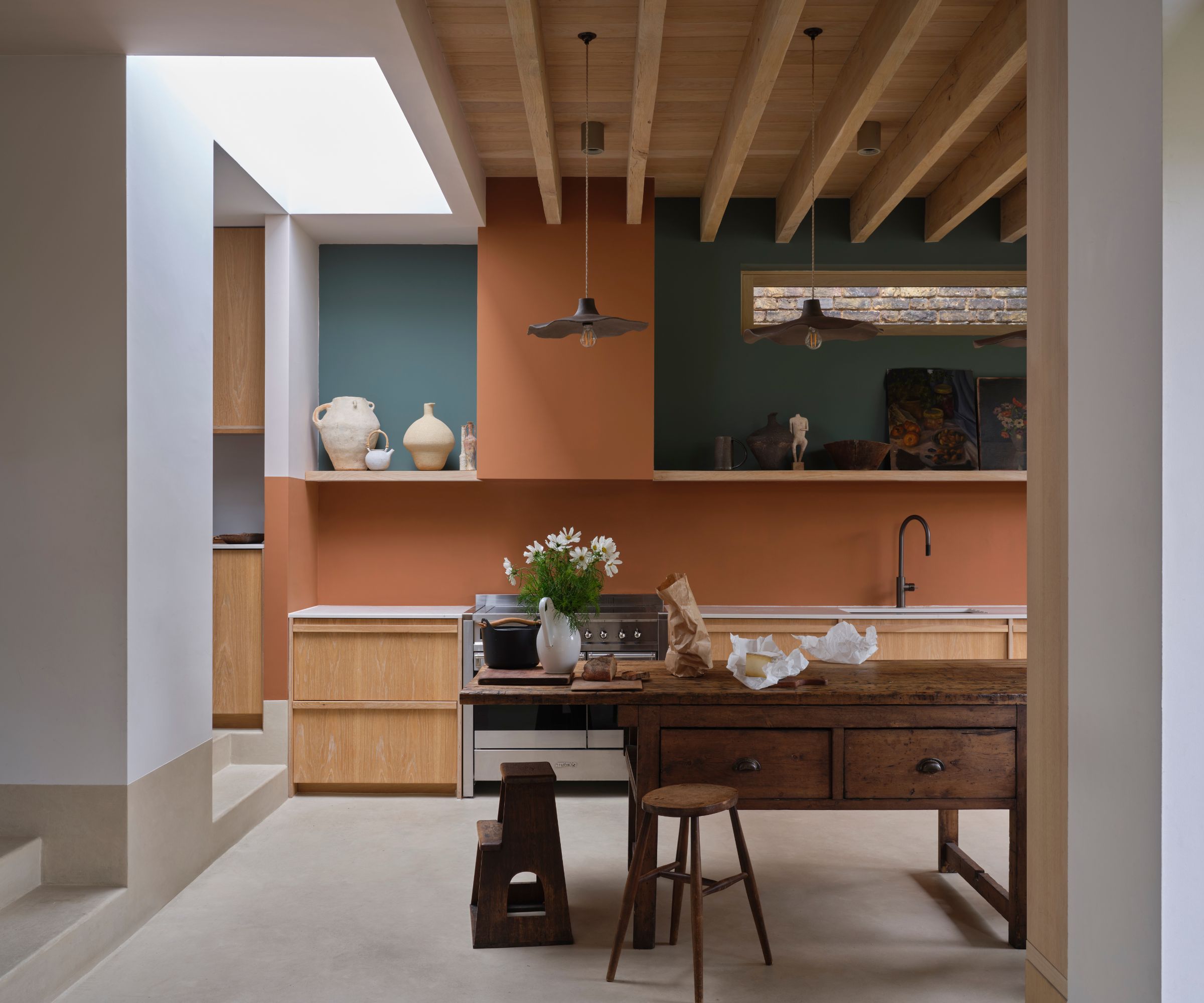
While an orange kitchen wall might sound a little bold, the beauty of orange is its versatility. With shades varying from deep terracotta to sunbaked hues, sticking to white walls seems like a boring alternative. Take inspiration from this kitchen with pairs Farrow & Ball's Marmelo with deep teals and crisp whites for a scheme that's bolder but balanced.
A warm orange is a classic color that can provide the ideal amount of snugness, the perfect contrast against hard, sterile finishes. You don't have to drench your kitchen walls entirely in the shade either; a bold feature wall can create a similar sensation without committing fully to the color.
These earthy shades always add a slight rustic feel, perhaps because of their closeness to bare plaster tones, and they work particularly well when paired with plenty of texture. As Helen explains, 'In rustic style kitchens that feature exposed beams, open shelving, and wooden islands, painting the walls with warm terracotta or burgundy will further enhance the relaxed style. These warm red and orange hues instantly inject a feeling of warmth that makes being in the kitchen a calming and convivial experience.'
Opt for Benjamin Moore's Byzantine for a terracotta that's far more brown than pink, perfect for pairing with white cabinetry for a balanced look.
Benjamin Moore's Persimmon is a pink terracotta that will create an instantly warming and feminine look.
Georgian Leather by Glidden is a light terracotta with golden tones. Use this as a standout shade alongside soft whites for a balanced look.
3. Yellow
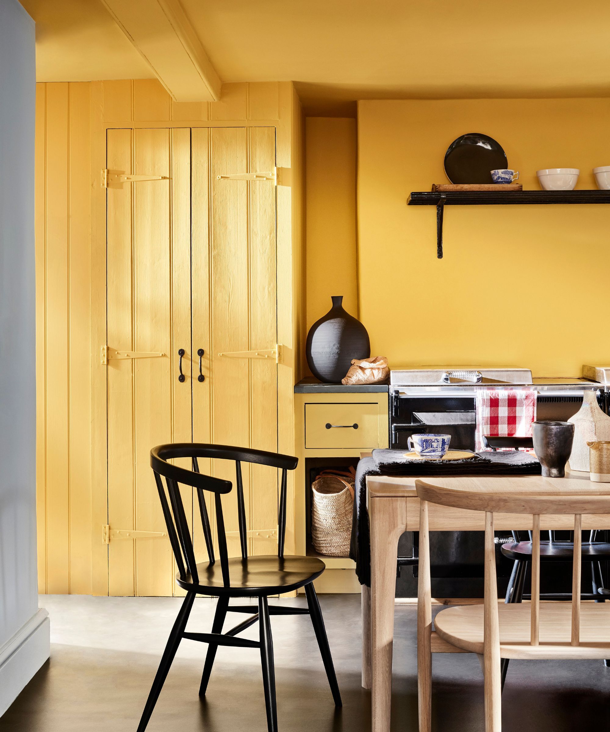
A yellow kitchen wall is a stylish alternative to white as it can make a kitchen feel bright, joyous, and welcoming. Not to mention butter yellow kitchens are all the rage at the moment.
Ruth Mottershead, creative director of Little Greene, says, 'Yellow is a timeless and positive color; it’s perfect for busy spaces that see a lot of activity, such as your kitchen. These hues instantly lift the mood and atmosphere of the room.'
'The kitchen, often seen as the heart of the home, is the perfect space to use bolder colors, such as ‘Giallo’, reminiscent of golden sun, which will bring joy and create an energetic scheme.'
'You can use a yellow to highlight architectural details or as an accent color on one of the walls, pairing it with soft greens and whites such as ‘Silent White’ in the rest of the space, for a more elegant and pared-back scheme. Or for an impactful look, drench your kitchen in color on all four walls to envelop the kitchen with sunshine all year round.’
If you want to take butter yellow to the walls, look no further than Farrow & Ball's Hay, a muted and pale yellow that works almost as a neutral.
A yellow with muted undertones, a kitchen with a Gervase Yellow wall will cheer and inspire, welcoming you as soon as you enter.
An uplifting, zingy yellow, Carys is a joyous yellow that color-lovers dream of. Cover an accent wall in the shade or color-drench your kitchen for a bold look.
4. Moody dark blues
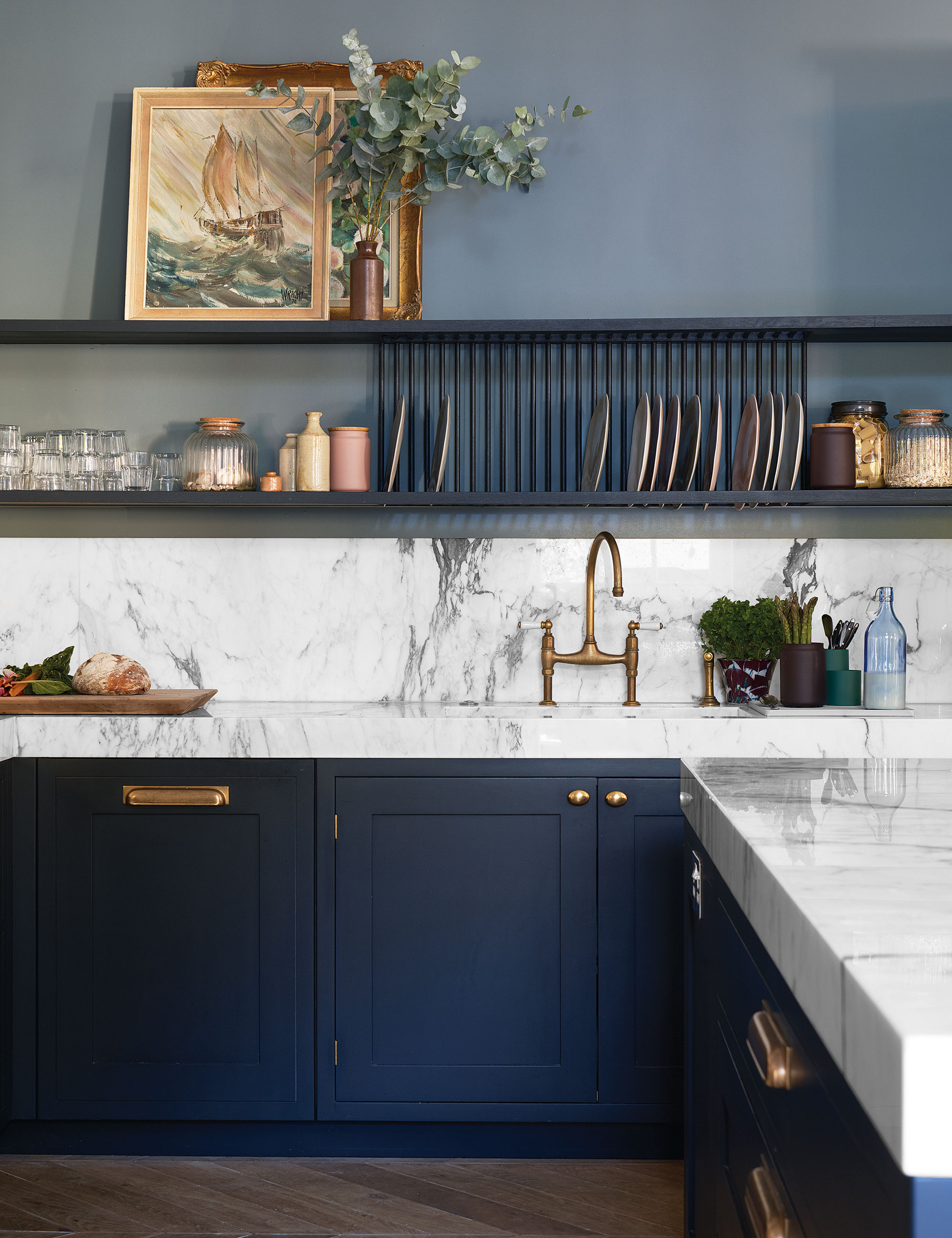
When introducing dark paint colors into the kitchen, many of us opt for the heritage style and embrace dark kitchen cabinet ideas. However, moody paint shades can provide a similar cocooning effect on walls, and although quite the opposite of white, darker kitchen walls can be just as timeless.
The best dark blue paints can frame and accentuate the architecture of a kitchen when used on the walls (not to mention they pair beautifully with aged brass accents) and create a sense of luxury and sophistication.
Although a kitchen color-drenched in dark navy is undoubtedly a statement, to create balance, Helen suggests opting for white kitchen cabinets. She says, 'A deep navy provides a more contemporary feel, particularly when paired with crisp white Shaker cabinetry. The clean, recessed panel design of Shaker doors allows these darker tones to stand out without overwhelming the space, creating a balanced and elegant look.'
Interior designer Nina Lichtenstein adds, 'For those who want mood and drama, deeper tones, such as navy, forest green, or charcoal, make a stunning backdrop. A darker wall in a well-lit kitchen highlights brass fixtures, marble counters, and wood finishes, turning a utilitarian room into an elegant, design-driven statement. These shades also create a cocooning effect, perfect for open-concept homes where the kitchen is the heart of daily life.'
For a timeless, versatile shade that errs on the dark side, choose this deep, classic blue shade by Benjamin Moore.
Van Deusen Blue is a mid-tone blue paint that's versatile and timeless on one wall or all four, across various kitchen styles.
A heritage blue with slight green undertones, you won't regret covering your kitchen wall in this warm yet sophisticated shade.
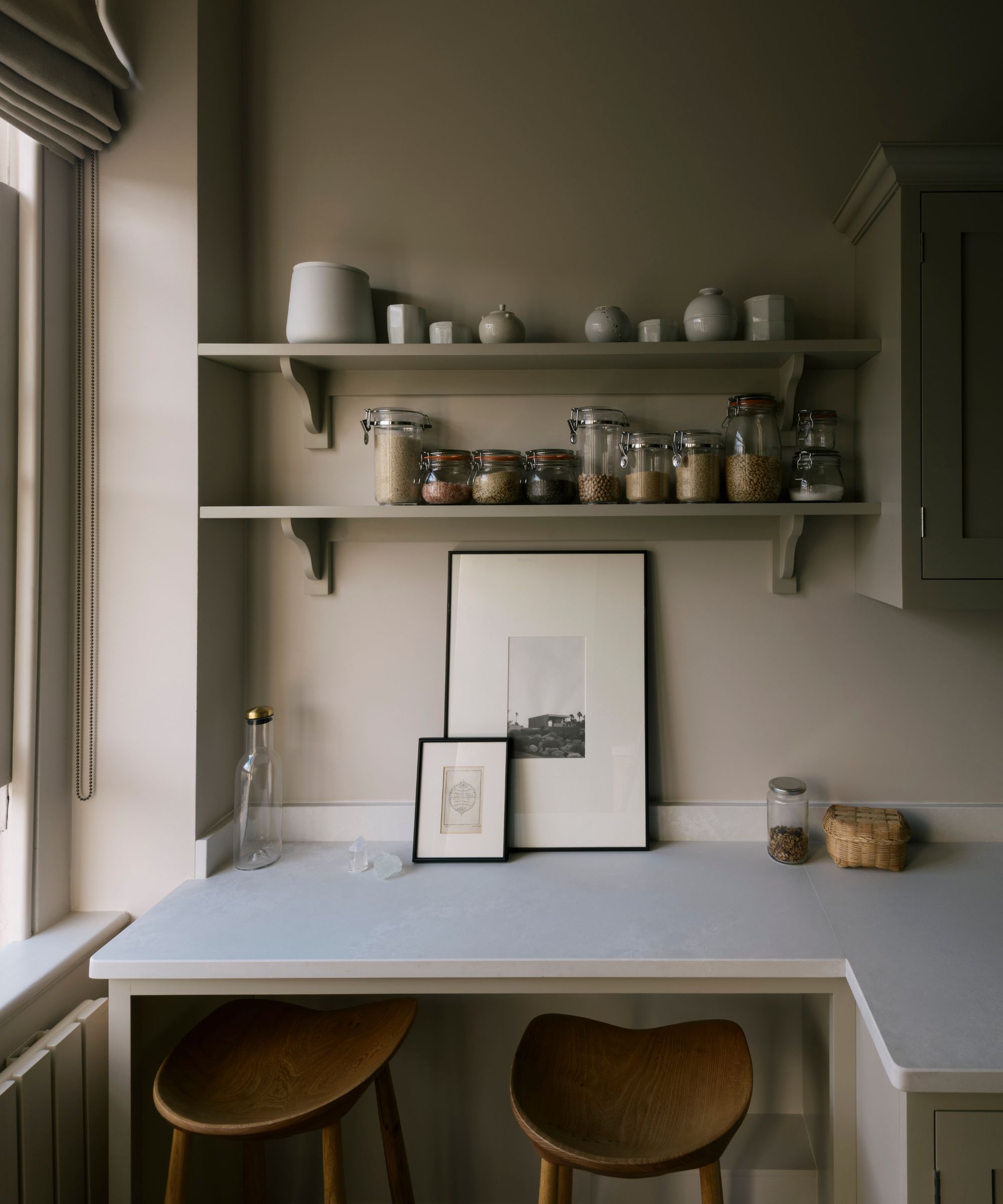
5. Muted pastels
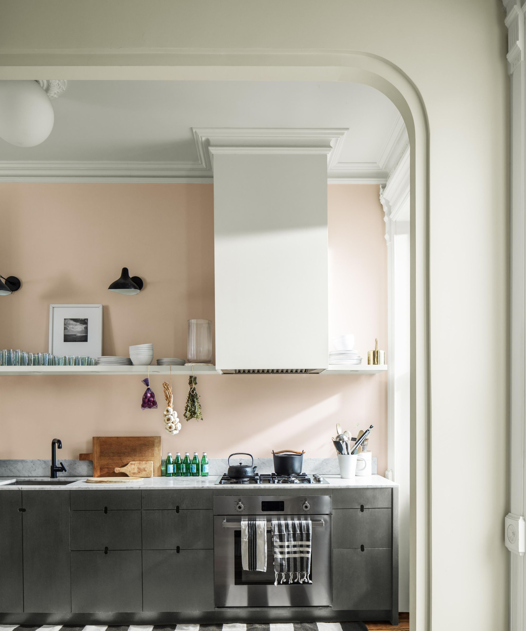
Despite being often associated with spring, pastel room ideas are the perfect choice if you're looking for an alternative to white kitchen walls. With light and bright undertones, pastel shades can uplift and refresh whilst also creating warmth.
Proven by the kitchen featured above, a pale pink wall in a kitchen feels almost as subtle as white does, but it creates added dimension and warmth that the latter often lacks. Fear not if you're not a pink lover, muted sage greens or subtle duck egg blues can create a similar charming feel, livening up the kitchen without shouting too loudly.
Helen says, 'For an open and airy kitchen environment, colors such as sage green, pale pink or soft gray are a fantastic alternative to white walls. The light, calming tones of these hues help to reflect natural light and make the space feel larger and more inviting.'
Andy Greenall, Head of Design, Paint & Paper Library, agrees, 'Moving away from impersonal and stark bright whites, kitchen design schemes are becoming more considered, with schemes reflecting the wider interior aesthetic of a home. ‘Mink’ is a wonderfully versatile, warm, pink-based neutral that adds depth and warmth to kitchen walls. Pair with the enigmatic, deep red-brown ‘Scarlet ‘n’ Rust’ for a sophisticated, timeless scheme.’
Paint your walls with Lick's Green 13 for a calming yet fun interior, whether it's at the heart of your kitchen or all over.
This plaster pink paint is a stylish alternative to white, offering more warmth but maintaining a sophisticated look.
Keep your kitchen walls light and airy with Ocean Air – adding a touch of soothing blue to your scheme.
While it can feel unfamiliar opting for a shade other than white for a kitchen wall, alternative colors can create a sense of warmth and comfort that paler shades like white can sometimes lack. Whether it's an embracing terracotta or a refreshing pastel, these shades frame, accentuate, and welcome you into the kitchen, and make the space feel authentic and thoughtful.