It's all so predictable. Every time the internet focuses in on yet another rebranding catastrophe, certain voices on social media have a snappy comeback: "People are just resistant to change."
No, friend. We're resistant to bad change.
When Twitter morphed into X, HBO became the forgettable Max, or Jaguar ditched its iconic leaping cat for what looks like the logo of a boutique management consultancy, the backlash wasn't because we're all small-c conservatives clutching our pearls at anything new. It's because these rebrands were objectively terrible, and don't belong with the best logos made by the best designers.
Functioning eyeballs
Let's be clear about something. I don't have an emotional attachment to the previous iteration of any corporate logo. I don't lie awake at night fondly remembering the serifs on the old Google wordmark. I'm not storing a collection of vintage Kleenex boxes in my attic.
But I do have functioning eyeballs and a basic appreciation for good design.
The Twitter-to-X debacle wasn't hated because it was different; it was hated because it looked like someone had five minutes to rebrand a global platform and just smashed the keyboard until they found a letter that wasn't trademarked yet.
The 2024 Jaguar logo doesn't say "premium British automotive heritage"; it says, "I'll help optimise your supply chain efficiency for a modest consulting fee."
HBO's transition to Max wasn't met with resistance because we all loved the old HBO static intro so much (though it was iconic). It was rejected because they took something recognisable and replaced it with the most generic streaming brand imaginable. It looked like something designed by an algorithm that had been fed nothing but corporate buzzwords and Pantone swatches.
It's not us, it's you
But while these rare catastrophes grab the headlines, most brands update their identities with barely a whimper of protest. And do you know why? Because they're actually good.
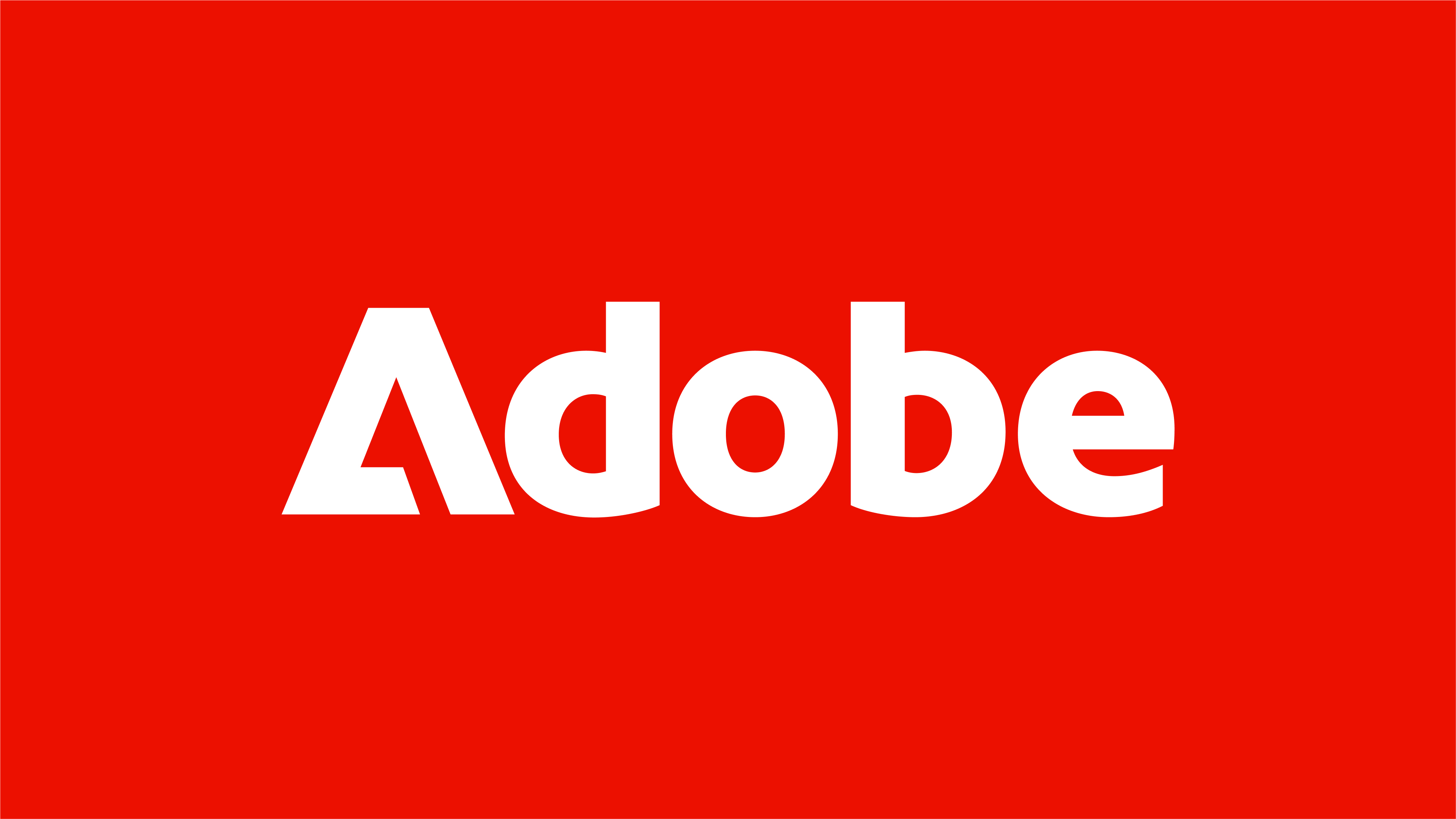
Recently, for instance, Adobe worked with Mother Design on a rebrand that makes their previous identity look like it was cobbled together from leftover parts. The new logo is confident, simplified, and (here's the kicker) feels like an actual improvement. This clever rebrand refined their red, sharpened their palette and introduced "The Adobe Lens" as a framing device for images. It's thoughtful, it's cohesive, and it doesn't look like they fired their entire design team the day before deadline.
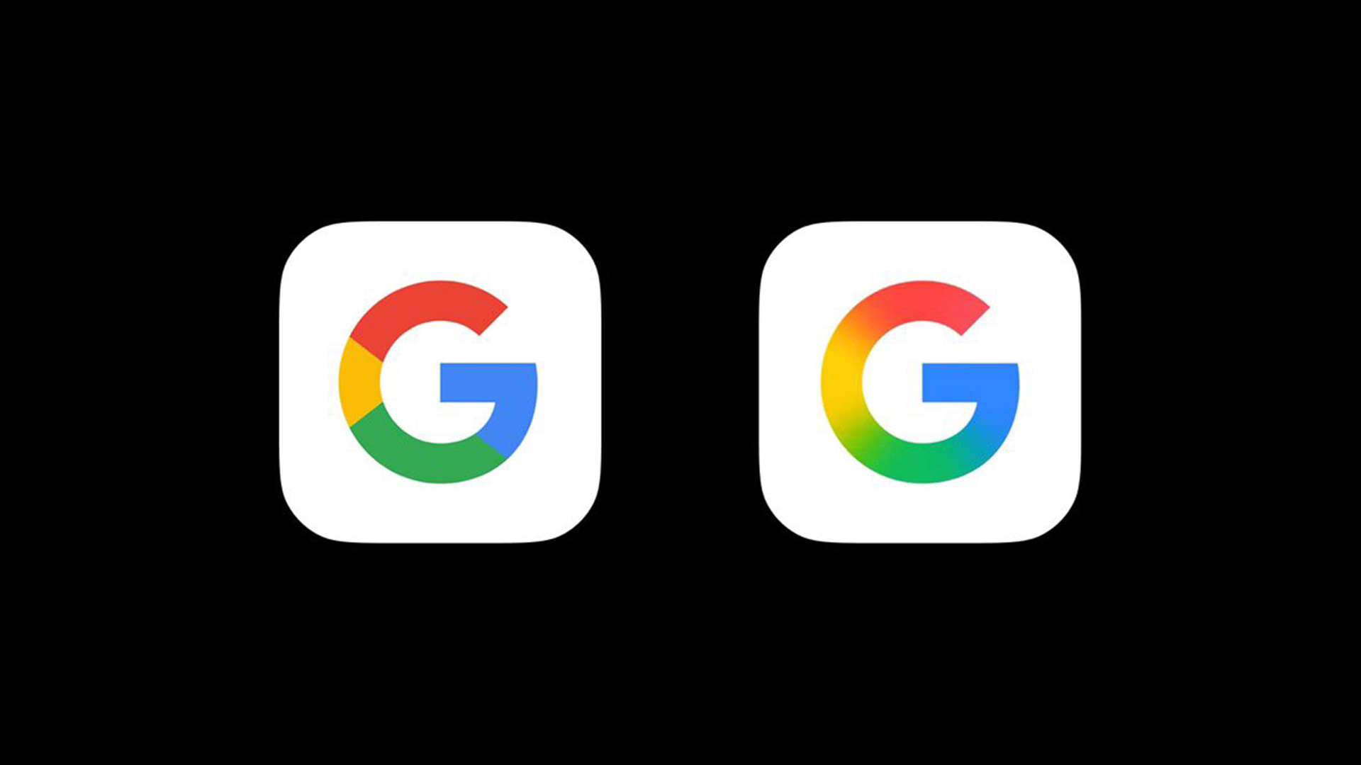
Similarly, Google just unveiled a refreshed logo that blends its iconic four colours into a smooth gradient, and the internet practically applauded. When was the last time you saw the internet collectively agree on anything?
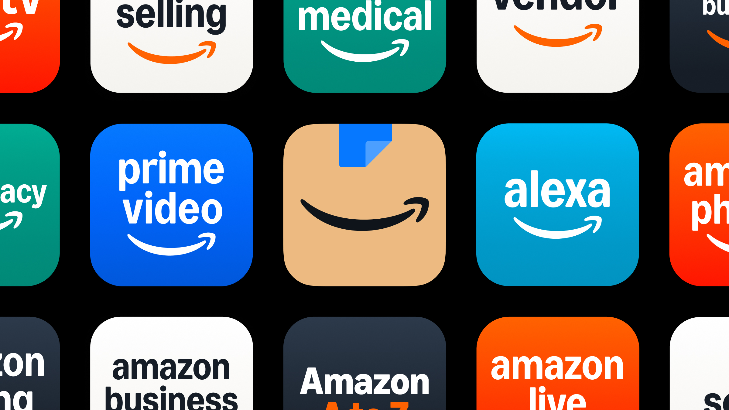
Perhaps the most masterful rebrand of 2025 so far has come from Amazon. Working with Koto, the ecommerce behemoth made their first logo update in 20 years. They deepened the smile, refined the arrow, and created a comprehensive system to unify their 50+ sub-brands. And the changes were so thoughtfully implemented, most people didn't even notice. Which, in my opinion, is how it should be.
This is what proper design thinking looks like. Not scrapping everything that made your brand recognisable in the first place, but evolving it meaningfully. The result? No backlash. No trending hashtags. No marketing directors being summoned to emergency board meetings.
Wombles to wonder
For a masterclass in handling nostalgia, look at How&How's rebrand of The Wombles. These beloved recycling pioneers from the 70s could easily have been ruined by a ham-fisted modernisation. Instead, the agency created what they called "a true British picnic of warm, Wombly features," preserving the essence while making the brand relevant for today.
As How&How's founder Cat How told us in this interview, "It's a delicate balance of making sure that you can successfully and sympathetically update the brand, while still keeping all the key components of what made that brand so charming and engaging in the first place."
Exactly. It's not rocket science.
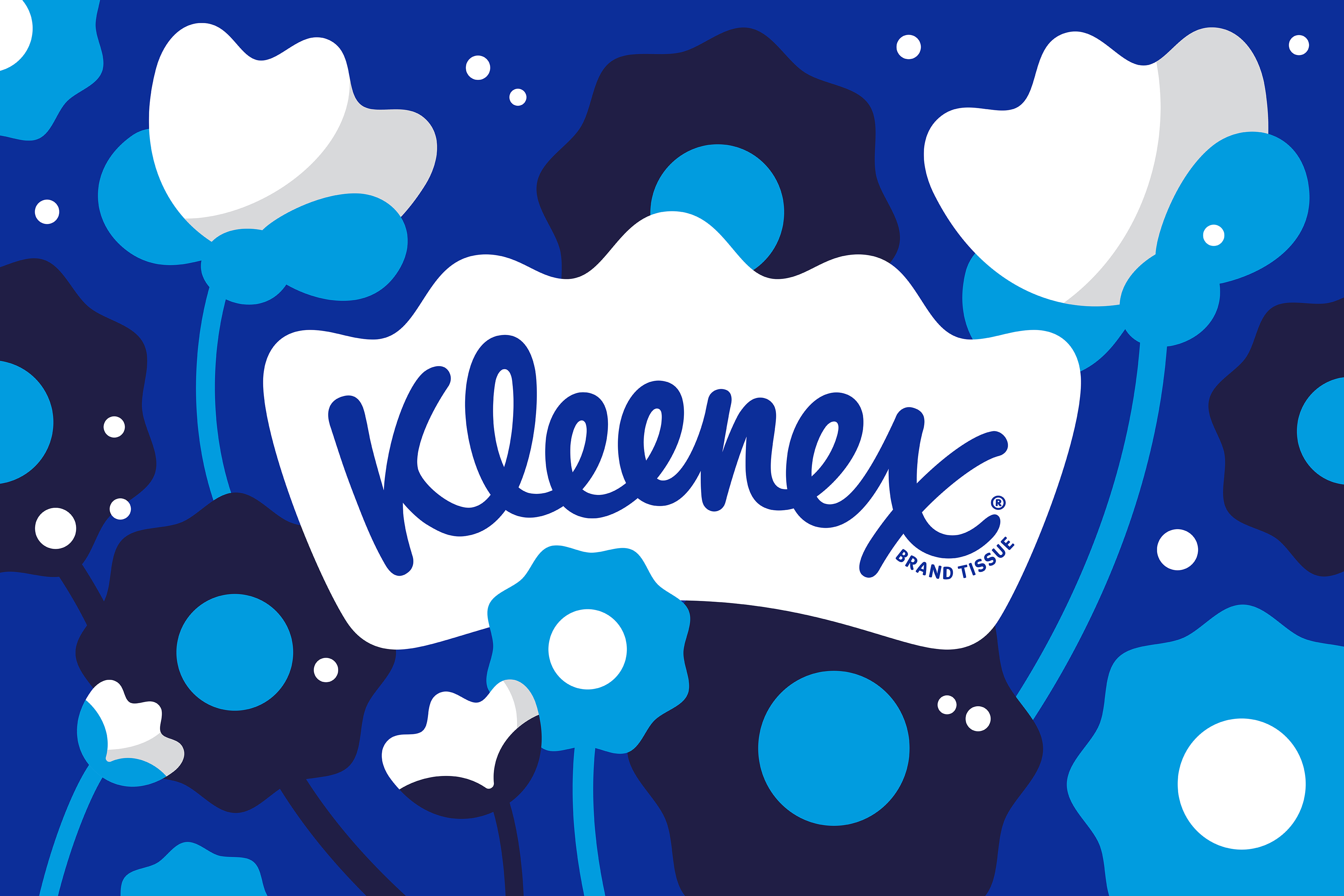
Even Kleenex, celebrating its centenary, managed to unify what had become a disparate brand identity across different markets. Turner Duckworth's work centres around a crown housing the wordmark, establishing leadership while using soft curves that hint at the product's use.
The tissue company's rebrand introduced a distinctive "Kleenex Blue" that feels like it's always been part of the brand, even though it hasn't. That's the magic trick of good rebranding; it feels inevitable rather than jarring.
An inconvenient truth
So next time someone tries to defend a terrible rebrand by claiming "people just don't like change," perhaps they should consider an alternative explanation: people don't like change when it's demonstrably worse than what came before.
Good rebrands clarify what a brand stands for. They simplify what had become complicated. They respect heritage while facing forward. They don't throw the baby out with the bathwater just to justify an agency's fee.
If your rebrand is being universally panned, it's not because the public is stubborn. It's because you've produced something genuinely inferior to what came before. And no amount of pretentious press releases about "embracing our new chapter" or "reflecting our evolved mission" will change that.
So if you're a brand working on a refresh, I beg you: look at Google, Adobe, Amazon, The Wombles and Kleenex. Study how they evolved without alienating. And maybe, just maybe, don't replace your instantly recognisable symbol with what looks like a placeholder from a design student's first-year project.
The public doesn't hate change. We just hate it when you make things worse… then tell us we're wrong for noticing.
Want to try? See the best laptops for graphic design.