Many of us who love color and paint are stalwart supporters of Benjamin Moore, and the paint brand has a handful of shades that are beloved and used again and again. if you are a true follower, you have likely heard of Simply White. It's one of Benjamin Moore's best selling paints.
As such, if you're searching for the best white paint, Benjamin Moore Simply White may well be high on your list. But it’s worth noting that decorating with white isn't just about choosing something clean and neutral. Undertones play a significant role, and understanding how they behave in different lighting conditions is key to getting the result you want.
Here, we speak with designers and color experts, taking a closer look at Simply White and exploring how to use it in real spaces, along with a few things to keep in mind if you're considering it yourself.
How to decorate with Benjamin Moore Simply White
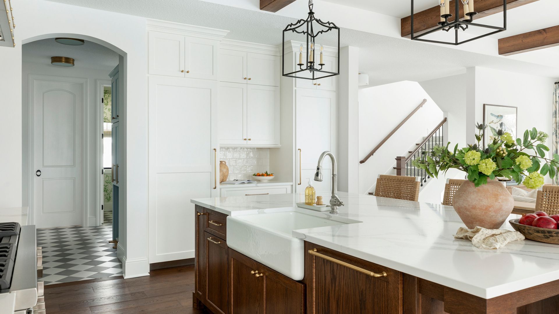
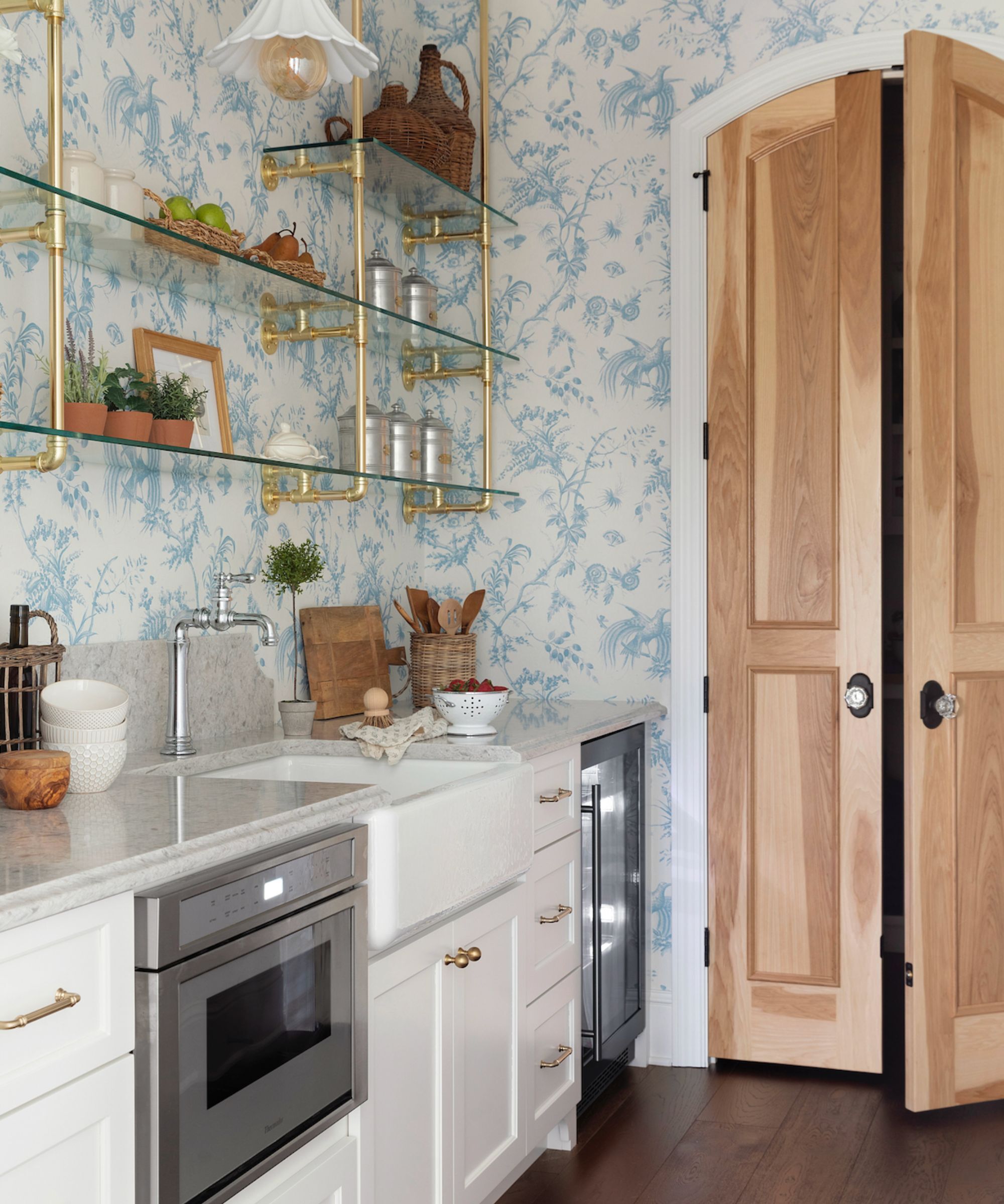
At first glance, Benjamin Moore Simply White is a soft, almost creamy off-white paint. 'It’s a softer version of pure white, with a slightly creamy undertone,' explains Lina Galvao of Curated Nest Interiors. 'This makes the white render as warm, which is desirable in most residential spaces.' That gentle warmth is part of what makes it such a go-to choice, not just for walls, but for trim, ceilings, and cabinetry, too.
Jennifer Davis of Jennifer Davis Interior Design agrees: 'It is clean and bright without feeling cold or sterile. There is a touch of warmth that makes it feel welcoming.'
That said, this isn’t a one-size-fits-all white. As with most colors that have undertones, Simply White can shift depending on the light in your space and what it’s paired with. According to Benjamin Moore Color Marketing Manager, Arianna Barone, 'Simply White is a bright white paint color with a subtle wink of yellow giving it just a touch of warmth. It is refreshing and crisp without feeling too jarring or cold.'
Where does Simply White work best?
Designers often use Simply White when they’re after a bright, clean, fresh look that still feels welcoming. It’s often used in living areas, kitchens, and bedrooms, where it acts as a soft backdrop to wood finishes, artwork, or colorful trims. 'It’s a great color choice to get a ‘light and airy’ feel,” Lina says, 'But also works as a great backdrop to colorful millwork or artwork.'
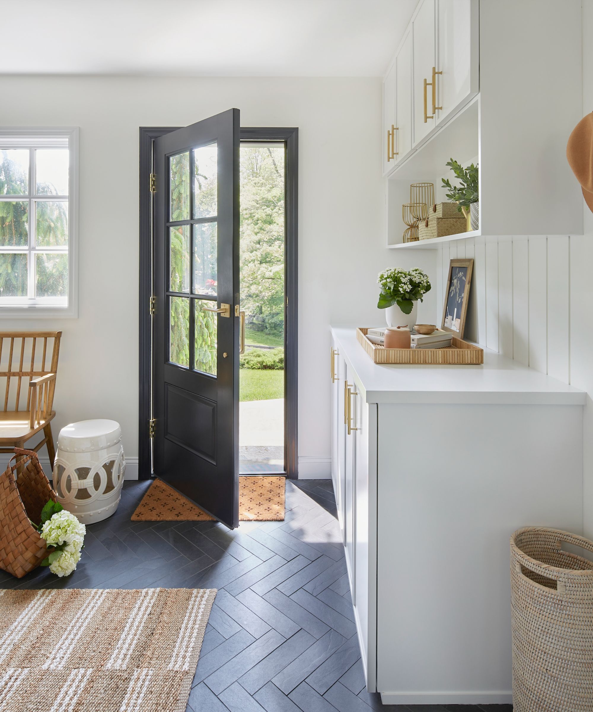
Ariana recommends it for a range of uses across the home: 'I love to use this color on the trim, ceiling, and interior doors throughout an entire home.' It’s also particularly helpful in transitional areas: 'Simply White is a great option for connector spaces, so it's a great entryway color idea, working especially well in spaces that connect multiple rooms.' Its slight warmth can also help in dimmer rooms or those with cooler lighting, where a bright, brilliant white would feel too stark.
Ariana also notes, 'When looking for an off-white for more dimly lit or cooler-lit rooms, Simply White is a go-to.'
Where should you avoid using Simply White?
Despite being a versatile color, Simply White might not work equally well everywhere. Because of its yellow undertone, it can skew warmer than expected under certain conditions.
Ariana advises: 'In rooms that receive a lot of warm, southern exposure, the yellow undertones can come through stronger, so always be sure to sample to ensure you get the look you desire'.
Jennifer Davis, on the other hand, says that she’s more cautious when using it in rooms that don't get much natural light or alongside cooler finishes. 'Because it can lean yellow in low light or when paired with cooler materials, proceed with some caution, particularly in dimly lit areas, ' she says. This may make it less of a match for spaces dominated by gray stone, marble, or steel.
In short, Simply White works best when its yellow undertone is balanced with the right level of light and other elements in the room such as natural textures, wood tones, or warm metals.
What colors work well with Simply White?
When it comes to pairing, Simply White does well with a wide array of palettes. 'Simply White offers a great complement to creamy tones, natural woods, and most colors,' Lina says. Ariana recommends it for spaces that feature blues, greens, or earthy neutrals: 'It brings a soothing warm contrast when paired with blues and greens to create more of an easygoing coastal look'.
That said, 'When pairing it with cooler violets, the yellow undertones can come through stronger,' Ariana notes. Because yellow and violet are complementary, that interaction can be more jarring than subtle.
Jennifer also avoids pairing it with crisp marbles or icy finishes, where a cooler white might provide a cleaner match. For a streamlined look across the whole home, Ariana suggests using it on walls, trim, and ceilings, changing only the sheen for contrast. This monochromatic approach keeps things calm and cohesive without introducing new undertones from a second white, allowing for furniture and decor to stand out.
The white marble glass on this lamp base is truly beautiful, its a reminder that simple, clean interiors needn't be one-dimensional. This brings a calm, cloud-like feel to a room.
If I were to create the recipe for the perfect bedroom, the first and non-negotiable ingredient would be crisp, white cotton bedsheets. These Ralph Lauren sheets are perfect.
If you love the bobble furniture trend then this coastal-cool occasional chair is just the ticket to achieving that laidback yet design forward look.
Every alfresco dining tablescape needs drinking glasses like these dotted about. They're smart, chic and timeless.
Marble is always a good idea. In traditional interiors, this table can evokea refined, Roman aesthetic. In modern homes, this will look bang on trend, with its playful scalloped legs.
If wafting in and out with armfuls of summer feasting food is on this summer's agenda, this beautiful, simple creation is a must buy.
Simply White OC-117 has become a go-to for a reason: it’s flexible, soft, and easy to live with in the right conditions. If you're drawn to a soft white that isn’t too stark but still feels clean and bright, Simply White is worth considering. Just be sure to test it on multiple walls, in different lights to see how it behaves in your space. It’s a shade with nuance, and those subtleties are exactly what make or break it in real-life spaces.