It's no secret that brown is having a moment in interior design. Over the past few years, the earthy color has slowly but surely been gaining traction in homes, eclipsing the cool grey hues that used to dominate the ever-popular minimalist style.
Decorating with brown has established itself as the new modern neutral, and its warming presence is not just for fall and winter. As long as you opt for the right hue, the color will look chic throughout the seasons. We spoke to some design experts to hear about cinnamon brown and why this color trend the perfect shade for all year round.
How to decorate with cinnamon brown?
Cinnamon brown could be the ideal hue for creating comforting and characterful spaces. If you are planning a modern refresh, take note of these useful tips from designers who have worked with the shade before welcoming this adaptable color into your space.
1. It creates a great backdrop
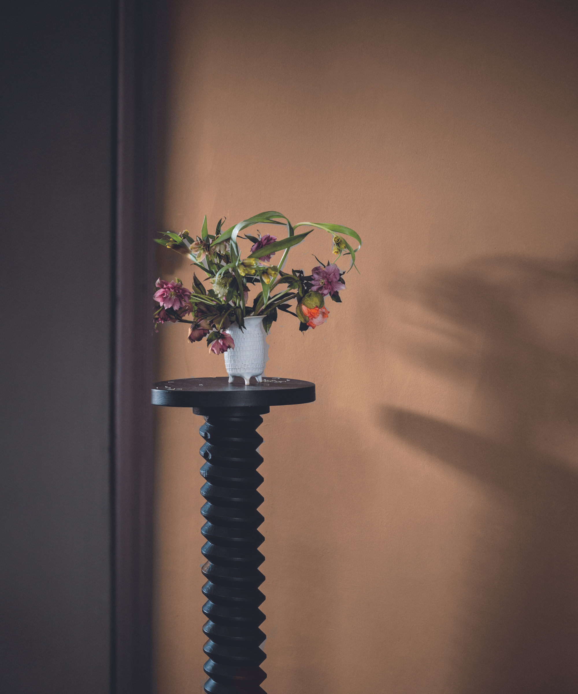
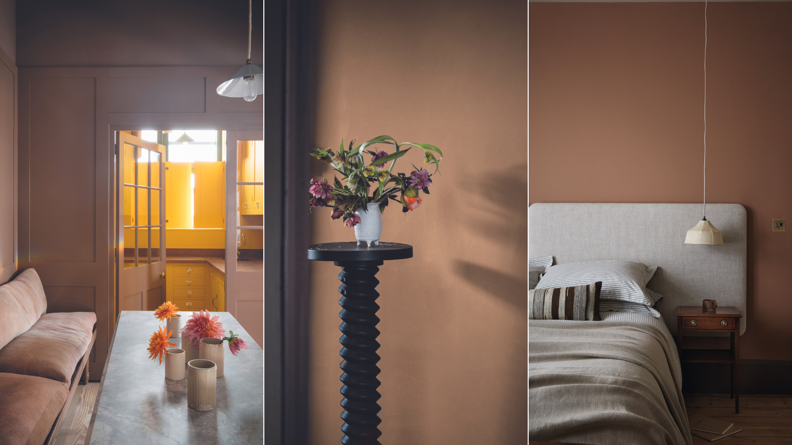
The beauty of a mid-tone brown is that it has a rich and interesting quality without adding too much weight or intensity to a space. It creates the perfect backdrop for displaying a jug of flowers, a pile of beautiful books or a group of ceramics.
Cassandra Ellis, founder of Atelier Ellis, suggests trying their color Coming Up Roses. She says 'it's a warm, rich, magenta-based brown. It feels old and nostalgic but it is comforting and feminine. I made this color using umber, yellow ochre and the magical magenta pigment. By avoiding black, the color feels both alive and very familiar. It’s been popular for kitchen cabinets, as well as rooms that are happy in evening light or – much better – candlelight.’
2. It will enhance your mood

Cinnamon brown is ideal for an everyday space, particularly if you want your surroundings to boost your mood and help you to feel calm. In a room like a home office, a mid-tone brown will feel uplifting on bright sunny days, as well as suit the low-lit glow of a table light in the evening.
Claire Sa, director of the interior design company De Rosee Sa, is all for using a cinnamon brown in a work-from-home space. ‘For this intimate home office setup, we decided to paint the walls with Paint & Paper Library Caddie. It creates an intimate and cozy atmosphere, complementing the dark wood as well as the pattern on the rug’, she says.
3. It works from dusk till dawn
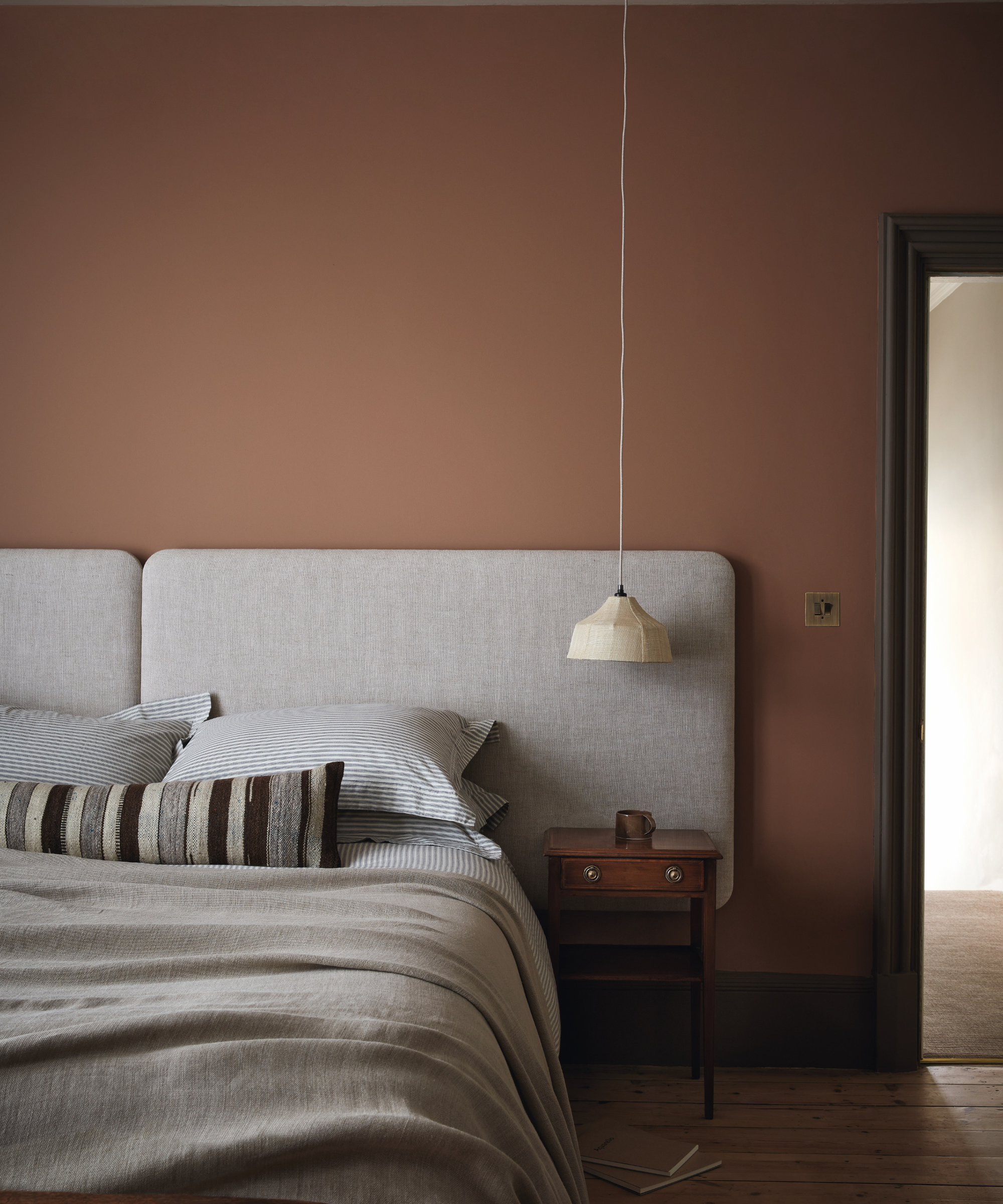
In a bedroom, cinnamon brown is a beautiful choice. In the morning light, it will reflect an energizing golden glow, and lit by a gentle reading light or a candle in the evening, it will feel cocooning.
Ruth Mottershead, creative director of Little Greene suggests trying Split Pink, describing it as an ‘Elegant and earthy, a wonderfully warm, brown-based pink hue.' suggests 'For skirting, try color-drenching, or opt for a coordinated color such as Attic II or dramatic deep blues and greens such as Obsidian Green or Dock Blue.’
4. It casts a flattering glow
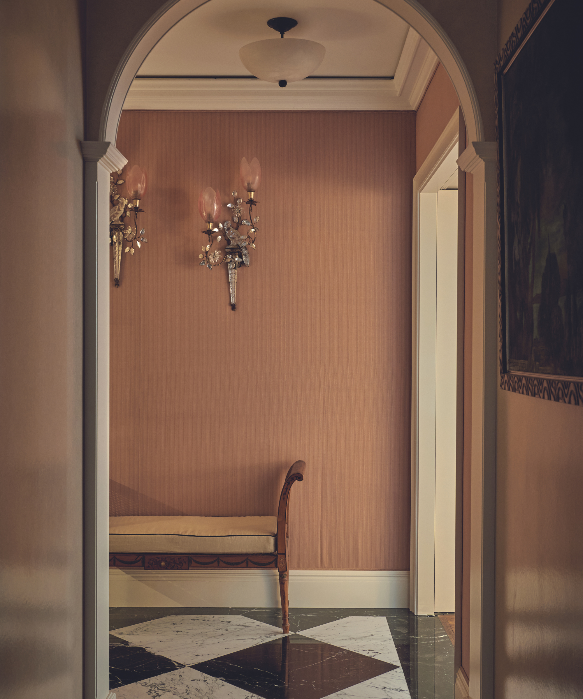
For Rosanna Bossom, founder of the eponymous interior design firm, the advantage of mid-tone brown is the ambiance it creates and the way it bounces light throughout a space and yet still always feels warm and cozy.
Of this entrance hall she says, 'We chose this color because it’s flattering on your complexion, as the warm tones give off a lovely glow. It’s a gentle shade that doesn’t darken a hallway with little natural light.'
5. It's the perfect bedmate for other hues
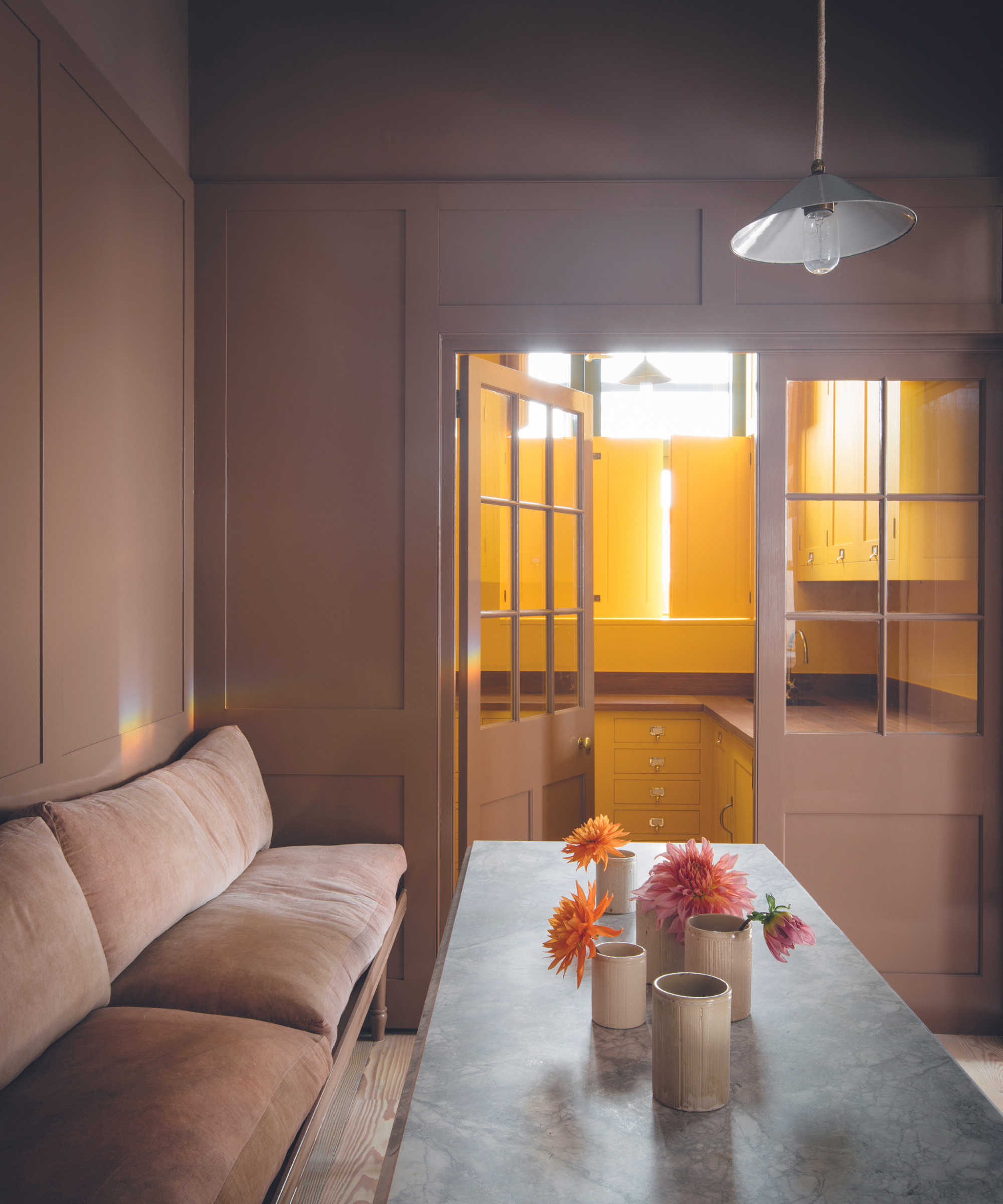
You might think that the rich quality of cinnamon would make it tricky to pair with other shades. However, a medium brown is neutral enough to sit happily with a multitude of colors. It can soften and balance out the effect of stronger tones.
This was the intention of Merlin Wright - design director at Plain English, when planning the scheme of this dining space. ‘The pinkish, smokey glow of Plain English’s Kipper creates a soothing nest-like space. For the pantry, we chose our Boiled Egg – a theatrical color that brings sunshine to smaller spaces. Kipper beautifully offsets the rich yellow.’
It's no wonder this spiced hue is becoming a go-to for interior designers. Classic and contemporary all at once, it creates spaces that both look and feel uplifting. More compelling than grey or white, cinnamon brown is versatile enough to be incorporated into most decorating schemes, making it the perfect neutral for now.