A clever use of colour and typography can communicate so much in graphic design. Alas, like even the finest-quality grass-fed beef from the Argentine pampas, it can be overdone and overseasoned.
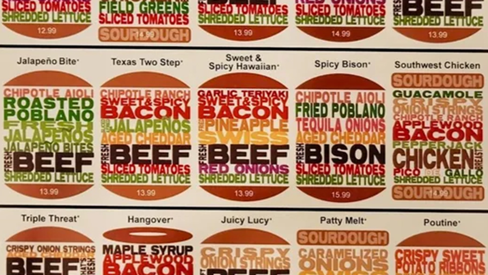
This menu design from a small local burger restaurant is giving infographic and festival lineup vibes for me, but graphic designers have serious beef with its legibility. Perhaps a word cloud sandwich doesn't makes for the best user experience when it comes to ordering a burger?
Local Burger Place’s Graphic Menu from r/DesignPorn
The menu from Colorado's Stuft burger bar has become unexpectedly famous thanks to being dissected by graphic designers over on Reddit, where the post above has racked up thousands of votes and hundreds of comments in just a couple of days. The design presents burgers in a variety of shapes, with sourdough, bagel or traditional buns, and the ingredients listed in text that approximately matches their colour.
We've seen design concepts like this before. The burger-flipping giant McDonald's once used logo-less type-only billboard ads that simply listed ingredients in different colours. But those ads worked thanks to their minimalist simplicity and instant recognition. One designer says the menu is so busy he would freeze in panic when of he had to choose what to order.
"I'm would just turn around and walk out," another designer writes on Reddit. "If I try to read this I’m going to give myself a migraine," another person weighs in "My eyes have enough trouble focusing together not even knowing how to scan through this. Forget it for people with dyslexia! And people with food allergies (or even preferences) who have to spend 10 min deciphering while they’re already hungry."
Some people have found more specific technical qualms to pick at, including tracking and word spacing. "Some words are touching while others have large spaces between them. And the redundancies make it harder to read too," reads one more detailed critique.
Others have some constructive suggestions. "If they just broke down the 'color-coding' with a graphic key, just using the colored stripes, could work really well," one person proposes. "I would probably start with vertically centering the protein on all of them, and come up with a fixed size 'block' for each ingredient, letting the Buns expand," another person suggests. But others argue that the need to consult a legend would make the user experience even worse.
To be fair, the menu does clarify what you can expect to get in each burger more than a photo might, and the customer may appreciate being able to see the shape and patty count of each item. But, given that this appears to be a paper menu that doesn't need to be read from a distance, surely it would be much easier to read if the ingredients were presented in a more traditional list format?
Prime cut or totally impractical? Let us know your thoughts in the comments section below. For more of the week's graphic design controversies, don't miss the debate going on over the tendency for designers to put circles over logo designs in presentations.


.png?w=600)

