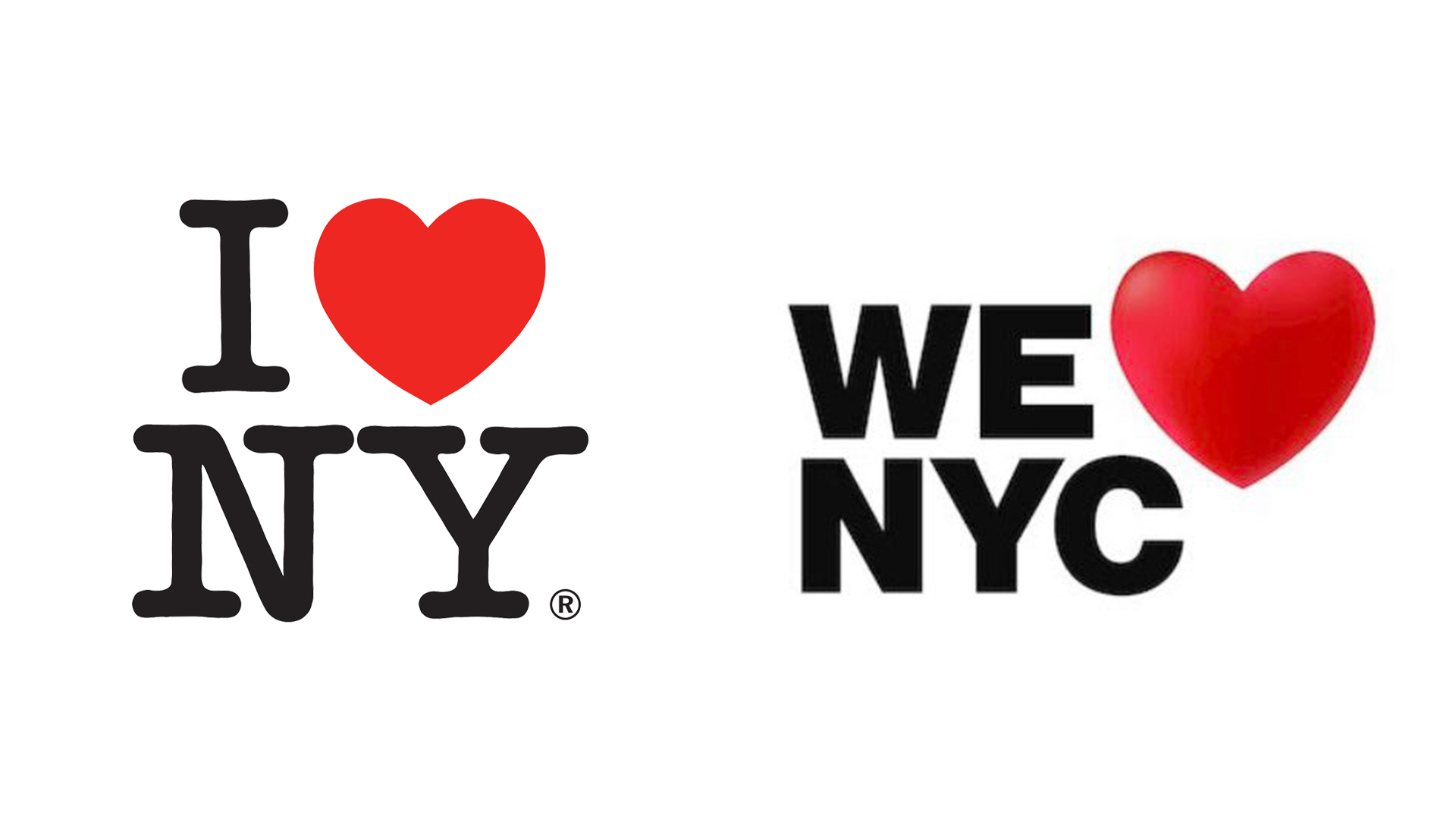
It's one of the most famous logo designs around, created by one of the most famous designers. Milton Glaser first sketched his 'I Heart NY' design on a scrap of paper in the back of a taxi – but from those humble beginnings, it went on to become iconic. Did it need updating? Judging by the response to a new campaign, no.
Unveiled by city officials this week, the new 'We heart NYC' campaign is designed to promote the city as it bounces back from the COVID-19 pandemic. And it's clearly based on Glaser's effort, both in name and design. But while the original is arguably one of the best logos of all time, this new version has prompted ridicule online.
The design features basic sans serif text which reads 'We NYC', alongside a heart. And therein lies the first problem – this could easily be read, 'We NYC heart'. And then there's the heart itself – with its not-so-subtle 3D lighting, there's something decidedly 'emoji' about the whole thing.
Milton Glaser kerning in his grave https://t.co/ADxEJ0DiqgMarch 20, 2023
Milton Glaser's ghost is absolutely crying over that NY logo. Sans serif?! ♥️March 20, 2023
WHO APPROVED THIS https://t.co/UoDNYxIRsMMarch 20, 2023
As plenty of brands have discovered the hard way lately, tinkering with a beloved logo design can easily lead to a furore. From Audi's flatter rings to Nokia's jagged rebrand, we've seen no shortage of online ire lately. So, if you're embarking on a branding project of your own, take a look at our guide on how to design a logo.