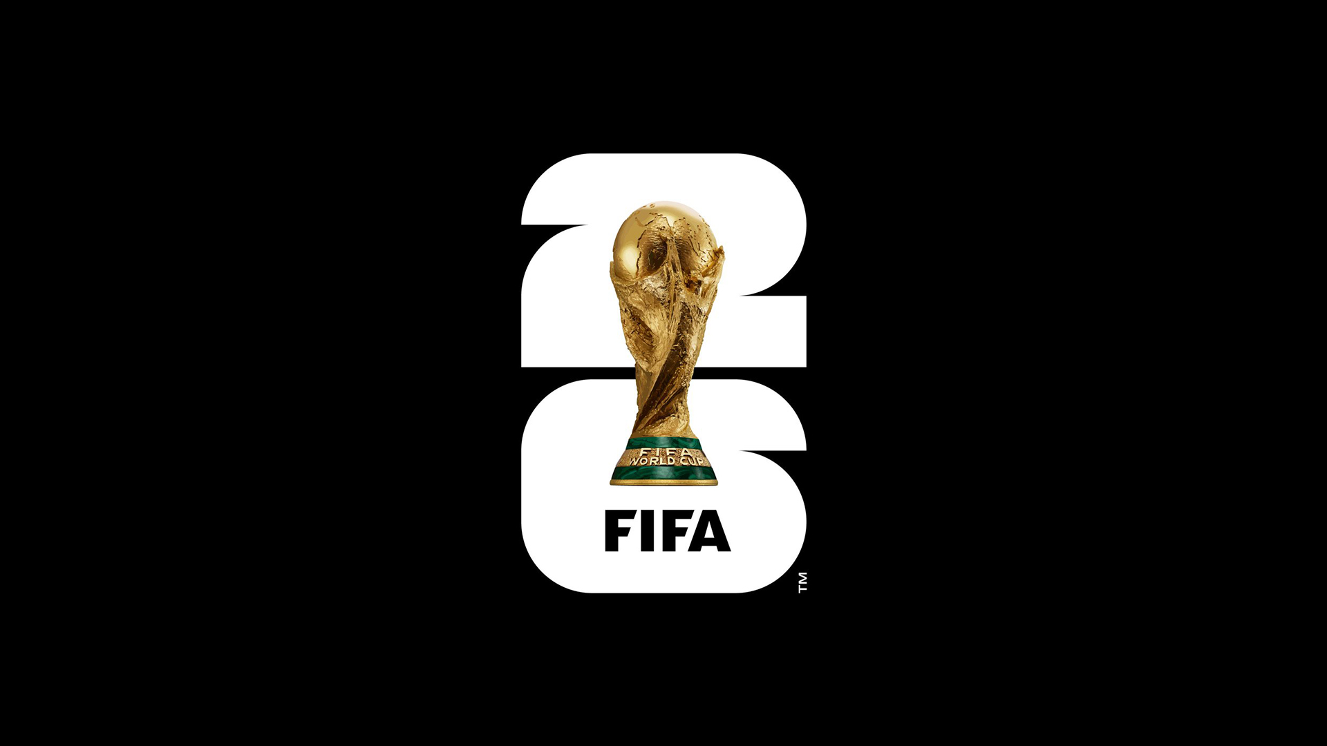
Almost as anticipated as the announcement of the host city for any Fifa World Cup is the reveal of a new logo. This week, the design for the 2026 Fifa World Cup in United States, Mexico and Canada was revealed – and fans are already declaring it an own goal.
Unveiled to much fanfare at the Griffith Observatory in Los Angeles, the new design is somewhat, er, simple. It features a stylised, vertically aligned '26' with a photo of the World Cup itself slapped over it, along with the word 'Fifa'. And that's it. As logos go, it's hardly a complicated one – but then some of the best logos of all time are incredible simple, right?
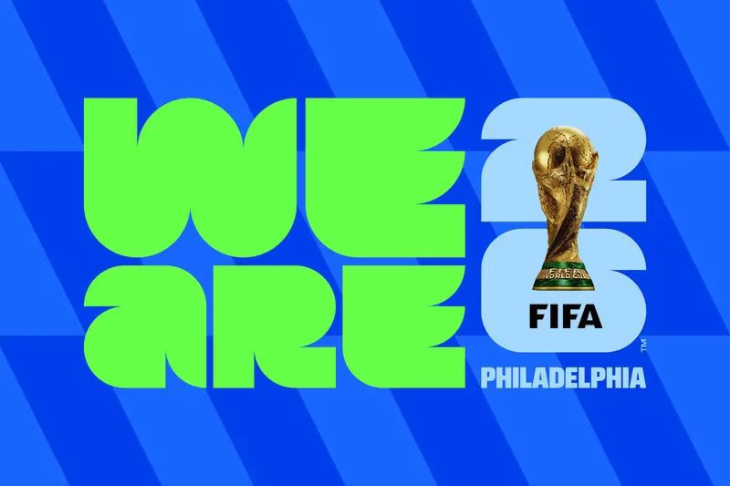
We'll focus on the good first. It's certainly a fun typeface, bold, blocky and curved, with a nice symmetry between the arcs of the 2 and 6. And according to Fifa, the design is intended to be customisable. "The image of the trophy and the year allow for customization to reflect the uniqueness of each host, while building an identifiable brand structure for years to come,” Fifa announced, showing how the design can be rendered in different colours for each host city.
But the issue most seem to have is with that giant World Cup in the middle. Rather than a cutout or even a silhouette, it's literally a photograph – giving the whole thing a rather slapdash quality. As many have pointed out, the cup itself looks somewhat of an after-thought, since its stylising (or lack thereof) isn't at all consistent with the rest of the flat, monochrome design.
It’s my first day working as a graphic designer! Let me know what you guys think ❤️ https://t.co/HHaz8QRcSIMay 18, 2023
THEY PUT A PHOTO OF THE TROPHY IN THE LOGO?!?!? https://t.co/ORCvCiwrXE pic.twitter.com/d17u5IzZHtMay 18, 2023
Minimalism has the world in a chokehold, what the hell is this? https://t.co/SbZq2KNfBRMay 18, 2023
Perhaps the worst logo of anything I’ve ever seen https://t.co/kADwyvl6ukMay 18, 2023
Indeed, it's hard to argue with those complaining about the apparent lack of imagination on display. But, in Fifa's defence, the brand package as a whole is lot more exciting than the logo taken in isolation – with the addition of bright colours and patterns, the typeface really pops. But still, that trophy...
Still, while it might be bland, this is hardly the worst logo design crime we've seen in the last few months. From Kia's illegible design to Calendly's unfortunate toilet resemblance, we've seen a few shockers of late. Think you can do better? Check out our guide on how to design a logo.