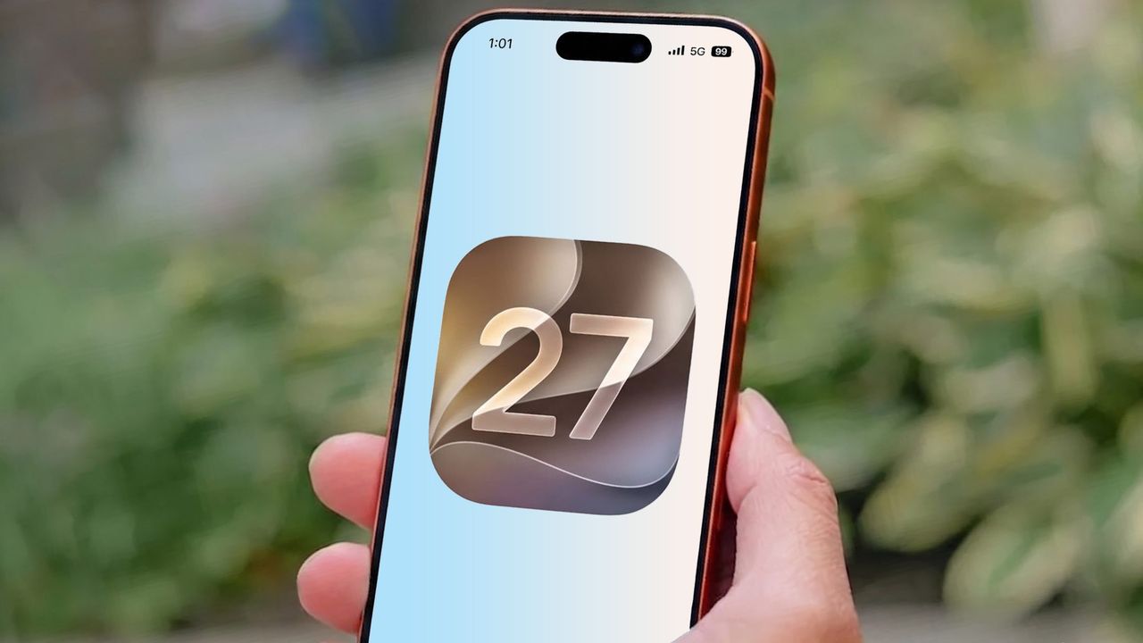
It's fair to say that Liquid Glass was rather controversial following its debut at WWDC 2025. It's no surprise that such a drastic change caused loyal iPhone users to complain; the same thing happened when iOS 7 made similarly drastic changes back in 2013. But this didn't change the fact that the backlash was so severe that Apple has made a point to tweak Liquid Glass in iOS 27.
The effect hasn't been removed, so any diehard Liquid Glass haters are going to be disappointed. But Apple has made some changes that could prove beneficial to those of you with valid criticisms about Liquid Glass and how the transparency effects actually work. Not only is there a new slider to control how the transparency effects work, but Apple also claims it has adjusted how Liquid Glass elements look on screen.
But just how much has changed compared to iOS 26? I decided to compare the newly-released iOS 27 beta with last year's software to find out.
Why people hated Liquid Glass
Beyond the people who criticize change simply because they don't like change, what was the deal with Liquid Glass, and why did people hate it so much?
The reduced readability was a common complaint, with multiple users complaining about blurry icons and the icons themselves having a strange "tilted" look that you can't ever unsee. Dark mode drew some particular ire from users, with some people complaining that the slight glow around Liquid Glass icons was distracting — and in some cases caused dizziness.
Others noted that the keyboard experience wasn't consistent across apps, with third-party apps frequently defaulting back to the old pre-iOS 26 keyboard design instead of the one infused with Liquid Glass effects. Those with older phones also experience inconsistent performance, and even Apple itself said that upgrading to iOS 26 would cause temporary issues with battery life and performance.
Those issues were supposed to fix themselves, but it seems people have a long memory for problems that occur when changes they already don't like happen.
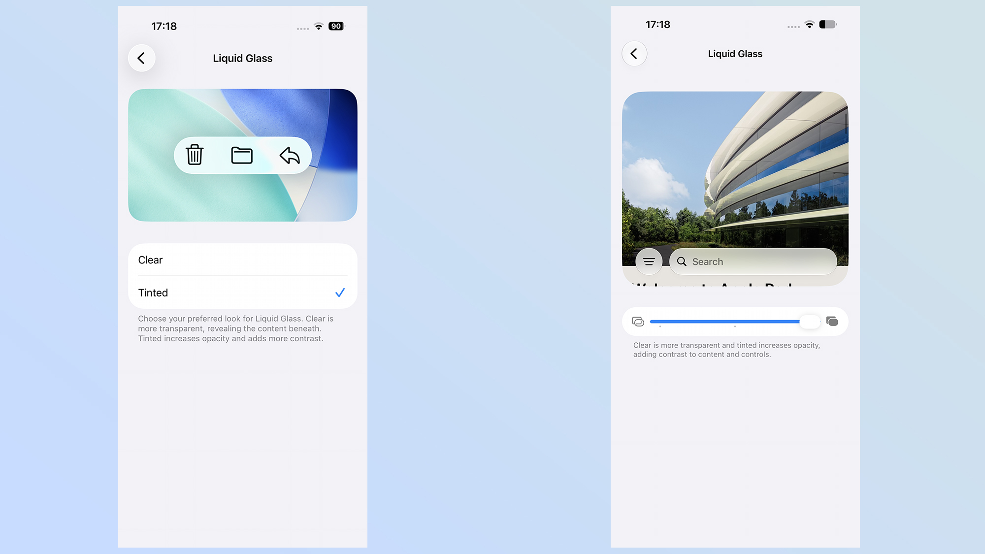
The main complaint when Liquid Glass first appeared after the release of the iOS 26 beta was that the effect couldn't be switched off. Apple did actually change this later on, offering binary "clear" and "tinted" options within the settings, while early adopters found there was a "reduce transparency" toggle hidden in the accessibility menu.
What Apple says has changed
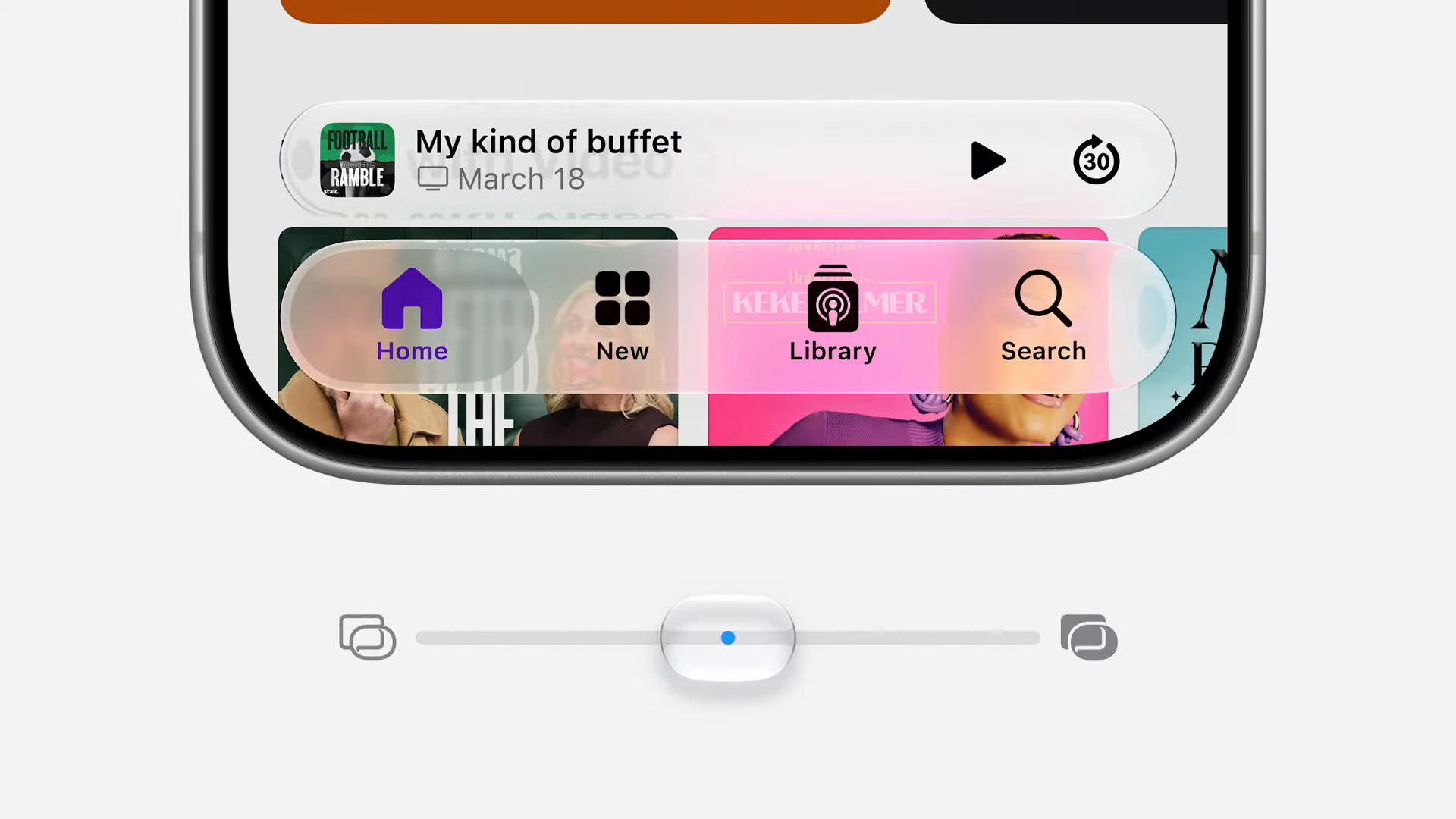
The main change that's come to Liquid Glass in the iOS 27 beta is the addition of a slider, which controls the strength of the Liquid Glass effect across your entire system. This is a big change compared to the binary on/off toggle that was available in iOS 26.
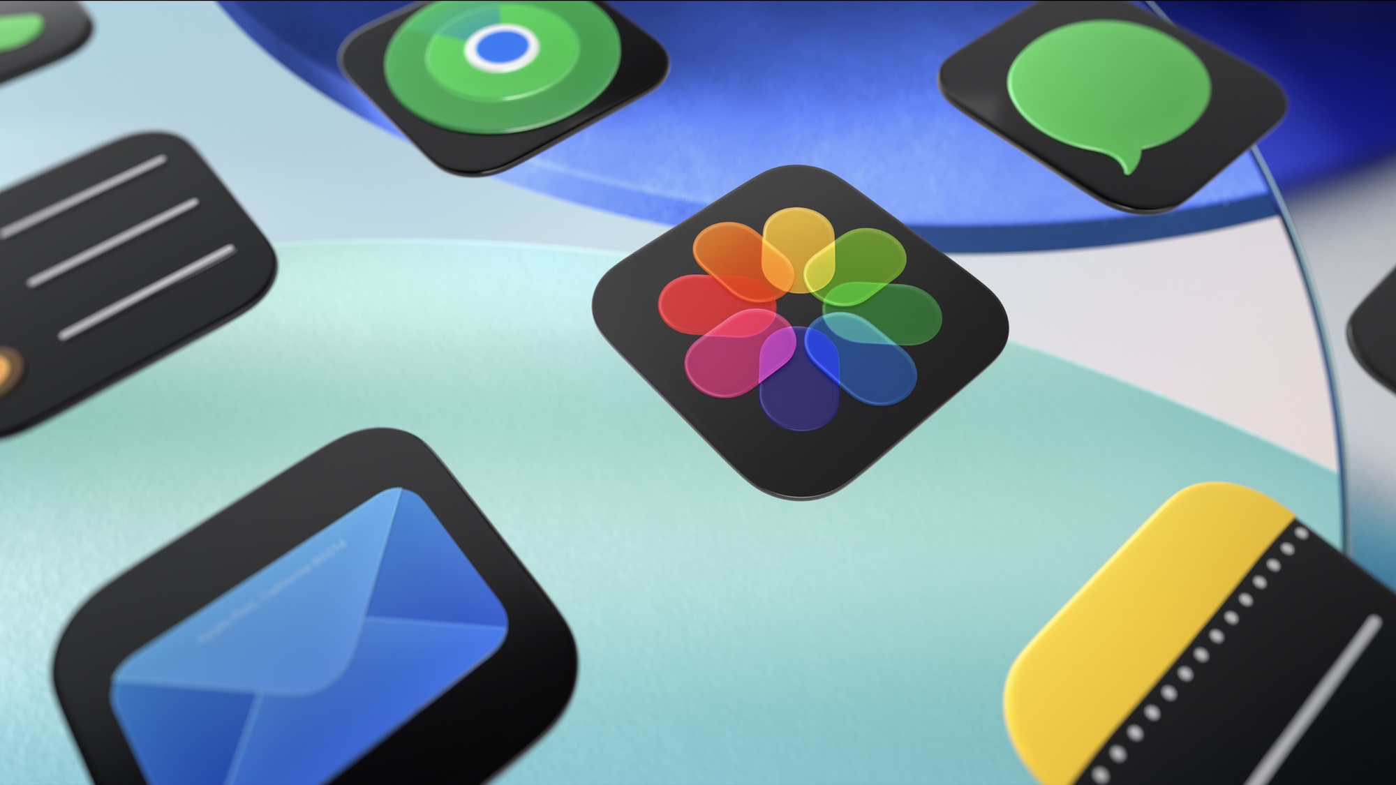
On one end of the spectrum, you have the full Liquid Glass effect, which offers a translucent appearance to icons, windows and other system elements. On the other end, things turn almost completely opaque, though you can still see some remnants of the background.
Apple has also promised huge improvements to readability. Part of this involves new darkened edges around Liquid Glass elements, which, when combined with brighter highlights, make them stand out more from the background. That should make them more visible and easier to focus on.
Another major change is the way that iOS 27 treats background elements behind Liquid Glass icons. According to Apple, the system is now able to disperse more complex background content more effectively, which improves the appearance of the top-layer icons and windows. Icons are also supposed to be sharper and more defined, with new refraction features for developers to take advantage of.
That is a lot of stuff to change, but how noticeable are these improvements compared to last year?
How things have actually changed to Liquid Glass in iOS 27 beta
Upon loading up the iOS 27 beta on my iPhone 17 Pro Max, I don't think I could have pointed out any big differences in the way Liquid Glass looks. Other than the new slider menu, of course, since iOS 27 brought it up during the initial boot-up process.
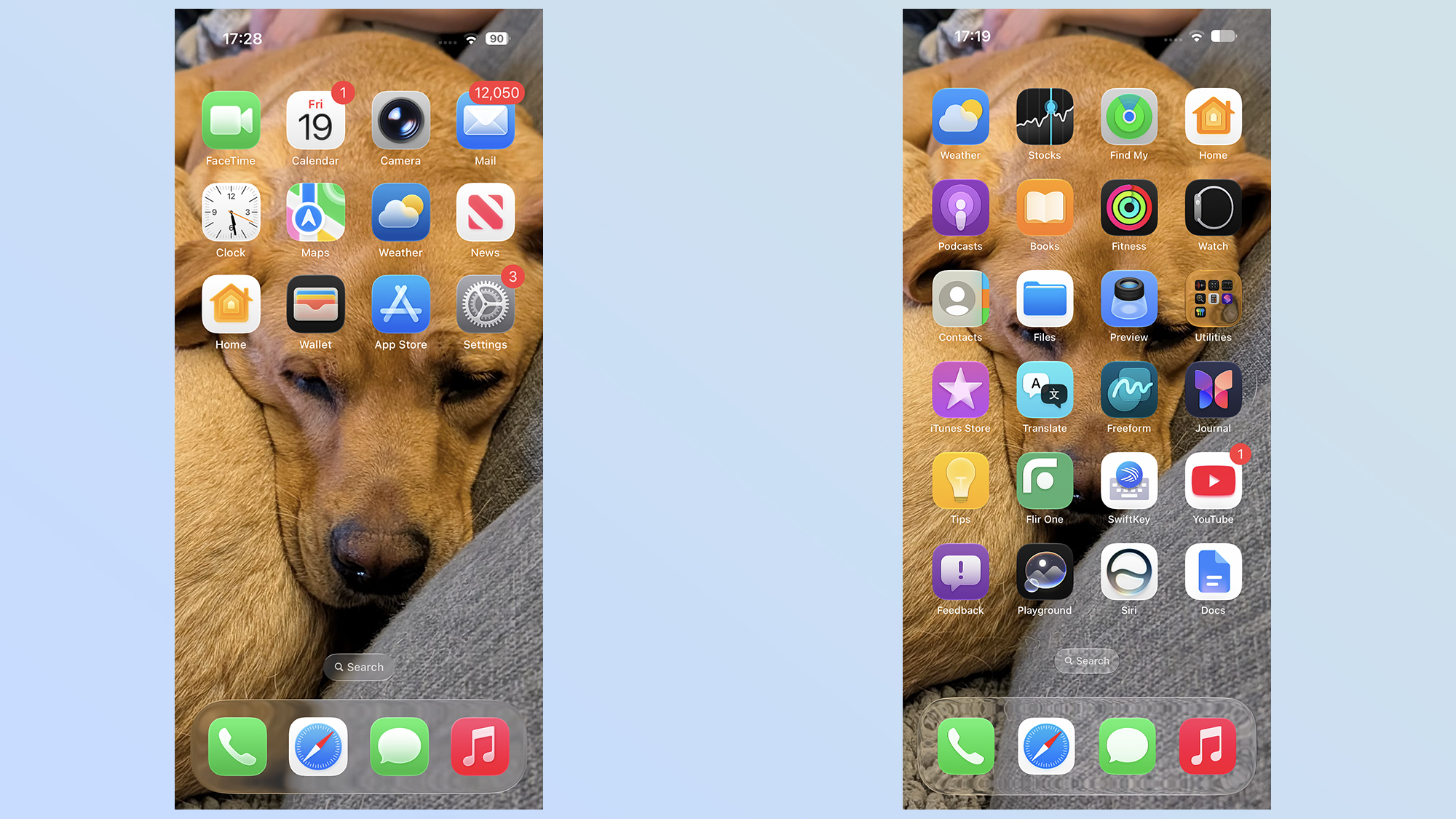
Looking closely, a lot of the effects are quite subtle, but when you know what to look for, they end up being the kind of changes that you just can't unsee. The first thing I noticed was that the transparency effects seem to have been ramped up for the iOS 27 beta.
Even with all the transparency switched on, Liquid Glass on iOS 26 retains a frosted glass-looking effect on transparent windows and icons. The iOS 27 beta makes these a lot more transparent, which means you can actually see what's supposed to be in the background with greater clarity. Whether it's the design of my couch or text that happens to be visible underneath, it's all a lot clearer.
Though there is still something of a warping effect in places, as though you're not quite looking through perfectly smooth glass.
The extra clarity works really well in a lot of places, notably the app list, since it means the screen isn't dominated by a blurry version of your background, but there are instances where it doesn't really work.
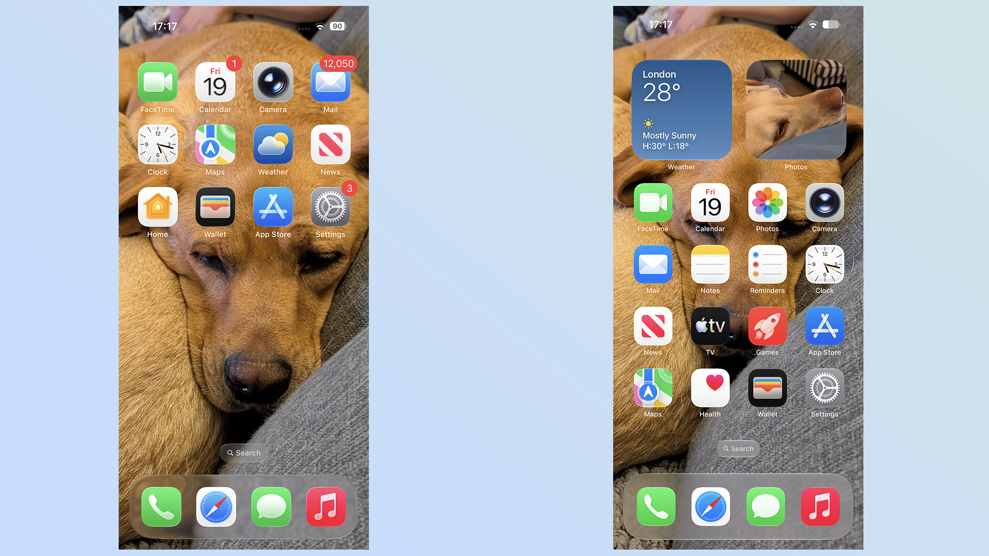
The search bar at the bottom of the home screen really stood out to me, since it's almost invisible and quite hard to read in iOS 27. In iOS 26, the frosted background makes it stand out much more clearly, with the small size not affecting the rest of your viewing experience. Personally, I also prefer the lesser transparency in other in-app menus, notably the camera app.
iOS 26's icons are also a lot brighter, with a glowing effect that feels rather distracting. For an app like Google Photos, it makes the whole icon look like it's appearing in some kind of religious vision in a Hollywood movie. The iOS 27 icon still glows a little bit, but that's the actual design Google rolled out for the app — it even makes an appearance on Android phones.
The tinted effect is a lot more pronounced with the iOS 27 beta, too, which is beneficial for those people like me who still don't like the tweaked Liquid Glass design. There never seemed to be much of a difference when you set Liquid Glass to tinted in iOS 26, but that's no longer the case.
Not only does iOS 27's increased transparency make the contrast between the two extremes more noticeable, but there's also a stronger tint this time around. Apple's also done things in such a way that it blocks out the background elements, rather than simply blurring them.
Outlook
It's clear that the changes Apple has made to Liquid Glass for the iOS 27 beta aren't just token alterations to try and appease critics until they get used to the new design. The alterations are quite subtle, but it does seem as though Apple cares whether people like the look of iOS — even if it means toning down some of the design elements that appeared last year.
Whether this is enough to satisfy Liquid Glass's harshest critics isn't clear. Personally, I still don't like all the transparency effects Apple has employed. Even with tinting set to maximum, it doesn't quite beat the opaque menus that are ubiquitous on other software platforms. While I appreciate the fact that Apple is making Liquid Glass look nicer, I still don't see the appeal of having transparent icons and windows all over the place. But that's just my opinion.
I assume Apple will continue to tweak Liquid Glass over the coming months, ahead of the release of the stable version of iOS 27 this fall. That's how beta testing works, and it's likely that the Liquid Glass we see now isn't going to stick around forever. However, as the design stands now, I definitely see some improvements to the look of iOS, even if it's not something I actually like using.