Making travel plans for 2024? One thing you might not pay much attention to is the font used in the tourism logo for the state or country you might visit. But unconsciously, the type chosen to promote a destination can have an impact on how we think of it. And it can reveal how the place sees itself, or how it wants us to see it.
While some country tourism board logos change with times, fashions or target outbound markets, some have proved to be remarkably enduring. Turespaña, the Spanish tourism board, has used the vibrant Sol de Miró logo created by the artist Joan Miró for 40 years, since 1983. Now, thanks to a trend on Reddit, we have maps that allow us to travel the world virtually and compare the typographical choices of different tourism boards.
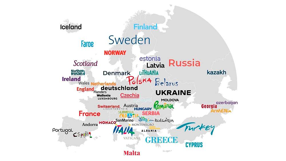
Fonts that countries use in their tourism board logos from r/MapPorn
The map above, shared by humanasteroid, compares the fonts used in the logos of European tourism boards. These range from the unique hand-drawn lettering of that successful Spain logo (Miró actually reused the lettering from the poster he painted for the 1982 FIFA World Cup) to some unconventional variations in height in Lithuania.
The lettering in the Italian logo is almost as vibrant and expressive as that of Spain, while Greece draws on its classical history with an elegant, stately all-caps serif. Many of the fonts chosen by northern and western European tourism boards look starkly reserved in comparison to those in the east and south. Modern, minimalist, they allow colour and the message itself to do the work.
"Austria didn’t know you could change the default font," one person suggested on Reddit, while somebody thinks Romania's font looks appropriate for a juice brand. And the Belarus logo is unnerving people people with its chiller vibes.
A Cool Guide To Fonts That Each State Uses In Their Tourism Board Logos from r/coolguides
Outside of Europe, the map above gives the same treatment to US state tourism logos. Intriguingly the range of different types of font used is just as varied as across Europe. While many states go for clean sans serifs, several have script fonts, including the wild Wyoming and South Dakota logos, which look like autographs, and the rather excellent new Ohio logo.
There are several novel ideas for 'O's. Wisconsin uses the shape of the state itself, Illinois goes for a map location icon and Iowa's 'O' is, er, an empty parentheses. Perhaps as we might expect, Mississippi and Louisiana have the most elaborate choices of font, and California's choice also seems quite representative.
But Hawaii, is that a modified Papyrus font we see? you must have really liked Avatar. Alaska's logo also looks like it might have been taken from a film poster with its gradient colouring (someone's more uncharitably compared it to Windows 98 clip art). And the map raises plenty of other questions. Why does Utah read 'Litah'? Why did Minnesota go for all-caps apart from the 'e'? And why does Pennsylvania look like a dairy brand?
So, I did a map of all the "Country tourism brands", Its more an interesting map rather than a map porn. from r/MapPorn
Now I'd like to see similar maps for the whole word. The nearest thing I can recall is the series of maps above, which were shared on Reddit a few years back. They don't isolate the fonts but focus on the entire tourism logo (use the arrows to browse the maps). For more cartographic gems, see the map of monsters from around the world.