White is widely recognized as one of the most classic colors. Popular across many interior design styles and rooms, white is a timeless shade that provides a clean and neutral backdrop throughout the home.
Although white is achromatic meaning it, in theory, looks good next to all hues on the color wheel, decorating with white across color combinations for rooms should be done so carefully. Certain white color pairings can create an overly harsh look and distract from the calming quality of white.
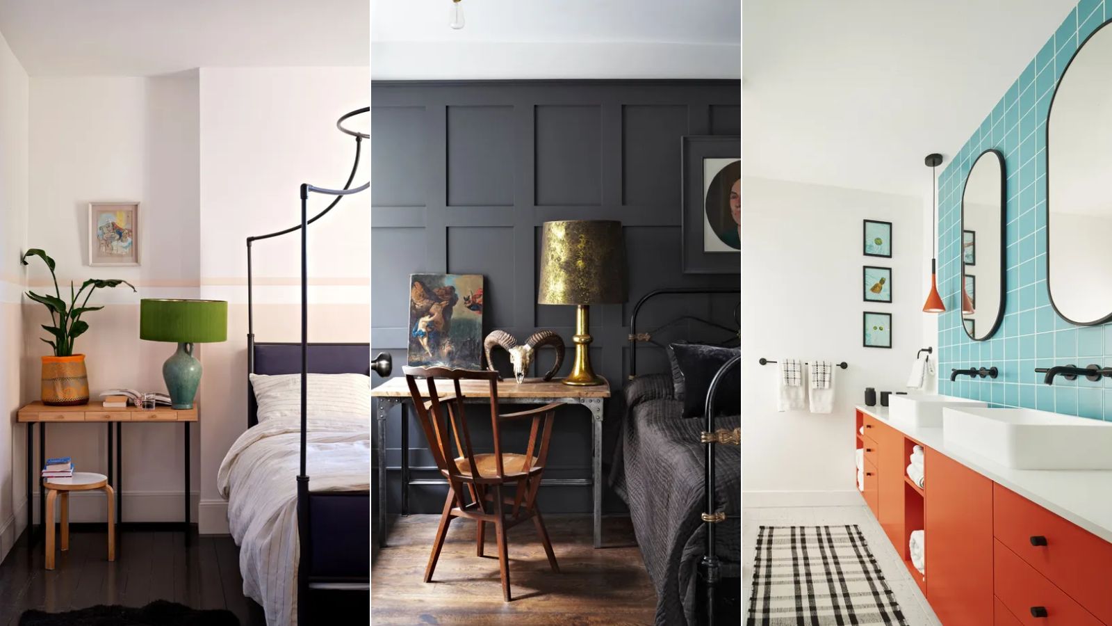
Here, we've rounded up five colors that interior designers generally steer clear of in white room ideas. Read on to hear from the experts on what they do instead to make the most of this classic color choice.
5 colors to never pair with white
The key to mastering white color pairings is to focus on matching the undertones of both white and your chosen color. Helen Shaw, Director of Color Marketing at Benjamin Moore tells us below why the undertones are so important when decorating with white to create a cohesive color scheme.
'White continues to be a popular choice for people looking for a minimalistic and uncluttered look for their homes. However, when deciding on a color combination, opt for colors with similar undertones that complement the light available in the room.'
'For example, warm whites such as Simply White, Mountain Peak, and Cotton Balls create a soft glow and welcoming mood, so avoid pairing with colors on the cooler side of the wheel like blue.'
'Cool whites with undertones of blue or gray create a crisp and clean look and are a great choice for contemporary spaces or in combination with green, gray, or blue accessories.'
1. Pastels
'You need to be careful when pairing white with light pastel colors,' says designer Trish Knight of Knight Varga Interiors.
While pastel room ideas are generally seen as inoffensive thanks to their soft and delicate tones, it's important to ensure the undertones are cohesive if you incorporate white into the scheme. Trish continues to share that the degree of warm or cool tones should be reflected across the pastel tones and white for a harmonious look.
'If your walls are a warm white paint, the undertone of the pastel must also be warm, and vice versa with cool tones,' says Trish. 'For example, if you have warm peachy-terracotta tones you want to be sure to pair them with a warmer white.'
2. White on white
It's not uncommon to layer varying shades of white within one room. Although their differences may be subtle, the slight nuances between the best white paints can be the key to enhancing a room's specific lighting conditions and creating depth. However, if different shades of white are layered in a room with unmatched undertones, it can quickly make for a color combination to avoid.
'I might caution against mixing different shades of white or treating them as interchangeable,' says interior designer Kathy Kuo. 'It may not seem like it at first glance, but shades of white actually differ quite a bit and don't always look great side by side in a space.'
Eugenia Triandos, Principal Designer at Hibou Design & Co. agrees, adding: 'The one thing you have to be conscious of is pairing different whites together. A creamy white will look muddy and almost dirty next to a bright, clean white.'
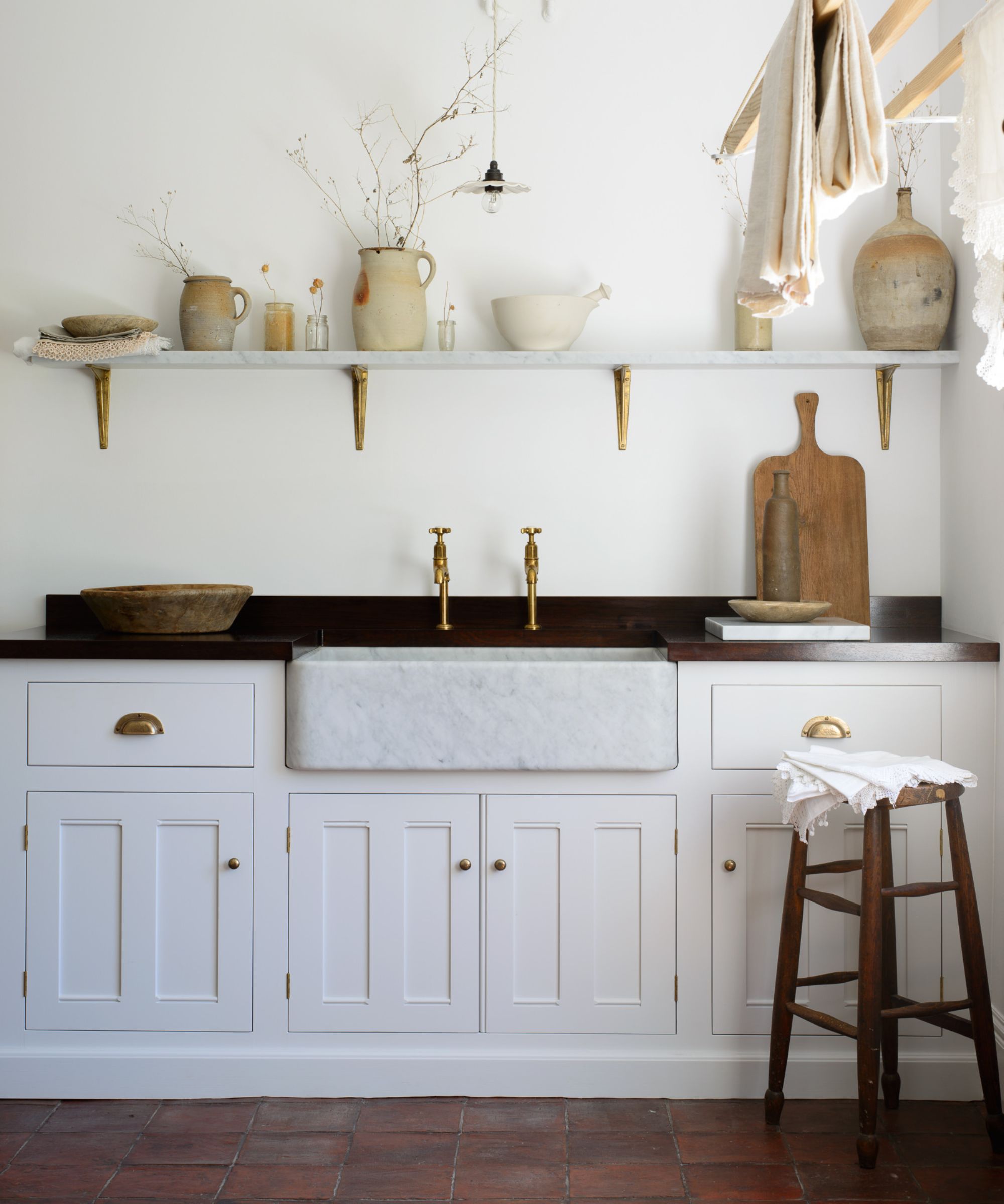
To ensure a cohesive look when layering varying shades of white, choose those with a similar level of either warmth or coolness for a tied-together look as demonstrated in this white kitchen by deVOL Kitchens.
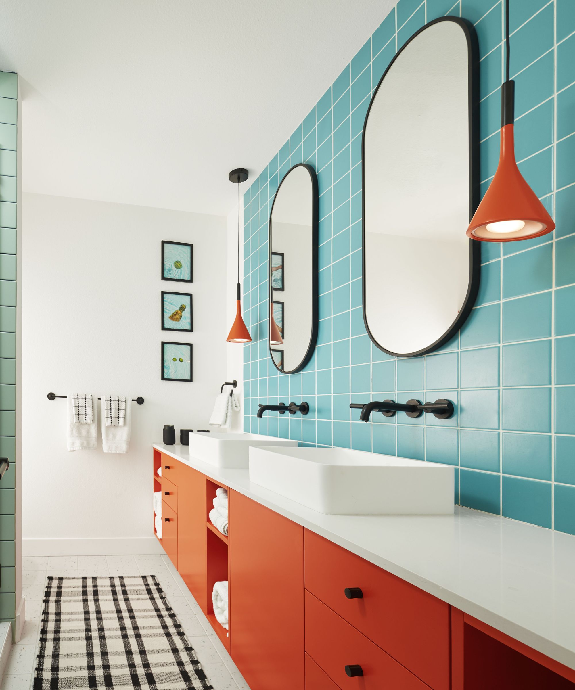
3. Red
Pairing white with warm and highly saturated colors can often appear overly stark with high levels of contrast. Tomato red paired with a bright white is a classic example of this, creating an incredibly intense look.
'Avoid pairing bright reds or oranges with white,' suggests interior designer Brandon Lange, creative director at BZ Interiors. 'These combinations are tricky to get right without feeling like a madhouse!'
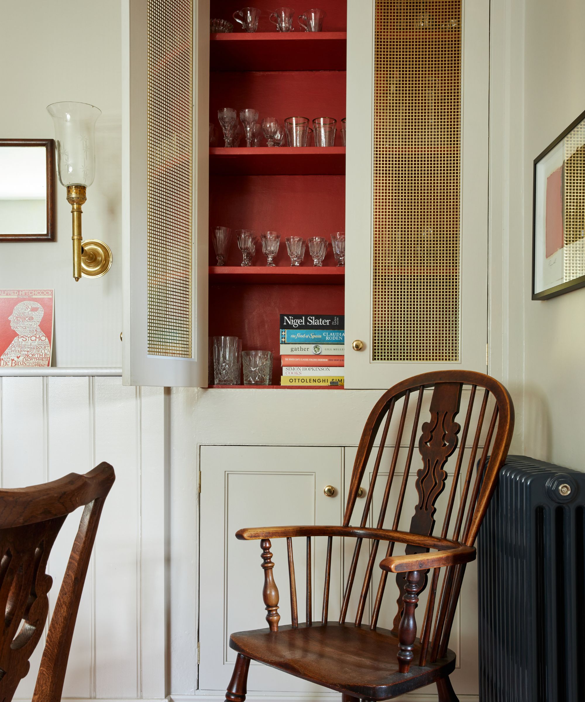
However, that's not to say red and white can't look good together. Rather than opting for a bright white, switch it for something more nuanced and warm, as shown in this farmhouse kitchen. This will instantly reduce the intensity and create a more restful look when decorating with red.
NYC-based interior designer Kati Curtis of Kati Curtis Design says that she regularly swaps white for more gentle off-whites to create a less jarring look: 'I typically don’t use white in practice and gravitate towards creams and off-whites that carry subtle undertones of other colors I’m using in the room. This approach allows for a more cohesive and visually interesting space as these more creamy shades can reflect and enhance the dominant and accent colors I’ve selected.'
4. Neon
Similar to combining red and white, pairing white with neon shades can also appear harsh. 'Bright neon shades can feel intense with white,' suggests interior designer Nadia Watts.
From neon blue to lime green, neon tones are the brightest colors, and when coupled with white, the result can be overwhelming in an interior space. This is especially true if a neon color is used across the walls and white runs across either the ceiling or trim due to the contrasting lines created.
Instead of using neon in large quantities across the walls, use white as the room's primary color and introduce neon in slightly more restrained ways, such as an accent color. This will allow neon to add drama to the room while still maintaining a liveable look.
5. Black

Although black and white is a classic color combination, it can run the risk of appearing overbearing when used in interior spaces due to the intense contrast.
'High versus low contrast is a matter of personal preference,' says Nadia Watts. 'I don’t use a lot of black and white in my design, and although the striking variance is beautiful, I prefer a slightly more subtle contrast such as navy and white.'
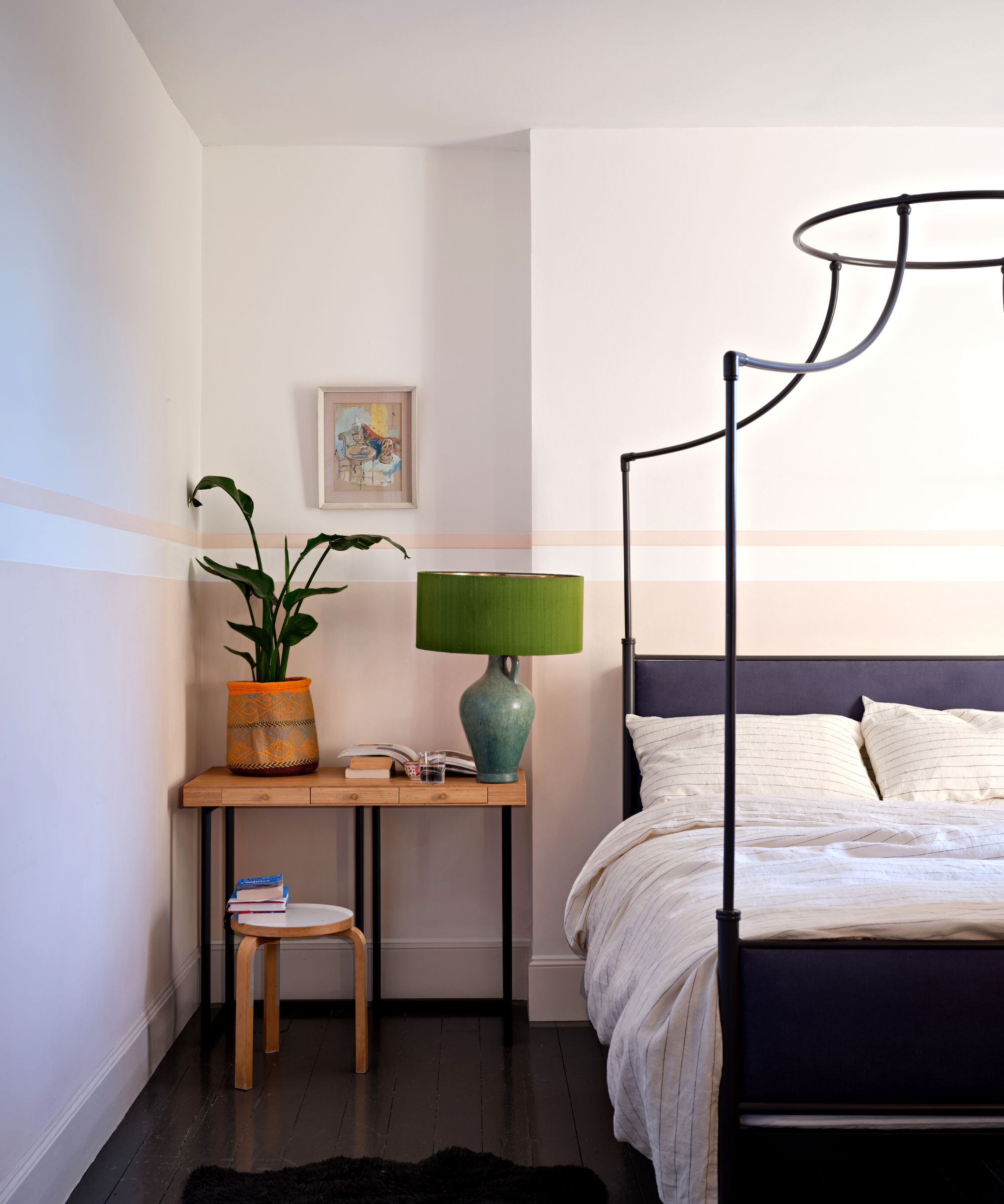
As Nadia suggests, switching out black for navy can generally be seen as a more flattering and liveable color combination alongside white. Or, if you do want to lean into the dramatic look of black and white, opt for an off-black such as Farrow & Ball's Railings, shown above in this moody bedroom. With a blue undertone, Railings feels a lot softer than true black.
When you pay attention to the undertones, white can no doubt work well alongside all colors. If you do want to pair white with one of the more saturated colors mentioned above, replace harsh white with an off-white with undertones that match your chosen color to achieve a softer and liveable look.