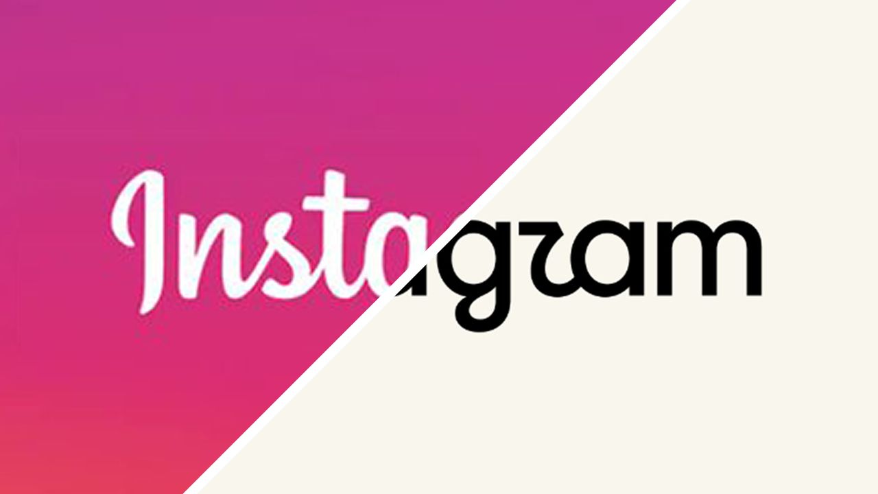
Some people never forgave Meta for the last Instagram rebrand ten years ago. The infamous replacement of a skeuomorphic camera icon with a stripped-down flat design cemented the app's transition from being a place to play around with retro filters into a platform for influencer hustles, workout videos, faux existential quotes and lots and lots of ads.
The reason for this week's new chapter in the Instagram logo history was less immediately clear. According to Adam Mosseri, head of the platform, it was "time for a refresh" simply because 10 years have passed, which sounds like the worst possible rationale for a rebrand.
When you look deeper into what Instagram's saying about the new logo, things become clearer. Nevertheless, users have largely decided one thing already: the new design doesn't say 'Instagram'.
Behold, the new Instagram logo – or is it Instagzam?
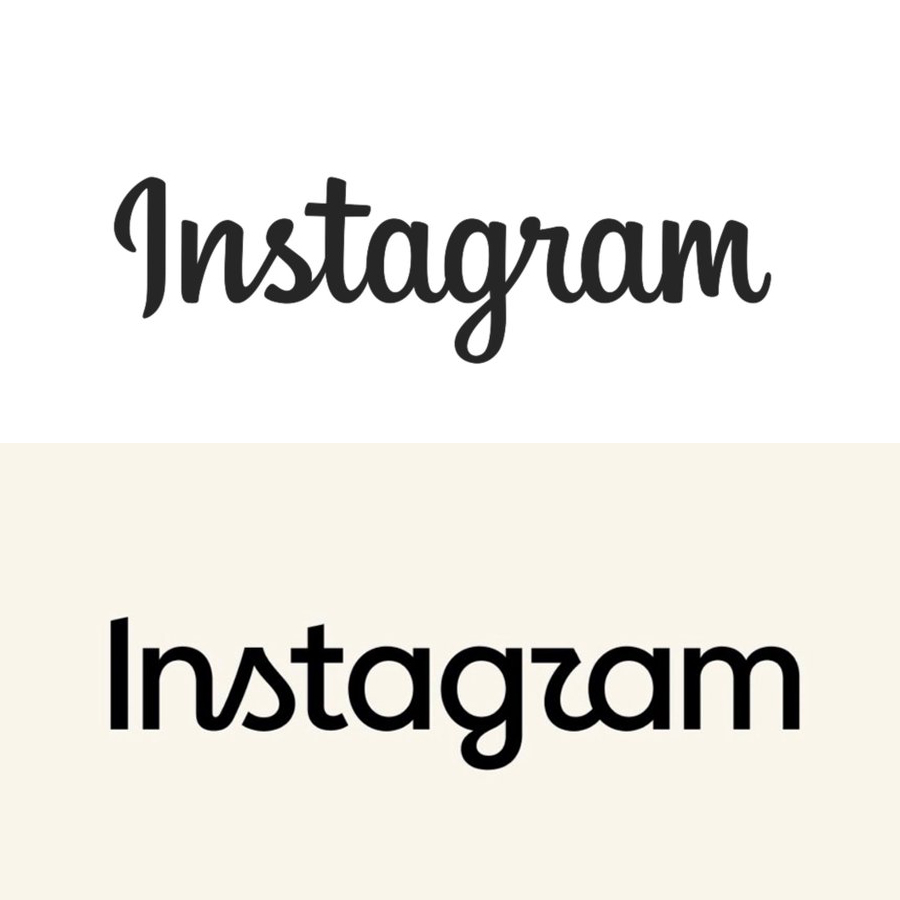
Instagram says its new wordmark "elevates simplicity, creativity and connection". The aim was to achieve a design that still feels like Instagram but also carries it into the future... and also takes it back to its roots.
The Meta-owned platform says its team "explored hundreds of directions: from all-caps, to camera concepts, to literal handwriting". Basically anything; after all, it was time for a change. But they came back to the idea of a script typeface, which was deemed to feel warmer and more personal.
“Script reflects individuality, so referencing that felt right. The new wordmark is bolder and simpler, with touches of unexpectedness. It cues individual expression, a personal voice, both of which have always been core to Instagram,” says Jasmine Probst, Director of Product Design.
The colours aren't going completely. Alongside the wordmark, there's a new brand system. The camera logo will still be used, as will the rainbow gradient, but the use of the latter is going to become more subtle.
We're told there will be refreshed motion and UI design. There's also new typography in the form of an updated Instagram Sans, a new handwriting typeface called Instagram Pen and a new Instagram Mono font.
A post shared by Adam Mosseri (@mosseri)
A photo posted by on
For some users, we've reached "peak blanding" when even the Instagram logo starts to look like a generic fashion identity. It is simpler and bolder, but is it also somehow more complicated at the same time? It moves from the script while also leaning into some of cursive writing's more challenging forms – and everyone knows that Gen Z can't read script typography.
'Instaguam?' is one person's attempt in the comments on Adam's post above, perhaps taking the new name to be a tribute to the US Micronesian territory. “Instagwam – how a toddler would pronounce it," someone else thinks. "InstagZam… like an orgasm?" another person suggests. That latter interpretation seems to be the most popular so far.
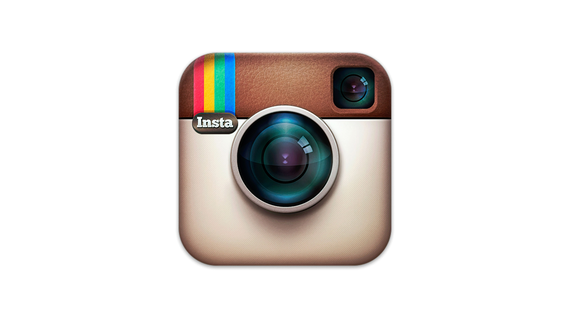
Perhaps we have to give it some time. When Instagram launched in 2010, it was with a skeuomorphic logo designed by co-founder Kevin Systrom to resemble a vintage Polaroid camera. But this was a time when the app's rivals weren't TikTok or Snapchat, but retro photo apps like Hipstamatic.
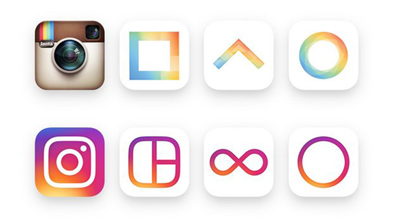
In 2016, Instagram replaced that with a flat, neon gradient glyph. Users weren't wild about it, to say the least. But ten years on, I think we can conclude that it was huge success in terms of building the brand. It's become one of the most recognisable app icons, if not one of the best logos, and still stands out.
Reading the blog, it feels like Instagram wants to roll back time and recover what it used to be: a platform on which to share cool, spontaneous creativity with friends, while injecting a touch of class to redeem it from the torrent of AI slop that's been unleashed on social media. The problem is that achieving this is going to take a lot more than a new logo design.
What do you think? Will the new Instagram logo grow on us? Or have they achieved the seemingly impossible and created a design that's simultaneously blander and less legible?