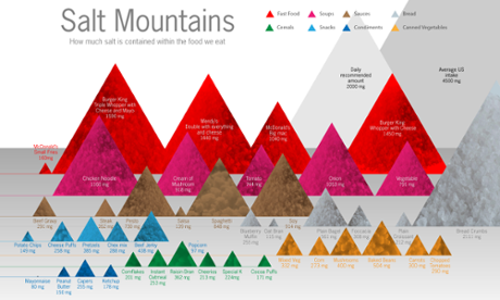
If a picture is worth a thousand words, a good infographic is worth a thousand pages. Data visualisation is a new visual language that is becoming increasingly popular, and the good news is that anyone with experience of storytelling, graphic design or data-handling can learn with ease.
This in-depth, introductory course provides an overview of the data visualisation process, as well as an eye-opening initiation into its potential as a storytelling medium. You’ll find out how to assemble and interpret datasets, and learn the basics of various popular visualisation techniques. In addition, you’ll learn how to interpret a brief, and how to frame your final project for your audience to ensure the best possible outcome.
This course is for you if...
- You have to present for a living, using Powerpoint, Prezi or similar software
- You work with data and want to learn more about turning it into something visually compelling
- You’re a team of journalists or charity workers looking to learn more about telling stories with data
- You’re a group of researchers who have to regularly brief designers and developers
- You’re a design team working for a research company who are looking to learn more about information graphics and interactives
Course content
- Introduction to the history and principles of data visualisation
- Data, story, design – the process of linking disciplines
- Understanding datasets and testing different perspectives
- Framing data for the target audience
- Maximising design for best impact, understanding and memorability
- Visualising data for different media
- Group activities to discuss example briefs, and explore solutions
- Group presentations of their visual outcomes
- Q&A and group discussion
This comprehensive course can be tailored to the needs of your team. Please contact alastair.price@theguardian.com with the name of this course in the subject line for more details.


