Photograph: John Maltby, courtesy of Scott Brownrigg
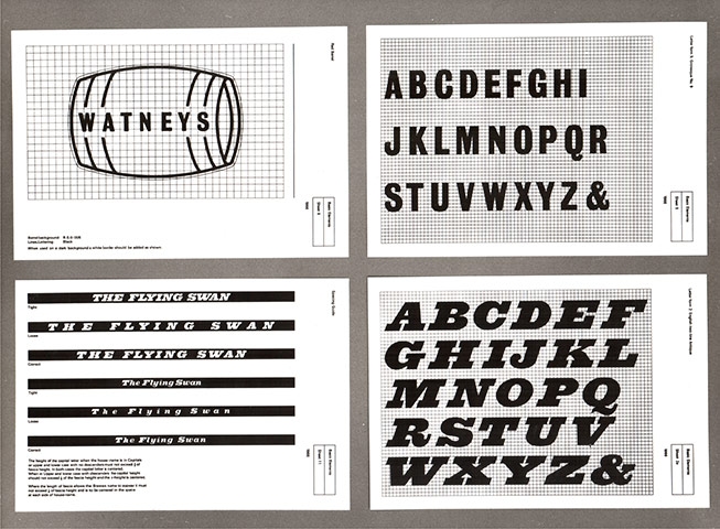
Photograph: Council of Industrial Design
Photograph: Alexander Gibson, courtesy of Scott Brownrigg
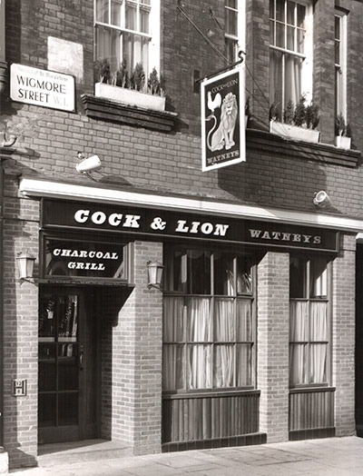
Photograph: John Maltby, courtesy of Scott Brownrigg

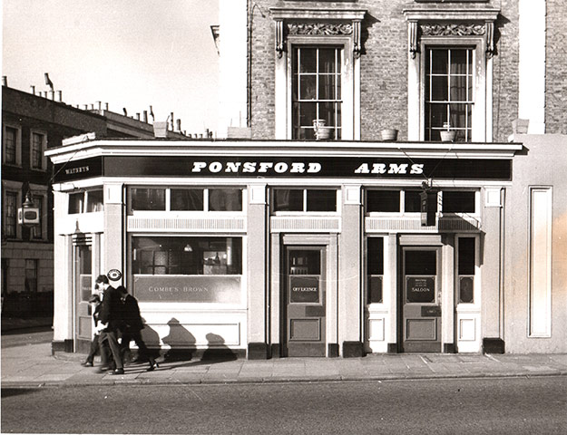
Photograph: John Maltby, courtesy of Scott Brownrigg
Photograph: John Maltby, courtesy of Scott Brownrigg

Photograph: courtesy of Scott Brownrigg