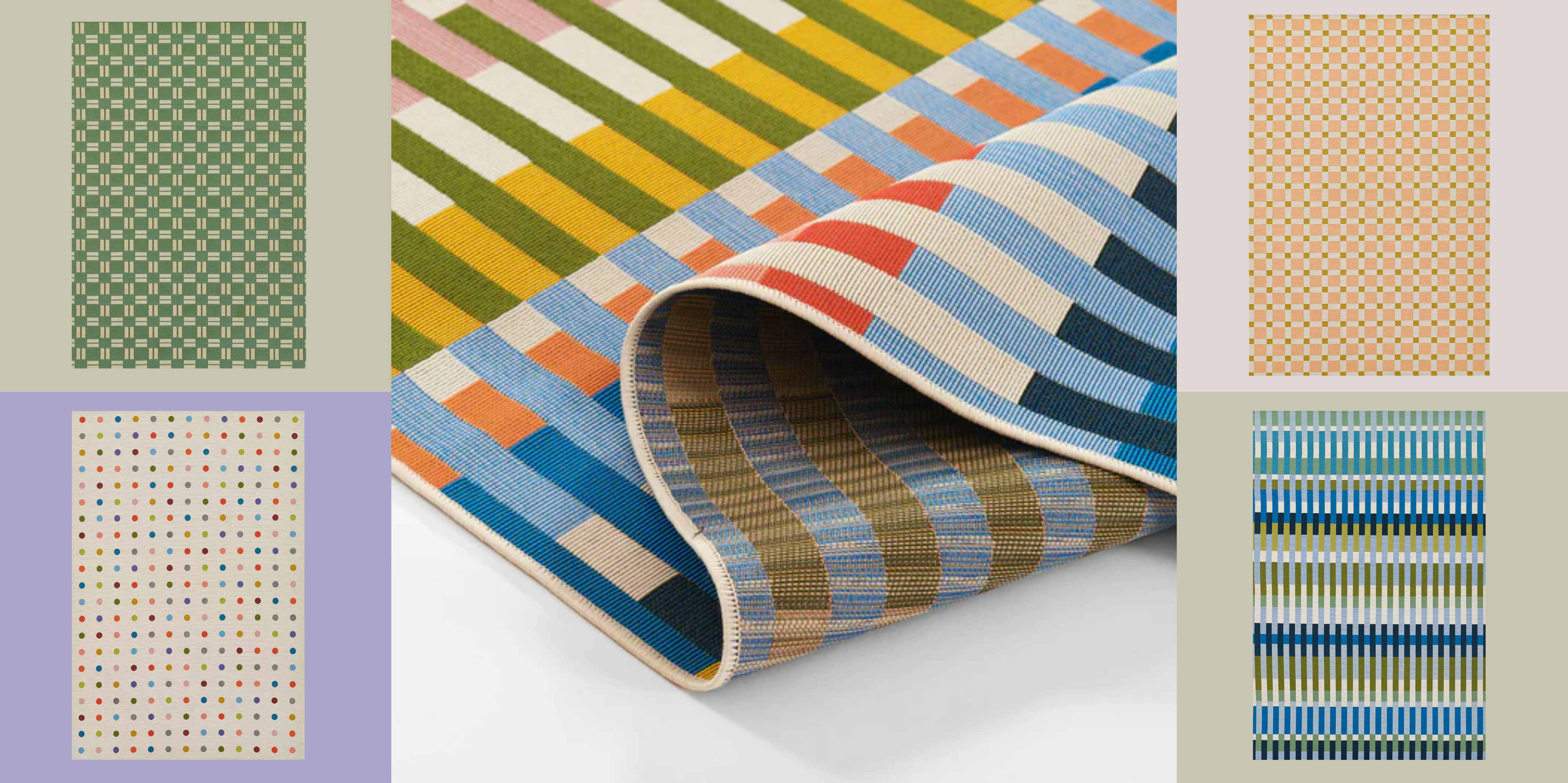
Think of the most recognizable elements from 20th-century design: Bauhaus geometry, Postmodern color, Matisse-like botanicals — all come to mind. Now imagine them reworked for modern life, then placed underfoot. That’s the energy of the Novogratz and Momeni's latest collaboration: a seven-style series of indoor-outdoor rugs inspired by monumental art movements.
The lineup is aptly named — Icon — and arrives right on time. Summer calls for optimism, and few things shift a space's energy like a bold graphic underfoot. What sets this collection apart is its flexibility: patterns that look like they belong indoors, built from materials that don’t care if they end up outside. Most outdoor rugs feel like a compromise — safely beige, overtly utilitarian. These don’t play it safe. And thank goodness.
The collaboration plays to each brand’s strengths: Momeni brings the technical rug-making expertise; Novogratz brings a lifestyle sensibility rooted in color, play, and ease. And the materials are just as considered: everything is woven from durable polypropylene, meaning they’re coffee-proof, patio-proof, and ready for whatever. You can walk on them barefoot with a Negroni in hand, and not worry about the consequences.
These rugs aren't matchy-matchy. That’s the point. A dotted rug in the living room, stripes on the terrace — it’s a conversation. What you get is a low-commitment way to make a high-impact statement. Your floors get the art education. You, icon, just get to enjoy it.
A Postmodern color palette gives this multicolor geometric rug a distinctly mid-century feel — nostalgic, but not even the slightest bit tired. Think of it like a gentle dose of caffeine: a vibrant, mood-lifting fix for drab spaces, indoors or out. Best styled with solid tones to let the pattern shine.
Trends are cyclical — so it’s no surprise that polka dots are back. Not just in fashion or throw pillows, but, as you can see: rugs. It’s less a new idea than a revival of a great one. Bold multicolors — burgundy, lime green, sky blue, and more — deliver just the jolt a space might need. For the bold: pair it with stripes (yes, we count those as a neutral).
Looking at this blue geometric rug feels like gazing through a window (either side!) on a crystal-clear day. While shown here as a rectangle, its indoor-outdoor versatility gives it lots of range. Try it as a runner for a cooling visual thread in tighter spaces or use as a makeshift walkway to break up larger ones.
The Bauhaus moment prioritized clarity and order — and this green geometric rug understands the assignment. Yes, the pattern is technically “busy,” but the effect is clean, graphic, and refreshingly simple. It’s the kind of visual rhythm that still feels digestable to minimalists. Pair it with its color wheel opposite (orange) or an of-the-moment violet for a cool-toned contrast.
If the multicolored rug above speaks to you but you’re after something a little quieter, meet its more restrained cousin: same geometry with a cooler cohesion. Its beachy sensibility pairs beautifully with textural neutrals like woven jute, rattan, or linen. And if you're feeling adventurous: add a glossy red somewhere (we love a cordless table lamp) to shake things up.
Call it Palm Beach, 1955. This peachy pink rug hits all the right notes: tile-inspired pattern, soft deco tones, and a subtle Hollywood Regency lean that feels relevant again. Add a leafy plant, a vintage glass, and you’re halfway to your own poolside (or deskside) vignette. Don’t be afraid of the blushy palette — it was built to handle red wine, sandy feet, coffee, and whatever else summer throws your way.
Styling matters. A lot. Head to our rug placement guide for foolproof tips that work across patios, parlors, and everything in between.