So, Mozilla's Thunderbird has been around for a long time. Since 2003, in fact, but I'm not sure I know anyone who has ever used it. Anyway, last year Mozilla announced it would be trying to bring back its email client – and a new logo has just been revealed.
I can't say I expected to have a strong feeling about this logo, but I have to say – I think it's brilliant. Clever, streamlined and perfectly aligned within the Mozilla brand (it's a witty variation on the Firefox design), there's also a delightful colour palette. In short, it serves as some spot on logo design inspiration, and it's an unexpected hit.
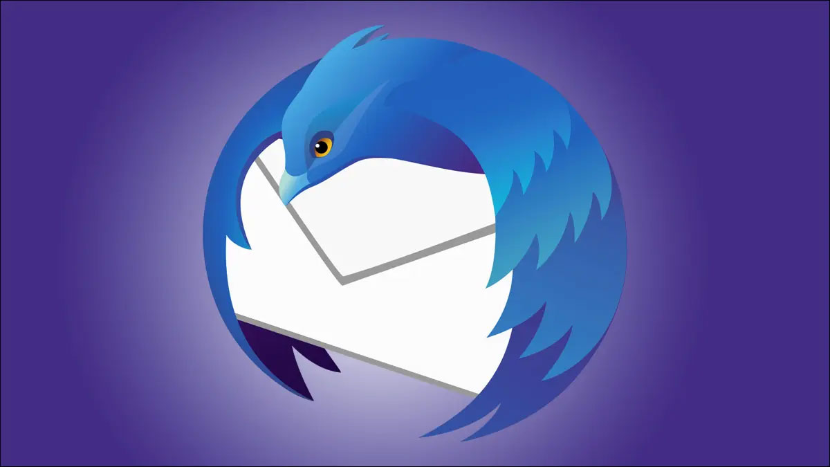
The Thunderbird used to sit atop an envelope with its textured wings drooping down around it (this was clearly before the minimalist trend took hold – see it above), but the bird is now tightly curled up around an envelope that takes the form of a witty speech bubble – take a look below.

The bird itself, once passively staring off into the distance, has been given a harder edge with oval eyes that mean business (I really hope you know what I mean). The curved lines are sleek and professional but the whole thing gives off a "video game villain" vibe. I'm totally here for it – and for some reason now wish the Firefox fox also had such personality-defining eyes (see them both below).

And Reddit users agree. "Fresh indeed. After all this flat design finally some soul and cool symbolism, says one user. "FireFox is obviously fire, Thunderbird is air because bird + mail icon. I need to see the the other elements, please," another theorises.
Whether or not it will tempt anyone to move over from Gmail is another thing, of course, but Mozilla has nailed this rebrand – and it sits beautifully next to the Firefox icon.
Fancy a trip down memory lane? Check out how these iconic logos used to look.
