Days are long, temperatures are hot, and the bright yellow sun is beating down. It's mid-summer — a time of year that elicits excitement, joy, and happiness. And if there's one color that reflects the season most accurately, it's our July Color Crush: Mid-Summer Citrine.
As a shade of yellow, Mid-Summer Citrine has an inherent joviality. The color yellow in interior design promotes positivity, optimism, and even self-confidence; decorating with yellow fills a room with a lively spirit. And Mid-Summer Citrine does the same — it's one of those colors that not only look good, but it makes you feel good, too.
That being said, this vibrant shade certainly isn't your average yellow. It's richer, deeper, and significantly more vibrant — a color that doesn't come across as the easiest to decorate with. But that's why we chose it to be our July Color Crush here at Livingetc. It's a color fitting for the season, but one that also presents a challenge in interiors. So it begs the question: are you game?
Mid-Summer Citrine has all the best qualities of yellow. The only difference? It packs way more of a punch than you might be used to.
"Mid-Summer Citrine reads as a richly pigmented shade — grounded in the earth but kissed by sunlight," interior designer Philip Thomas Vanderford remarks. "It's bold but nuanced, with ochre undertones that give it gravitas."
It's a rather suggestive color, too. As Interior designer Iwetta Ullenboom tells me, Mid-Summer Citrine is "a warm, slightly muted but still very vibrant shade of yellow that really evokes the feeling of a bright summer afternoon," — hence its name.
And while the butter yellow trend has cast a whole new light on the previously overlooked color, it's safe to say that Mid-Summer Citrine sits on the complete other end of the spectrum.
"Where Butter Yellow is lighthearted and youthful, this hue is editorial and evocative," Philip says. "[Mid-Summer Citrine] leans into nostalgia but carries a sense of modern provocation. It’s less trend and more statement — something that doesn’t fade with the season."
Designer Erin Sander thinks people resonate with the color's uplifting potential and are looking for new ways to decorate with yellow in their homes. "It's cheery and exuberant," she says, and Mid-Summer Citrine taps into the joy of the color, but serves a side of intrigue.
So, how do you use it? "It has the rare ability to be both transportive and grounding, depending on the materials and light that surround it," Phillip says. That said, let's find out how to nail this color trend in your home.
While Mid-Summer Citrine is full of potential, it's not always the easiest color to work with in interior design. "It's all about tension and restraint," Philip says. Whether you use it to drench a room or as a subtle accent detail, Mid-Summer Citrine needs balance, and knowing what colors go with yellow can help achieve that.
"I think it works best in spaces that already embrace a strong color palette," Iwetta says. "Pairing it with other warm, summery tones — like terracotta or rusty bordeaux — can help create a harmonious scheme and balance its vibrancy."
She also recommends pairing our July Color Crush with materials like wood and linen. Mid-Summer Citrine combined with a rich, summertime palette and textural details, "creates a cozy, inviting atmosphere that feels both timeless and full of character," she adds.
Mid-Summer Citrine can also benefit a darker room filled with moody colors. Philip suggests pairing it with shades like burnt umber, deep olive green, or oxblood — colors that add complexity but also accentuate its depth.
For sophistication and "a modernist tension," Philip says to pair Mid-Summer Citrine with muted neutrals like gray or ecru. "The result feels both unexpected and composed," he remarks.
Mid-Summer Citrine encourages creativity in design — don't be afraid to experiment with this shade and pair it with the most unexpected colors.
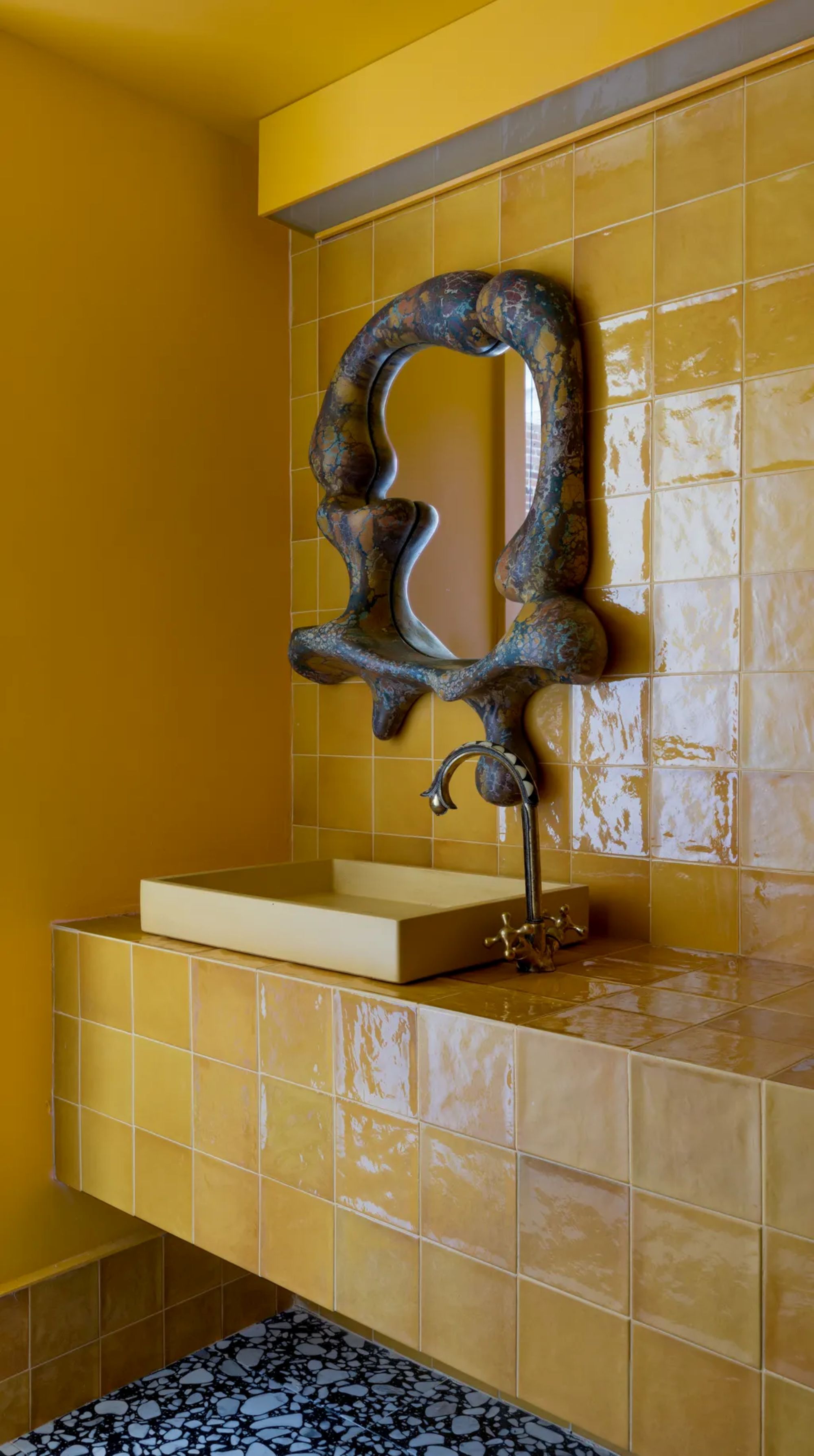
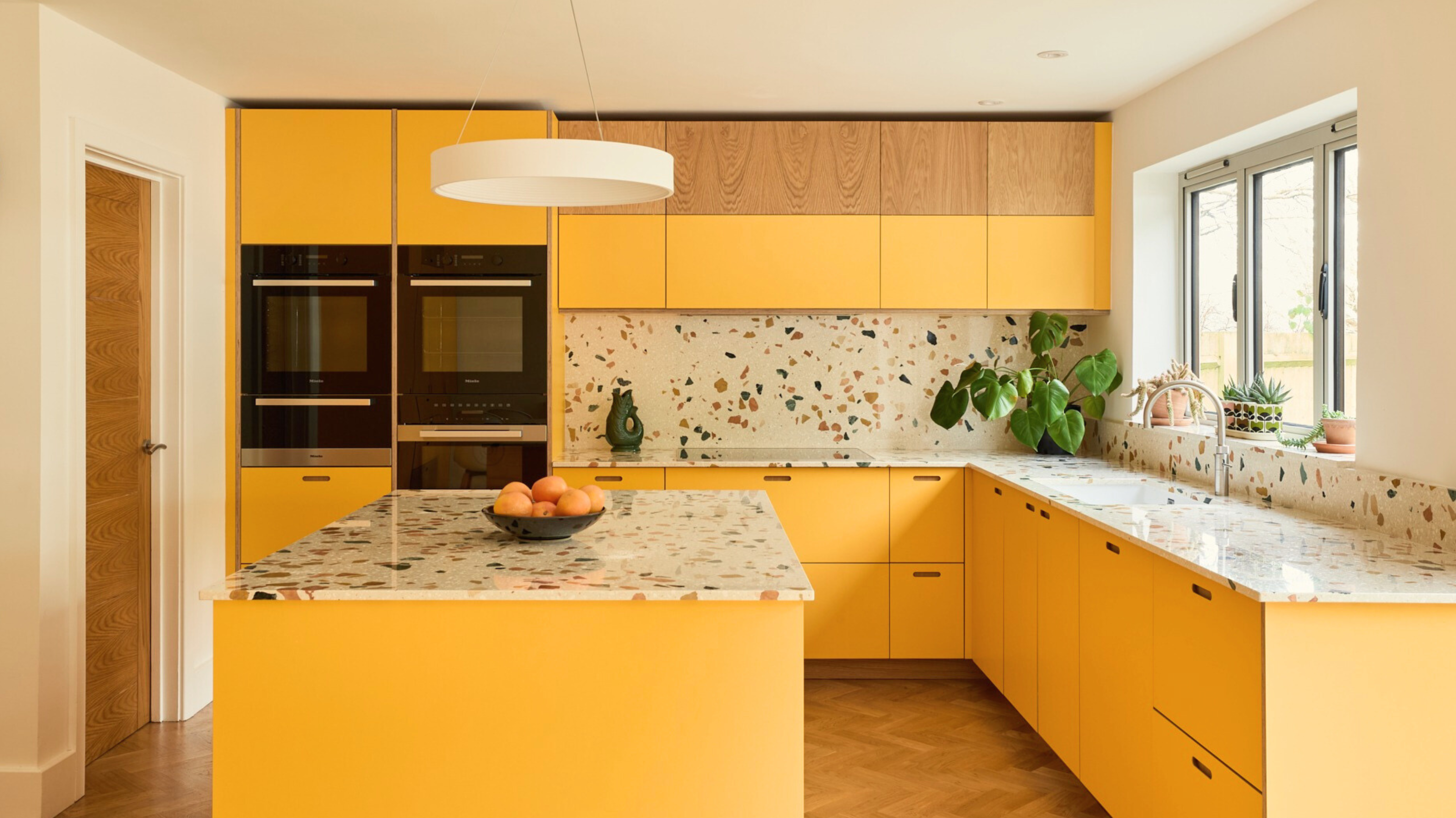
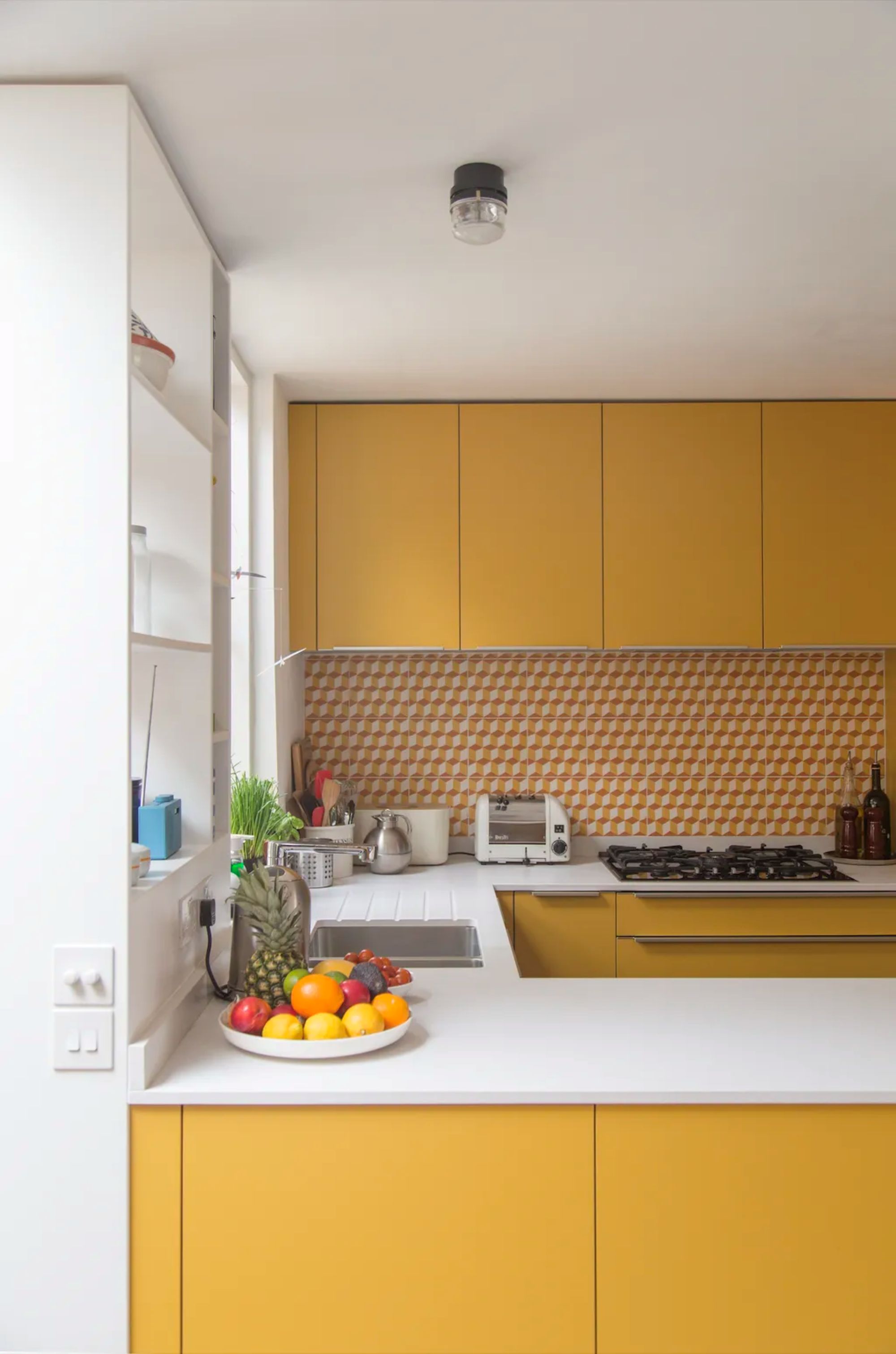
While yellow can enhance any room of your home, there are certain spaces that might benefit most from a splash of Mid-Summer Citrine. "I’ve seen it work wonderfully as the tile in a complete kitchen or as an all‑over color in a bathroom — and I think that’s where its full impact really shines," Iwetta says.
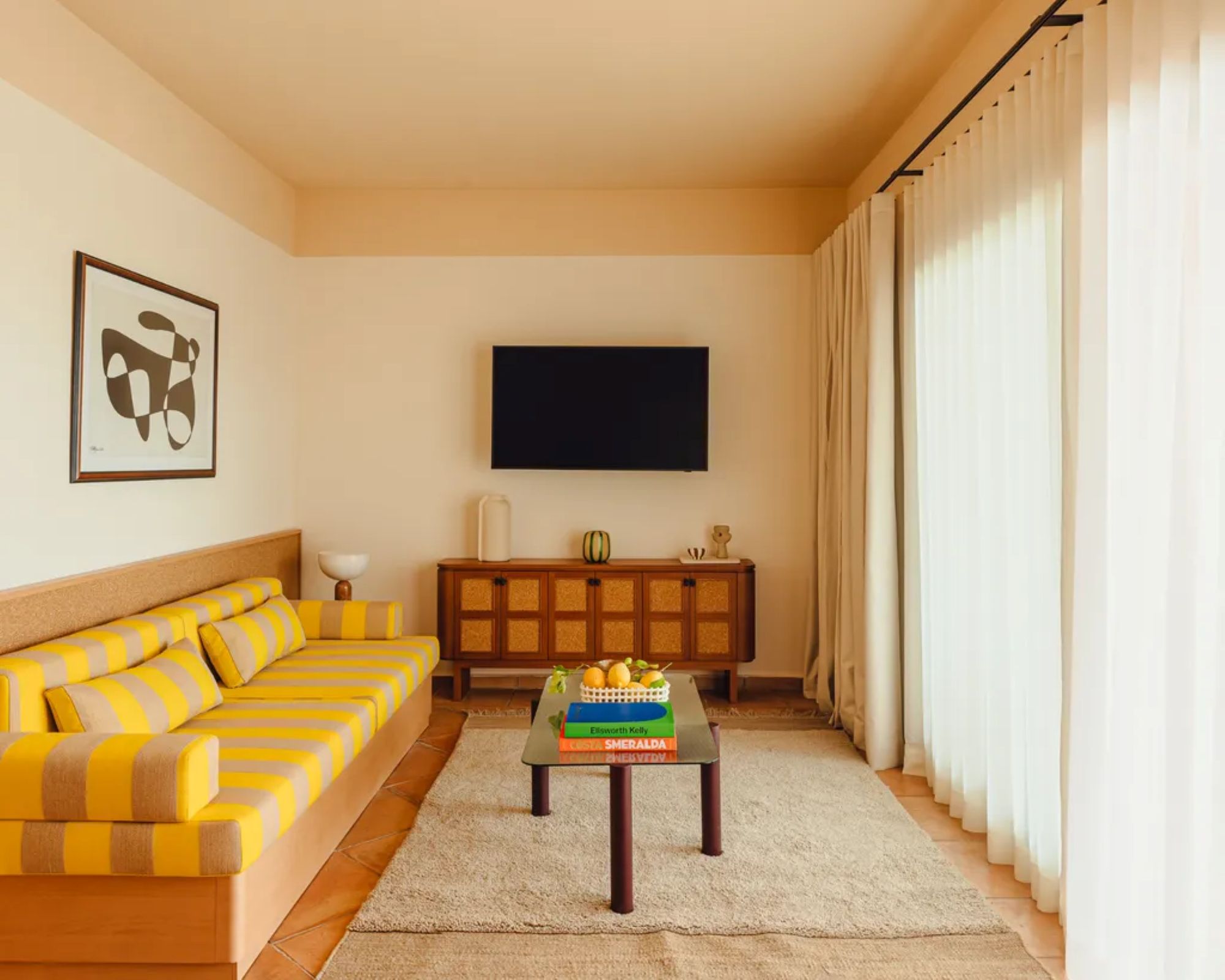
It's a color that works wonders in small spaces, too. "We advise bringing this bold shade of yellow into smaller rooms such as a powder room, a bar, or a pantry," Erin recommends. "Or, bring its vibrant hue into statement pieces, art, or furniture for a pop of color."
Philip explains: "I tend to treat a bold yellow like an accessory in couture: it should accentuate, not dominate," he says. "Used in a single, sculptural gesture — be it a velvet drape, lacquered cabinet, or even a bold trim detail — it feels intentional and elevated."
With its innate vibrancy and alluring qualities, Mid-Summer Citrine has the potential to be a highly sought-after color in interior design, one that can completely transform any room in your home, regardless of how you use it.
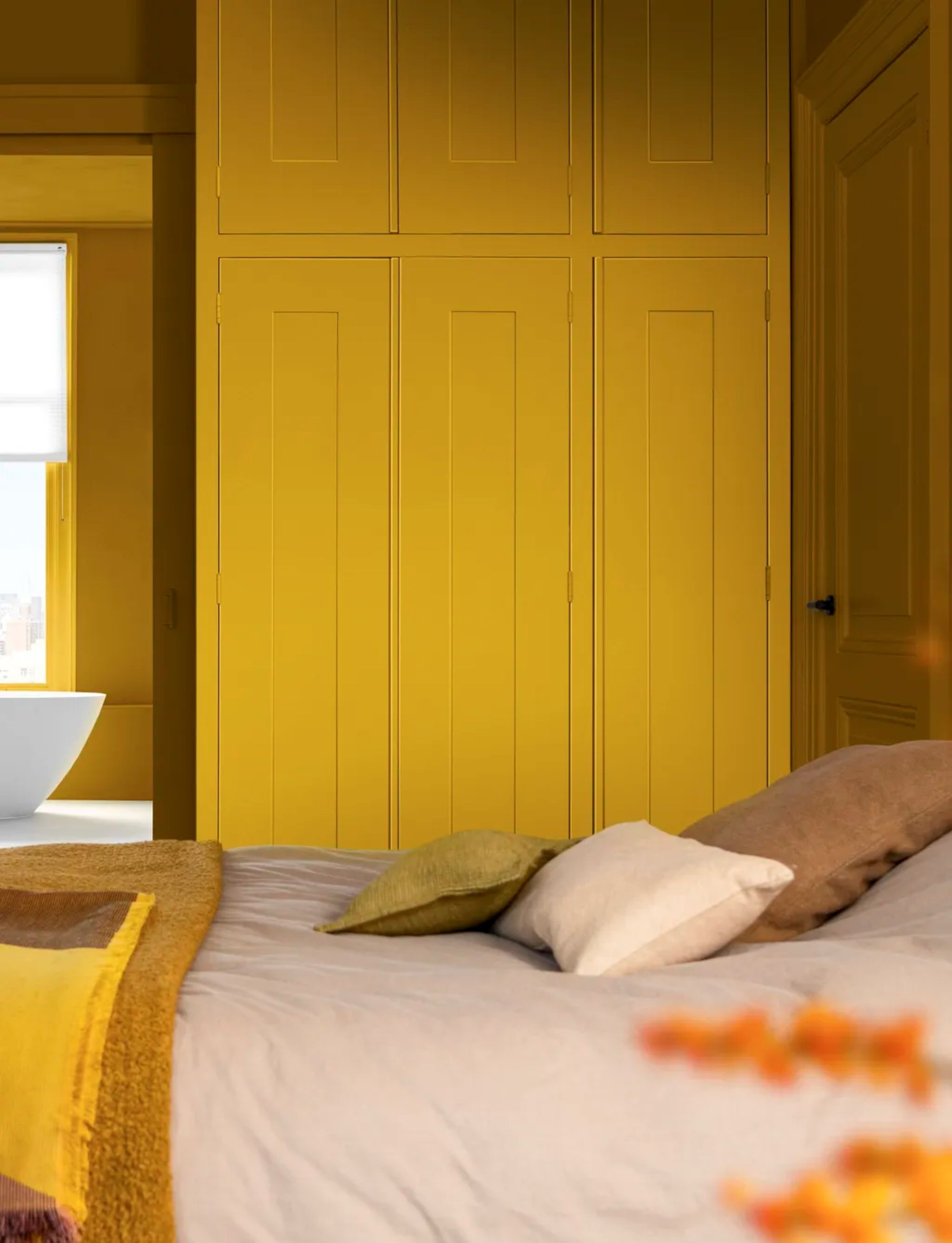
Mid-Summer Citrine invites all the joys of the high season into your home in the most rich, alluring, and attractive way. Its pigmentation has a captivating quality to it — a quality that lighter shades of yellow might lack. While it's not the easiest color to decorate with, it sure is satisfying when done right.
If you love Mid-Summer Citrine as much as we do, shop the shade below.
Your modern living room could use a burst of Mid-Summer Citrine energy. And this side table is sure to do the trick. Of course, its color makes an eye-catching statement, but its glossy finish and drum-like shape are just as intriguing. Place it next to your sofa to add some visual interest to the room.
Farrow & Ball's Babouche is the closest shade to our Mid-Summer Citrine. It has the same brightness and subsequent depth as our Color Crush, and can easily transform the look of your room. For a dramatic effect, use this paint to drench your room, or for subtlety, use it to paint a side table.
Your garden sofa deserves a lively pillow to rest atop it. Choose one in Mid-Summer Citrine, like this style from Anthropologie. With a repeating yellow and white stripe pattern, this pillow is fun and bright. It's bound to put a smile on your face every time you see it.
Known as 'The Wire', this style was introduced in 1972 by furniture designer Verner Panton. This re-edition of the lamp features the same alluring qualities — a steel wire spiral base and a dome-shaped top. This style is finished in the captivating shade of Mid-Summer Citrine, and could easily enhance any room in your home with a contemporary flair.
Summer is the season for outdoor entertainment, so if you want your outdoor dining set up should reflect the vibrancy of the season, opt for some outdoor dining chairs in Mid-Summer Citrine. This bright style is made from recyclable plastic with a UV and weather resistant coating that protects it from the elements. Style a few of these around your outdoor table for a festive, summertime look.
Even the hottest summer days are subject to chilly nights. So when that evening breeze rolls in, curl up in a blanket in a color as bright as the sun. This Mid-Summer Citrine blanket is made from pure sheep's wool, so it's bound to keep you warm on a cold summer night. Even in the wintertime, this blanket will warm you up and its lively color will brighten your spirit.
Looking for the perfect vase for your flowers? Here it is. This design is not only intriguing through color, but through shape and texture, too. Place it in the center of your dining table with a fresh bouquet to invite some radiance onto your tablescape, or style it empty on your bookshelf. Either way, it'll look so good.
I'm a firm believer in the idea that placemats are essential to table design. Not only do they safeguard your table from stains, but they add some charm to the surface. This Mid-Summer Citrine placemat would be ideal for a summer garden party — it'll dress your tablescape with a lovely array of pattern and color.
If you're eager for a taste of Mid-Summer Citrine, these cocktail glasses are the decoration to satisfy. Although they're totally different than your standard cocktail glasses, they're nonetheless chic and can serve as a subtle pop of color in your home bar.
Mid-Summer Citrine is a joyful color. Like Iwetta says, "it’s a cheerful, warm tone that can instantly bring a statement and a sense of brightness to a space."
If you want to wake up to its charm, discover our yellow bedroom ideas — these designs are bound to brighten your mornings and bring warmth to your space.