Another day, another soft drinks rebrand. This time it's PepsiCo's Mirinda that has a new look. Its vibrant colour palettes have definitely drawn me in, but overall I'm feeling underwhelmed by this particular rebrand. Perhaps it's because I have no real affinity with Mirinda as a brand, or maybe it's just because we've already seen new identities for 7UP, Fanta and Minute Maid in the last few months. Or perhaps it's because the refresh doesn't feel like it's doing anything, well, fresh.
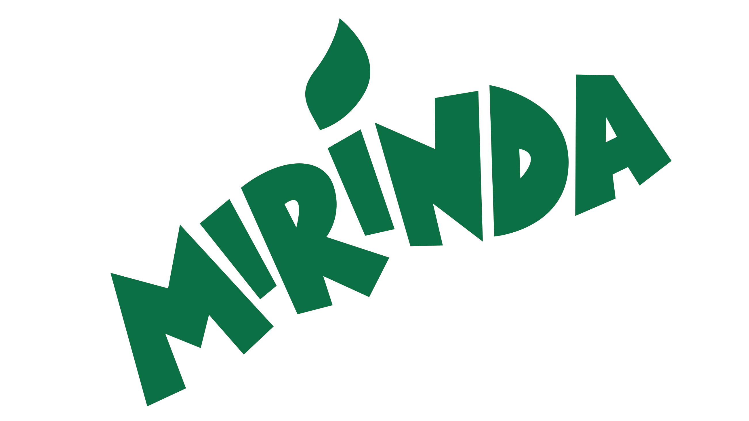
The new look focuses around the 'M' – with the new slogan 'Making an M-pact', which was apparently designed to "ignite creativity". The Mirinda logo is now brighter green, with sharper corners and cleaner lines. The dot on the 'i', which I assume represents the leaf of a piece of fruit, is now on the first dot rather than the second, which works well on the can, as it draws the eye into the 'M' behind the logo. This is all seems like a sensible move, but I can't say it's exactly inspiring creativity.
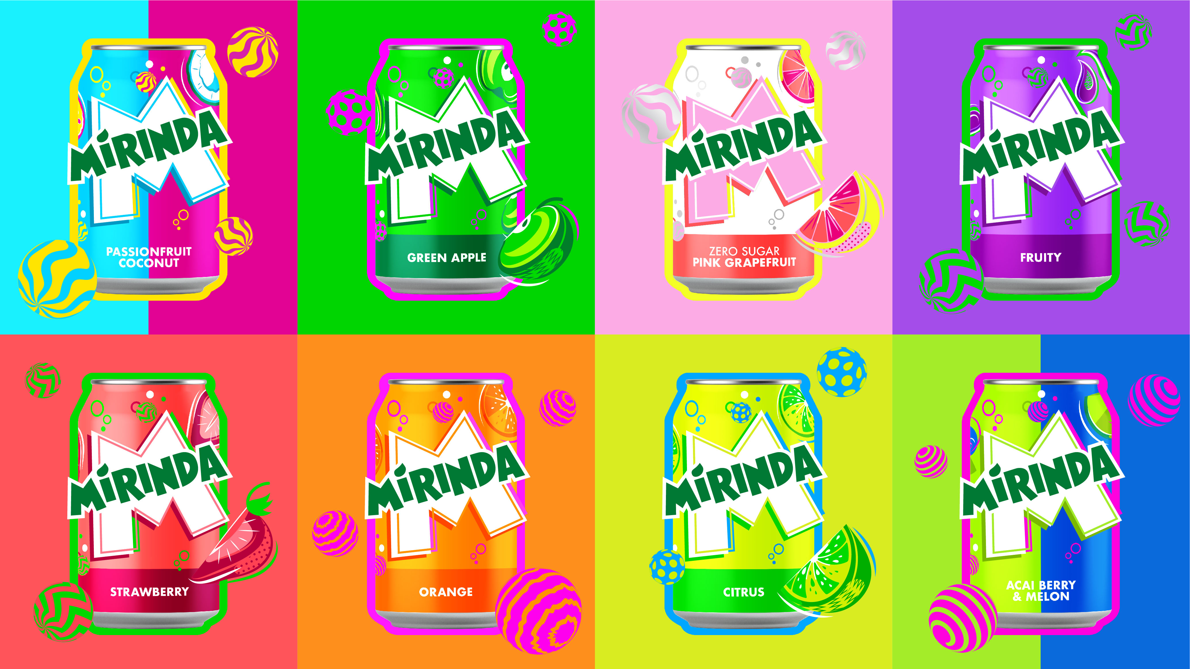
The colour palettes are definitely more appealing, with different palettes for over 50 flavours (who knew there were so many?), "which provide a burst of refreshment, while twirling spheres, fizzing bubbles and zesty fruit illustrations convey a sense of playfulness and energy throughout". I particularly like the pink grapefruit and watermelon flavours.
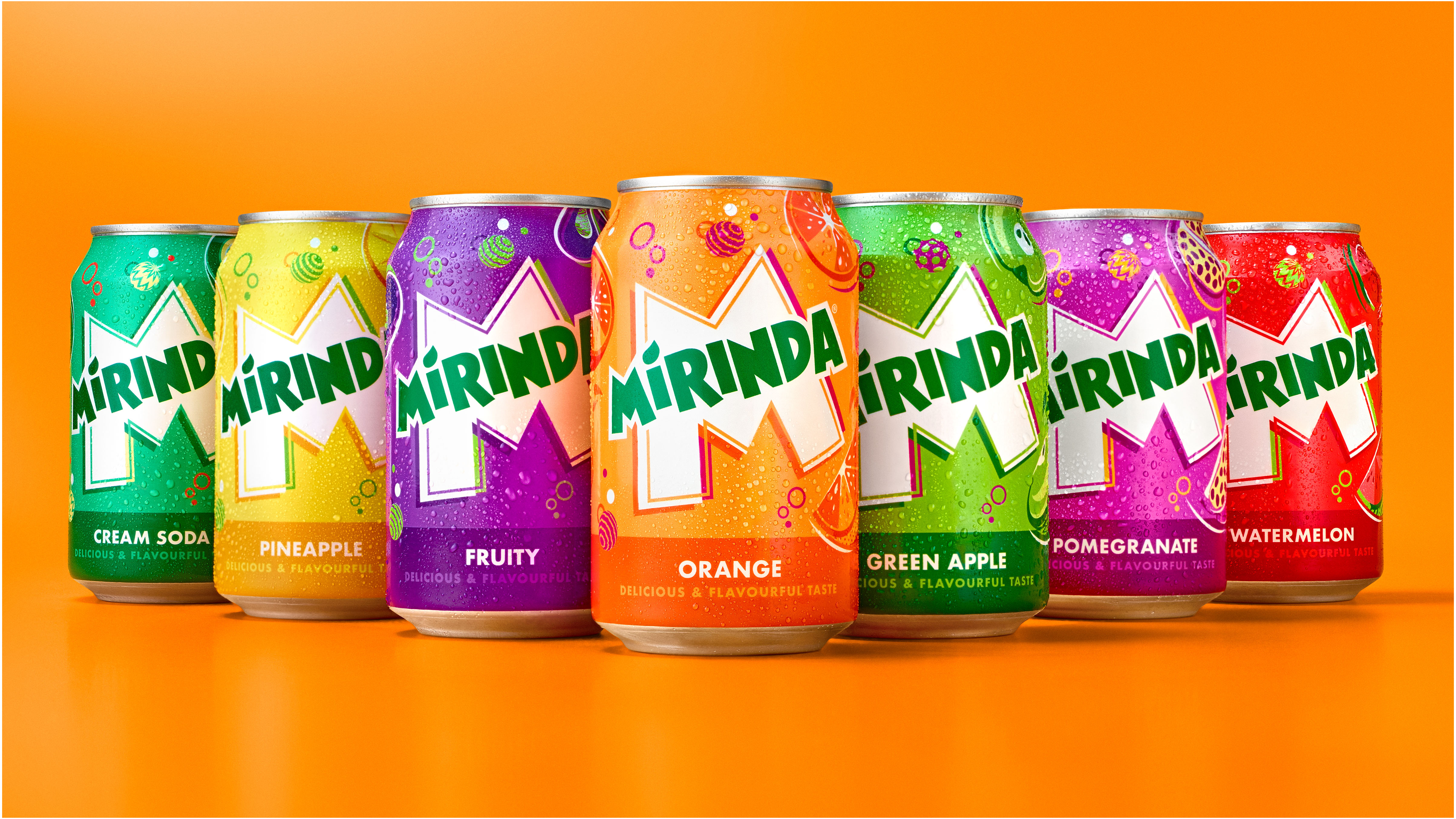
"Mirinda’s 50+ flavours are a treat for the senses, and we wanted the brand’s visual identity to look and feel the same," says Mauro Porcini, SVP and chief design officer of PepsiCo. "PepsiCo Design and Innovation brought Mirinda to life with vibrant, contrasting colours and bespoke illustrations that create a sense of dynamic energy and playfulness. We know Mirinda fans engage with the brand digitally as much as they do physically, so we created a visual identity that retains its excitement and distinction across all platforms."
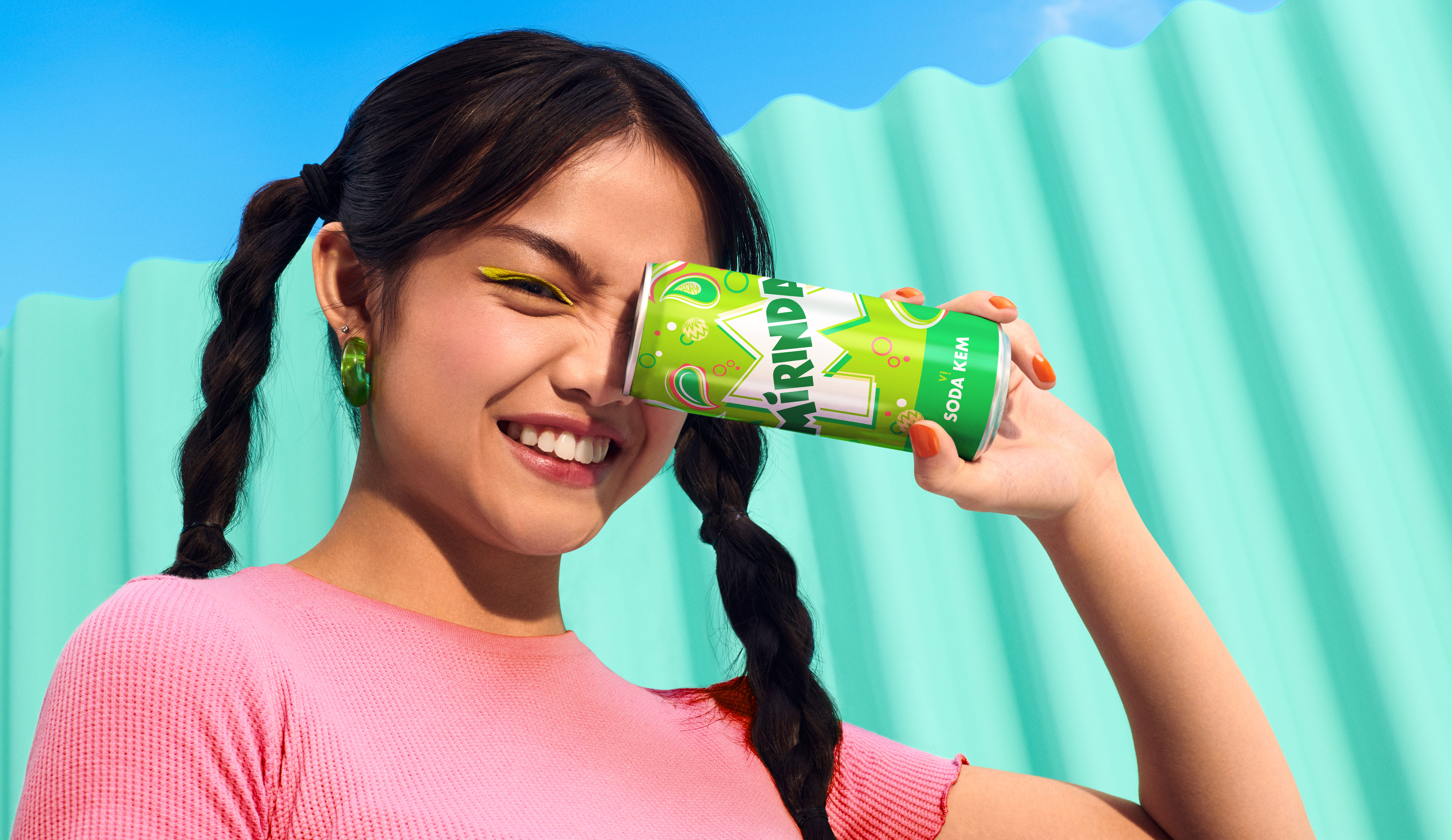
In case it wasn't clear, this is all designed to appeal to Gen Z, and compared to the old branding, it is more appealing. I just can't say it's appealing enough to get me really excited. Is this because I'm a millennial and therefore too old for it?
Or perhaps I've just seen one soft drink rebrand too many of late. What's next, do we think? Coca-Cola? Probably not. Lipton Ice Tea? Maybe. Vimto or Dr Pepper? Perhaps. Place your bets now. And in the meantime, check out our guide to how to design a logo if you're looking at creating your own branding.
Have you created some stunning branding this year? Enter the Brand Impact Awards today.