"Rich" is regularly used as an adjective to characterize colors in the design world. As a design writer, I often catch myself using the descriptor — 'the rich, chocolatey brown walls,' 'the richly layered palette.' But what does that actually mean? Are there specific 'rich colors', or is it just about how you decorate with them?
When we describe a color as rich, we're not necessarily talking about how expensive it is, but rather that the level of saturation and depth conveys a sense of luxury and opulence. A forest green velvet lounger with oxblood side tables? That's a rich color palette. When it comes to decorating, it's all about embracing the drama and mood that rich colors carry, whether you're styling a studio flat or a spacious penthouse.
To better understand how to decorate with color like this, I spoke to interior designers and color experts about what defines a rich color and why we're so drawn to these shades. Here's what they shared.
What are Rich Colors?
Before we dive into the luxurious world of rich colors, let's start with the basics: what is a rich color?
Amy Krane, an architectural color consultant and host of the design podcast Let’s Talk (paint) Color, explains that, "colloquially it's used to describe a combination of often dark and somewhat saturated (but not too much) colors."
These colors create an immediate and strong visual impact that draws the eye, which happens to be perfectly in line with the boldness of contemporary interior design trends.
But it's worth noting that rich colors aren't to be confused with dark colors. "Rich colors are those that evoke strong emotions and visually set the tone of a space. They are not necessarily bright or dark; rather, they are complex, layered, and full of character," explains interior designer Oksana Zavarzina of Lake and Walls.
Examples of rich colors include jewel tones like emerald green, amethyst purple, and ruby red. Also in this category are deep wine, terracotta, mustard yellow, dark chocolate brown, and even rich charcoal gray.
How to Decorate with Rich Colors
When it comes to decorating with saturated colors full of richness, color drenching is one way to maximize the impact. Imagine how sophisticated an office or powder room would look coated in Farrow & Ball's Hague Blue, or dining room walls painted in a romantic oxblood red — rich, refined, and sure to turn heads.
However, using rich colors for your paint inspiration isn't the only option. "Unless you’re really trying for high drama in a room or it’s a really dark room you want to create a luscious cave in, I would use these colors sparingly," says Amy.
For instance, "rich hues would look amazing as a sofa color," she adds. "They would be fantastic as part of a pattern in curtains. They would be great in a den or a library on the walls with saddle colored leather seating."
Rich colors would even work beautifully as an unexpected trim color, especially in less-used or communal spaces, such as a mudroom or hallway.
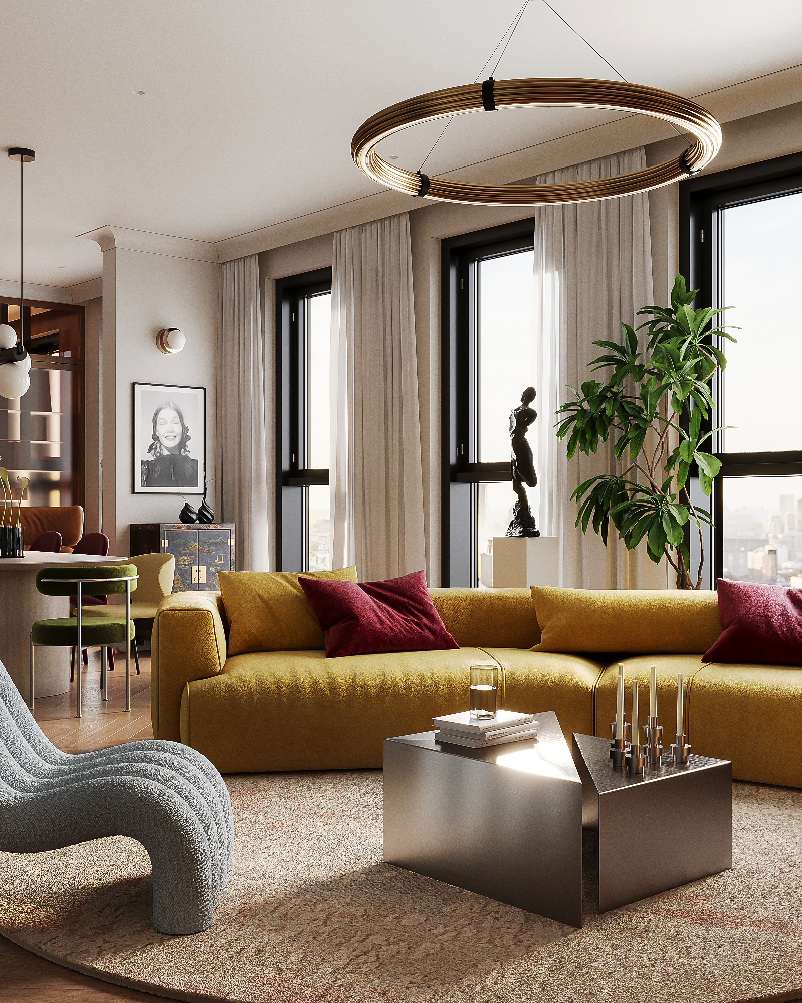
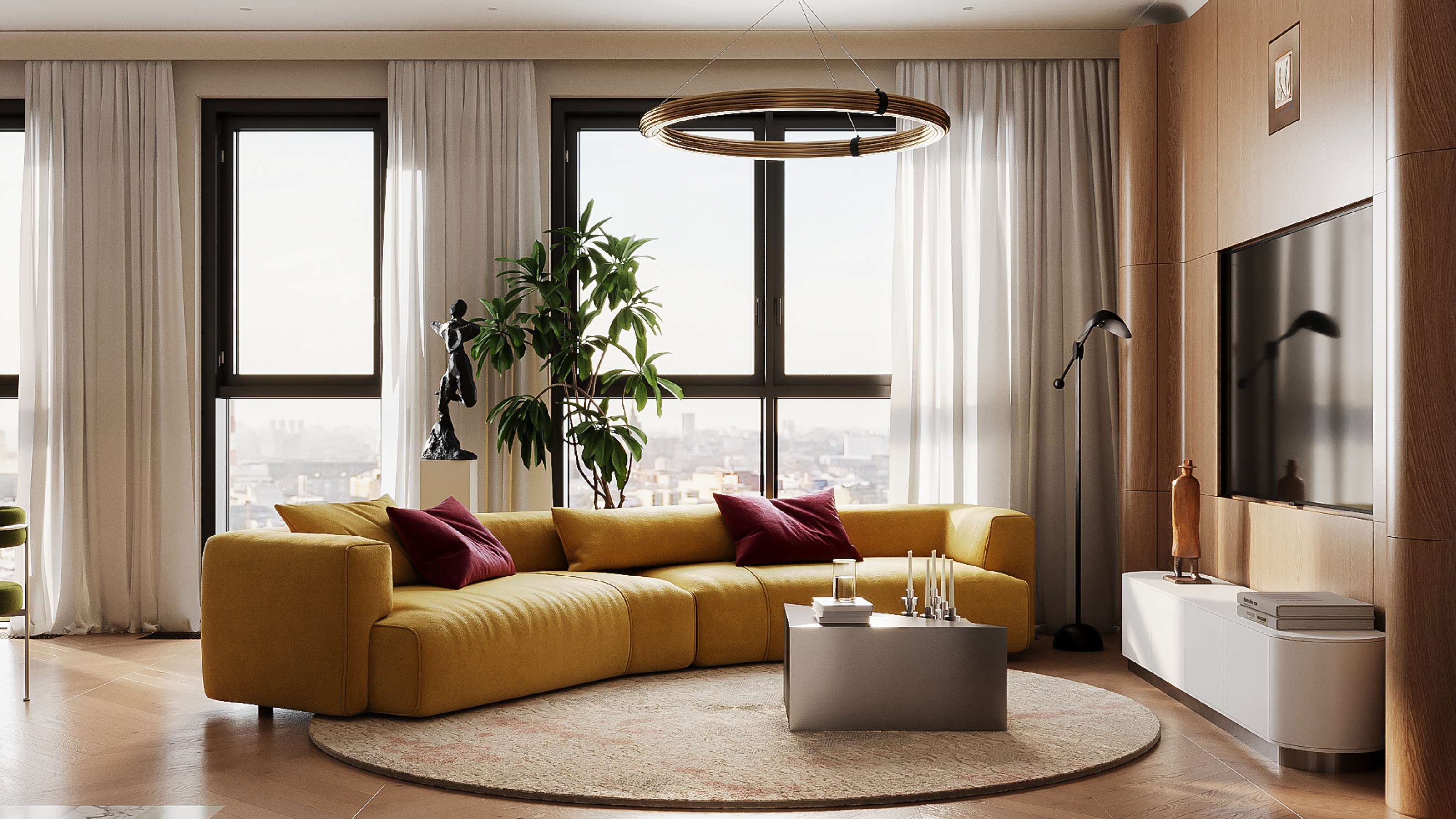
Oksana recommends choosing one rich color and using it boldly on a statement piece. "In our living room, that’s an ochre sofa," she says. "We surrounded it with neutral walls and added just a few rich accents like burgundy cushions."
Another key to decorating with rich colors is mixing in textures such as velvet, silk, wood, linen, and metal. Combining different finishes can make rich colors feel deeper and more multidimensional. Then you can balance these heavier and more intense features with neutrals.
"Warm grays, beige, cream, and white tones give rich colors room to breathe and prevent the space from feeling too heavy," says Oksana.
And, like always, "paying attention to the natural light in the room, how you'll use the room, and the proportion of rich colors in the room will determine your success," adds Amy.
Oxblood red was one of my favorite shades to come out of the past few years. There is something so timeless about a sneaky pop of red and there is no better way to do it than with a red table trick. This AM.PM table is perfect for that.
Though this green marble table from Pietra comes with a higher price tag, I love the idea of decorating with rich colors in unexpected ways. Sure a deep green sofa is chic, but a green marble table? Stunning.
Nordic Knots has become one of my favorite rug brands as of late because you can count on them for timeless styles with a contemporary edge and quality build. An ochre yellow rug is a fabulous way to introduce rich colors in a way that can change and shift with evolving design styles.
I didn't know I need marble bookends, or bookends in general, until I spotted this emerald green pair from Ligne Roset on Heals. If we are talking about rich colors, than upgrading your bookshelf decor feels like a natural next step.
Burl wood decor is a unique way to use rich yellow and orange hues without going the obvious paint color route. Plus, small decor items like picture frames are the perfect way to sprinkle a little color around the room.
Just because emerald and phthalo greens are the more common rich greens, doesn't mean there aren't other options out there. A saturated olive green, especially in velvet finish, screams luxury.
Decorating with rich colors can be tricky, but pulling it off comes with a high reward — in fact, I have a feeling it's the secret to making your space look and feel more elevated and expensive.
Want to know the most expensive-looking rich color? For that, you need to meet Phthalo Green.