No one loves the phrase 'spring clean' like a team of interior and style editors. While there's certainly no one size fits all formula; trends are entirely subjective. There are still a few, five spring decorating ideas to be precise, that will no longer be gracing my home this season. After all, we’re trained to have an 'out with the old and in with the new' mindset when it comes to our interior decorating choices, and spring is the optimum time to reevaluate how we choose to express our personality through our homes.
Here, I talk through my current favorite spring trends, and the ones I no longer love. However, our affinity towards certain looks, materials, and colors has a lot to do with our personalities, environment, and experiences, so it is always important to choose decor that makes you happier at home, whether they are on-trend or not.
Outdated spring trends I am avoiding this year
When it comes to the best interior design trends, it can be a minefield of styles, colors, and materials, so we can't be expected to get it right every single time spring arrives. Here are the spring decor trends that I plan to leave behind in 2023.
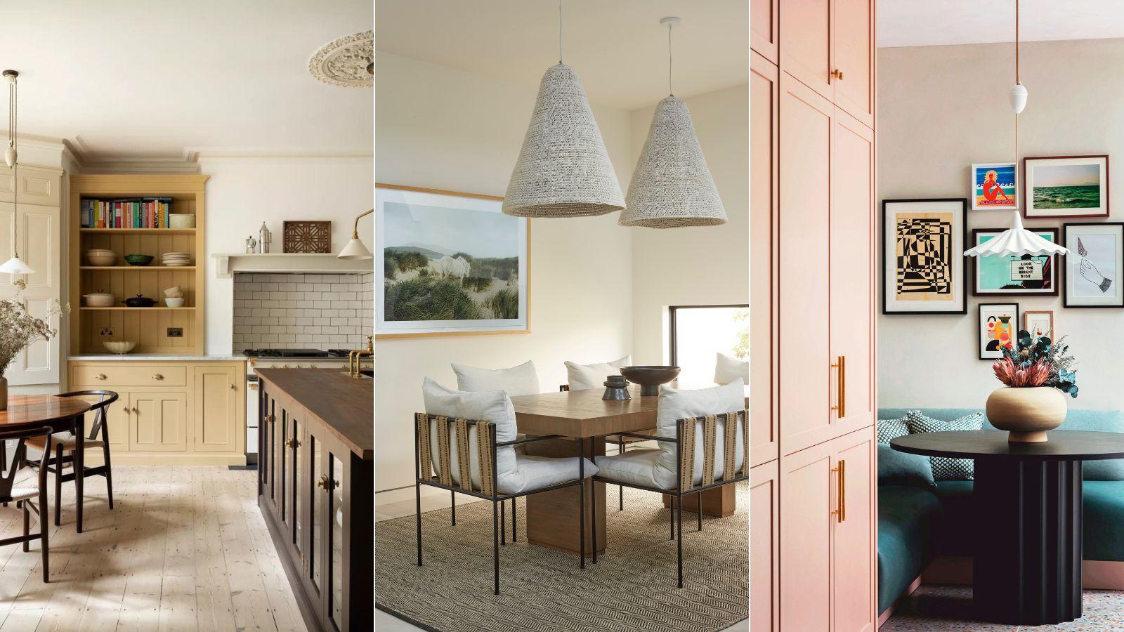
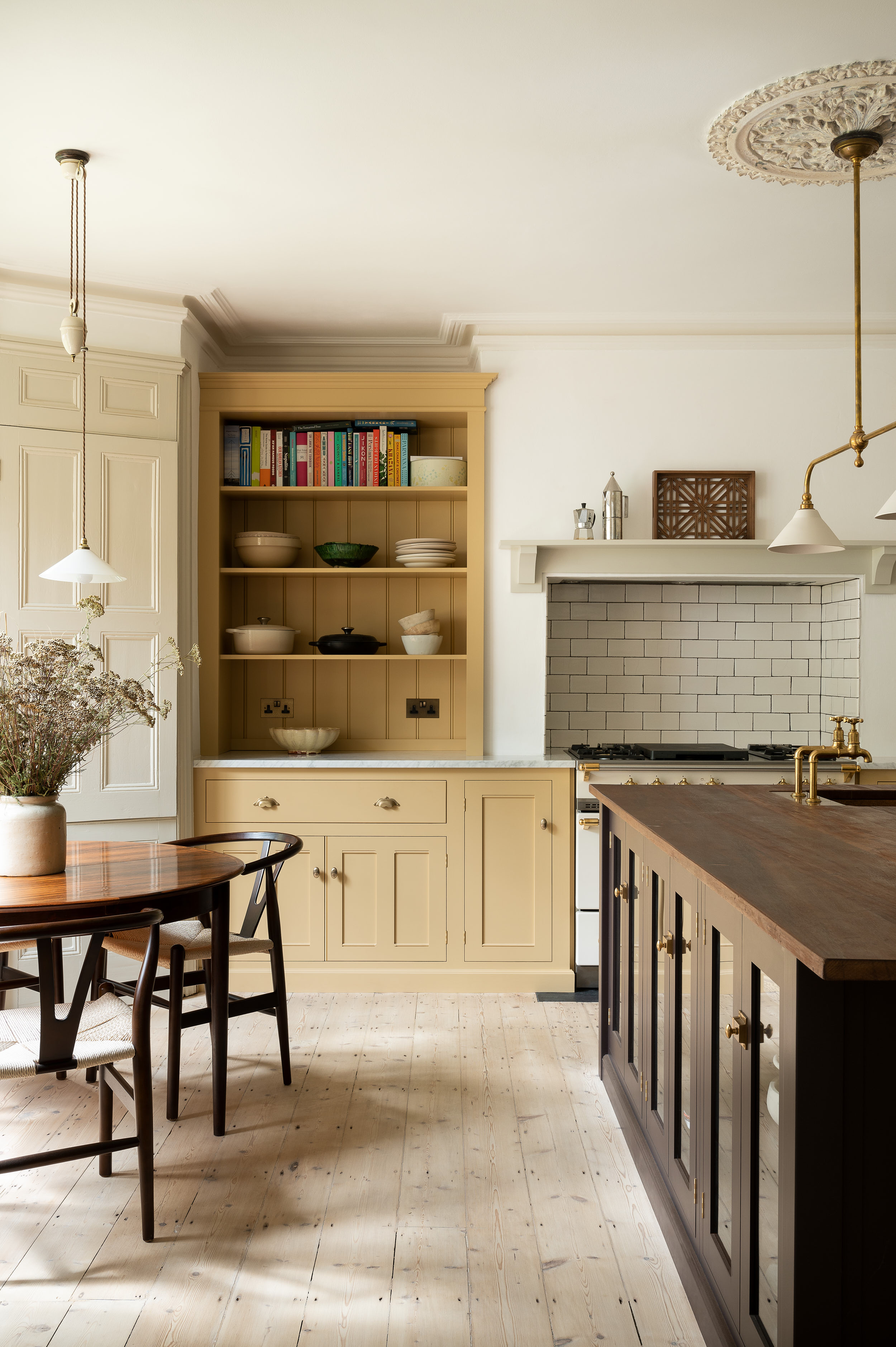
1. Swap big florals for small-scale prints
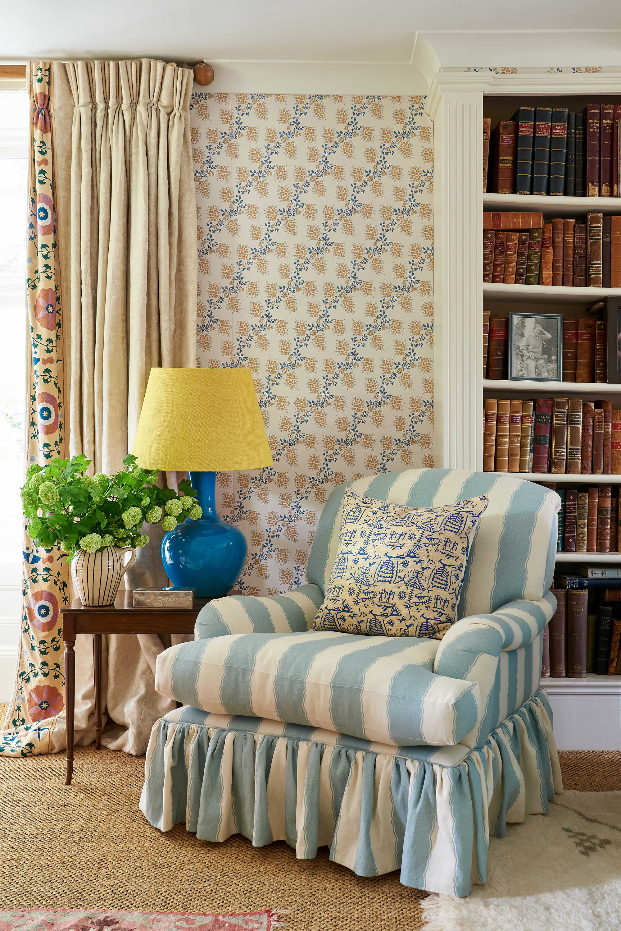
Oversized florals for spring are certainly not ground-breaking, and while they have the tried-and-tested seal of approval from fashion and interior experts worldwide, they are starting to feel a little tiresome and outdated. Instead, look to small-scale prints as a statement-making alternative. These miniature marvels –from simple stripes to dainty trails – are the unsung hero of the design world.
For those with a passion for decorating with pattern, small prints are a wonderful way to bring color and interest into the home in a way that will remain timeless and elegant. Key to the popularity of small prints is their versatility; they can be used in isolation, or mixed and matched with other patterns depending on the look you wish to achieve.
If you are stuck for inspiration, small patterns that feature multiple shades can provide a great starting point for an interior color scheme. Alternatively, ‘small prints in a single color work wonderfully to add design detail without overpowering a space. They act almost as a plain, providing a perfect backdrop to artwork or a host of other prints and patterns, but bring with them personality and detail,’ explains Kate French, creative director of wallpaper brand Dado.
'There is a diminutive print for every room or situation. ‘Pretty botanicals and trailing designs work well in bedrooms and living spaces, while bolder graphic prints or stripes add character to rooms such as small entryways, kitchens, and more energetic dining spaces,’ explains Kate.
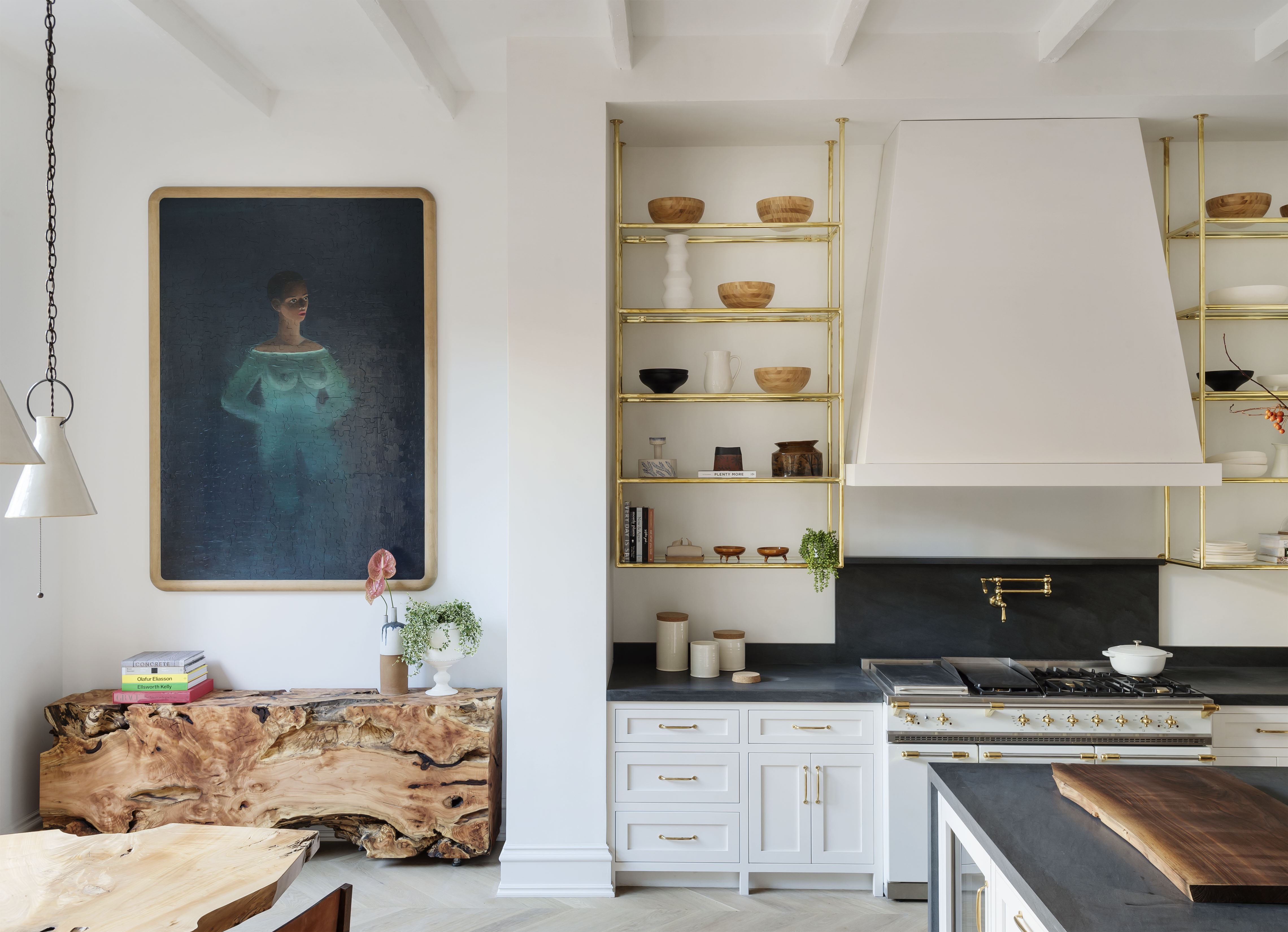
2. Switch out coastal style for a 'California Casual' aesthetic
Coastal style is synonymous with the start of spring and early summer, and while it is a look I hold dear to my heart, its timeworn aesthetic is starting to grate on me.
Modern coastal designs have stepped into the light in recent years. California Casual – also known as California Cool or just California Style – is a decorating trend that majors on neutral, soft colors on furniture and walls, furnishings that are inviting and comfortable, a relaxed Bohemian feel enhanced by natural materials and fabrics, such as leather, wood, wool, cotton, and stone.
'California Casual may be laid back, but that doesn't mean it can't be smart,' says Lucy Searle, Homes & Gardens' Editor in Chief. 'The key to its success is its muted color scheming, which is effortlessly elegant, and the lines of the furniture you choose – low-slung pieces can have neat lines that enhance space but still invite you to want to lounge.'
Here, the traditional hues and craftsmanship of antique and rustic furniture have been deftly brought up to date with the introduction of contemporary lines and detailing that bring drama and an almost-sculptural luxury to modern coastal schemes.
3. Ditch loud color in favor of subtle pastels
Loud room color ideas have been gradually seeping back into our interior consciousness, and while the bold saturation of spaces is both energizing and mood-boosting, I am embracing the 'quiet luxury' that comes with calmer color choices for spring. No, I don't mean cold or clinical minimalism but a subtle pastel palette, instead.
It’s fair to say that the approach to using color in the home has grown much more sophisticated as we move through the 2020s. Color palettes have become more nuanced, creative, and experimental, and the fear associated with using an abundance of color (often linked to concerns over a home’s possible resale value) has faded over time. However, the one constant is the desire for a room’s color scheme to feel timeless and contemporary, not flat and toneless. But without falling back into the loud color situation, how do you approach making an unexciting color palette come to life?
'Choosing colors for any project is always dependent on the light, proportions, and architecture of the space,' says color expert, Ruth Mottershead. 'In a kitchen, however, as the hub of the home, the use of fun pastel colors adds a welcome dynamism and energy. Even a neutral kitchen can pack a punch with a contrasting highlight or a bold lowlight, so long as that contrasting tone is used in the correct proportion – a maximum of 30% of the entire scheme.'
There’s a je ne sais quoi to an unexpected color scheme. The emergence, or should I say reemergence of pastels, is a welcome nod to the Miami aesthetic of the 90s that some of the world's best interior designers are starting to embrace with open arms.
4. Do away with a front door wreath in favor of hanging baskets
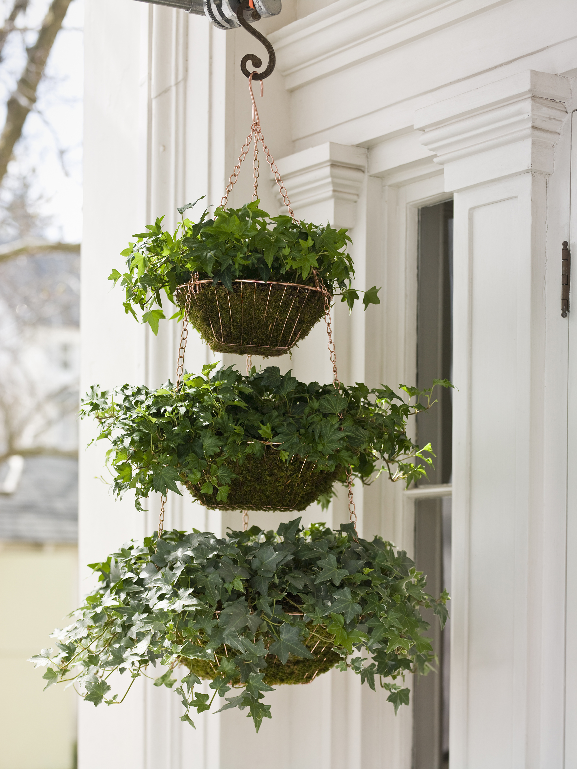
I love a seasonal wreath as much as the next person. After all, the humble wreath is one of the most versatile decorating tools at our disposal. But I miss the rows and rows of hanging baskets that once adorned our front yards, which is why I welcome their fragrant and colorful return.
Hanging baskets are a brilliant way to bring color and interest to your porch during the spring months. Perfect for special celebrations and for outdoor spring styling, hanging floral décor and planters can be used to create pretty seasonal displays for your front or back porch. Think wreaths but more modern, and more laid back.
You can use your own flower beds to source the blooms for the spring display, but you can of course resort to the florist if there's a particular flower or evergreen you want to feature.
‘Hanging baskets are a great way to express your creativity and add some color to your front porch, no matter the size,’ says Holly Crossley, garden editor of Homes & Gardens. ‘A color theme is a great starting place, where you can consider a wide range of different plants to create a mix of lush foliage, big blooms, and delicate flowers as part of your arrangement. Choosing blooms of similar shades can create an impressive design that is guaranteed to impress your visitors come the season shift.’
5. Leave behind botanical prints in favor of scenic photography

Botanical prints will always be popular for spring, but with photography so advanced and precise, perhaps it is high time we invited something a little more personal into our homes.
The whole purpose of a home is to answer the needs of the individuals living in them whilst reflecting their personalities with good design, space, and functionality, which is why over-produced, impersonal cookie-cutter botanical prints are making our homes look dated, and dare I say, cheap.
Instead, surround your home with art from your favorite photographer, or better yet, if you're lucky enough to reside by a beautiful coastal landscape, why not take some photographs yourself?
And don't forget the frame. A piece of art framed well is a thing of beauty but it takes a lot of thought and care for a stunning end result. From the perspective of a picture dealer, it’s worth trying to ensure the frame is in keeping with the date and style of the image. ‘And if you have the original frame, I would try to keep it,’ says Harry Moore-Gwyn, a specialist art dealer.
‘If the artist chose the frame, it’s integral to the piece.’ When deciding on a new frame, think about the quality of the finish, adds Harry. ‘You can really tell the difference between hand-finished frames and machine-made high street versions, which often look too clean and consistent.’
This is not to say that you shouldn't have any of these home decor ideas if they truly bring you joy. It is always important to choose decor that makes your heart sing – and take what the naysayers suggest with a pinch of salt.