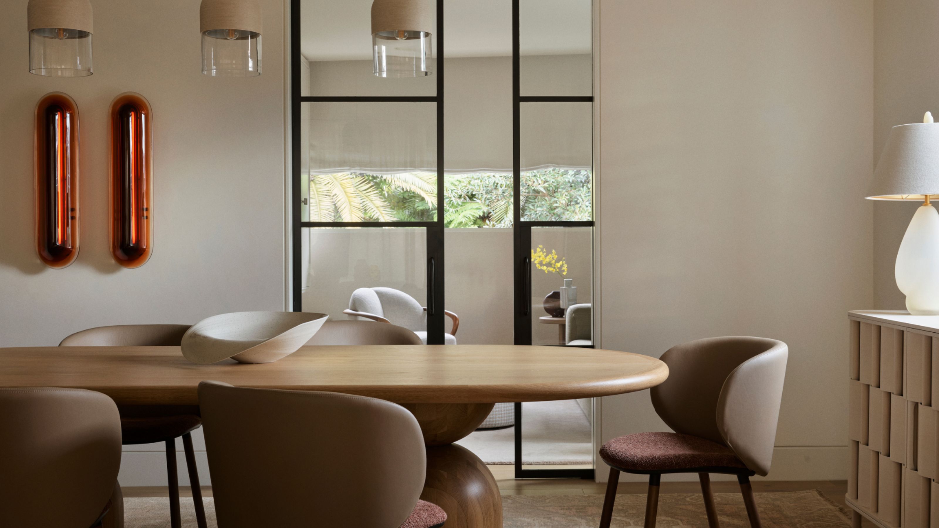
There’s something deeply grounding about an earthy color palette. These are the shades that make us exhale when we walk through the door — colors drawn from the natural world, like clay, sand, stone, and sun-drenched greenery. They’re soothing, timeless, and incredibly versatile.
In a world of fast-moving trends, it’s easy to feel overwhelmed. Sometimes it’s hard to know what you truly love. But what I’ve found from doing over 5,000 color consultations is that nature offers the best color palette you can bring into your home.
For those who want to dip their toe into the world of color and express more of their personality, an earthy color palette is often the key that unlocks the feeling they’ve been searching for. Decorating with earth tones connect us to something real. They’re grounding, soft, and built with black pigment that give them depth — they look just as beautiful on a gray day as they do on a sunlit morning.
They also tend to evolve throughout the day with the changing light and shift with the seasons, creating a home that always feels considered and alive. And unlike trend-driven tones that come and go, earthy color palettes have longevity. That’s because we instinctively trust them — they make us feel safe and settled. Whether you live in a period home, a new build, or a cozy flat, these hues create a sense of calm and cohesion — especially when paired with natural textures like wood, linen, and rattan.
As the founder and director of interior design at Lick, I reach for earth color palettes all the time in my consultations. They're perfect for creating warmth in light-staved spaces, for bringing depth to open-plan rooms, or even for just softening modern architecture. And what I love most is how forgiving earthy color palettes are — they're easy to layer, blend, and live with.
Below, discover four of my favorite earthy color palettes for the home.
1. Blush Walls, Forest Green, and Natural Warmth
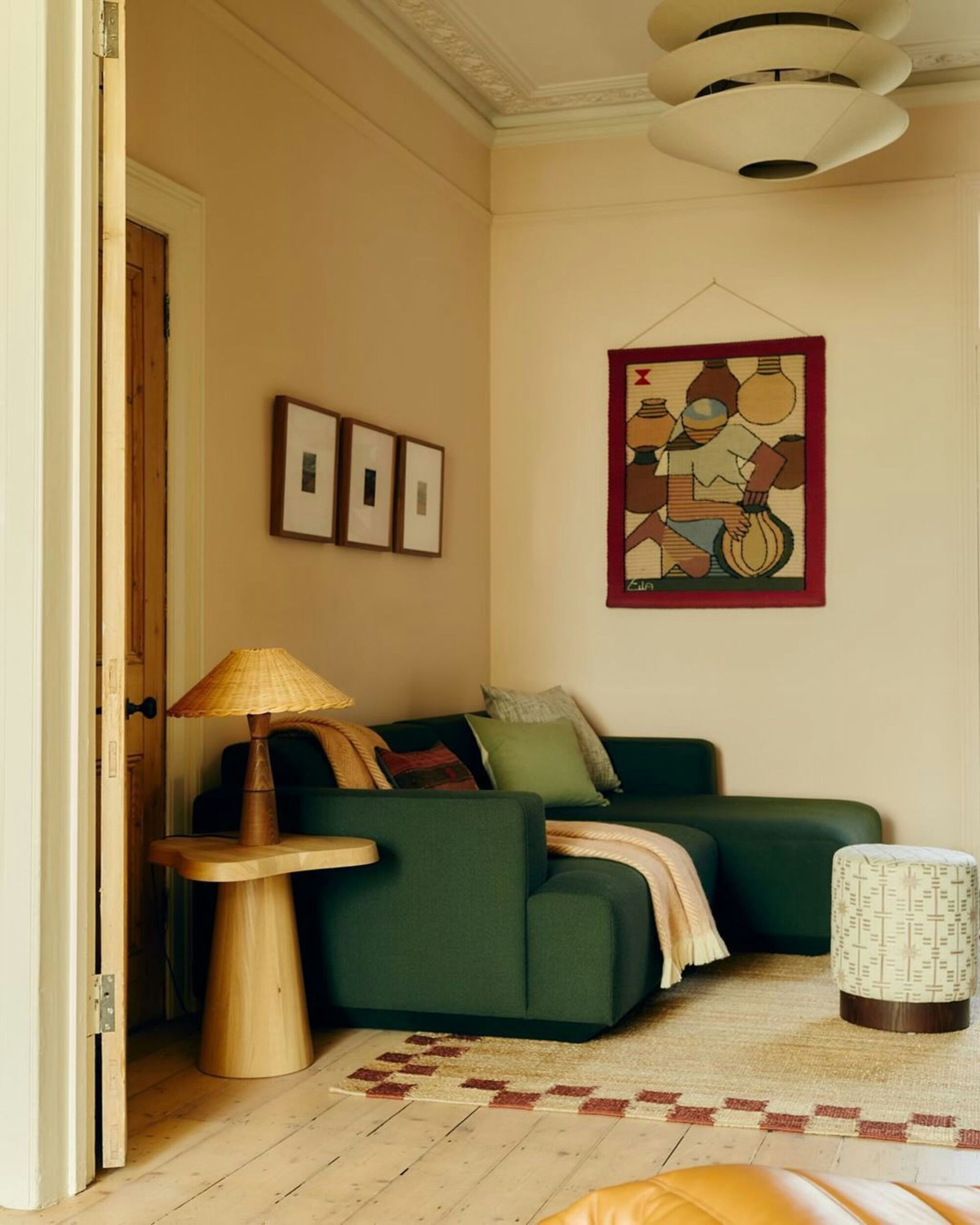
This earth-toned living room is painted in Lick's Pink 02, which is one of the most versatile and elevated pinks in the Lick palette. It has an earthy, clay-like undertone that gives it warmth without being overly sweet — the perfect backdrop for deeper, more saturated tones.
What makes this space really sing is the contrast and balance between the soft blush walls and the deep green upholstery. That forest green sofa adds grounding richness, while the honeyed wood tones (in the floors, doors, and lamp) bring a golden warmth that harmonizes the palette.
Every element in the room feels rooted in nature — the chalky pink of a worn pebble, the leafy depth of green foliage, and the sun-baked warmth of wood. It’s a layered, textural palette that feels both calming and intentional.
2. Layered Greens, Stone, and Statement Marble
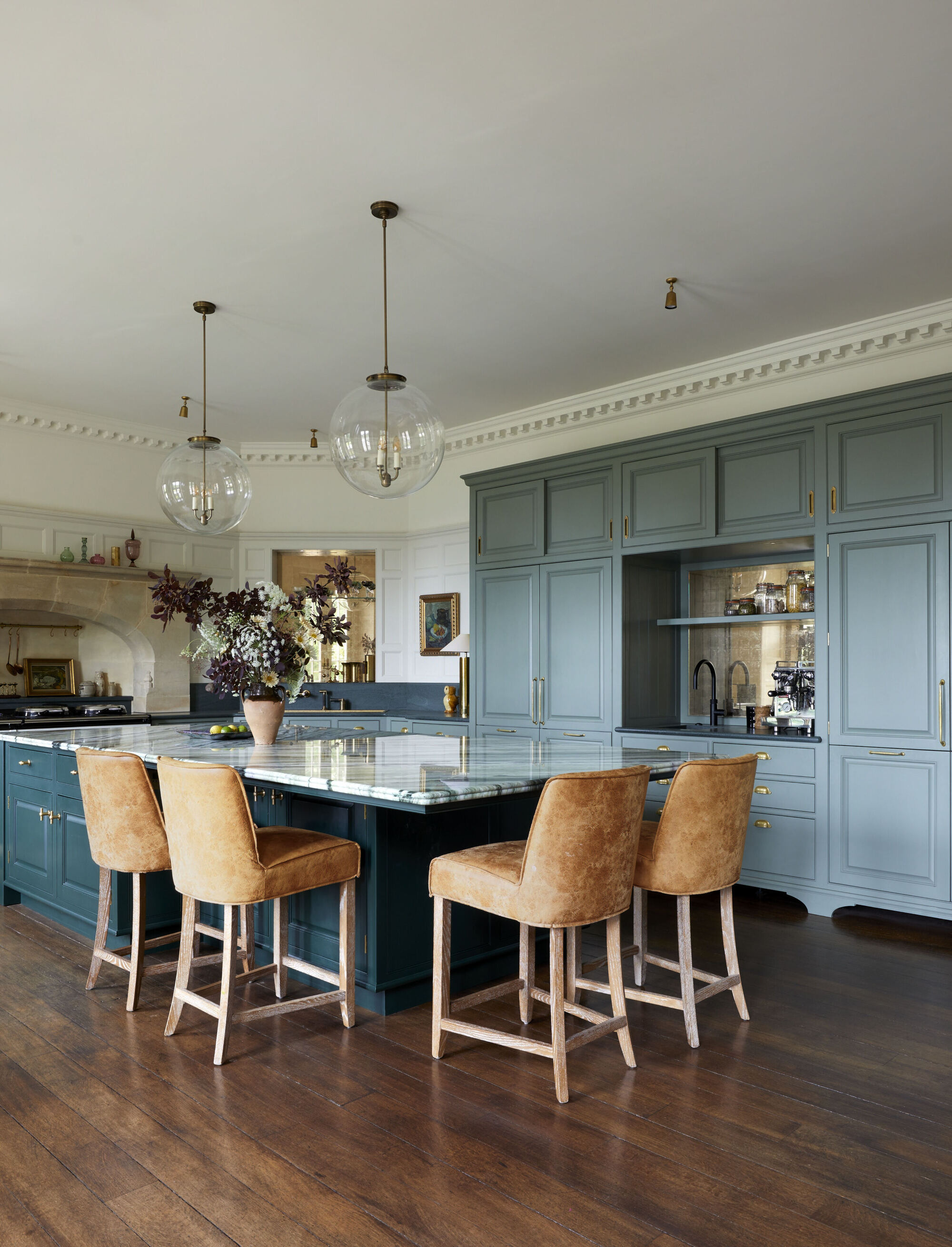
This kitchen is a perfect example of how an earthy color palette can still feel bold and luxurious. The main cabinetry is painted in Lick's Green 02, a soft, mid-tone sage green with gray undertones that feels rich and timeless.
For contrast, the island is painted in Lick's Green 06, a darker, moodier olive green paint that grounds the space and adds depth. The walls and ceiling are kept light with White 05, a warm yellow-toned white that complements both greens beautifully and enhances the natural light.
What really elevates the look is the pairing of painted cabinetry with rich, natural materials: the creamy limestone above the cooker adds rustic warmth, while the island’s dramatic green marble worktop becomes the star of the show. Together, these elements create a layered, nature-inspired scheme that’s both sophisticated and grounded. It’s a masterclass in earthy color done the elevated way.
3. Teal Depth, Pattern, and Warm Accents
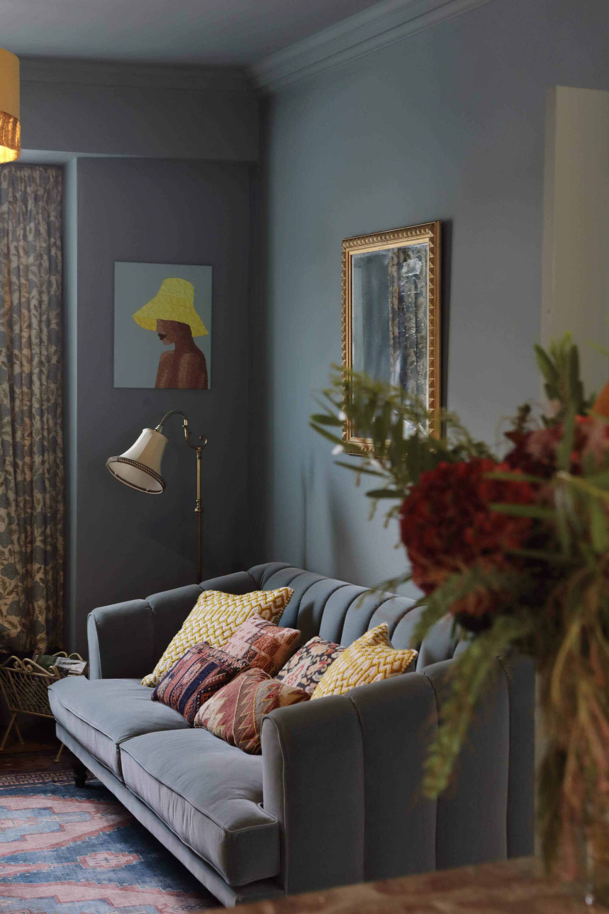
This living room is a brilliant example of bold color drenching done right. The walls are painted in Lick's Teal 03, a rich, moody hue that balances blue and green undertones for a deeply cocooning feel. It wraps the room in color, making it the perfect backdrop for layering pattern, texture, and warmth.
What really works here is the harmony between the warm depth of the teal and the earthy, sun-baked warmth found in the accessories — the mustard yellows, terracotta reds, and dusty pinks in the cushions bring life and energy to the scheme.
The gold accents in the mirror and lamp further elevate the look, adding a touch of vintage glamour while tying in beautifully with the yellow tones.
4. Taupe Tranquillity with Earthy Accents
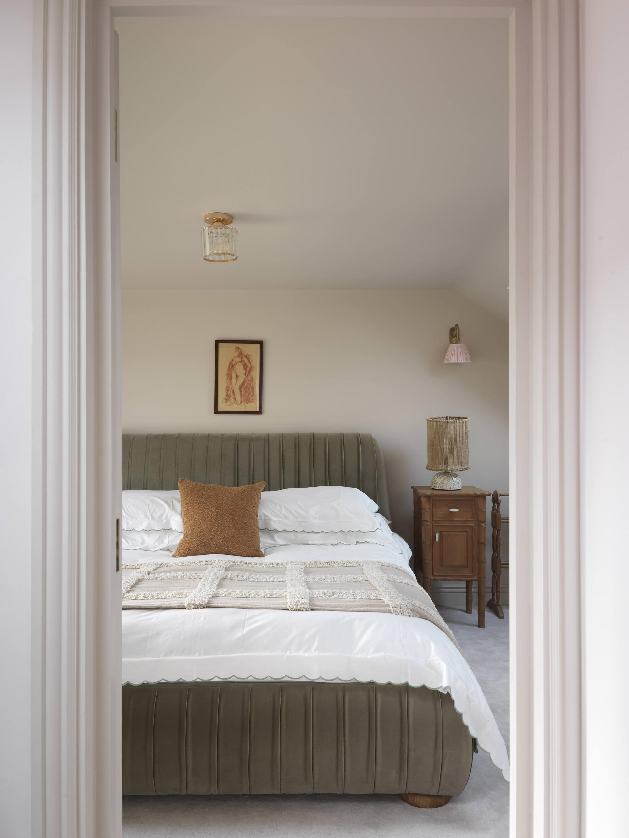
This earth-toned bedroom is painted in Lick's Taupe 03, one of the most soothing shades in the Lick palette. It has a subtle mushroom undertone that brings depth without overpowering the space — making it ideal for a bedroom where rest and calm are the priority.
Taupe 03 works beautifully with soft whites and warm natural tones, as seen here in the headboard, terracotta cushion, and wood furniture.
What makes this space work so well is the gentle contrast between cool and warm. The taupe walls ground the room, the crisp white bedding adds light and freshness, and the layered textures — from the bouclé lamp to the velvet headboard — give the space softness and comfort. It’s an earthy, neutral scheme that feels warm and elevated.
FAQs
What Are Earthy Colors?
I’m going to encourage you — after reading this article — to step outside and really look. Look up at the sky, look at the trees, go for a walk and take in the tones you find.
Whether it’s the color of the flowers, the soil beneath your feet, the pebbles on a beach, or the grains of sand on your next holiday, tune your eye in and notice the subtle shades nature offers.
Earthy colors are inspired by exactly that — the natural world. Think clay, sand, stone, moss, terracotta, and muted greens. These tones tend to have warm, grounding undertones that make them feel timeless and calming. They’re the colors of nature at its most gentle and soothing, and they bring that same relaxed, grounded energy into our homes.
What Are Some of the Most Popular Earthy Interior Paint Colors?
Some of my go-to earthy shades from the Lick palette include:
- Taupe 03 – a soft mushroom-y neutral that works in any room
- Pink 02 – an elegant, clay-toned blush with serious warmth
- Green 05 – a rich olive with natural depth
- Red 03 – a terracotta-toned red that brings grounded warmth
- Beige 02 – a rich sand that’s perfect for layering
- Teal 03 – a moodier take on blue-green, perfect for cozy spaces
- Green 02 – a rich sage, perfect for kitchens or bedrooms
- Green 06 – a bold, dramatic olive that adds warm impact
- Pink 07 – a midtone, dusky pink that feels grounded and grown-up
Earthy color palettes have this magic way of making your home feel like a big exhale. They’re easy to live with, never try too hard, and always play nicely with natural textures and changing light.
So next time you’re stuck on where to begin when it comes to decorating with color, just look outside — nature’s already done the hard work for you.