The Warner Bros. logo is one of the most recognisable in the world; it's a piece of design history that has enabled many filmmakers to get creative over the years. The bold shield shape and graphic WB was so strong that even from the outset in 1938 with the movie The Adventures of Robin Hood it has been adapted, abused and misused. Let's celebrate some of those changes.
Last year Warner Bros. celebrated 100 years and launched a special logo to mark the occasion, with a clever logo refresh that enabled the company to highlight fan-favourite movies and characters. (Check out the best logos of all time for more examples of great logo design.)
What I love about the Warner Bros. logo design is just how malleable it is without ever losing its identity. Time and again the logo has chunks bitten out of it, recoloured, and even pulled, pushed and abused by a rattled Daffy Duck in the intro to Gremlins 2. Below I share some of the Warner Bros. logo variants that have impressed over the years. Is your favourite here?
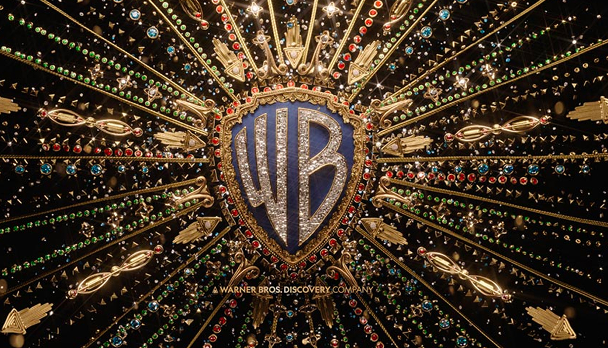
Elvis (2022)

With an ornate WB shield exploding with gold and silver jewellery this brings to life the movie's central character Elvis Presley. This Warner Bros. logo animation was created by DevaStudios.
The Batman (2022)
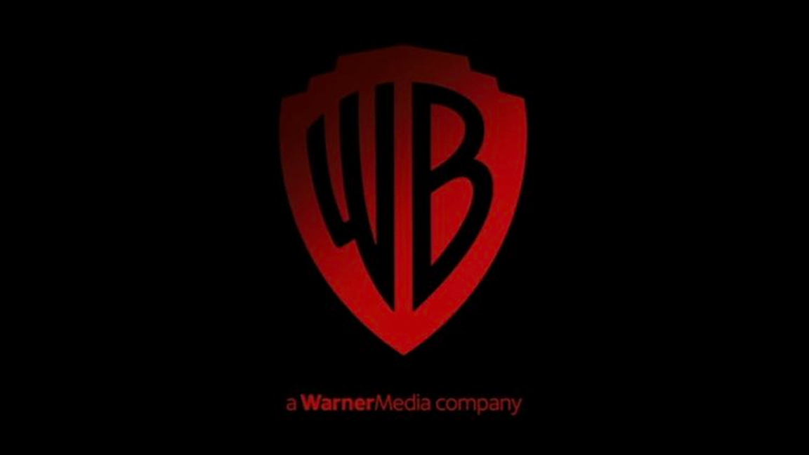
While many Warner Bros. logo variants are animated, The Batman is a still image, a bold red out of black. This is a version of the print logo, so we know we're about to get an authentic Batman movie.
In The Heights (2021)
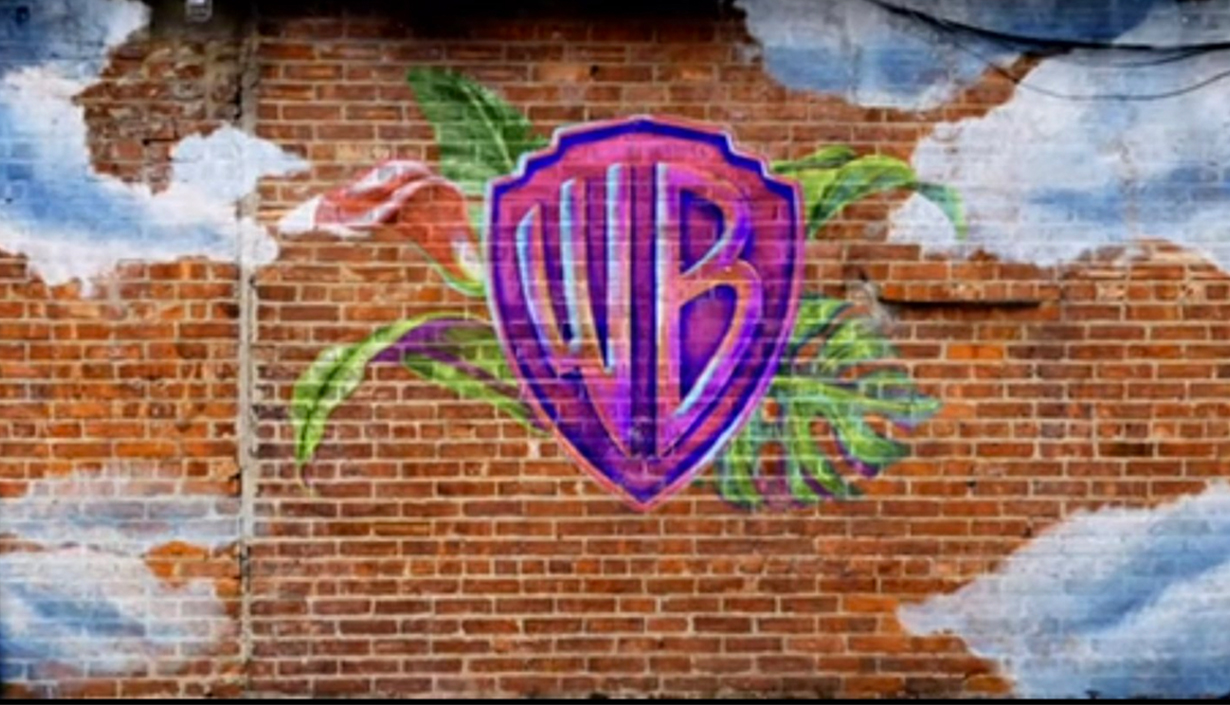
A bold graffiti drawing of the Warner Bros. logo teases what's to come; while the WB shield appears darker than normal the final design is bright and bold.
Aquaman (2018)
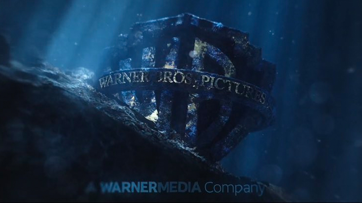
The Warner Bros logo is encrusted with coral and seaweed and clearly beneath the ocean. Even with this detail and a portion of the WB shield missing it's still recognisable.
The Lego Movie (2014)
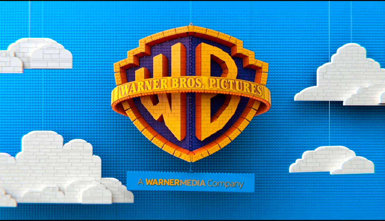
Ah, look, the Warner Bros shield is made from Lego bricks. This is so cute but it's the smallest details that sell the idea perfectly, from the Lego clouds being winched on string to the final reveal of the new (for the time) Warner Animation logo.
The Great Gatsby (2013)
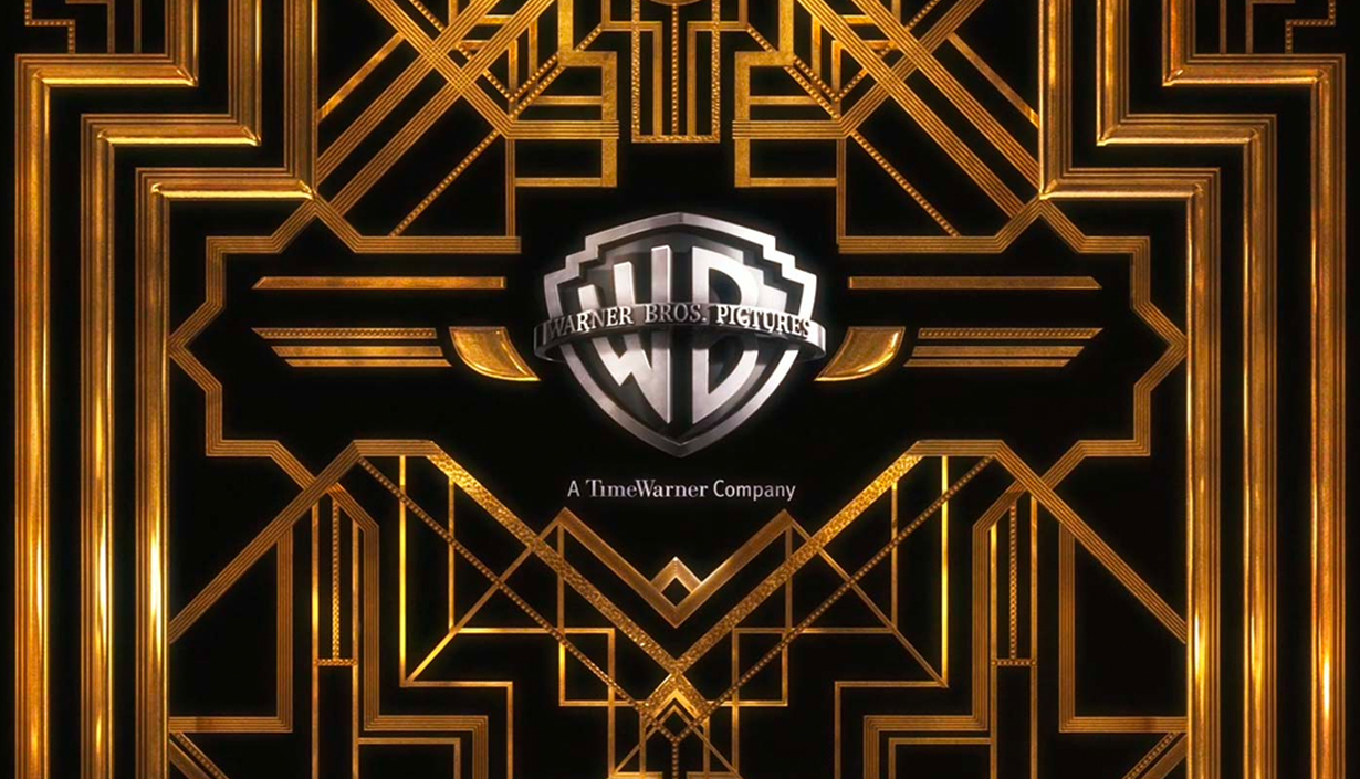
The art nouveau era design aesthetic is played out on as the Warner Bros. logo sits within a set of elaborate gates. A nice touch is that the WB shield is depicted in black and white.
Sucker Punch (2011)

The film's stage is teased in this opening WB shield animation, with the logo projected onto the curtains. This one managed to echo the themes and tone of the movie perfectly.
The Losers (2010)
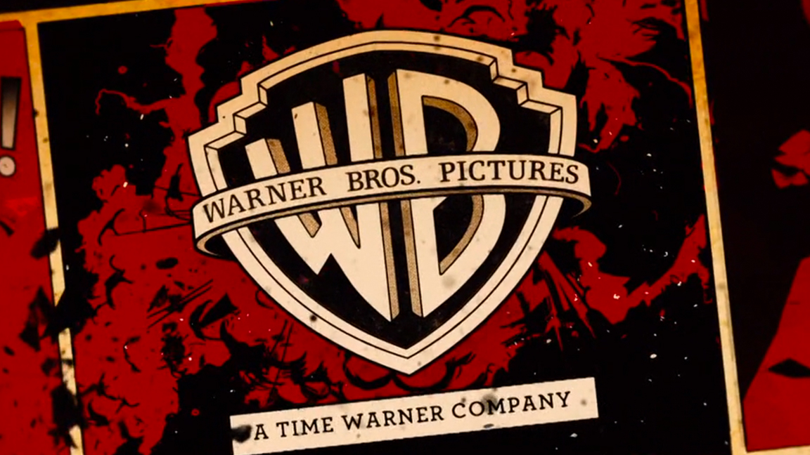
The Losers is based on a cult comic book, so the animation places the WB shield into a comic book panel. Designed by Prologue Films and animated and edited by Giovanni Bucci the other production logos follow the same aesthetic.
Where the Wild Things Are (2009)
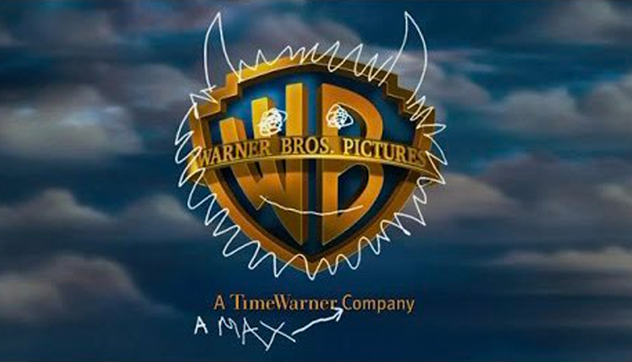
One of my favourites, this Warner Bros logo for Where the Wild Things Are is scribbled over by the movie's lead, Max. The childlike drawings turn the WB shield into the famous creature, Bernard The Bull.
Orphan (2009)
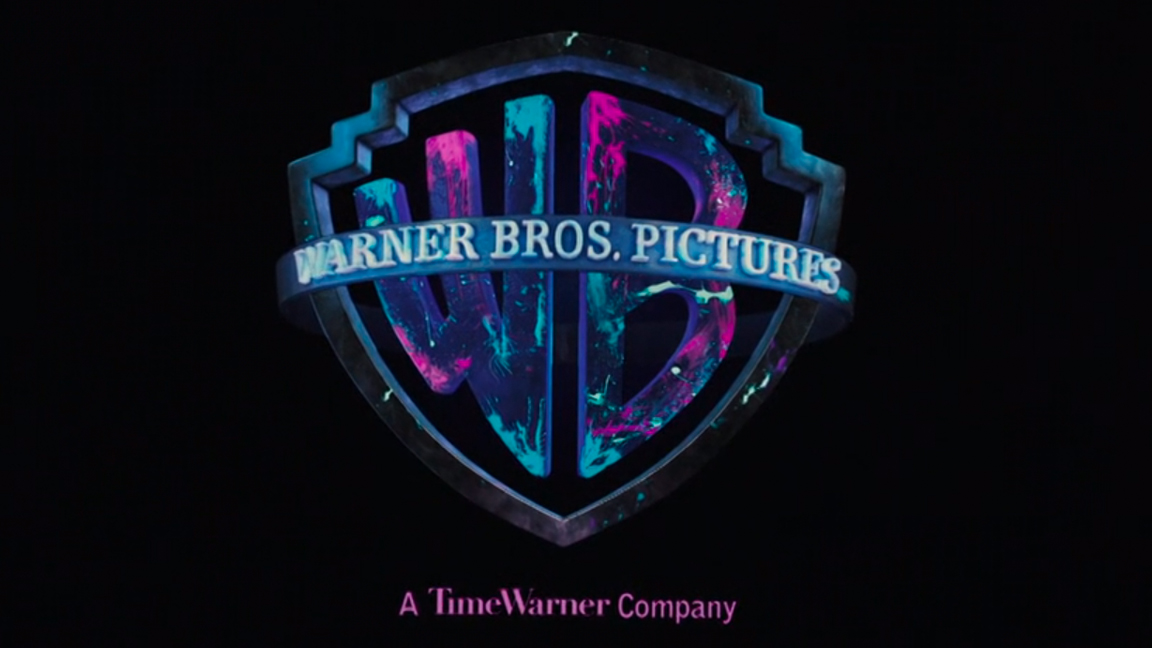
When this Warner Bros. logo variant came out it really took people by surprise. The WB shield is animated to resemble invisible ink being lit to reveal the logo; it radiates from black and white to blue and hot magenta. Another one designed by Prologue Films.
The Curious Case of Benjamin Button (2008)
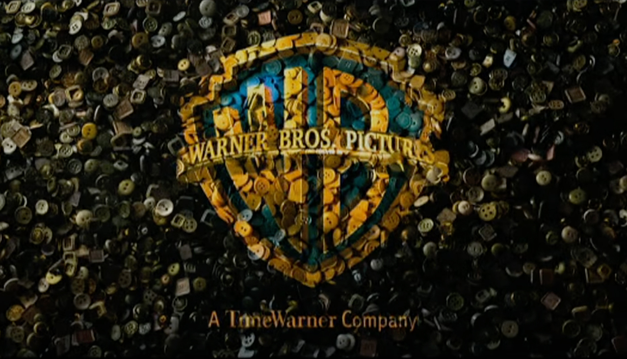
This one begins as a blank screen before thousands of buttons are dropped from above, the mix of colourful buttons creating the WB shield logo design as they accumulate.
Speed Racer (2008)
Another one from Prologue Films, Speed Racer opens with a series of spiralling kaleidoscopic backgrounds with the WB shield set in the middle. One of the best modern Warner Bros logo variants.
Scooby-Doo (2002)
All seems fine with the WB shield, though keen observers will notice the clouds are slightly different. When the music ends abruptly and a chunk of the shield is bitten off, and Scooby-Doo laughs wildly, all is not what it seems. This is another one of the variants that demonstrates the strength of that shield design.
Ghost Ship (2002)
Perhaps the use of the 1953 3D shield is the most surprising thing about this so-so horror movie. The classic logo does, however, tease the spooky things we're about to witness and subtly celebrates Warner's b-movie credentials.
The Joker (2019)
The movie played on themes of nostalgia and an imagined past, so reworking the Warner Bros. logo into a variant of the classic 1973 design, as audiences would have seen at the start of Bruce Lee's Enter The Dragon, feels a good fit.
And finally…
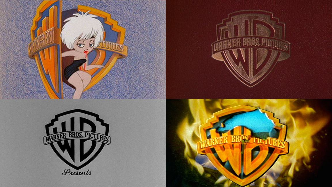
Warner Bros. has a long history of messing around with its iconic WB shield design, and this stretches back to the early days of this famous film producer. Here are some of my favourites, from top left we have Who’s That Girl? (1987), What's Up, Doc? (1972), The Tall Story (1960) and Blazing Saddles (1974).