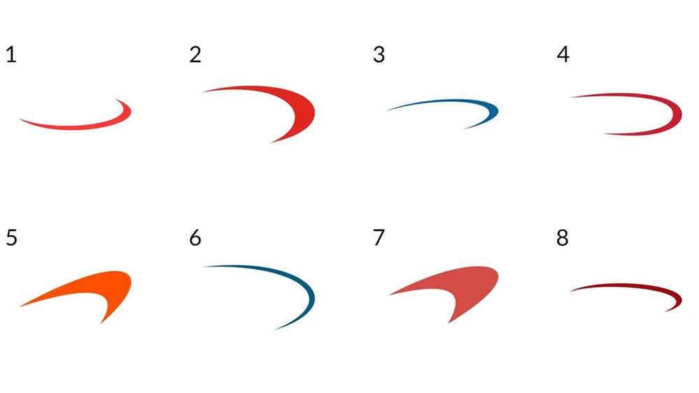
I love a good logo design quiz, but I don't think I've ever come across one as challenging as this. Over on Reddit, users are scratching their heads trying to identify the brands behind 16 swoosh logos.
We're not talking distinctive swooshes like those of Nike or Asics, but frustratingly similar disc-shaped designs that, when they're presented all together, look almost ridiculously generic. I like to think I know my logos, but I've managed to guess just one of them. Can you do any better?
We have lots of logo design roundups on Creative Bloq around different categories of brand marks, from circular logos to cursive logos and even ambigram logos. But it seems we need a post dedicated to 'generic oval swoosh logos' because this shape is everywhere.
Without cheating (reverse image searching, checking the comments, etc) can you correctly identify which companies these swooshes belong to? from r/graphic_design
The logo quiz is a challenged posed by a Reddit user called G1ngerBoy, who says he started compiling a collection of swoosh logos to help show businesses how much harm their uninspired brand identity was doing them. He says the fiendish quiz features just a tiny sample of the more than 200 similar designs that he's rounded up so far.
"I started paying more attention when traveling in town and started noticing an extreme amount. Even in the small area I live in, there are at least 6 local brands with swoosh logos: 1 a plumber/pluming supplies 2: electrician 3: a landscaper 4: a trash company 5: a local ISP 6: a towing company."
Some suggest the success of Nike's branding is to blame, sparking a trend toward swoosh logos in the 90's. Free logo makers might now be making such generic designs even more commonplace.
I think the OP has definitely succeeded in discrediting the enduring trend. With the brand names removed, it's extremely difficult to recognise any identity in these designs. That suggests this ubiquitous motif is hardly memorable. A lot of people have guessed that one of the designs belongs to Capital One – although many aren't sure which.
"I thought at first that these were all iterations of the Capital One logo," one person commented. That's the only design I think I've guessed right. I thought I also spied the Nerf logo, but after cheating and looking it up I'm now not so sure.
Take a look back in a couple of days, when the poster says he'll share the answers. In the meantime, it seems we have a new candidate for the most overused shape in graphic design. As G1ngerBoy comments on Reddit, "if you want to stand out then avoid a swoosh logo like the plague".
For more logo design news, check out the thinking behind the new Game Awards logo.