
Enjoy our content? Make sure to set Android Central as a preferred source in Google Search, and find out why you should so that you can stay up-to-date on the latest news, reviews, features, and more.

Android Central Labs is a weekly column devoted to deep dives, experiments, and a focused look into the tech you use. It covers phones, tablets, and everything in between.
When TVs were first sold in color, people were sceptical. Sure, a color TV show or movie was an obvious upgrade from black & white from a fundamental perspective, but the quality of early color content simply didn't match the contrast of black & white programming.
Things were made worse by a lack of standards and difficult-to-use equipment. One Reddit user remembers having to "twiddle knobs to decide whether the people would be orange or green."
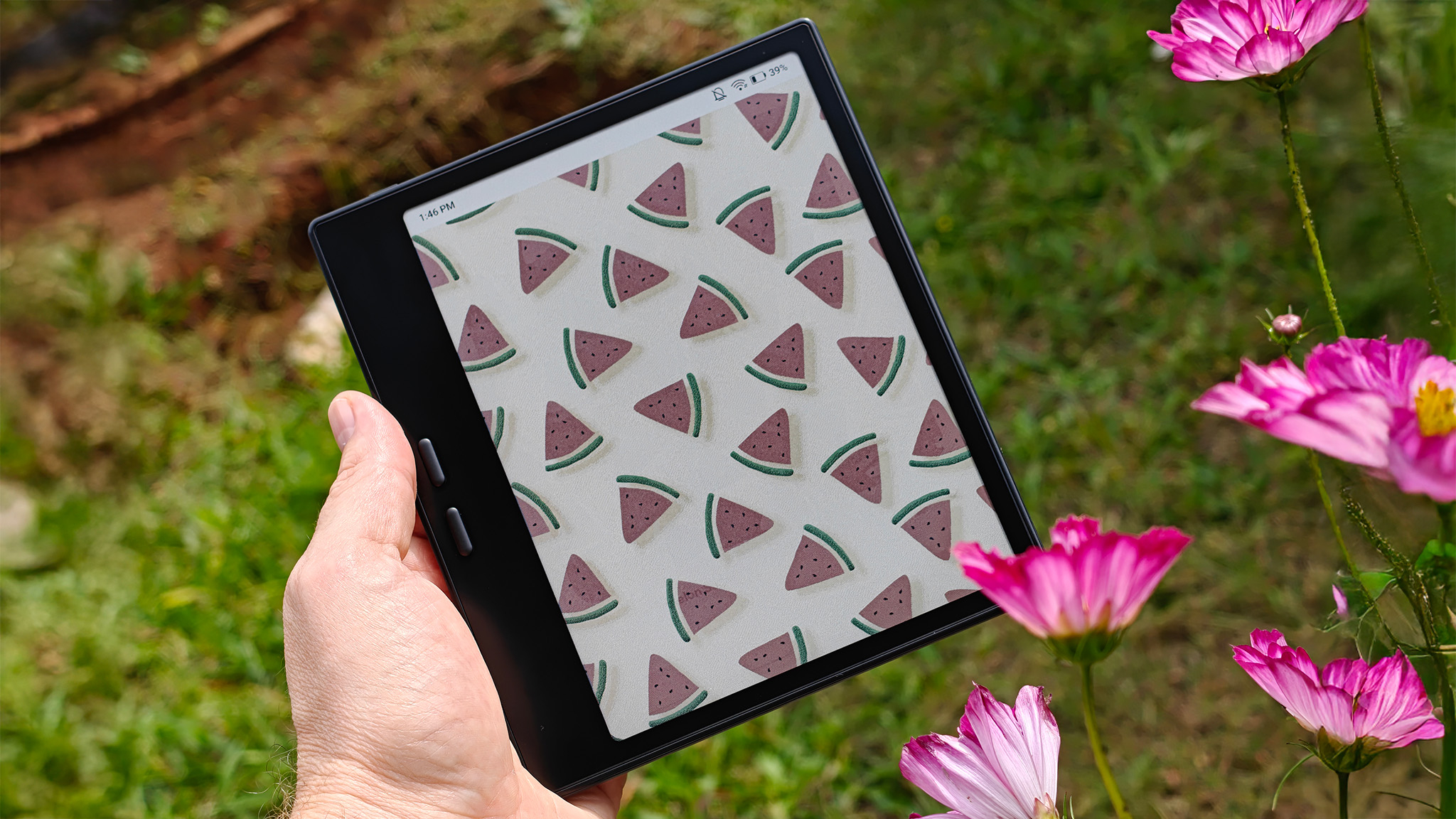
In a way, color e-readers can suffer from similar problems but for very different reasons. I've been using the Onyx Boox Go Color 7 Gen II as my main e-reader since the middle of August, and I've been extremely impressed with the unit. However, my older Onyx Boox Page still excels in a few areas that I didn't expect.
Clarity and light
Let's be clear: The Boox Go Color 7 Gen II (I'll call it the Go Color from now on for simplicity) is a better all-around e-reader than the Onyx Boox Page. The design has been refined to feel more comfortable in the hand, and the OS features new capabilities enabled by the updated display.
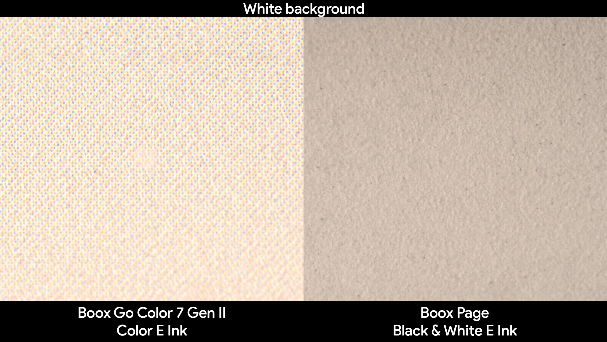
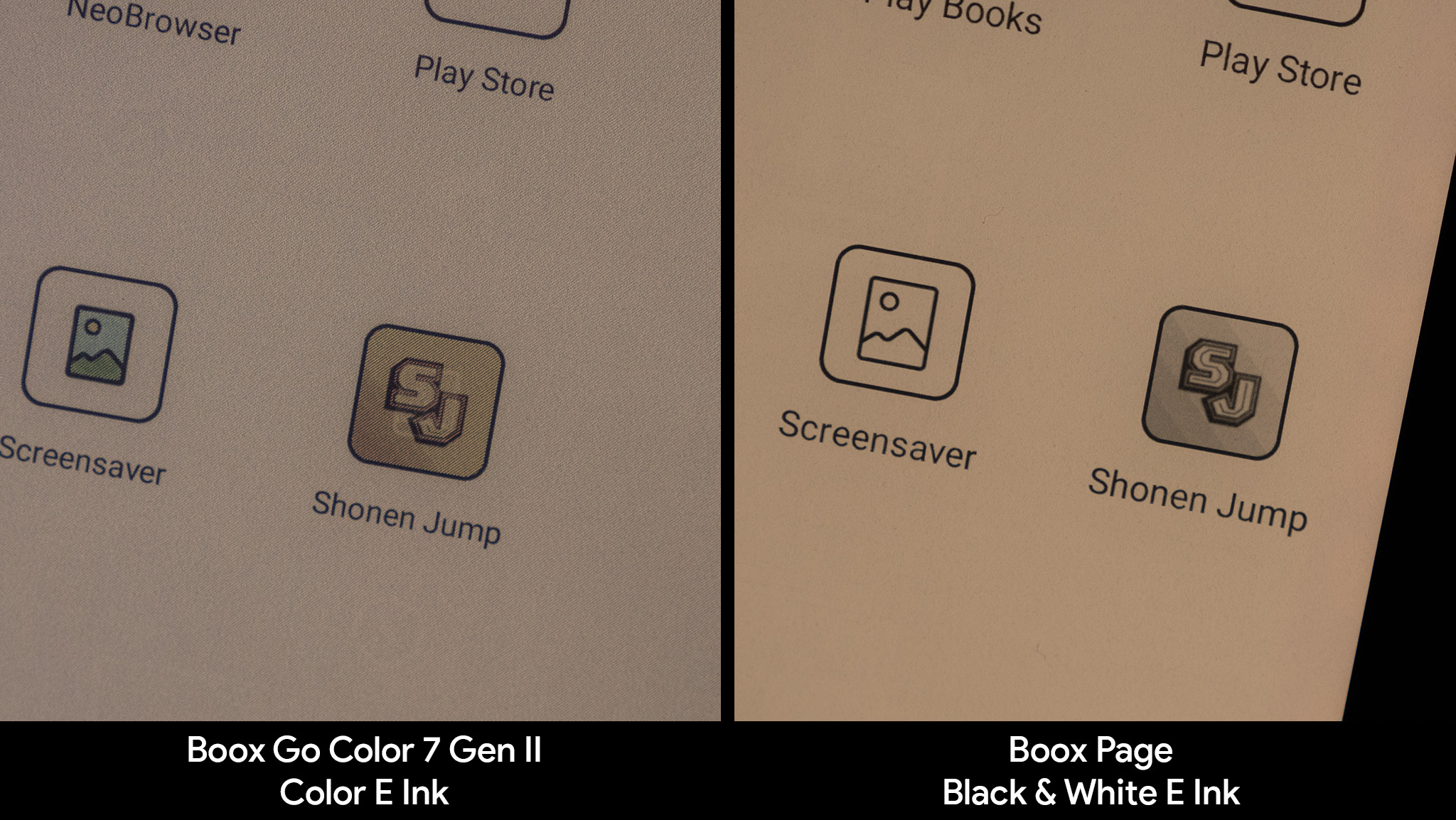
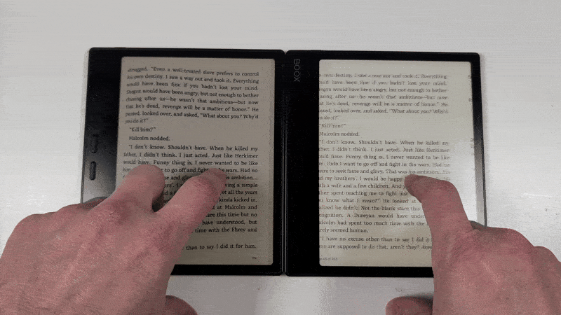
But anyone coming from an older black-and-white e-reader will immediately notice the graininess of the new color display. Flat white backgrounds now have an almost "old film" quality, giving the picture a distinct character that isn't present on digital stock. The same feeling can't be said for reading, where this grain can be distracting for some.
Text on the black-and-white Boox Page looks smooth and clean. Even when viewed through a macro lens, the Page's letters appear to be printed ink. However, the color screen has a distinct digital pixel look to each character.
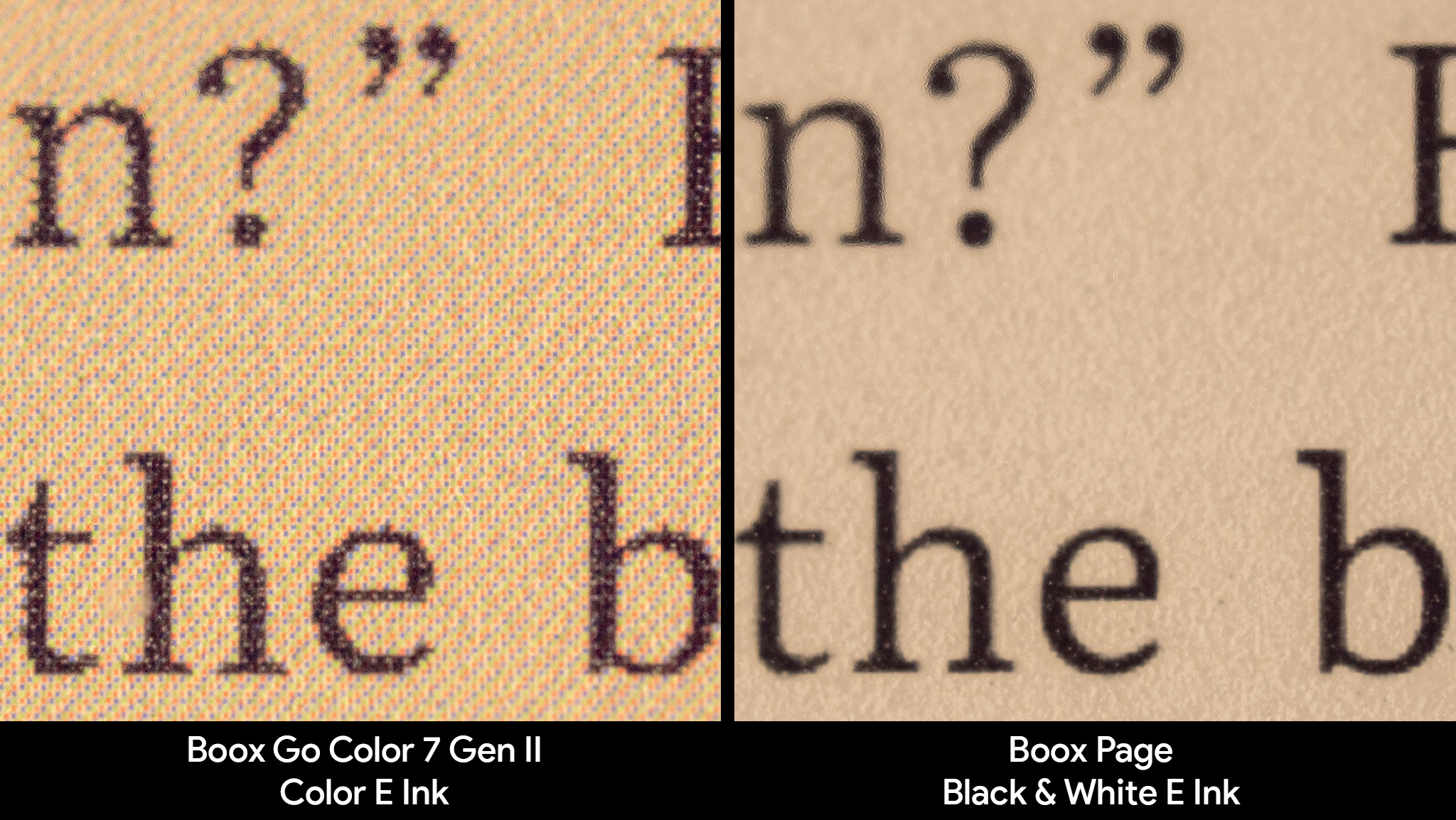
For some people, this won't be a big deal. However, people who want to replicate the look of a physical book in a more convenient digital form factor may find themselves disappointed.
Color E Ink is marvelous to look at, especially if you're a fan of graphic novels or manga, but it's less comfortable to read on due to the drop in clarity.
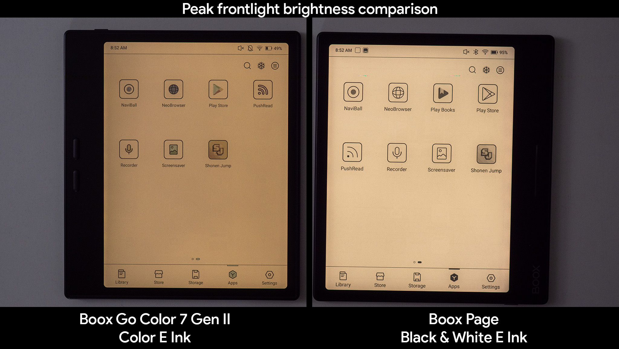
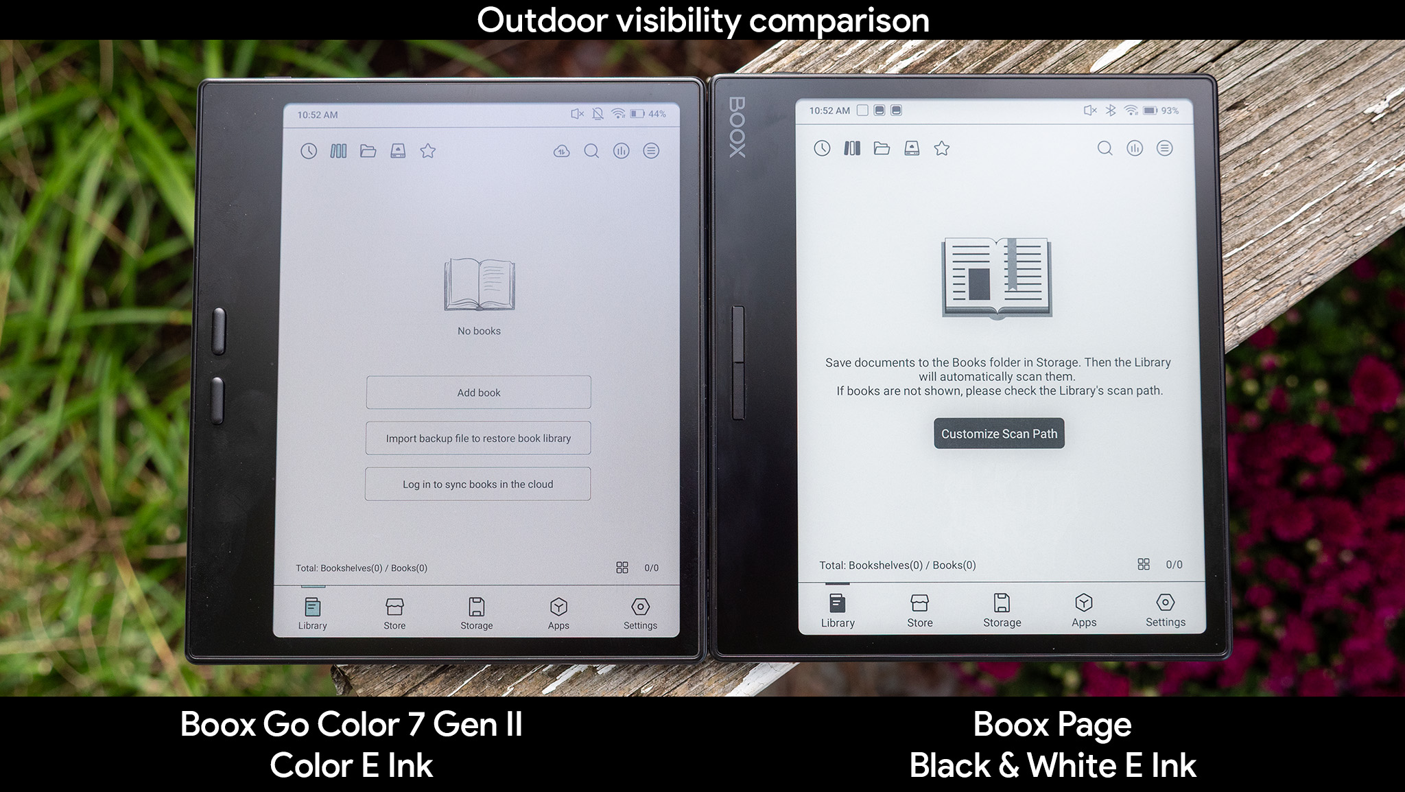
The Go Color's frontlight also struggles to get as bright as the Page's. My light meter measures the Boox Page at 500 lux (159 nits), while the Go Color tops out at 250 lux (79 nits). Color E Ink is also dimmer in the sunlight, something that seems odd for an e-reader.
It still offers far better visibility than any LCD or OLED device available today, but it lacks the bright, white paper-like look and feel of the Boox Page.
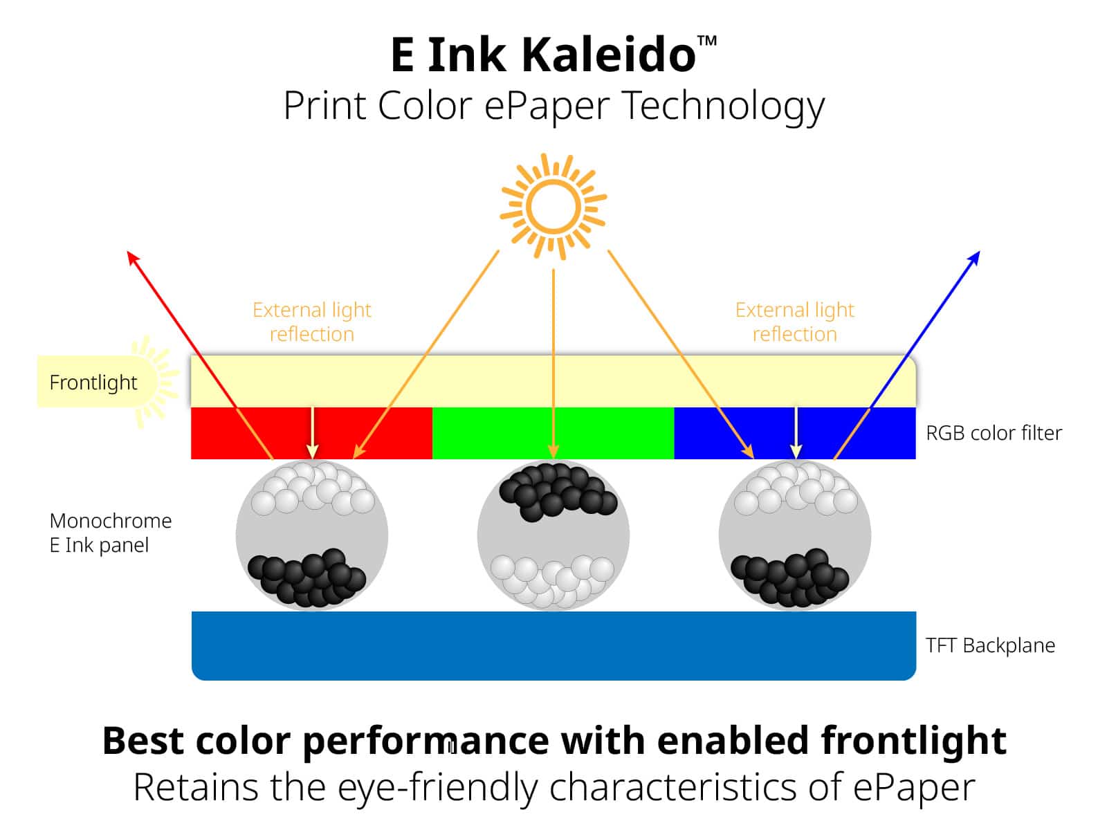
E Ink technology works by magnetically pulling positively and negatively charged black or white particles to the surface of the display. On a black-and-white display, those particles can move anywhere they need to. On a color E Ink display, they're sorted into red, green, or blue-colored bins to create the illusion of a more solid color to the eye.
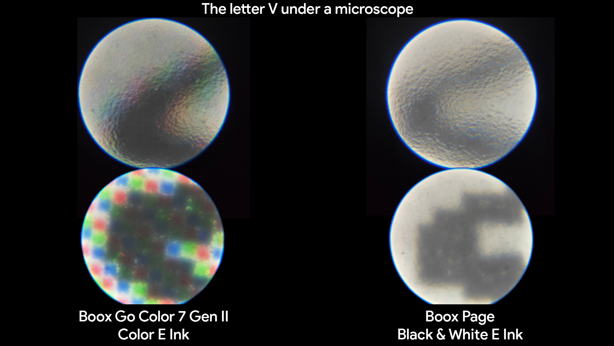
Because E Ink "pixels" can't be as small as those of an LCD or OLED, there's an obvious noise pattern that appears because you can still visibly see these red, green, and blue chambers with your naked eye.
Having pigments in separate chambers also means it's harder for light to scatter across the entire display. All these color chambers effectively create small divots in the display that trap light rather than help disperse it, unlike black-and-white E Ink. That makes a color E Ink panel appear darker.
Where it gets good
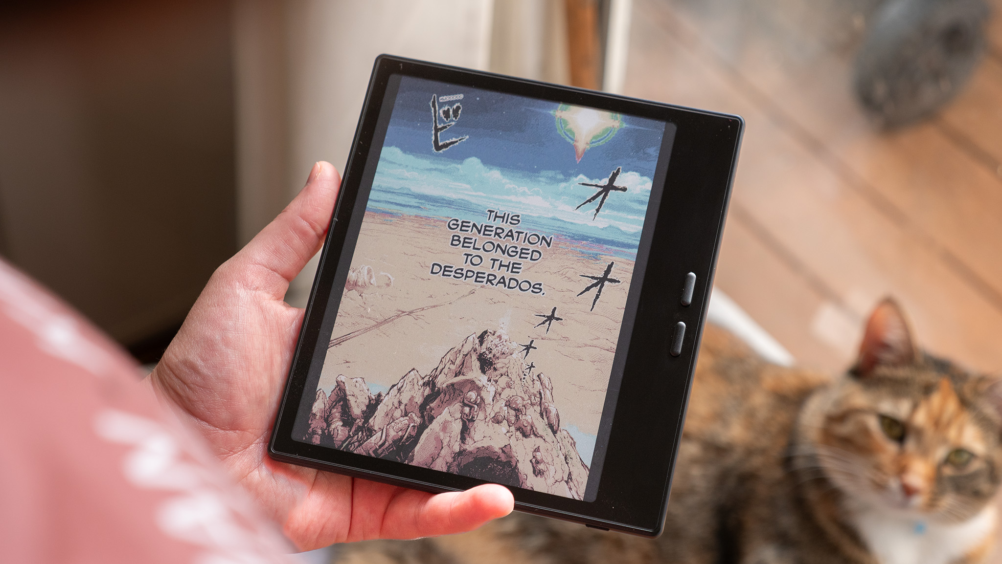
The text clarity and brightness of the Go Color's E Ink display may be lower, but the refresh rate and color availability are substantial upgrades. Plus, its 7-inch size feels more comfortable than some larger E Ink tablets.
And while color is certainly delightful, the refresh rate enhancements are the biggest upgrade over the Boox Page for me, as you can see from this side-by-side:
The newer E Ink display on the Go Color refreshes significantly faster than the older Page display, resulting in smoother scrolling and page turning, while also reducing flickering.
Onyx also upgraded the OS with several niceties and additional refresh features that make a significant difference in usability. The quick toggles panel now includes four preset options for the frontlight, making it easy to adjust brightness and color with a single tap without having to adjust each individual slider.
The E Ink adjustment panel is now simplified into a button layout with an AI-powered "recommended" setting that does a remarkable job of further streamlining the process. I've also found that apps are more stable on this hardware than on older Boox hardware, where apps would routinely crash for no apparent reason.
To sum it all up, while the Go Color is a better overall e-reader than the Boox Page, it looks less like paper than older E Ink displays. That's made up for by the addition of color and a substantially better refresh rate, making it more versatile.
I also love the design changes, from the new button layout to the rough paper-like feeling on the back. At 7 inches, it remains a Goldilocks size for an e-reader since it's about the size of the average novel and is more comfortable to hold long-term than having to fold back a spine. Overall, a fantastic choice for an e-reader upgrade, so long as you don't mind the less paper-like display.
E Ink is already gorgeous, but when you add color to it, things get really impressive. Featuring a faster refresh rate and a more comfortable handheld design, the Onyx Boox Go Color 7 Gen II is a fantastic, versatile e-reader powered by Android.