Kitchens are often underestimated as a space, but it’s where so many key moments and events take place, even without us realizing. The color sets the ambience every single day, meaning you need to choose the one that works for you - possibly the reason why people often choose simple neutrals like white.
However, a growing number of designers are choosing more surprising, expressive shades for their spaces. 'Kitchens are where art is created, an art that will give birth to memories for years to come,' designer David Quarles says. 'I don't know about you, but when I look back on these memories, I want color to accompany the smell and taste of the foods made, and the laughs and smiles shared!'
'Much like scent, colors are closely linked to our memories. Having a colorful space of hues that communicate joy, love, and excitement is what makes the difference in a kitchen!' David adds. Take a look at these unexpected kitchen color ideas to inspire a bolder approach to your remodel.
1. This chartreuse backsplash

This bold chartreuse kitchen belongs to David Quarles, and it’s the perfect example of how color and materials come together to create such a connected scheme. The dark wood certainly balances the bright vertical tiled backdrop in David’s kitchen, and the terrazzo worktop breaks them up in a very stylish manner.
'It's all about the look you're going for,' David tells us. 'One fun way to really mix things up beautifully in a kitchen is painting your base cabinets a rich, dark color, while opting for something a little more neutral for the upper cabinets, or go for natural wood shelves. From there, you're able to play even more with color for your wall covering; be it paint, tile or wallpaper! Last but not least, and to help bring balance through color in the kitchen, you can add a subtly striking kitchen countertop in marble or terrazzo. Using these materials not only adds a layer of personality to your kitchen, but they also do so in an elevated way.'
2. This moody color pairing
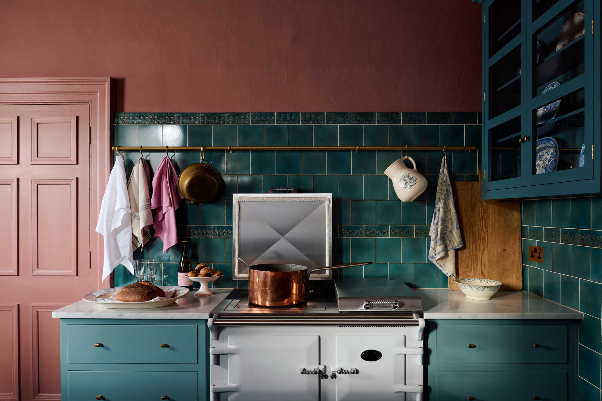
Some kitchens are made bold not by the choice of a single color, but an intriguing combination. This split of ‘Clerkenwell Blue’ and ‘Trinity Blue’ (cabinetry) by deVOL and 'Palette Red' (walls) by Atelier Ellis, offers a warm and homely space, perfect for cooking around the island and welcoming guests.
'Sometimes when a room is naturally dark and north-facing, it is tempting to make everything light and bright, paint the cupboards in creams or whites and have lots of lighting,' says Helen Parker, Creative Director of deVOL. 'Well, we did the opposite in here, we went for dusky pink on the walls and rich dark Shaker cupboards, in the hope of creating a really moody atmosphere.'
Dark spaces, when embraced, can often generate a much stronger scheme and result in something quite magical when matched with the right kitchen color scheme. 'The sink run gets the morning light shining right across it, the Carrara marble worktop and sink add some nice reflections, and the tongue and groove back panelling along this whole run gives a warm tactile feel while being a lovely place to display plates and bowls,' Helen adds.
3. This surprisingly sophisticated palette
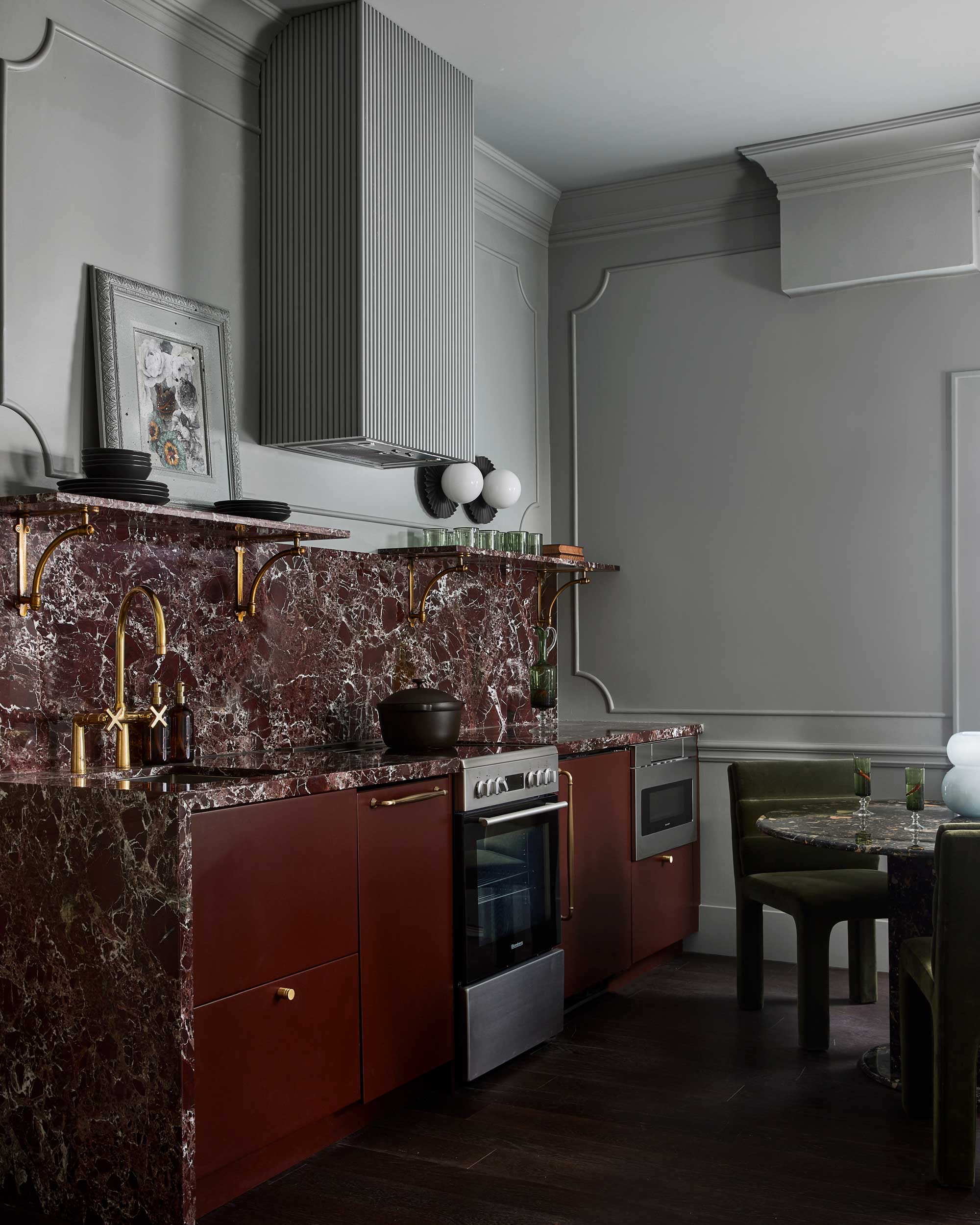
Burgundy and light grey might not feel like natural bedfellows - one rich and sumptuous, the other pared-back, almost industrial. Yet when combined into this kitchen with so much textural interest and grand materials, it’s a marriage made in heaven.
The deep tone of burgundy is used both on the cabinetry, and within the marble, while the grey then extends onto the walls covering detailed panelling and other architectural features, also allowing the appliances to appear dominant.
The sophisticated finishes of brass fixtures, and dark olive velvet chairs around a rich brown marble dining table pulls the entire scheme together.
4. This grown-up take on pink
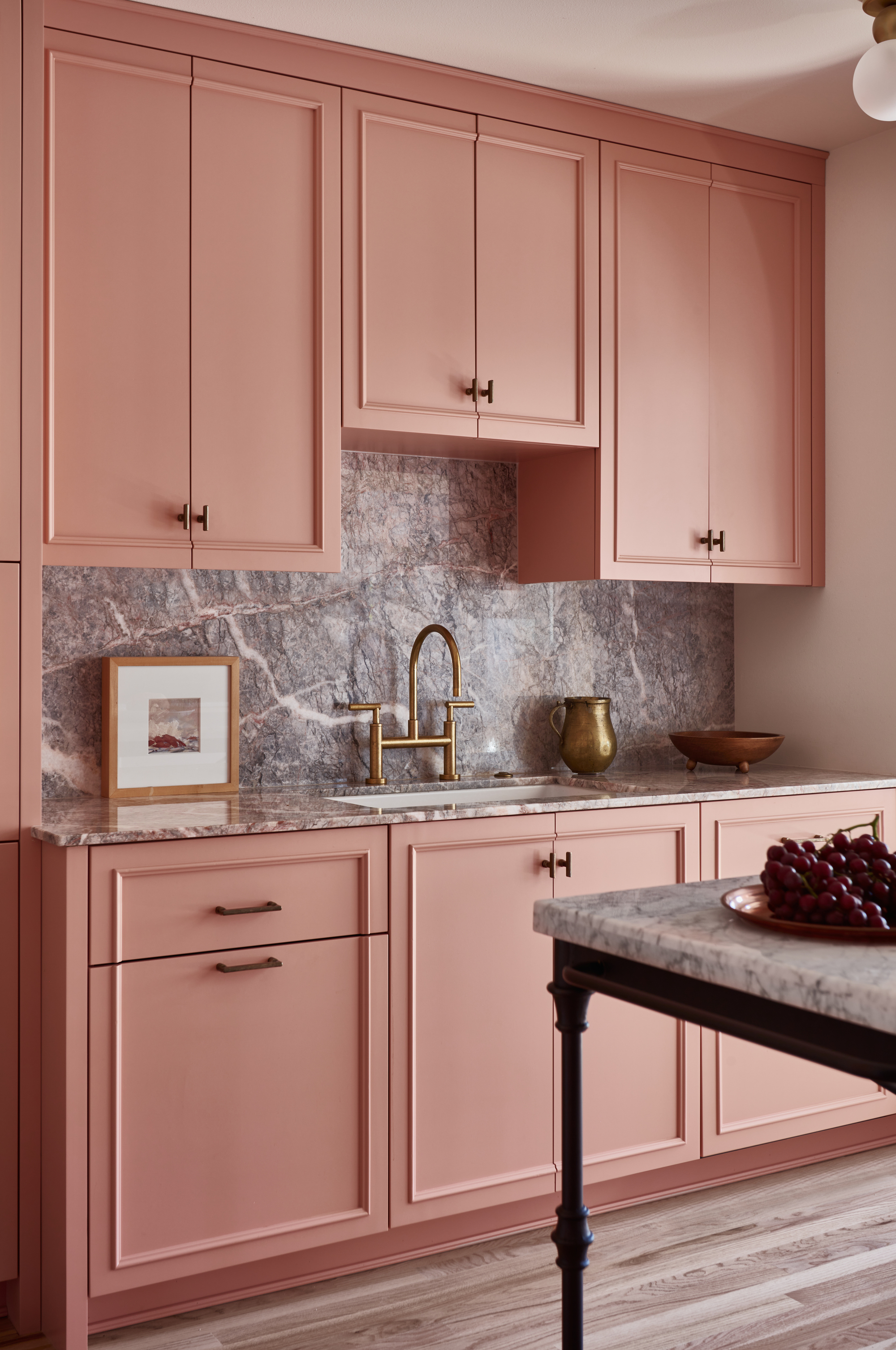
Pink isn’t a color you would necessarily picture in a modern, sophisticated kitchen but we're seeing a more grown-up approach to pink take off as a color trend.
'Putty pink can be both stylish and warm when used on kitchen cabinets,' says Lisa Staton, Principal of Lisa Staton Design, who designed this space. 'Paired with an unexpected marble with both grey and pink it stays both fashion forward and classic.' This timeless kitchen surely projects a sweet and sophisticated charm.
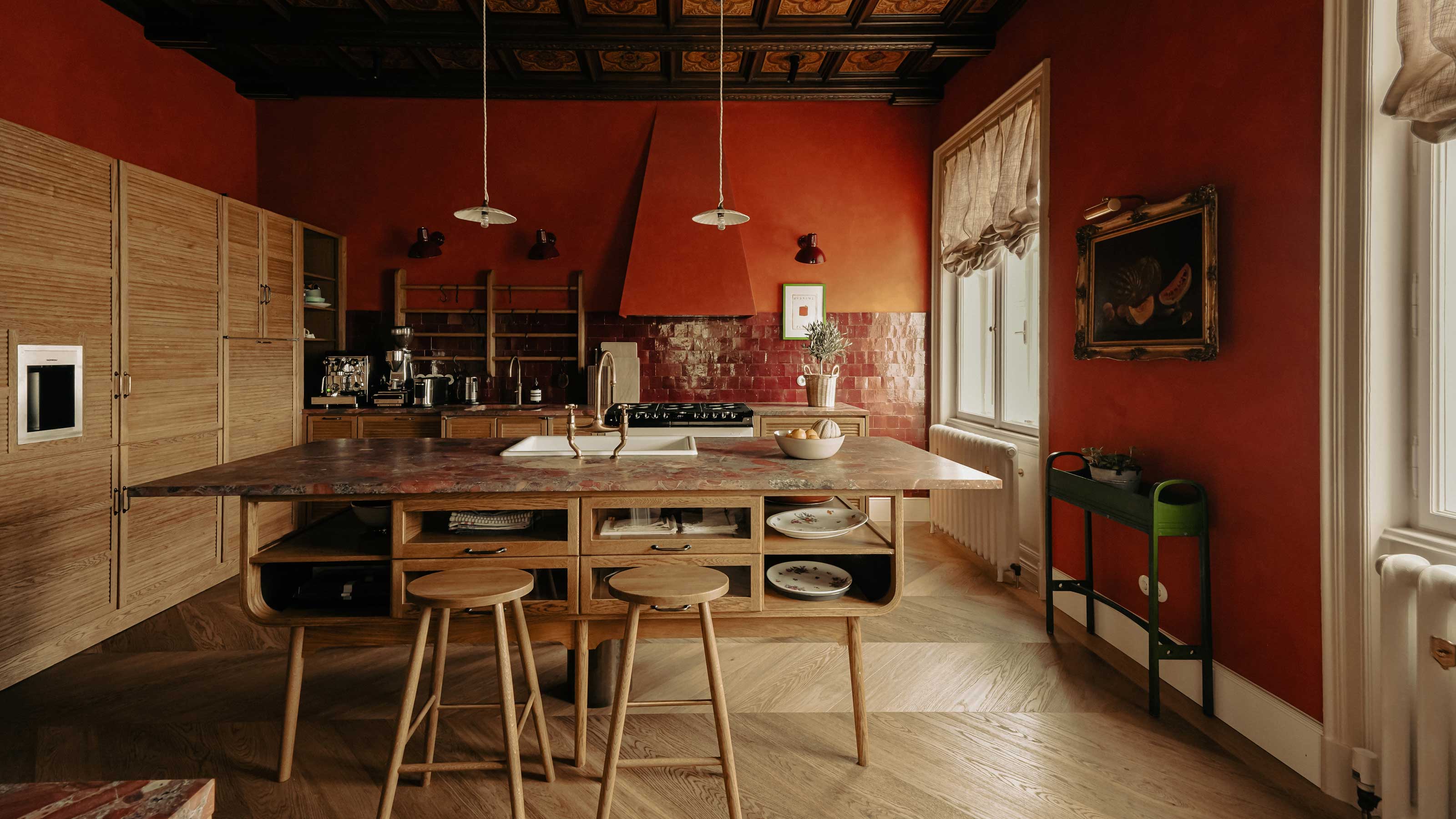
5. This all-red wonder
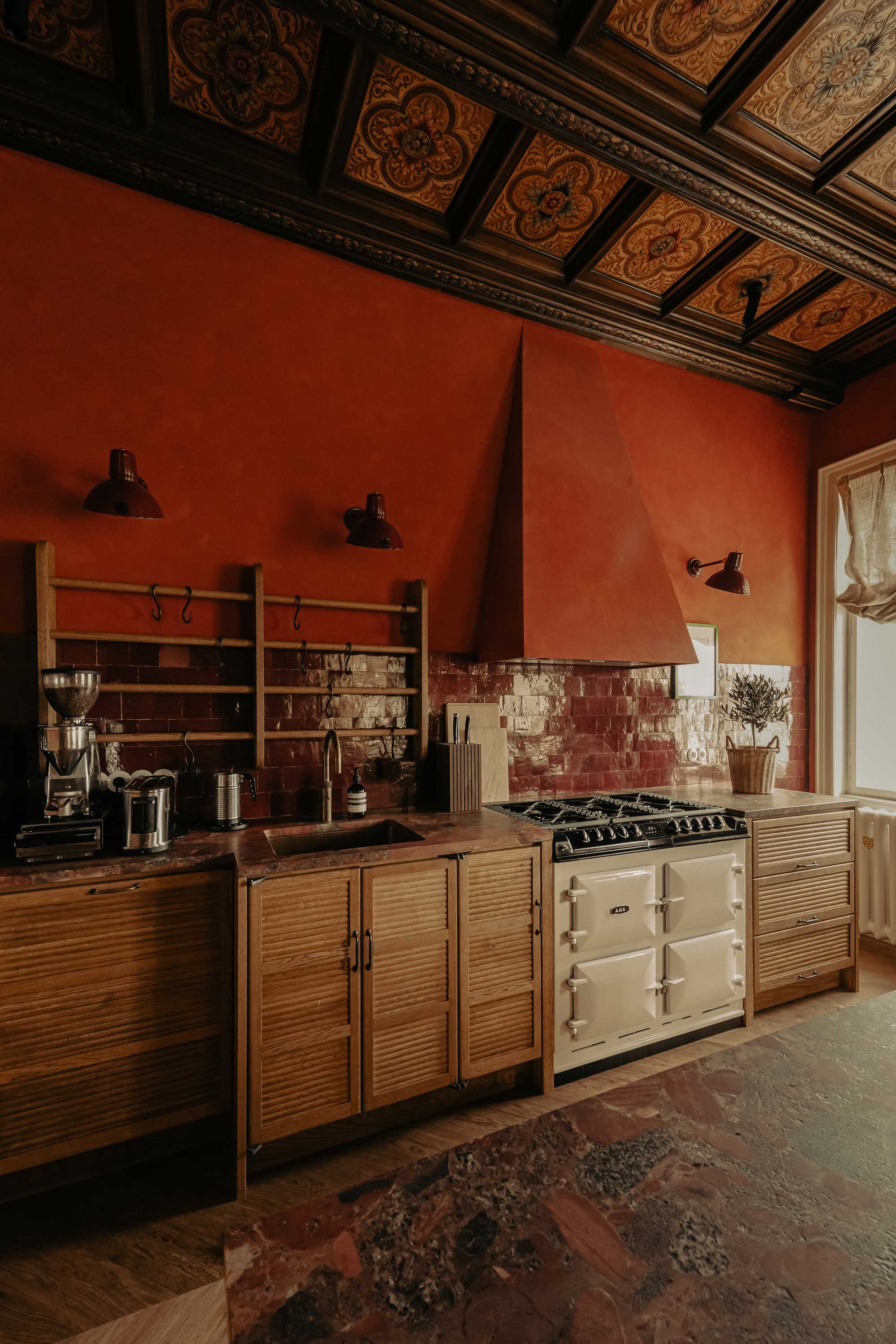
Achieving harmony within a bold color scheme no doubt involves careful consideration to complement your "power color", rather than compete with it.
The color choice for this kitchen, Paprika by Bauwerk Colour, was inspired by the vibrant narrative of the clients. 'Their shared affinity for a reddy-orange aperitif became the cornerstone of this design,' elaborates Laura Karasinski, founder and director of Atelier Karasinski. 'The hue not only reflects their personal history but also adds an inviting warmth to the space.'
Its boldness beautifully complements the classic haberdashery-style deVOL kitchen and the meticulously restored wood panelled-ceiling, keeping this feature just as strong and a focus, resulting in a visually striking yet totally balanced space. “We selected materials that resonate with Paprika while offering textural and tonal contrast. What captivates us about this kitchen is its transformation from a traditional culinary space into a focal point of the house. The infusion of the clients stories, such as their favorite cocktail, imbues the design with a distinctive essence.'
'It introduces a surprising yet welcoming element that integrates seamlessly with the historical restoration efforts,' Laura adds. 'The end result is a testament to the blend of narrative-driven design, meticulous craftsmanship, and a bold color palette.'