So Google Fi has a new logo. What, another one? Yep, and a new name too. In its third rebrand in eight years, the mobile virtual network service is now Google Fi Wireless. So far, so sensible. The clarified name should mean that more people know what Google Fi actually is (and that it exists).
The new Google Fi Wireless logo is also clearer than the previous design (and it feels very familiar thanks to the usual Google logo colours), but there are some strange things going on, and I can see why people find it confusing (no, it won't be making our pick of the best logos).

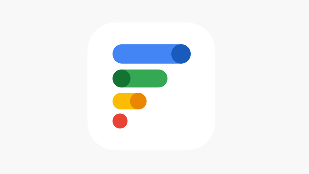
Personally, I think the Google Fi rebranding is at least an improvement for what is still a fairly unknown Google product. The previous logo spelled out 'Fi', but the overlapping colours made it messy and unclear. The new design is cleaner while still clearly part of the Google family with those colours and curves. But what it represents isn't a whole lot clearer.
At first glance, we have the same four colours we see in most Google logos – blue, green, yellow, and red (this insistence on using the Google colours for every logo has been criticised for making the apps look indistinguishable). But because of the additional hues used in this new design, there are actually a whopping seven colours in there – one more than in the previous design and in the relatively fussy Google Meet logo.
The new Google Fi Wireless logo vs the old oneI hate it pic.twitter.com/1vF7pFtMI6April 20, 2023
The reason appears to be to make the new logo look like it's made of oddly proportioned toggle switches. What do toggles have to do with telecoms? It's presumably a reference to Google Fi's mobile app, which is used to configure and control plans. The app's handy, sure, but referencing it in the logo doesn't help us understand what Google Fi is.
The final curious design decision is the use of four bars to make an 'F' when three might have sufficed (think Figma). It makes it feel like the logo is bigger than necessary, which makes it look squashed as a favicon or when it appears on the Android status bar. That seems intended to make the logo resemble signal strength bars... if you turn it on its side.... and reflect it in a mirror.
For tips on how to avoid design pitfalls, see our piece on how to design a logo. We also have a guide to the best graphic design software.