Every year, the biggest paint brands unveil their Colors of the Year, and of course, with 2026 on the horizon, we're already knee-deep in announcements.
From deep, moody reds to soft greens, these chosen hues give us a sneak peek into the mood of the year ahead. While some have been well-received, others, like Pantone's Cloud Dancer (a surprisingly 'meh' white shade), have seen a less-than-positive response.
Curious to see what color trends interior designers are actually backing for 2026, I asked some of the experts to share their own alternative ideas. These are colors they’re actually looking to use in projects – but don't fear, these are far from fads, but instead, colors that feel fresh yet timeless, uplifting yet grounding.
Interior Designer's Alternative Colors of the Year
Whether you want to color-drench a bedroom, color cap a small living room, or transform a space with an accent ceiling, these designer-selected shades show that 2026 is shaping up to be a cozy, warm, and personality-packed year for decorating.
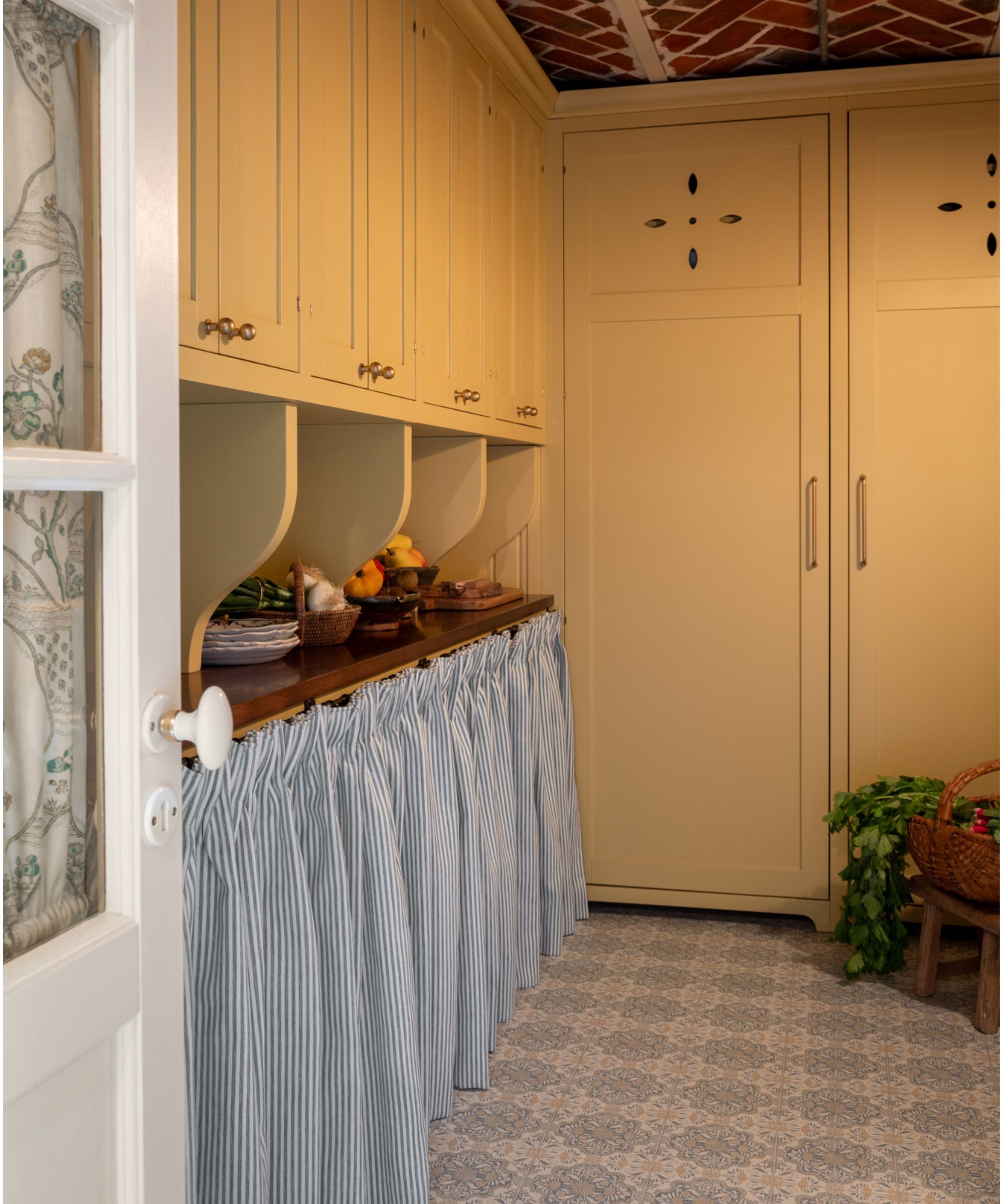
Ochre
Warm, inviting, and endlessly versatile, ochre is shaping up to be the top favorite among designers for 2026 – and the new butter yellow. Its golden, sun-kissed tones bring a sense of optimism to interiors while remaining grounded and moody enough to feel sophisticated and livable.
'My pick would be ochre,' says designer Sean Symington. 'It feels fresh yet grounding, and when used thoughtfully, it brings warmth and an extra sense of punchiness to a space without overpowering it. It’s such a lovely year-round shade.'
'My color of the year is going to be ochre,' Bethany Adams agrees. 'I haven't used it yet, but I'm developing concepts for a late mid-century home, and I just keep circling back to this rich, fabulous, happy shade. It pairs so beautifully with my forever favorite, burgundy, not to mention greens and cobalt. I'm looking forward to using it on everything from walls to upholstery,' she adds.
Alicia Meirles, creative director at OWN LONDON, sums up why ochre feels so right for 2026: 'Decorating with yellow is sunny and optimistic, offering a warm, soft, golden canvas. This subtle yellow hue evolves from beige, introducing a more cheerful, charming, and appealing tone that blends familiarity with a touch of much-needed joy. It seamlessly integrates into various interior styles, from classic to contemporary minimalist, and everything in between.'
Lick's home color edit for 2026 named their hue Yellow 07 among their palette of colors of the year, while Farrow & Ball's Duster is an underrated aged yellow, and Benjamin Moore's Deep Ochre brings the moodiest tones.
Inky Green
Among verdant fans, deep, inky green is emerging as a favorite for grounded, timeless, and elegant decorating. Rich yet subtle, it’s a color that adds depth to a room while maintaining that sense of calm that comes from decorating with green – plus it's a hue that works equally well in contemporary settings and more traditional schemes.
'Deep, inky green offers a timeless, grounding quality and works well in both contemporary and traditional interiors,' says designer Portia Fox. 'Its practicality makes it particularly suited to family homes, where durability is as important as aesthetic appeal.'
Green paints have been particularly popular for Color of the Year 2026, with Behr naming Hidden Gem as their pick and Valspar selecting Warm Eucalyptus (8804-28F). But for a deeper take, inky greens like Farrow & Ball's Studio Green or Sherwin-Williams' Night Watch are great choices.
'Inky green pairs well with natural materials, dark joinery, and brushed or antique metal finishes,' she adds. 'It aligns with the growing focus on wellness and sensory-led design, creating spaces that feel calm, confident, and connected to nature without overwhelming the room.'
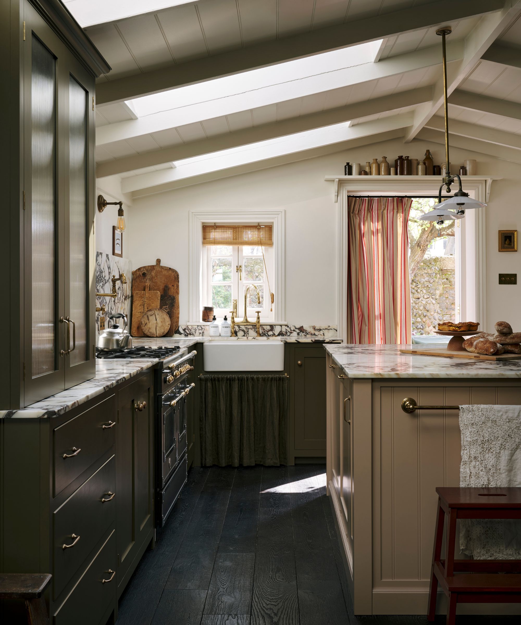
Brown
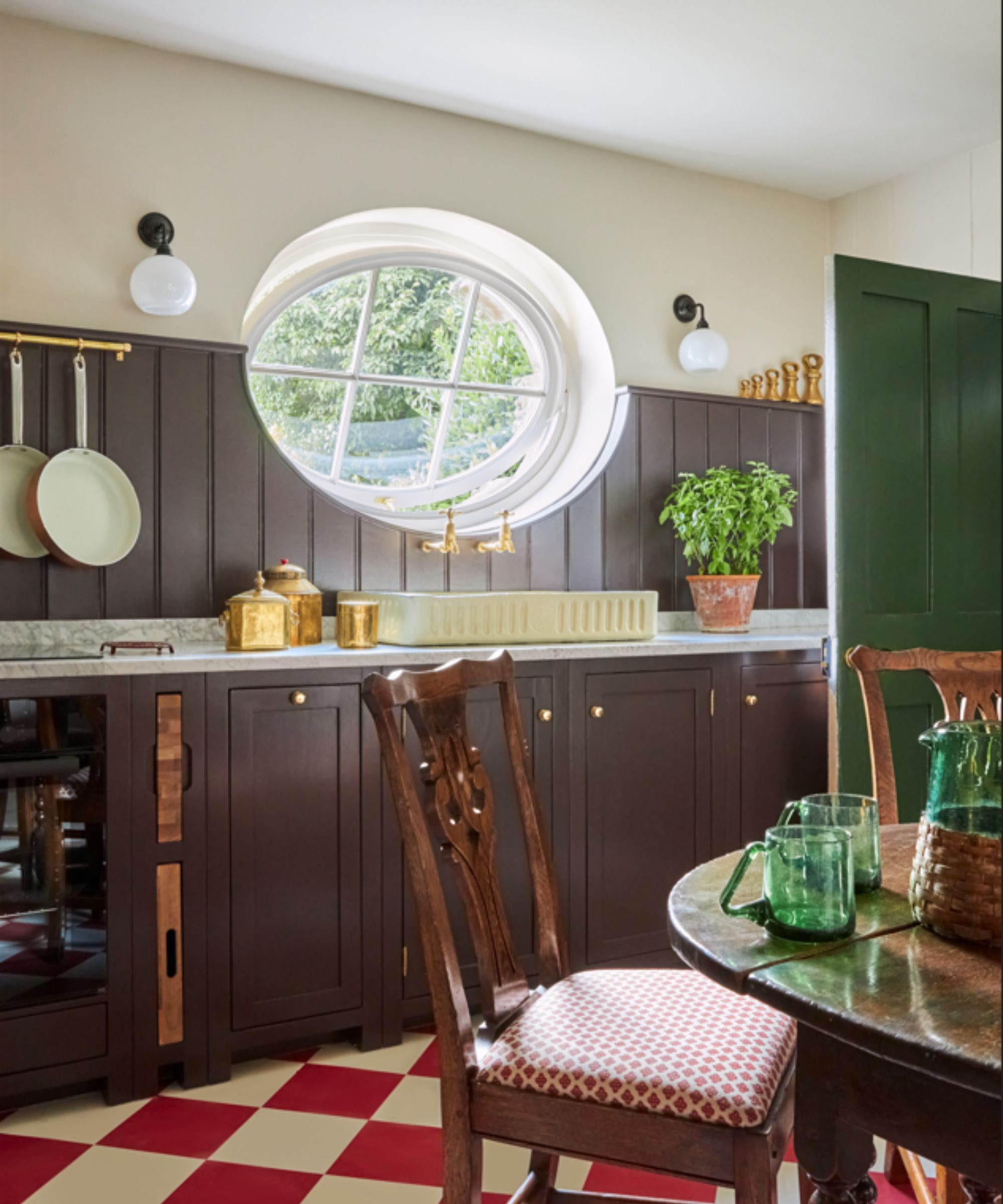
For 2026, warm, earthy browns are stepping into the spotlight, offering a comforting alternative to cooler neutrals. Rich without being as heavy as black, brown shades bring a sense of depth to interiors – from kitchen spaces to moody living rooms.
Jennifer Davis of Davis Interiors names Tea Leaf by Sherwin-Williams as her Color of the Year, explaining that it is 'a rich, grounded neutral that quietly embraces warmth in a way that feels both elevated and livable. What draws me to it most is its subtle red undertone. It offers the depth and soul of a burgundy without asking you to fully commit to a true wine or red palette, making it incredibly approachable for homeowners who want warmth without boldness.'
'It lives in that sweet spot between brown and muted red, giving it an earthiness that feels layered rather than trendy,' Jennifer continues. 'It’s the kind of color that grounds a room and makes everything around it feel more intentional.'
'As we look toward 2026, I see clients craving spaces that feel collected, cozy, and emotionally grounding. Tea Leaf delivers that beautifully. It’s warm, nuanced, and timeless, perfect for those who want depth and richness without stepping too far outside their comfort zone.'
Alternatively, House of Hackney's Carnelian is a purple-brown shade with rich red undertones that pack a punch, while Farrow & Ball's Deep Reddish Brown is the designer Melissa Oholendt founder of Oho Interiors pick for her Color of the Year.
'My absolute favorite color right now is Farrow & Ball's Deep Reddish Brown. It can feel both masculine and feminine depending on how the space is styled,' she explains. 'It's an incredibly juicy and versatile color that immediately brings soul to a space. On the lighter side, Farrow & Ball's Shaded White does a great job of reading white when you wrap a whole space in it. It's cozy without reading yellow. This really is a perfect neutral that can balance anything else.'
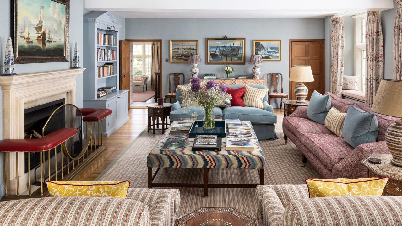
Powder Blue
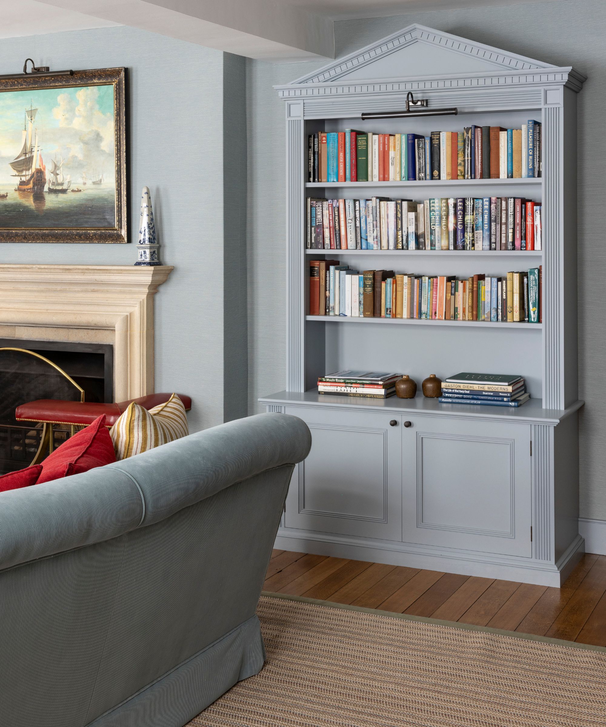
Blue has been popular for a few years, but the soft, serene, and quietly confident powder blue is emerging on top next year.
As Marcelina Janiszewska from Project London explains: 'Powder blue is set to be a standout color for 2026, offering a softer, more expressive alternative to classic neutrals. Its light, calming quality makes it particularly suited to bedrooms, children’s spaces, and areas where a sense of ease is key, while still feeling grown-up when layered thoughtfully.'
'It works beautifully alongside warmer tones such as ochre, mustard, and bronze, or with natural greens for a more grounded feel,' she continues. 'Used on cabinetry, feature walls, or even ceilings, powder blue brings gentle character and cohesion to interiors, striking a balance between freshness and longevity.'
Dulux's Color of the Year is actually a trio of blues that includes a pale blue dubbed Mellow Flow, while Lick's Blue 14 is a serene alternative with warm white undertones.
While they might not make the most sense as a color scheme for your home, used individually, these colors make up the mood of 2026 beautifully. Whether you’re ready to commit to a bold wall color or simply want to introduce a new tone through accent pieces, these expert-approved shades offer inspiration for the year ahead and beyond.