London's National History Museum was the UK's most visited indoor attraction in 2021 and 2022. And visiting just got even better, as the museum's recently got a brand new visual identity, created by Marina Willer and her team at Pentagram along with Stuart Watson and Nomad.
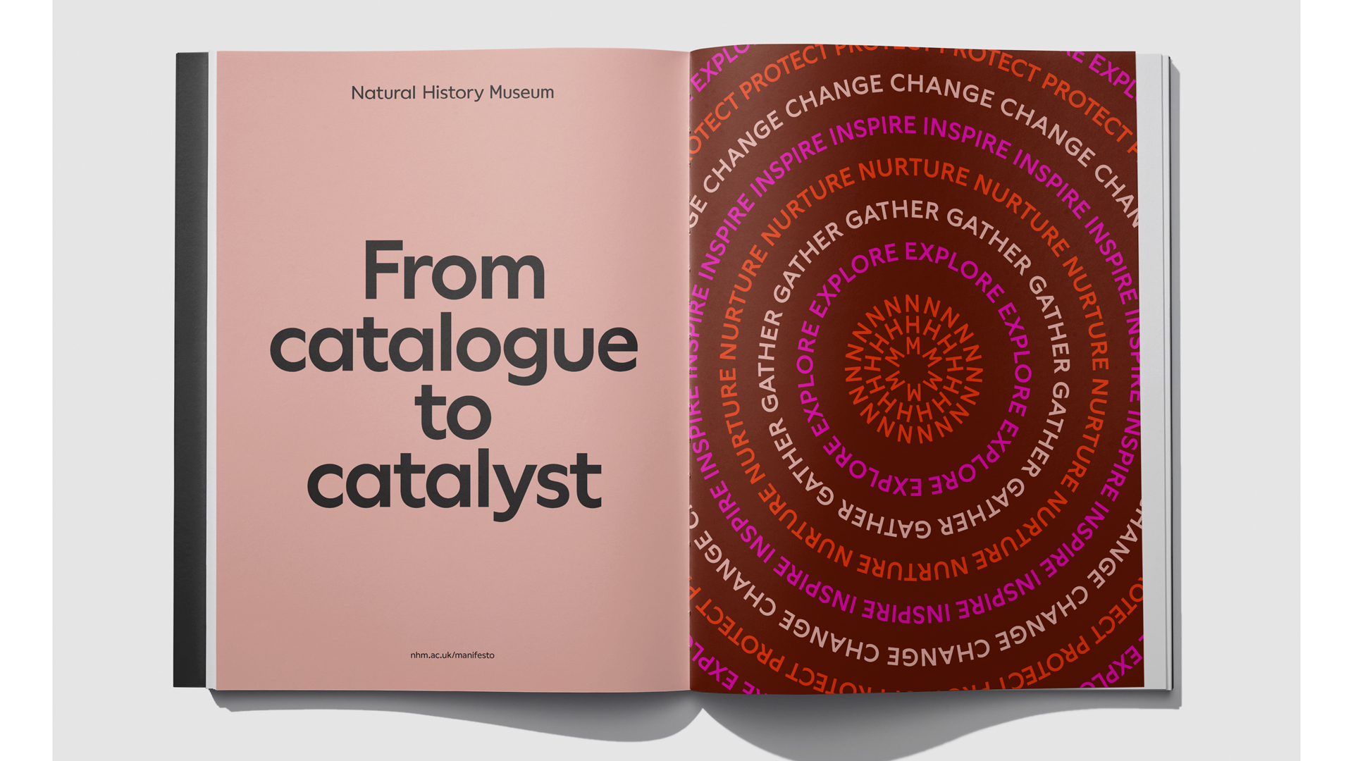
The museum's mission is to turn visitors into advocates for the planet, and ultimately create a future where people and planet can thrive. The new brand aims to make this mission happen, with a digital first identity that engages visitors. "We summarised the role of the museum as: moving from passive catalogue to active catalyst," says Willer.
Central to this rebrand is the symbol NHM, which forms a circle that ripples out, and works especially well in motion. To find out more about this stunning new identity, we spoke to Willer and Watson about their inspiration, the challenges they faced, along with their favourite parts of the process.
What inspired you to create this scheme?
Marina Willer: The connection between all things in nature. From microscopic organisms to the planet and the universe, from a dandelion to a school of fish and the ripple effect referring to the transformation that we must inspire. The brand in motion always pulsating and igniting change, responding to sound and being the active catalyst.
How did you work together on the project?
MW: We collaborated closely from start to finish, our Pentagram team bringing the experience of cultural branding, and Nomad’s experience with mass brands. With the aim to create a malleable and motion-led identity.
What challenges did you come across when creating it?
Stuart Watson: The many dimensions that the brand needed to include, from different locations such as London and Tring, many sub brands such as Wildlife Photographer of the Year, the Urban Nature Project, exhibitions and many scientific facets, programmes and products of the Museum.
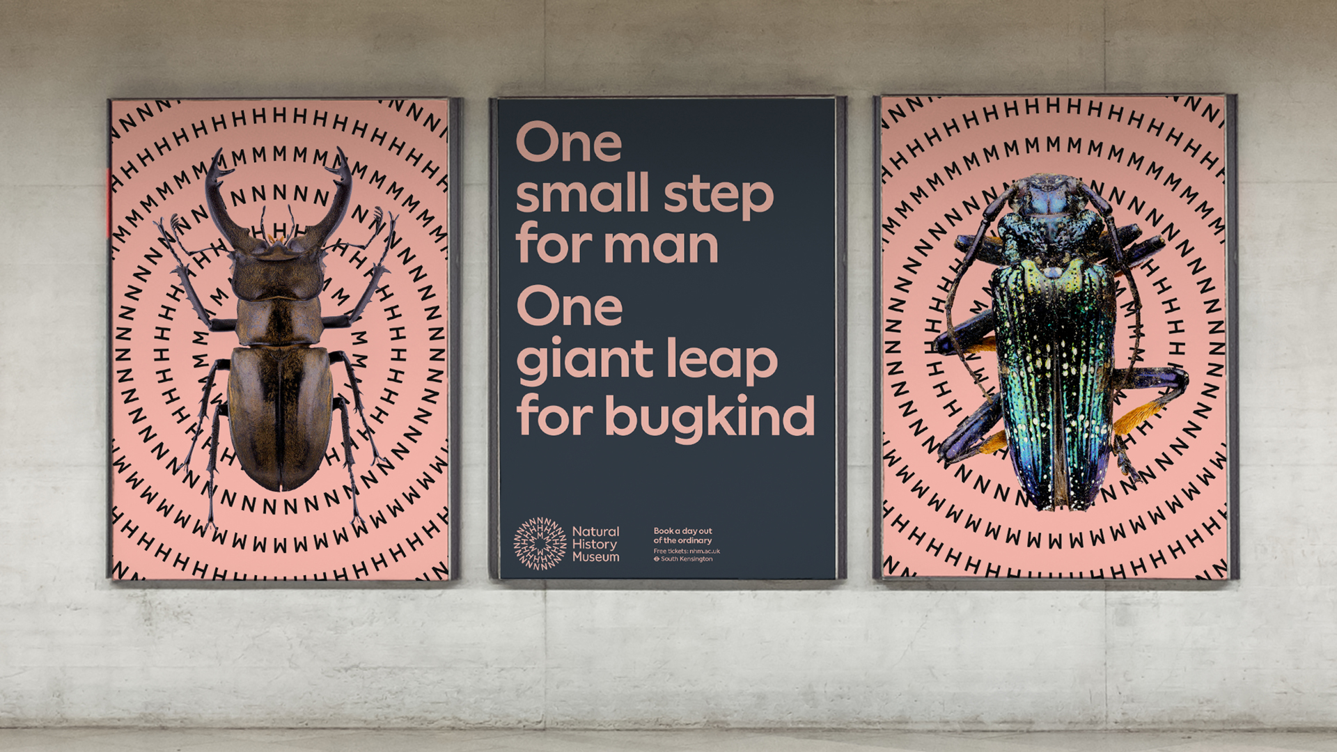
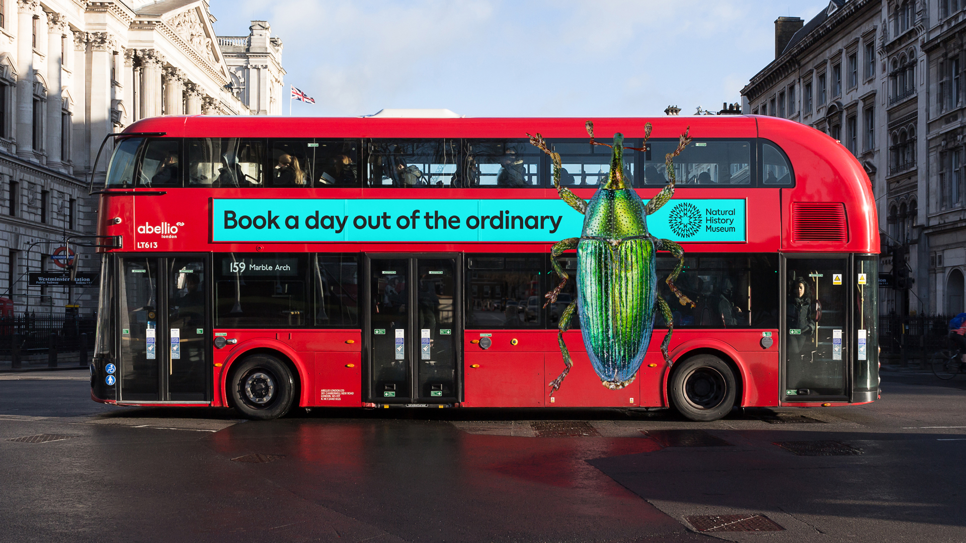
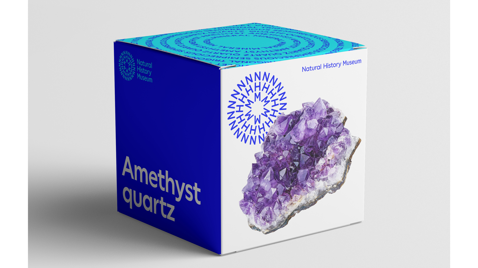
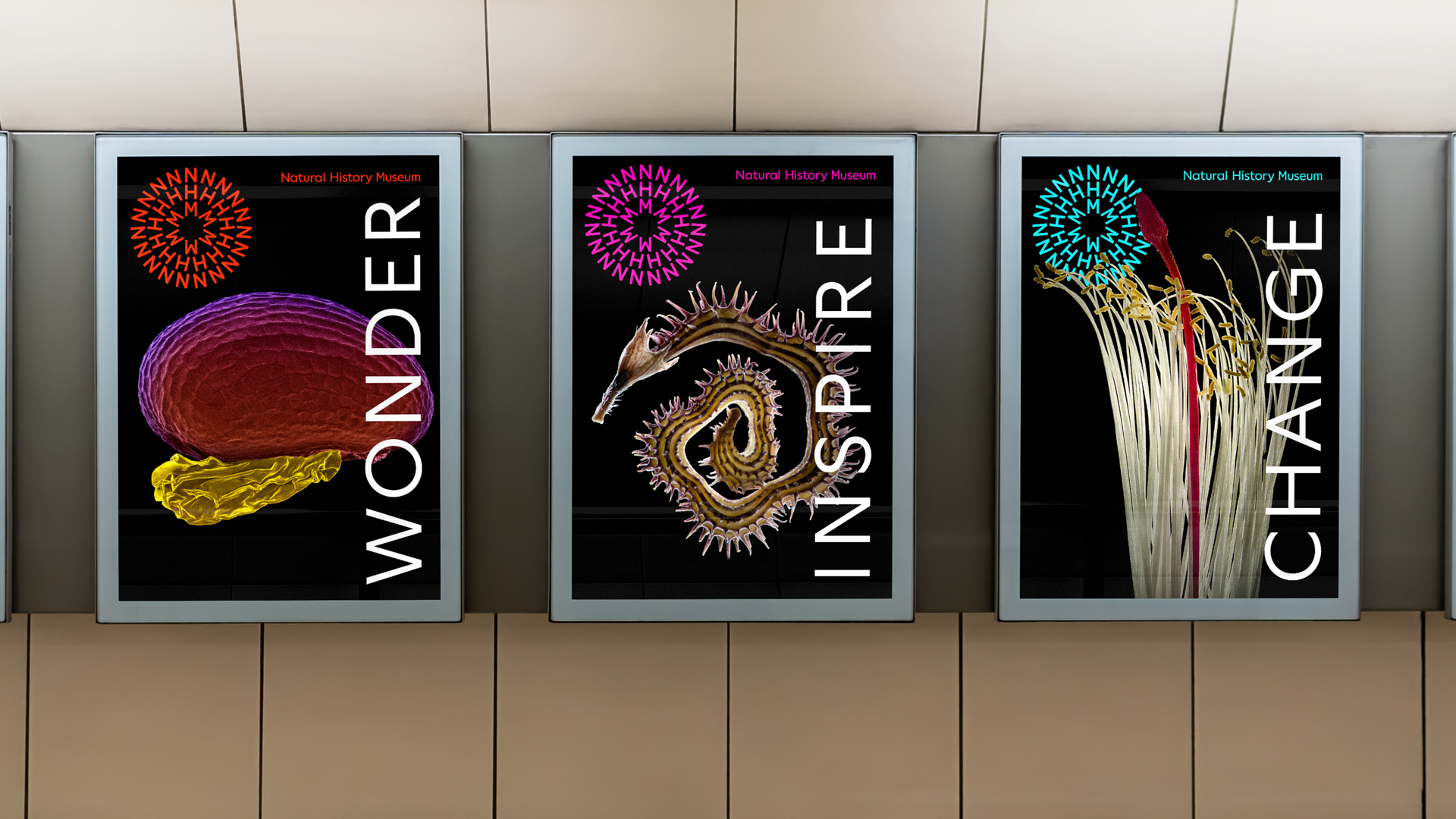
It needed a symbol that was iconic and made reference to the planet, but also included the initials NHM within it, so that it could be used in the future as a shortcut to the name when positioned alongside projects within the Museum ecosystem without repeating its long name.
What is your favourite part of the finished piece?
MW: The logo in motion reacting to sounds.
How important was motion to the new identity?
SW: Extremely important. Since the beginning we created with motion in mind to work as an active brand aiming to entertain and engage audiences.
Which part of the process did you enjoy most?
SW: It’s always a great feeling when you come up with the vision for the logo and how that naturally unfolds as a system.
How do you feel the identity reflects the museum?
SW: It is a catalyst brand, it is contemporary but also timeless. It makes reference to most things in nature and the planetary perspective, which must be present in all that the museum does.
Tell us about the generator you created for creating Patterns and Word Rings
MW: When we came up with the solution for the logo, all the patterns started to appear from there. We wanted to be able to give the Museum design team the tools to create these assets coherently and easily. The generator allows you to create words or sentences in any of the colours from the palette.
How accessible is the new identity?
SW: Its diversity of colours and its mass appeal invite people of every origin, gender, age and background. The type is timeless and friendly, of a humanist approach.
We ran our own tests and worked closely with the Museum on accessibility standards as usual.
How do you think this branding helps the museum stand out amongst other museums?
MW: It’s a brave brand that is active and memorable. It works for all ages and different backgrounds.
It turns the museum to focus on the future and the planet as a crucial consideration, but with a tone that is celebratory and joyful.
For more about this project, visit Pentagram's website.
For more in the How we Made series, delve into the process behind the LEGO Disney Castle and Eurovision's visual identity.