I'll admit, at first, thinking about an orange and green color combination in an interior made me squirm. Even with my affinity for color, I was perplexed by how they could be paired well together. But then I spoke with designers, and the overwhelming opinion they shared was that it's an obvious choice, it just requires a little care.
"In the language of interiors, color is more than decoration — it’s storytelling," shares St. Louis-based interior designer, Rachel Blindauer. "Orange and green, at first glance, might seem like unlikely companions, too bright or bold. But under the right conditions, they can create some of the most dynamic and joyful spaces imaginable."
Orange and green are commonly found next to each other in nature: think of juicy citrus next to lush foliage, autumn leaves, or a summer sunset melting into the treetops. In fact, when it comes to what colors go with green, orange is a natural fit — and the result can feel surprisingly grounded, fresh, and invigorating.
So, how do you make an orange and green color combination work? First of all, creating a sense of balance is key. Green is inherently calming, tied to growth and renewal. Orange, on the other hand, brings warmth, optimism, and a hint of playful energy. "Together, they create a dialogue that feels both vibrant and organic — if you strike the right tone," explains Rachel Blindauer .
A sage green wall with rust-colored throw pillows, or a velvet olive sofa layered against a backdrop of warm, muted orange drapery — these are examples of schemes that feel layered, lived-in, and sophisticated.
In each case, "the undertones matter," says Rachel, adding, "Muted, earthy versions of both colors are easier to live with than their brightest, most saturated cousins."
But that's not to say you need to shy away from those more energetic colors all together. It's just about knowing your space and the aesthetic you want to create. To help you take the leap, below are three designer-approved orange and green color combinations to inspire you.
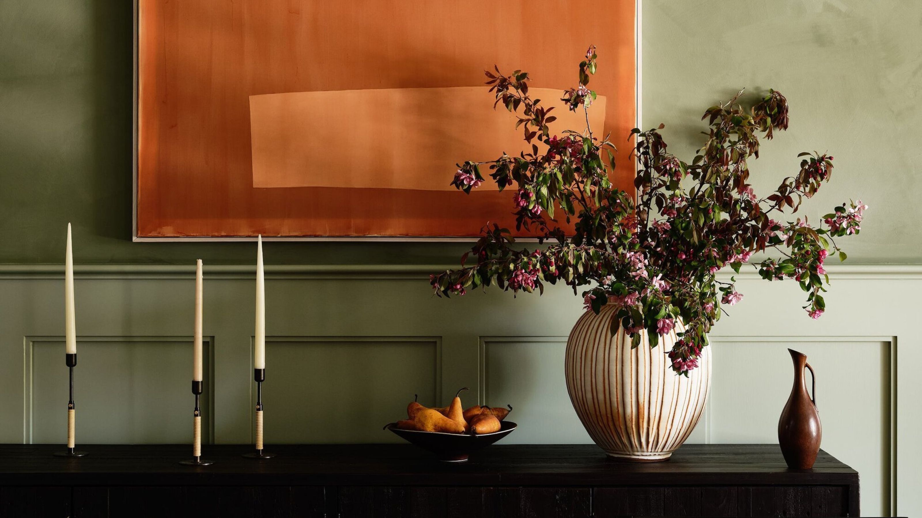
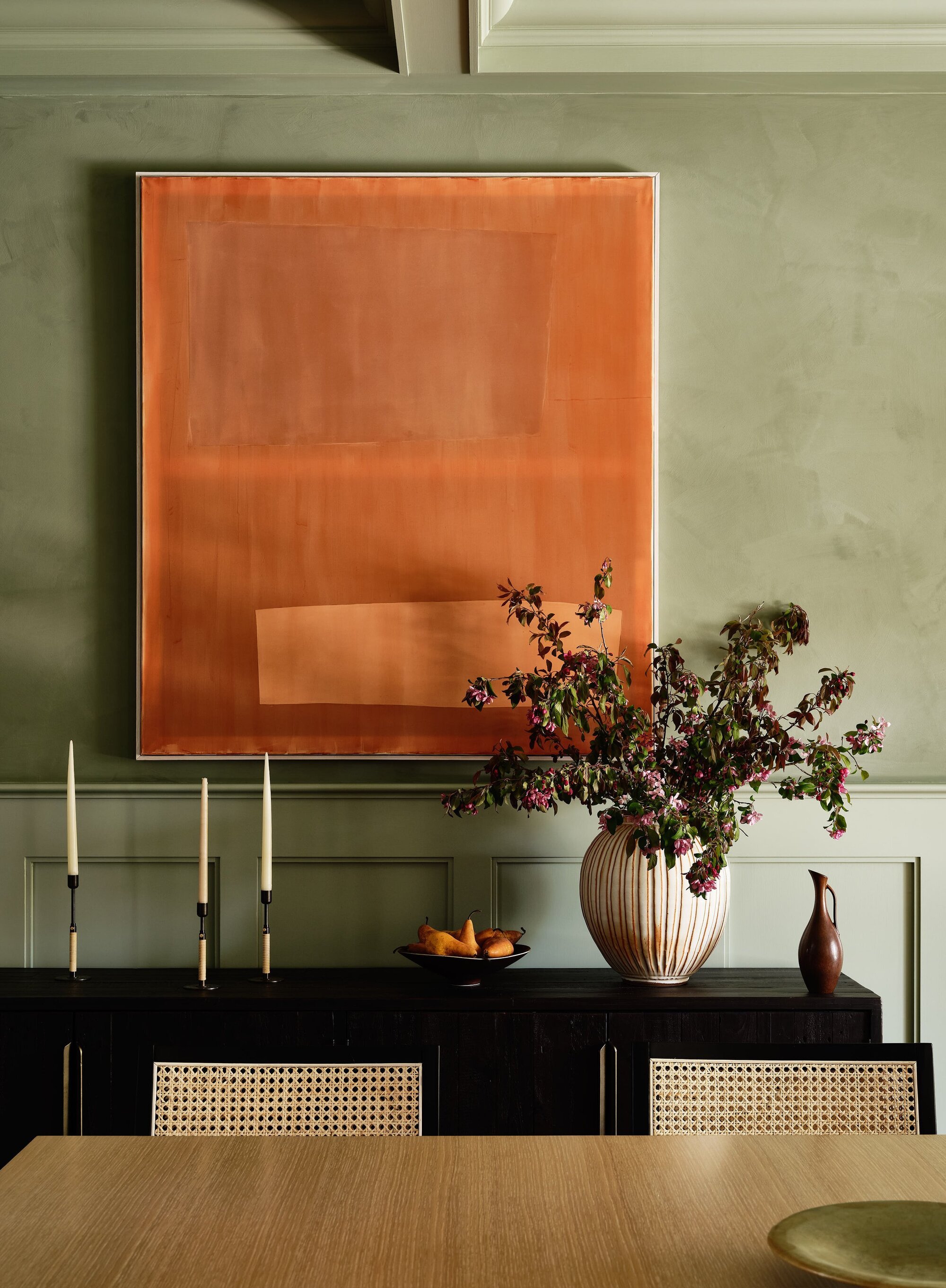
1. Olive Green and Terracotta Orange
The first (and my favorite) orange and green color combination is a vibrant olive paired with terracotta orange. "It's an earthy, sophisticated pairing that feels timeless," says Rachel.
Canada-based interior designer and director at Alykhan Velji Designs, Alykhan Velji, says, "More saturated greens and oranges can be used beautifully across all room types, but we particularly love introducing them in spaces where a bold, unexpected statement can make a big impact."
As a dining room color idea, or even in your laundry or power room — these are all fantastic places to embrace this vibrant palette. It brings character and warmth to areas that are often overlooked, "making everyday spaces feel a little more special," says Alykhan.
Layer this orange and green color combination with natural textures like linen, leather, or reclaimed wood for a more minimalist approach.
2. Sage Green and Soft Apricot
Next up: sage green and apricot. This orange and green color combination is lighter, airier, and perfect for creating a gentle energy in high-trafficked areas like a sunroom, kitchen, or creative studio.
The softer tones create a more peaceful environment that is easy on the eye and caters well to a minimalist color palette craving just a touch of color.
Rachel recommends using this palette in colorful dining rooms as "orange stimulates appetite and conversation, and green keeps the atmosphere relaxed." However, you don't have to limit yourself to any certain room, there are plenty of spaces where sage green and apricot will work well.
Try opting for an even softer apricot shade, like Little Greene's Tuscany, to match the softness of sage green. This paint shade would suit children’s spaces particularly well because "the colors can feel playful and imaginative without being overstimulating," says Rachel.
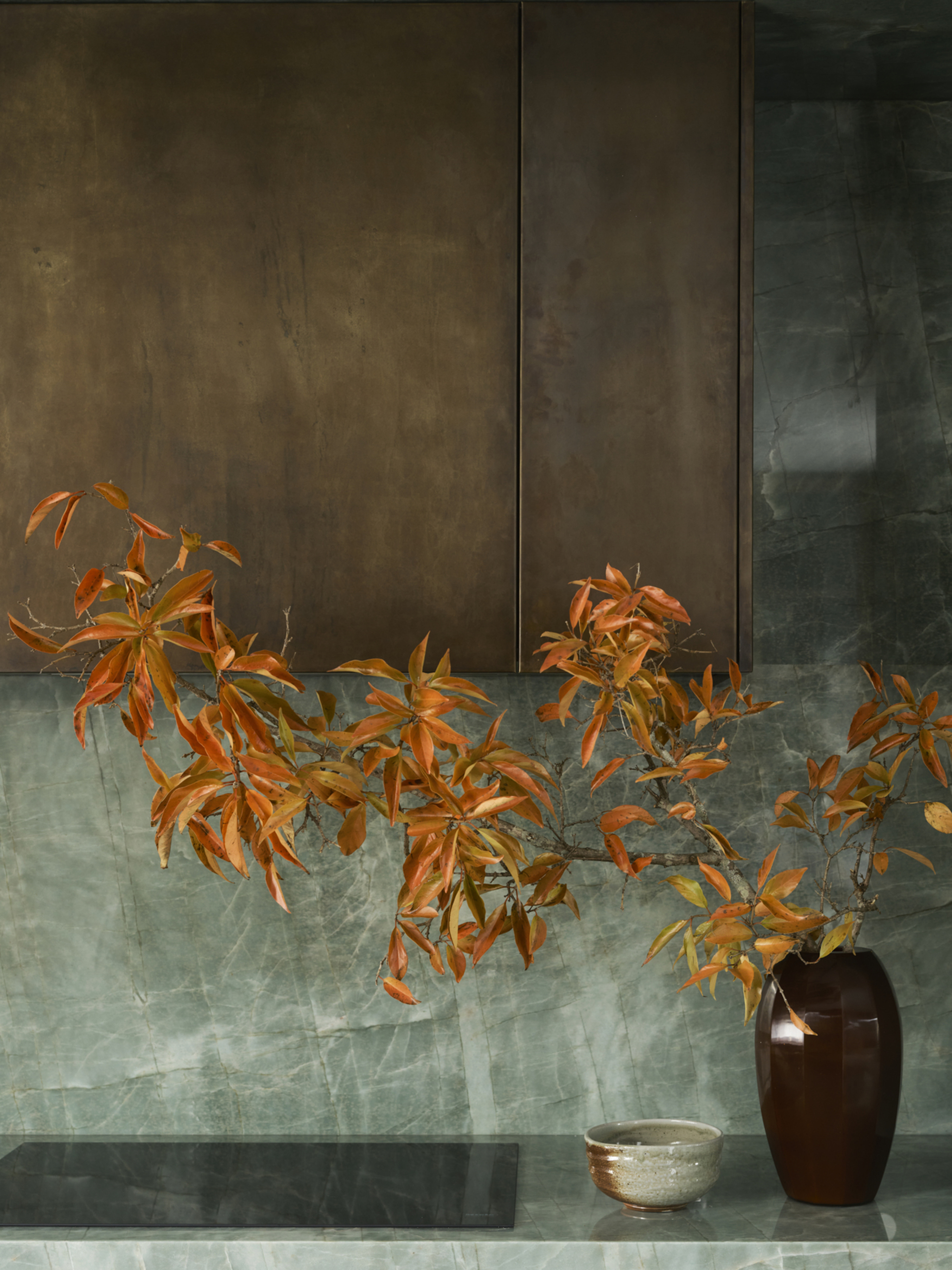
3. Deep Forest Green and Burnt Orange
Last but not least, we have deep forest green and burnt orange to wrap up our orange and green color combinations. This darker iteration is rich and dramatic, yet incredibly grounding when used thoughtfully. They are earth tones after all.
"Shades like deep forest green paired with earthy rusts or black-orange colors create a cozy, welcoming atmosphere," says Alykhan. "These richer tones add a sense of depth and sophistication, making the space feel thoughtfully layered and intentionally warm."
This combination sings in moody dining rooms, cozy libraries, or dark-academia-inspired offices. However, you can also lighten up the duo by incorporating burnt orange and forest green into neutral color schemes.
What to Avoid With an Orange and Green Color Scheme
So, while it's clear orange and green can work together in interiors, that's not to say this is a pairing that doesn't require some thorough planning, patience, and practice.
"When working with this color combination, it’s important to be mindful of the tones you choose," says Alykhan. "Lighter, pastel versions of green and orange can sometimes feel less cohesive or sophisticated when paired together. Instead, we recommend leaning into deeper, more saturated hues, which tend to harmonize beautifully."
The balance of darker and lighter colors creates contrast in design, resulting in a more cohesive look. When selecting your preferred orange and green hues, here are a few key things designers say to avoid:
- Over-Saturation: "Neon versions of green and orange together can quickly feel chaotic and overwhelming," says Rachel.
- One-to-One Ratio: Instead of using both colors in equal measure, "let one dominate and allow the other to play a supporting role," says Rachel. One color can be used in large doses, like as a wall color or rug, and the other should be saved for strategic accent pieces.
- Ignoring Undertones: Cool-toned greens don’t always harmonize with warm oranges. Matching undertones (warm with warm, cool with cool) ensures a more cohesive look.
Orange and green color combinations can absolutely work, especially when you're working with cozy paint colors, and carefully make sure the shades harmonize with one another. The pairing can be energizing and vibrant, or soft and understated. It just depends on how you use them.
And when in doubt, "I always suggest weaving in plenty of neutrals — creamy whites, soft beiges, and natural textures like rattan or light oak — to create breathing room between the bold moments of color," says Rachel.