Marketing and promotional material is one of the most vital elements for selling a movie. Film posters speak volumes – from setting the mood to establishing the theme, a poster is meant to pull you in and make you want to learn more from just a quick glance. So what better way to test your artistic skills than to try your hand at designing your very own?
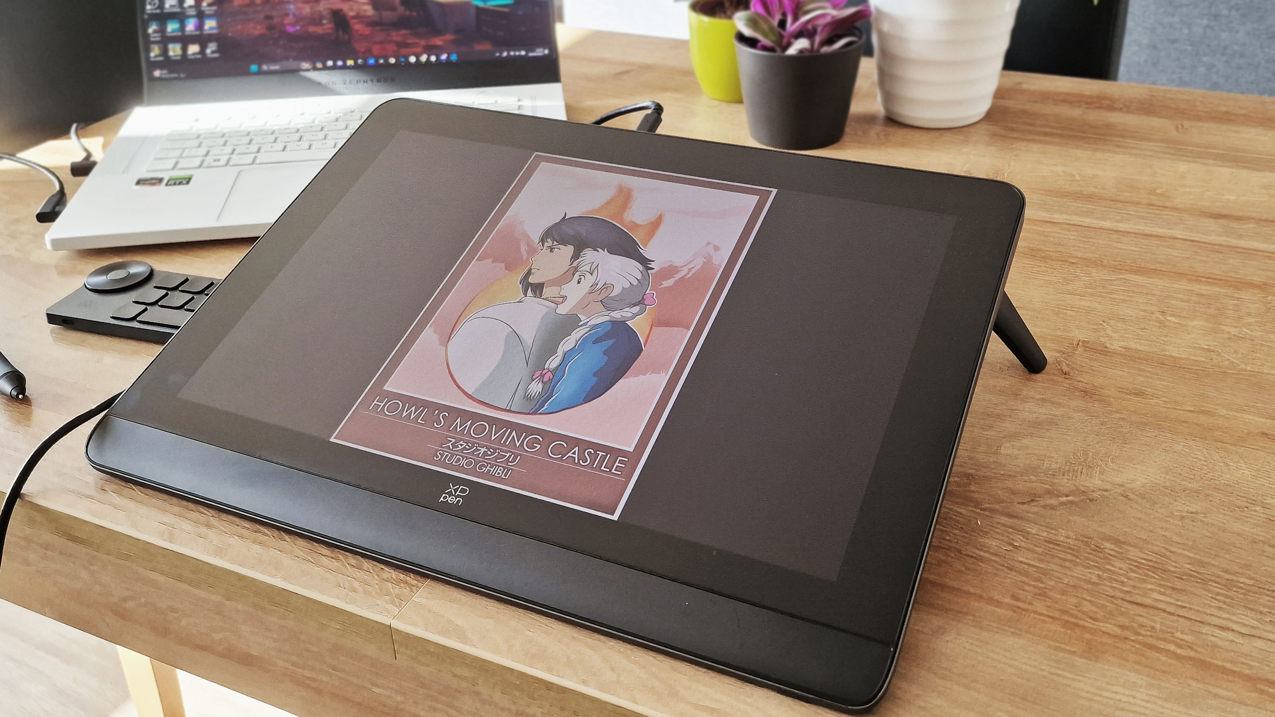
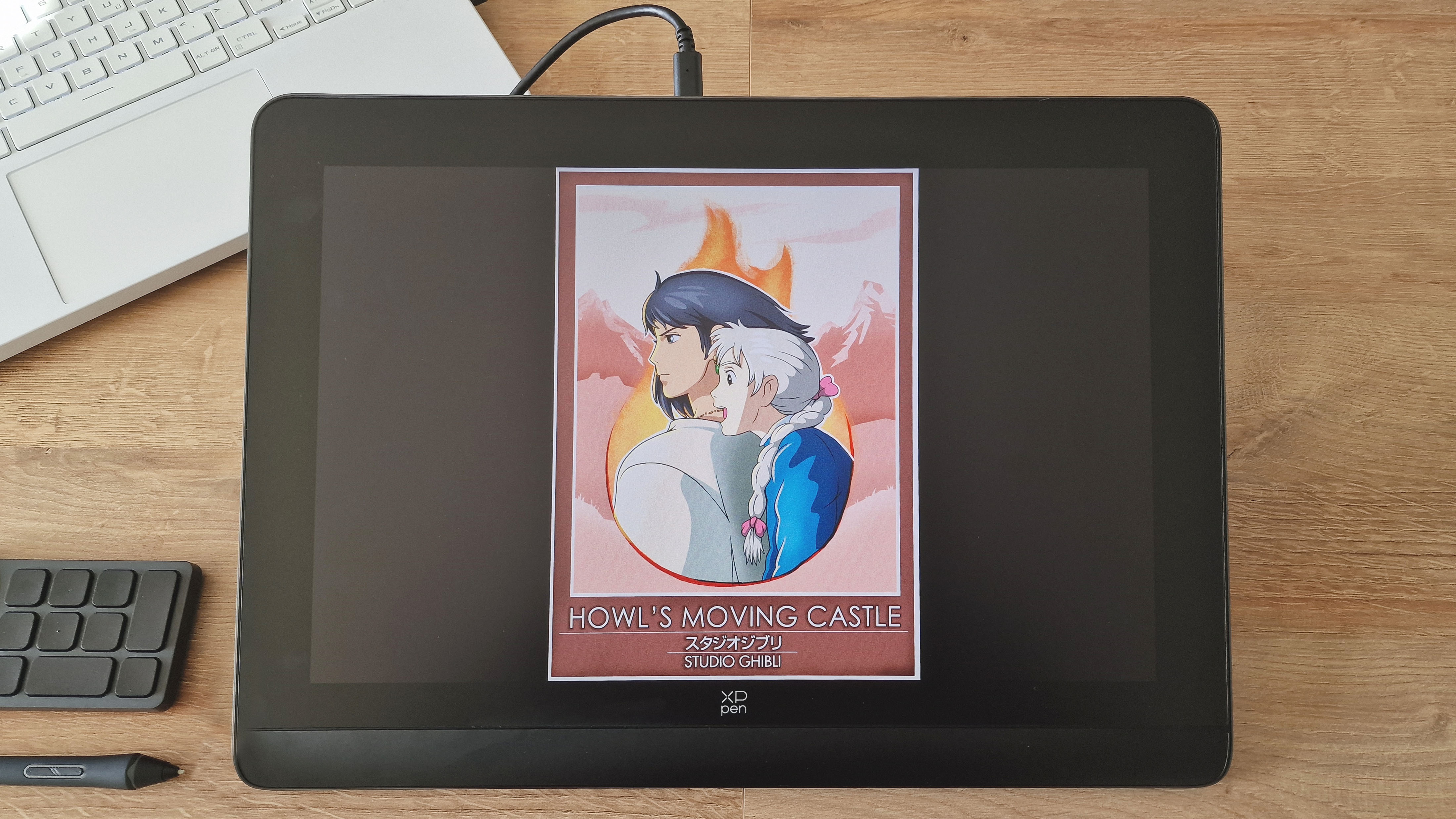
Using the brand new XPPEN Artist Pro 16 (Gen 2) tablet, I challenged myself to take one of my favourite movies and design my own poster for it. This allowed me to test my graphic design skills and whilst trying something a bit different to my usual illustrative style. It also allowed me to fully utilise the hardware of the XPPEN Artist Pro 16 (Gen 2). I’ve been using this tablet for a few varying art projects recently (such as this rework of an older illustration) but graphic design was one avenue I hadn’t properly touched upon yet, and I wanted to see how it fared for work using the varying design tools in Photoshop. And it’s safe to say that, as expected from previous experience, the tablet didn’t disappoint.
01. Introduction
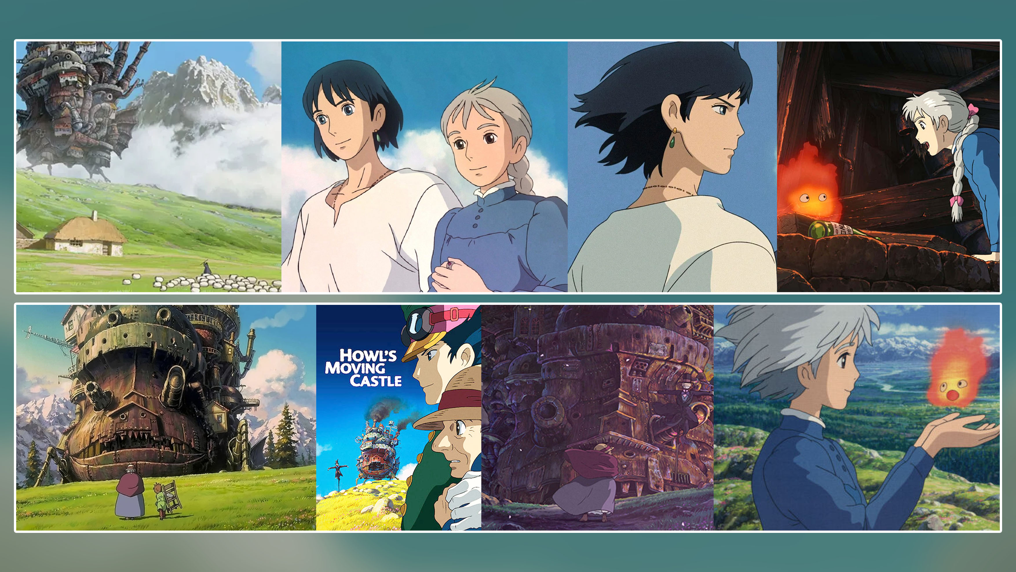
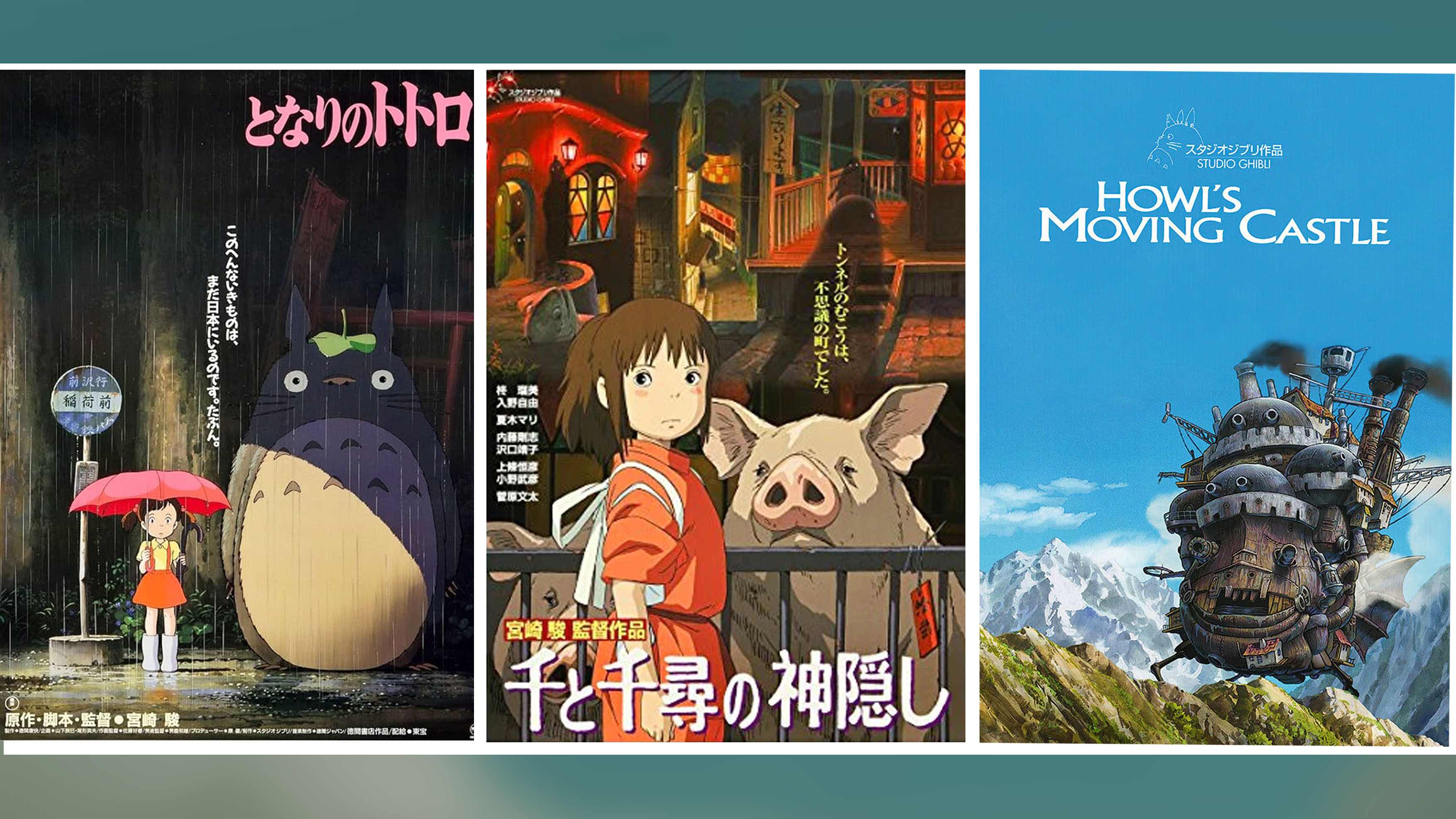
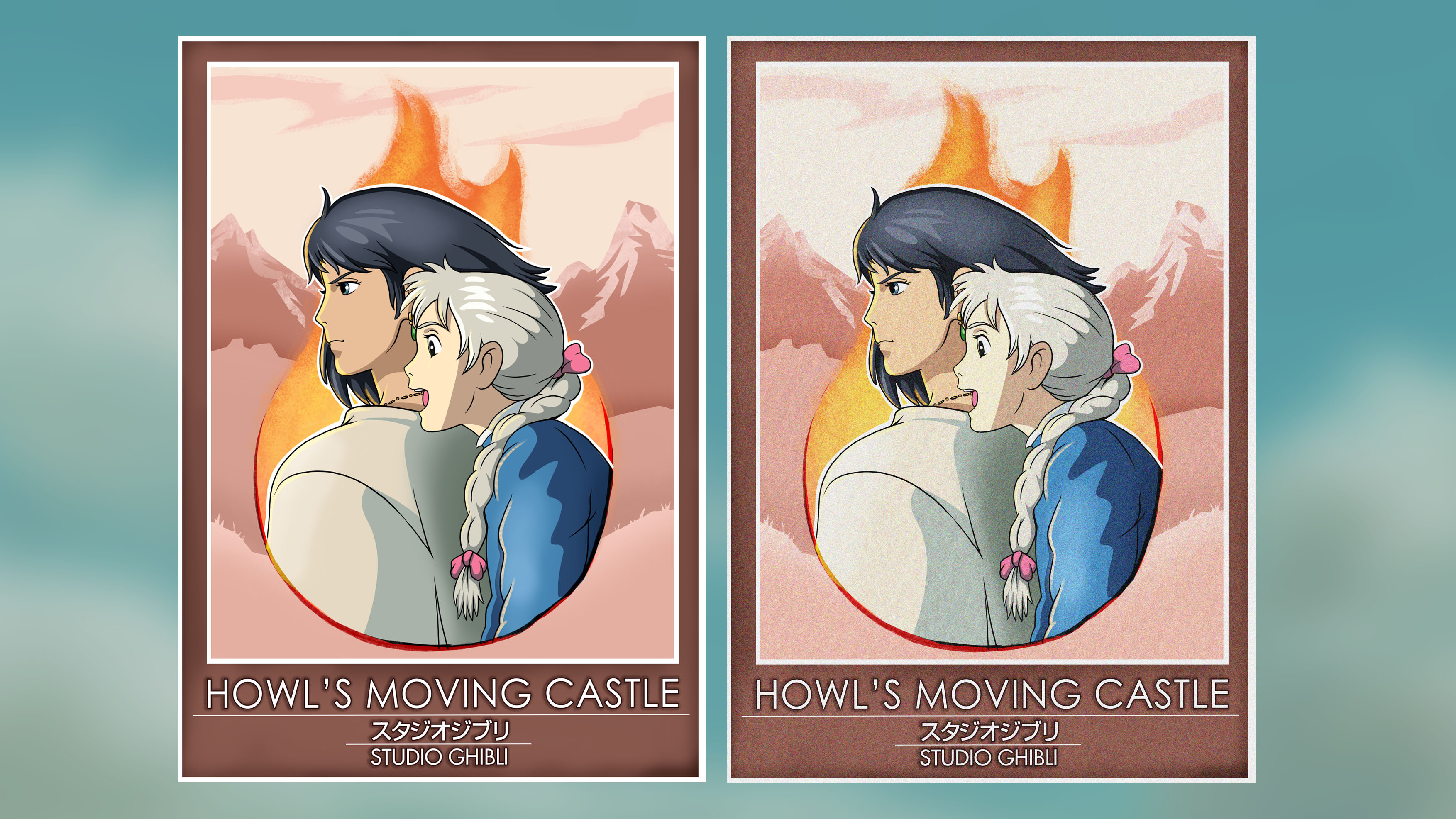
For this project, I decided to base my poster on the Studio Ghibli classic “Howl’s Moving Castle”. This not only allowed me to create something based on a film I love, but also to work with an already beautiful and recognizable art style. The first step for this project was to gather references to get a rough idea of the direction I wanted to go for when designing. I wanted to keep this poster relatively simple in terms of detail, so the references were primarily to get an idea of color and theme. I gathered a bunch of official Ghibli posters as well as screenshots from the film I could easily glance at whilst working to keep my style and colours consistent – you can see the collective mood boards below.
02. Planning
Once I had a general idea of theme and direction locked, it was time to start mapping out the image itself. I knew I had three major elements I wanted to convey:
- The two main characters, Howl and Sophie
- Mountains to convey the open landscapes of the film
- The title
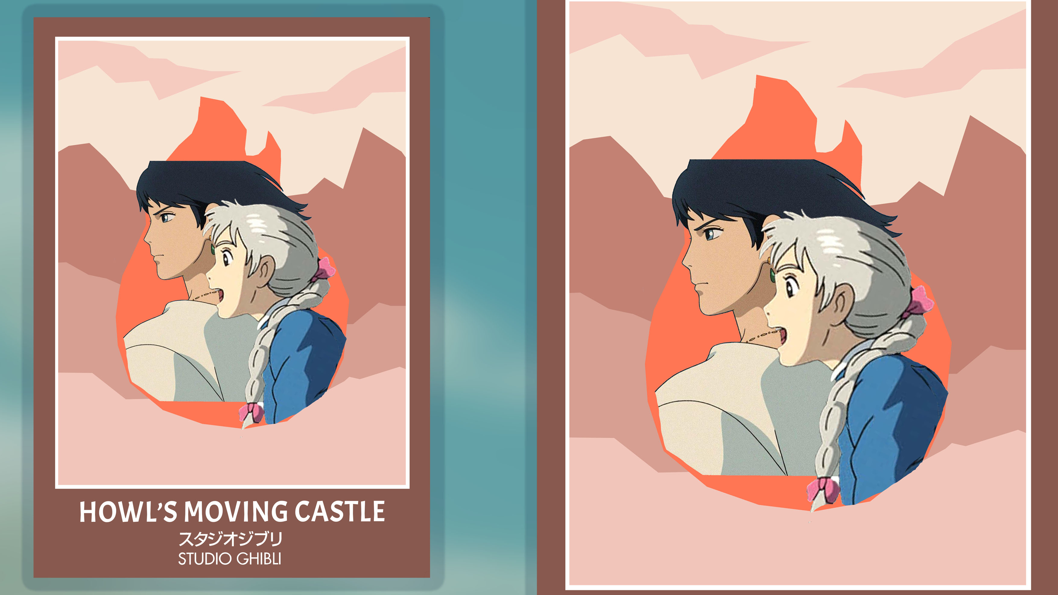
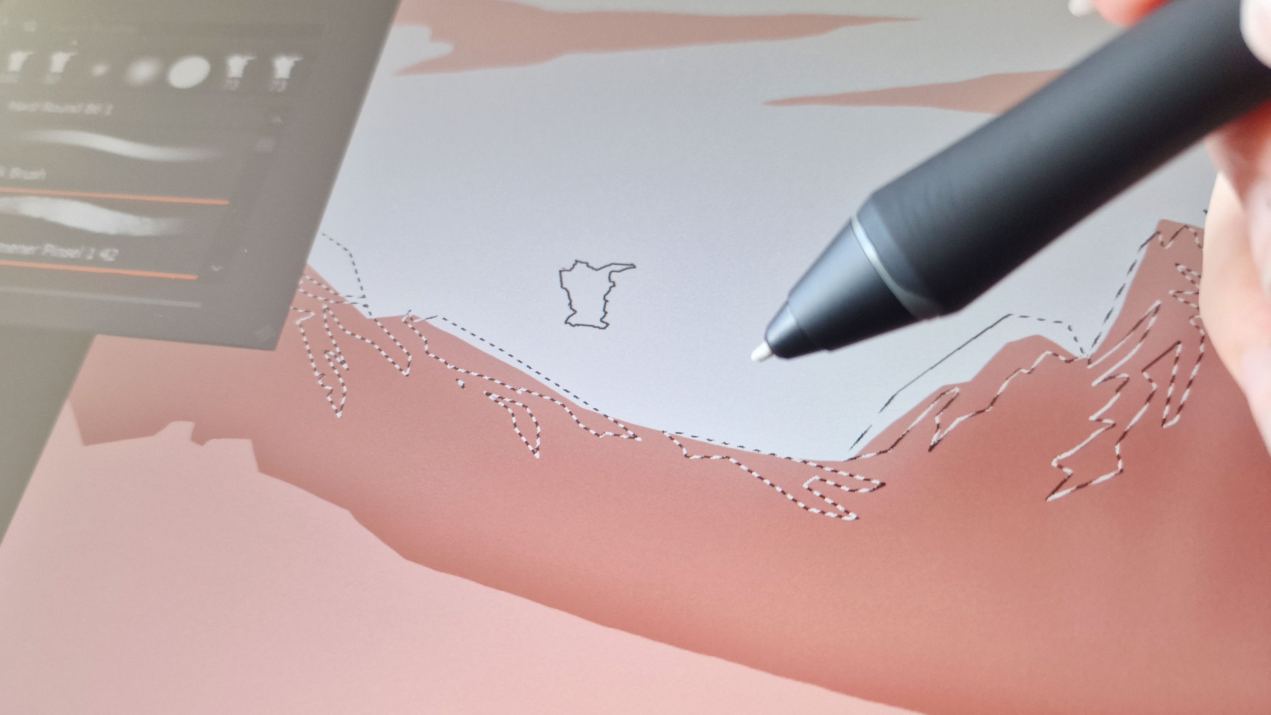
With these staple elements in mind, I put together the rough plan below. Using the XPPEN stylus meant I could quickly use the Photoshop lasso tool to roughly lay down the shapes of the mountains and the flame behind the characters. Making a rough draft gave me a great starting point, and you can see the original draft for the poster below.
03. Line art
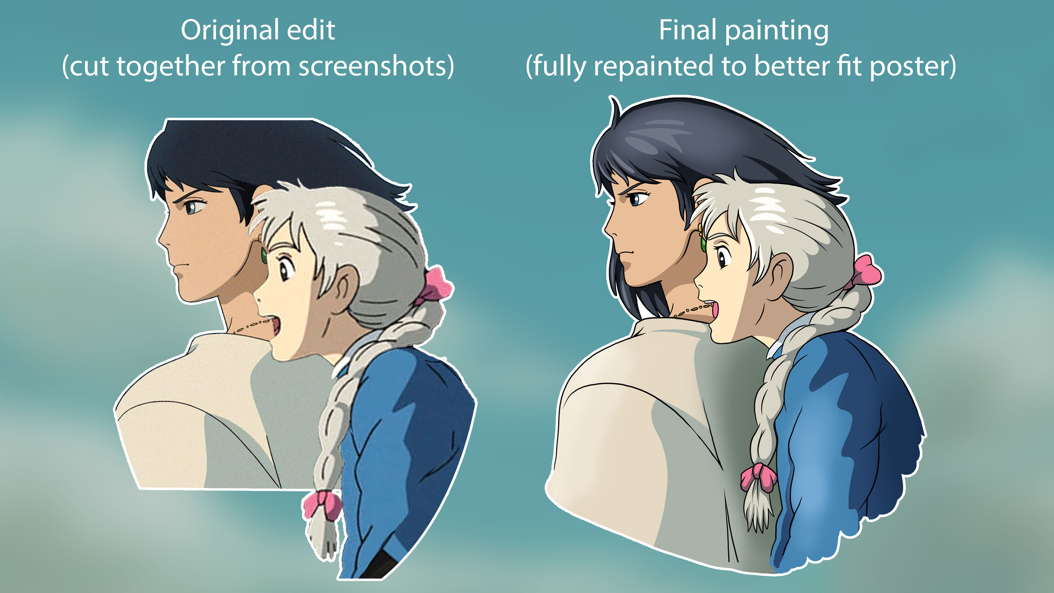
The most important part of the poster was the characters as I wanted to ensure they were the central focus point of this piece. I also wanted to convey their personalities - with Howl being usually quiet and observant whilst Sophie is excitable and full of joy. With this in mind, I spliced two screenshots from the film to make one whole image (the full two screenshots are included in the above references). Whilst I could have drawn up something completely original, I wanted to make sure I stayed true to the art style and showed shots from the film itself that I could then paint over so I decided to go over the original line art.
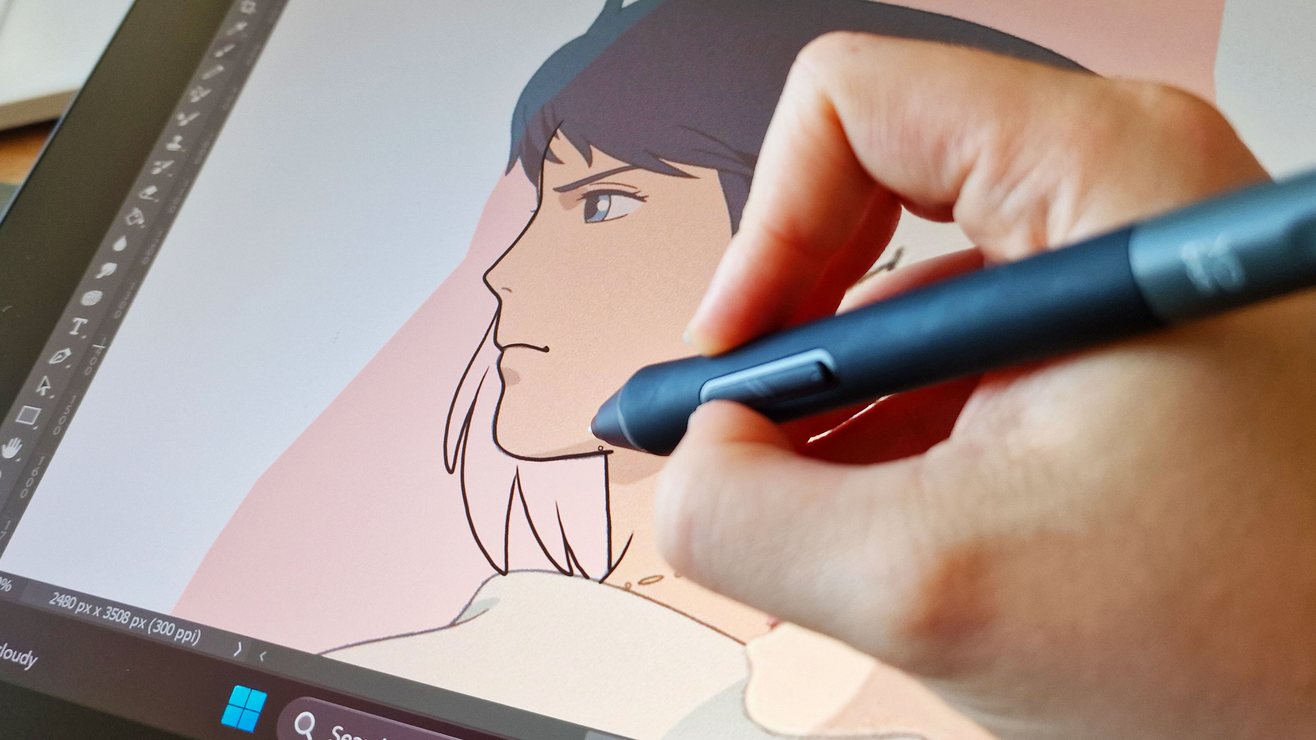
Then it was time to get started on the line art. This step allowed me to easily combine the two screenshots into one cohesive piece that I could then add some extra details to, like the draping curtain of hair on Howl you can see above. The X3 Pro Smart Chip Stylus meant that this process was incredibly satisfying. The accuracy of the stylus ensured I could easily achieve a consistent weight of line art that was true to the Ghibli style, and being able to quickly zoom in and out on the impressive 16-inch screen using the quick-key remote meant it was easy to discern all the finer details on this piece whilst working.
04. Painting
Once the line art was in place, I could then move onto getting the base colors of Howl and Sophie down. Using the eyedropper tool in Photoshop to swatch the colors from the original references, I used the default hard round brush (with pen pressure turned on for better shape control) to set them down under the line art. By swatching the original art, I made sure the colors were consistent with the original film and therefore easily recognizable to fans.

With the base colors down, it was easy for me to add shadows and highlights. Once again, I referenced the original art, but I also added some extra detailing to add personal flair to the piece. This included more solid hair highlights and some light gradients on their clothing to make them more visually interesting. They were very subtle changes that made sure the images still had the Ghibli spirit, but overall made them look a bit more polished. You can see the differences in the image below.
05. Background
Satisfied with the portraits, I could now move onto the background. Luckily I knew I wanted to keep this part simple as to not divert attention from the main characters, so this process was pretty short. I cleaned up the original shapes of the mountains and hills to make them look a bit more organic using the eraser tool, and also added some subtle gradient between each layer to better define them. I then went back in with the lasso tool and a watercolor brush to make some snowy detailing on the mountains to give them more depth and tie them back into the film’s art style. Using the lasso tool meant I could keep the edges sharp without having to be too precise as I could easily go in and edit afterwards.
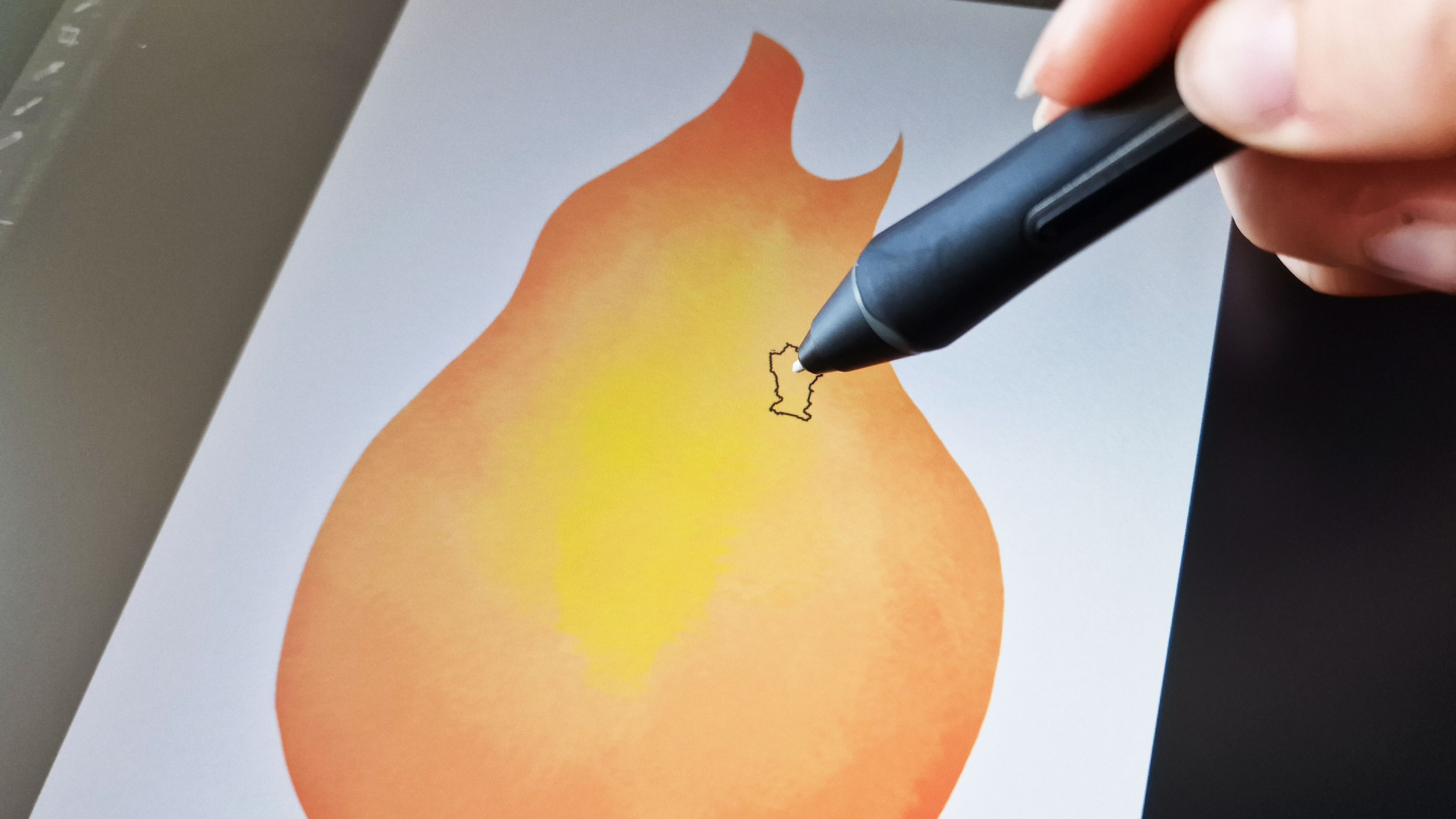
Using the same textured brush as above I added some detailing to the flame that would sit behind Howl and Sophie and act as a frame for them against the background.
06. Font and text
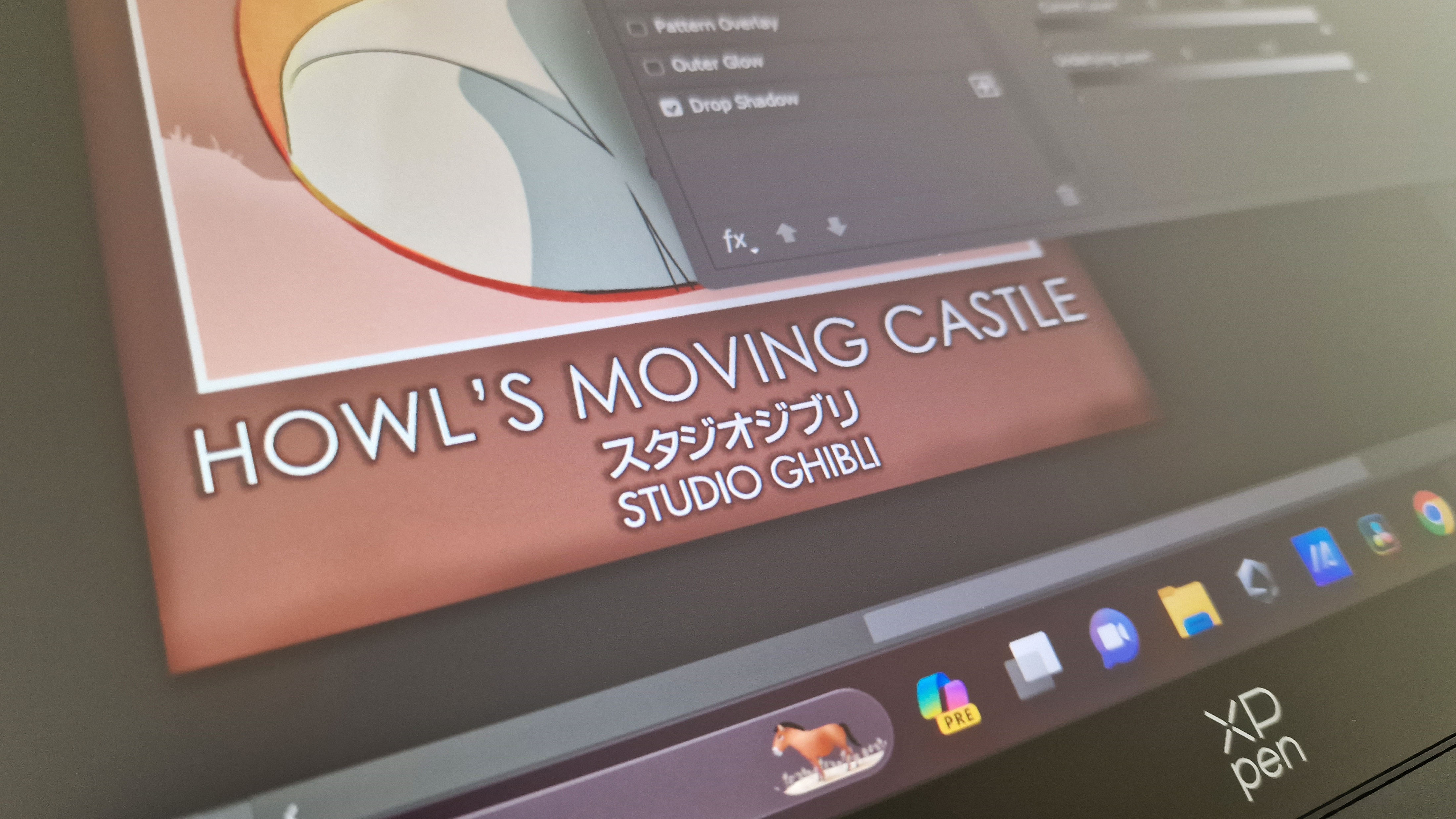
The title of both the movie and studio were another crucial detail for this poster. To that extent, I wanted to make them bold yet simplistic to ensure it would be easy to read from a distance. I chose a basic font for the movie title using the Studio Ghibli logo as reference, and then used both the “stroke” and “drop shadow” tool from Photoshop’s blending options to add a shadowy outline to further make the font stand out. It’s a subtle detail, but one that ultimately makes a world of difference to the contrast in the piece.
07. Texturing
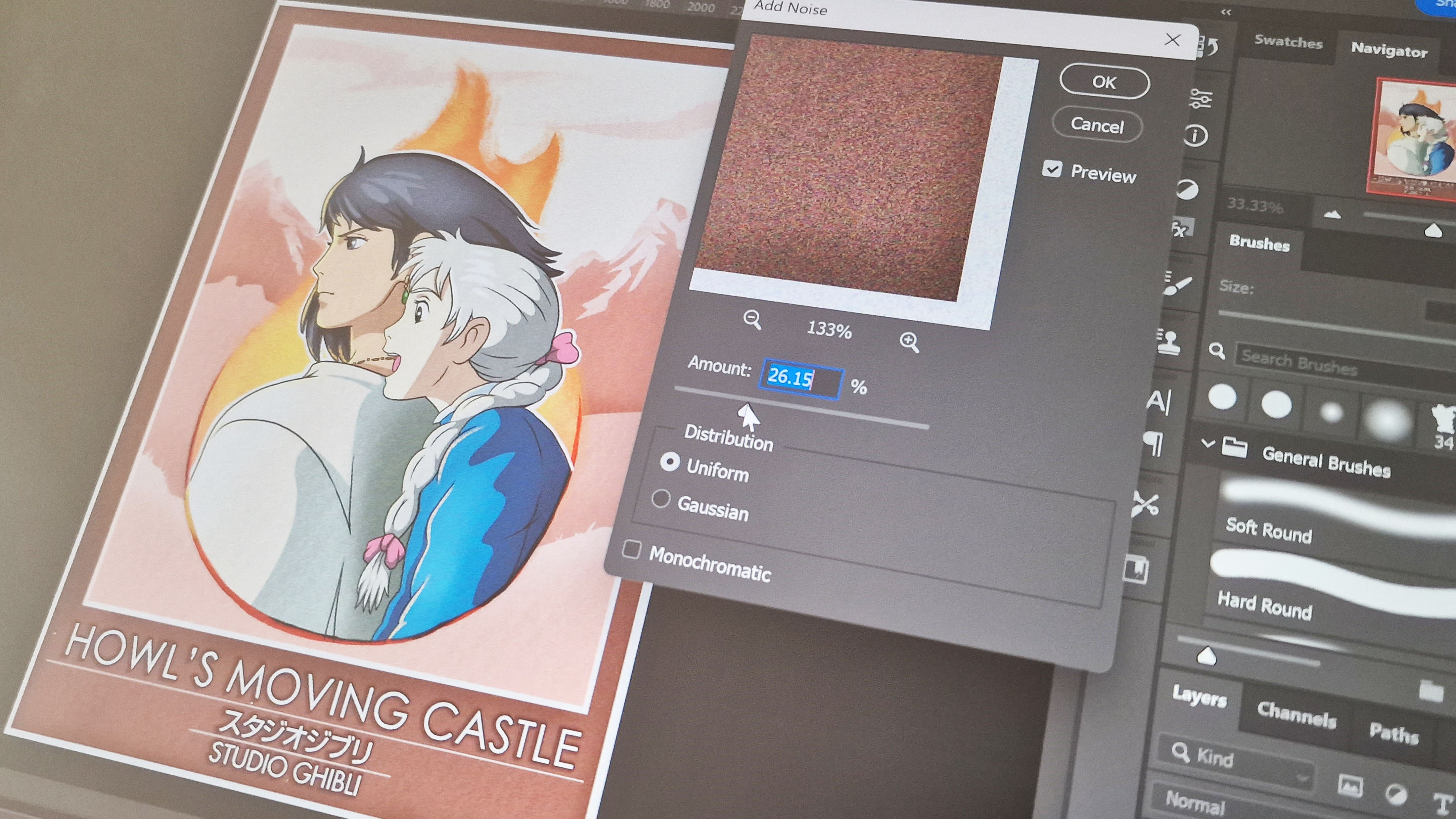
With the poster nearing completion, I felt like something was missing to make it pop. With most Studio Ghibli films being animated using hand-drawn frames, I realized that a traditional grainy texture would make the poster feel more true to the source material. To achieve this, I duplicated the poster as a merged layer (so that it was all one single image) and then used the “noise” filter to add my preferred texture. This method is a great way to add texture to your digital pieces, especially if you’re going for a more traditional-looking finish.
08. Reflection
Overall I’m incredibly proud of this piece and love the end result. It was fun to take an already established art style and add my own twist to it in a way that felt true to the source material. It’s rare I tackle something non illustrative, but I always advocate for artists to push their limits and try something new to improve their skills.
I especially loved getting to work on this piece using the XPPEN Artist Pro 16 (Gen 2) tablet - it’s truly a joy to work on a larger display and I love how intuitive the XPPEN software and devices are for artists. The matte finish of the screen truly feels like drawing on paper, which is a big win for artists like myself who prefer working traditionally. If you're wanting to treat yourself to one of these powerful tablets, you can buy the XPPEN Artist Pro 16 (Gen 2) directly from the retailer on Amazon.