As I mentioned last week, I have no idea who I’m going to vote for next month. And, since none of my local candidates have taken me up on my offer to visit my house and plead for my loyalty while I clap my hands and wet-nurse myself like that creepy kid from Game of Thrones, I’ve been forced to base my decision on other factors.
Specifically, I’ve chosen to base my decision on the presentation of each party’s election manifesto launch. Not the contents of the manifestos themselves, because that would be too easy. No, I think the best way to judge a book is by looking at the backdrop hanging behind the man holding the book. Since I have no logical reason to suspect that you’d disagree with me, I’ve chosen to share my findings with you, in chronological order:
Labour

Backdrop: Red, but a darker red than usual. This means one of two things: either Labour deliberately skewed purple in an effort to woo Ukip supporters, or someone bought the wrong type of lightbulb.
Slogan: “A better PLAN. A better FUTURE.” Although, thanks to some unfortunate head placement on the part of Ed Miliband, for much of the launch it read “A better PAN”.
You should vote for them if: Your love for quality cookware is only matched by your disdain for immigrants.
Greens

Backdrop: A simple standee that somehow combined all the very worst shades of green and – for some reason – a lot of names. It’s unclear who these names actually belong to but, Steven from Oswestry, this is your time in the sun. Cherish it.
Slogan: “Standing for the common good.” Or, thanks to some equally unfortunate head placement, “Standinor the commod”.
You should vote for them if: You have a fondness for slogans that sound like they’re about Tolkien characters who other Tolkien characters occasionally use as a toilet.
Conservatives

Backdrop: A union flag. Such a big union flag, in fact, that David Cameron spent much of the launch looking like a new Britain’s Got Talent judge. A secondary judge. The judge that Simon Cowell spends most of his life deliberately undermining.
Slogan: “A brighter, more secure future.” Rookie error, there, not specifying whether brighter and more secure things are good or bad. Why is the future going to be brighter? Will Conservatives introduce legislation allowing the sun to explode? We deserve answers.
You should vote for them if: You don’t value life and secretly want to spend your dying moments writhing around in agony as your body is consumed by a fiery galactic orb.
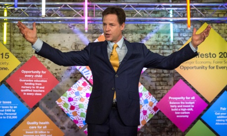
Liberal Democrats

Backdrop: Nightmarish. There were brightly coloured diamonds. There were handprints, like the kind of thing you’d find covering the exits three days after a tragic locked-door/fumigation accident at a paint factory. And there was a bare brick wall, making the whole thing seem like a catastrophically ill thought-out Seinfeld tribute night.
Slogan: “Stronger economy, fairer society, opportunity for everyone” was one of them. But, frankly, every possible surface was covered with dozens of would-be slogans. It was a mess. The whole thing looked like what happens when you let a six-year-old paint their own bedroom.
You should vote for them if: Don’t. Seriously, just don’t vote for them. Yuck.
Ukip

Backdrop: Another union flag, just like the Conservative backdrop. This one, however, was almost entirely purple. It was the sort of union flag that people look at when they’re simultaneously having a migraine, a stroke and several successive heart attacks.
Slogan: “Believe in Britain #voteUKIP.” A hashtag. Way to capture the youth vote there, Nige.
You should vote for them if: You’re an easily swayed teenager with dangerously high blood pressure.