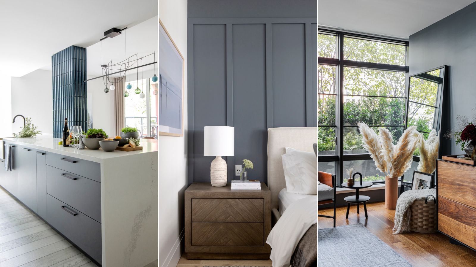
Dark, moody spaces are all the rage right now, and finding the perfect statement shade is bound to take any room's atmosphere to the next level. Designers love decorating with deep yet subdued hues, and Sherwin-Williams' Storm Cloud is no exception.
An artful mix of blue and gray, Storm Cloud pairs beautifully with a wide variety of colors and textures, making for the perfect base layer or accent hue. To get expert insight on decorating with this cool and calming shade, we spoke with seven interior designers. Here's what they had to say about the Sherwin-Williams' popular shade.
How to decorate with Storm Cloud
Storm Cloud is the perfect pairing for bright white paints, pared-back neutrals and bolder jewel-toned hues. Suiting both a full wall and an accent feature, finding the perfect place for the shade can be quite difficult – the opportunities are endless. Here's how designers say the color is best put to use.
1. Combine with clean white shades
According to Sue Wadden, director of color marketing at Sherwin-Williams, Storm Cloud SW 6249 is a 'moody, blue-gray shade' that adds depth to any space. Its versatile undertones make it a great color for any room in the home.'
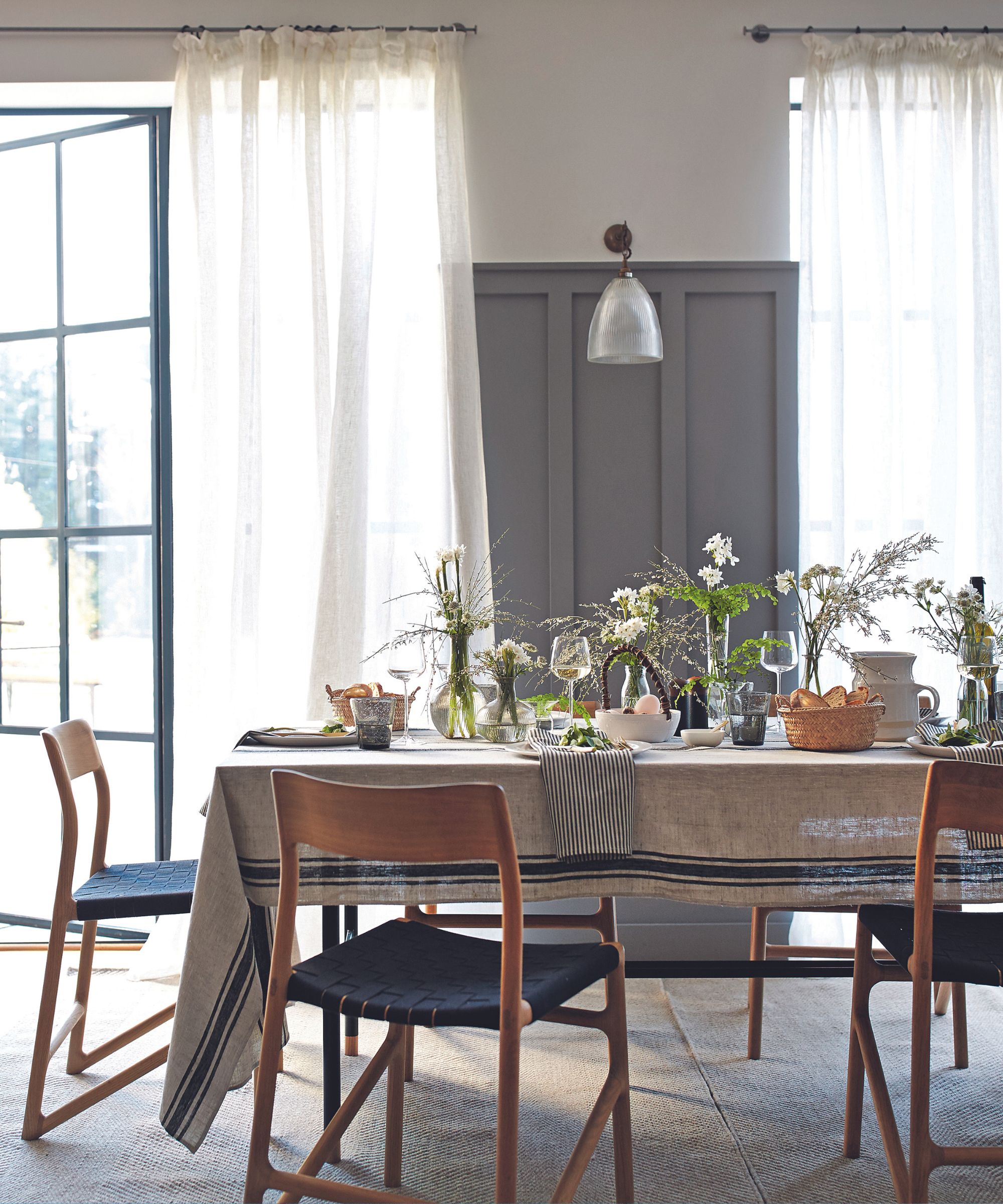
'Blue is one of the colors that can play well in almost any space, but this shade would be a great choice for a bedroom or living room color, to create a relaxing environment in the spaces you’re usually in the most! To create a truly serene space, pair this color with clean delicate whites like Origami White SW 7636 or a light blue like our 2024 Color of the Year Upward SW 6239,' says Sue.
2. Stick to brightly lit spaces
Trish Knight, interior designer and co-founder of Vancouver-based Knight Varga Interiors says that 'deep, moody blue-grays are my love language.' Providing the perfect opportunity to bring the natural beauty of the Pacific Northwest indoors, Trish says these 'calm and inviting' hues work the whole year round. She suggests using Storm Cloud and similar colors in brightly lit rooms to harness their maximum impact.
'Storm Cloud is a deep color which absorbs light, so on a bright sunny day in a light-filled room, this color will still have intensity. But for that reason, you need to be careful how you use it in a home with lower light,' says Trish.
Trish says these shades work well in dining room millwork, home library walls when paired with wood floors and light trim, and in a bedroom 'to encourage a good night's sleep.' She adds that light neutral shades and trendy earthy tones like rust work wonderfully alongside Storm Cloud.
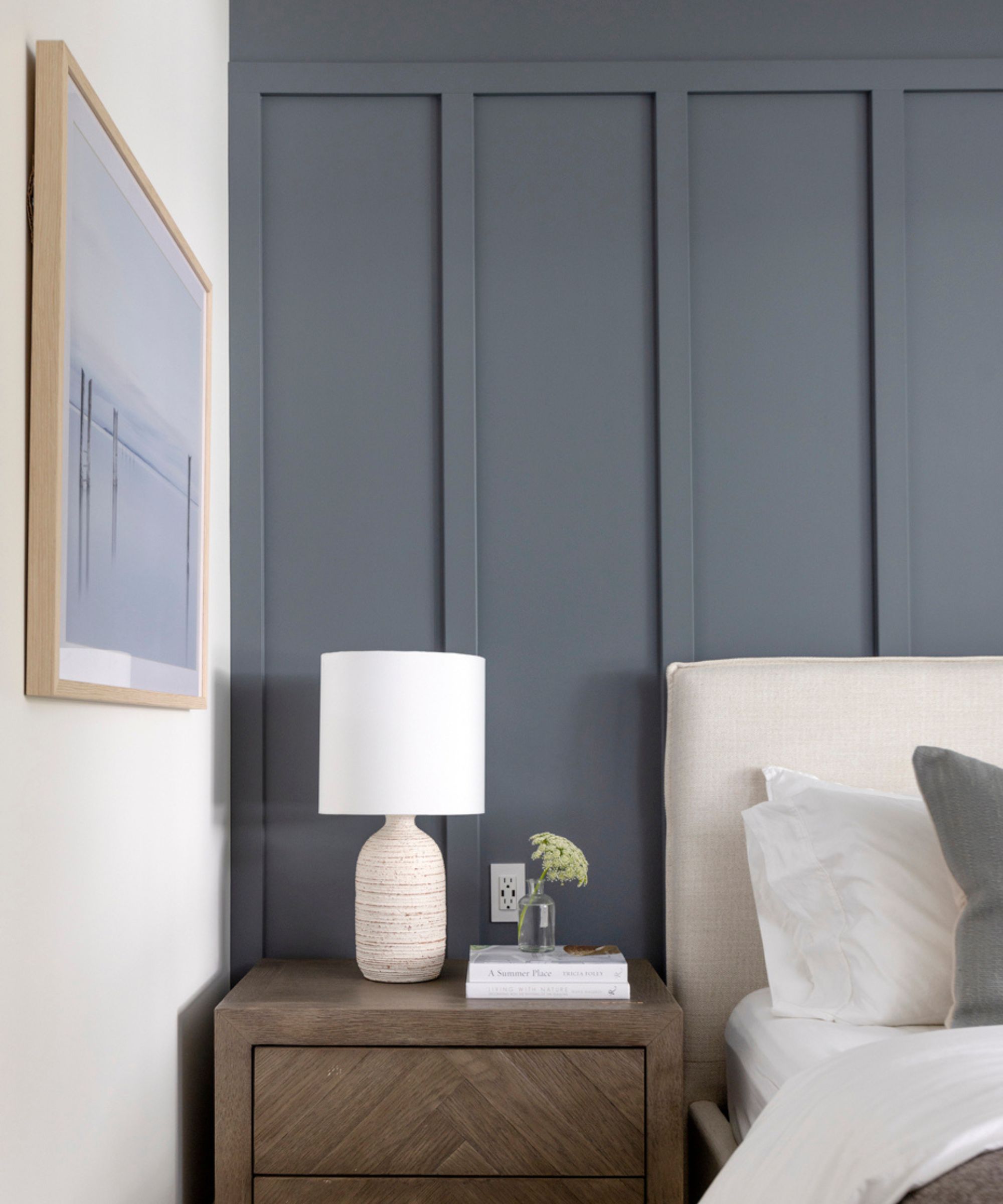
3. Try the shade in the bedroom
Becky Shea, interior designer and founder of Becky Shea Design, regularly uses these steely blue grays like Storm Cloud thanks to their depth and visual impact.
'Wolf Gray and Gunmetal by Benjamin Moore are hues that share that same sultry quality as Storm Cloud, with an intriguing undertone. Picture a blend of gray and navy – or, as I like to playfully call it, "Gravy"!' she says.
Becky suggests using this color palette in the bedroom, saying it sets the perfect mood for a restful sleep. In this bedroom, Gunmetal-painted walls pair with lush textures and neutral accents to create a relaxing bedroom escape.
'There's a certain magic in creating a dark sanctuary where light is absorbed by the rich hue, cultivating a serene, quiet, and cocoon-like atmosphere that fosters a restful night's sleep,' says Becky.
4. Pair with neutrals and simple lines
Storm Cloud makes for a stunning accent wall in well-lit living rooms, dining rooms or bedrooms because its rich and moody undertones curate a comforting atmosphere, says Shaunn Lipsey, principal designer and creative director of Shaunn Lipsey + Co. She suggests pairing the dark hue with neutral tones and simple structures for a more balanced look.
'Shades like soft greys, crisp whites, and warm beiges provide a soothing contrast while allowing the dark hue to stand out. For a cohesive look, select furniture pieces with clean lines and simple silhouettes. Lighter woods brass finishes can help to brighten the space and prevent it from feeling too heavy or enclosed,' says Shaunn.
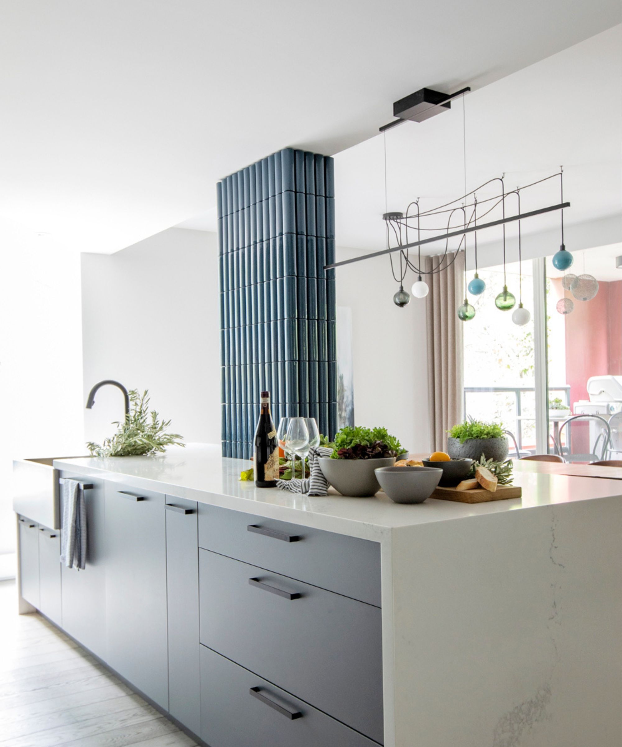
5. Paint paneling and cabinetry
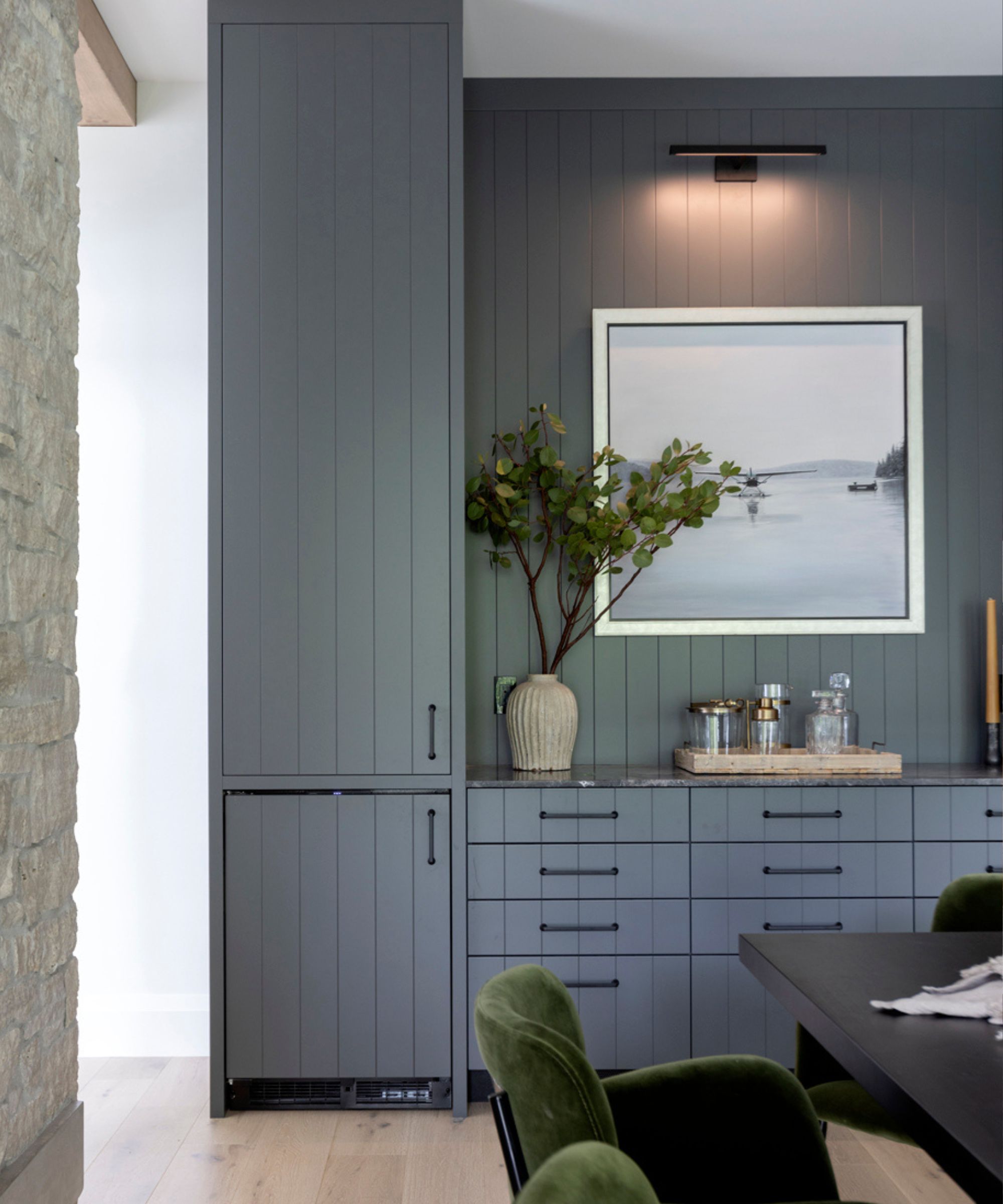
Kristine Renee, interior designer and co-founder of Design Alchemy, says that kitchen cabinetry and wall detailing really shine when painted with this inviting hue. And the finish you choose for your blue-gray coat can make a huge difference, proving that the color truly works with any design style.
'Sherwin-Williams' Storm Cloud is a great go-to for cabinetry as it's a cool neutral that exudes a sense of tranquil energy and pairs perfectly with natural wood tones. This shade also works well for trim work such as wainscoting and wall paneling. When featured in a high gloss or satin sheen, the color takes on a reflective nature, creating a luxe vibe,' says Kristine.
6. Opt for complementary jewel tones
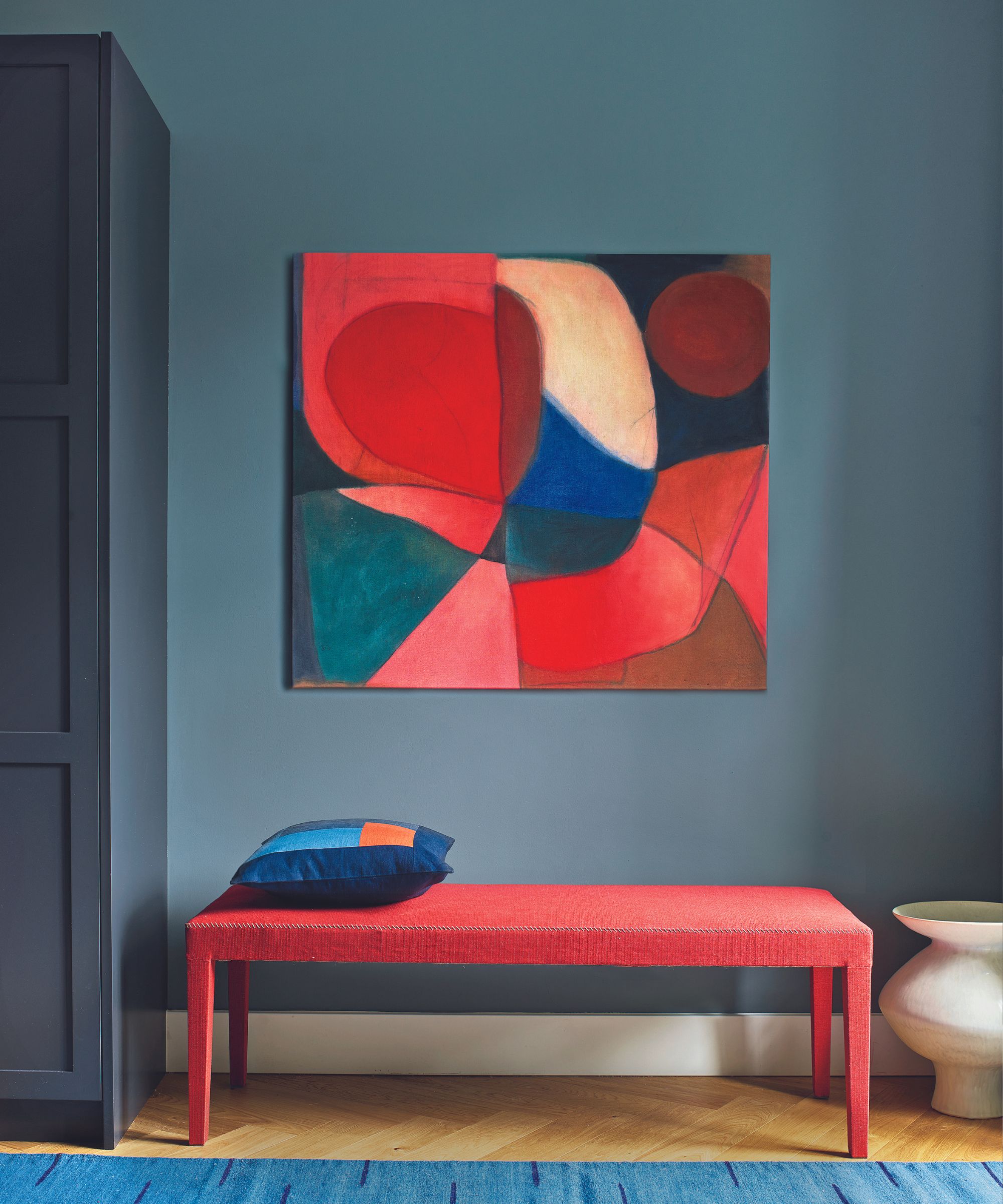
If you want to avoid neutrals and go all-in with the moody hues, Marie Cloud – owner and principal designer of Indigo Pruitt Design Studio – suggests opting for jewel-toned accessories. While a lighter base is probably best for making the blue-gray pop, brighter accents pull the whole look together.
'Storm Cloud is bold and moody – perfect for making a statement. Use it for an accent wall or cabinets and watch it transform the space. I think it pairs well with lighter shades and shiny silver or chrome details. If you're feeling adventurous, throw in some jewel-toned accessories,' says Marie.
Sticking with a cool color palette can also contribute to a cohesive Storm Cloud space. Layering hues with similar undertones creates a comforting and welcoming room you'll want to spend all your time in.
'Keep the vibe consistent with similar undertones, like deep blues or purples. This color really sings in a well-lit room, where it gets a bit softer and more inviting,' says Marie.
7. Play with reflective accents
Metallic and reflective accessories bring light – and life – to a space awash with darker paint colors. Emma Beryl, interior designer and founder of her eponymous design studio, says that balancing the deep undertones of Storm Cloud proves vital for creating an eye-catching space.
'Pair Storm Cloud with neutral furnishings and lighter accessories to balance the dark tone, and incorporate metallic or reflective surfaces to enhance the overall ambiance. Introduce soft textures and ample lighting to prevent the space from feeling too heavy, ensuring a stylish and inviting environment,' says Emma.
Sherwin-Williams' Storm Cloud is a shade to keep in mind when going for a welcoming, comfort-forward space. Working best when balanced, this shade creates a moody atmosphere you'll never want to leave.