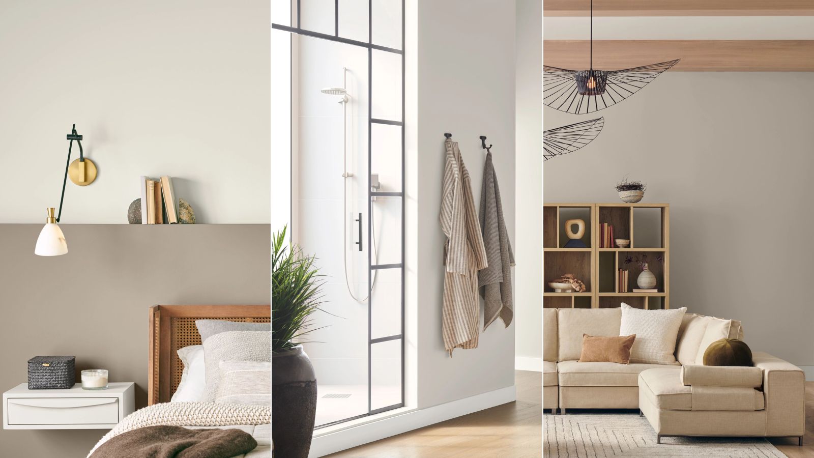
Sherwin-Williams just announced Drift of Mist, a warm and cozy greige shade, as February's Color of the Month – and it's so easy to see why. Chosen for its 'serene, inviting' influence and versatility, this minimalist hue is a favorite among designers, and works in every room of the house.
Drift of Mist pairs beautifully with layered neutrals or bright pops of color, and shines alongside natural light and organic decor. This is how color experts and interior designers decorate with the well-rounded shade, and why they say it's a Sherwin-Williams favorite.
How to decorate with Drift of Mist
Drift of Mist is part of Sherwin-Williams' 'Mindful Minimalist' color palette, a perfect place to look for color pairing inspiration. The palette ranges from deep, dark hues like Prelude and Quarry Stone to the ever-classic Pure White. Layered together, these welcoming hues create a timeless, approachable space fit for any design style.
1. Lift a room that's lacking in natural light

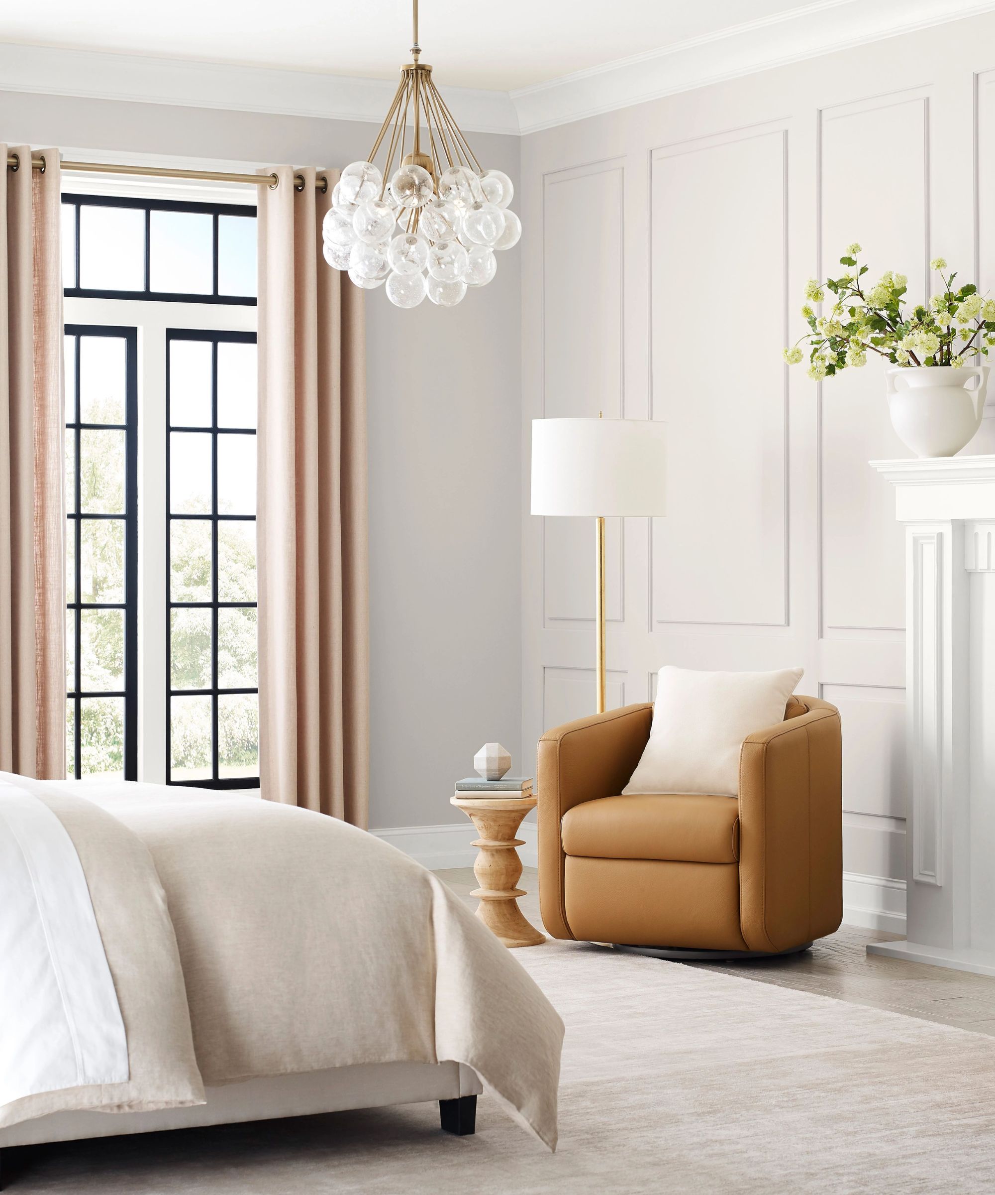
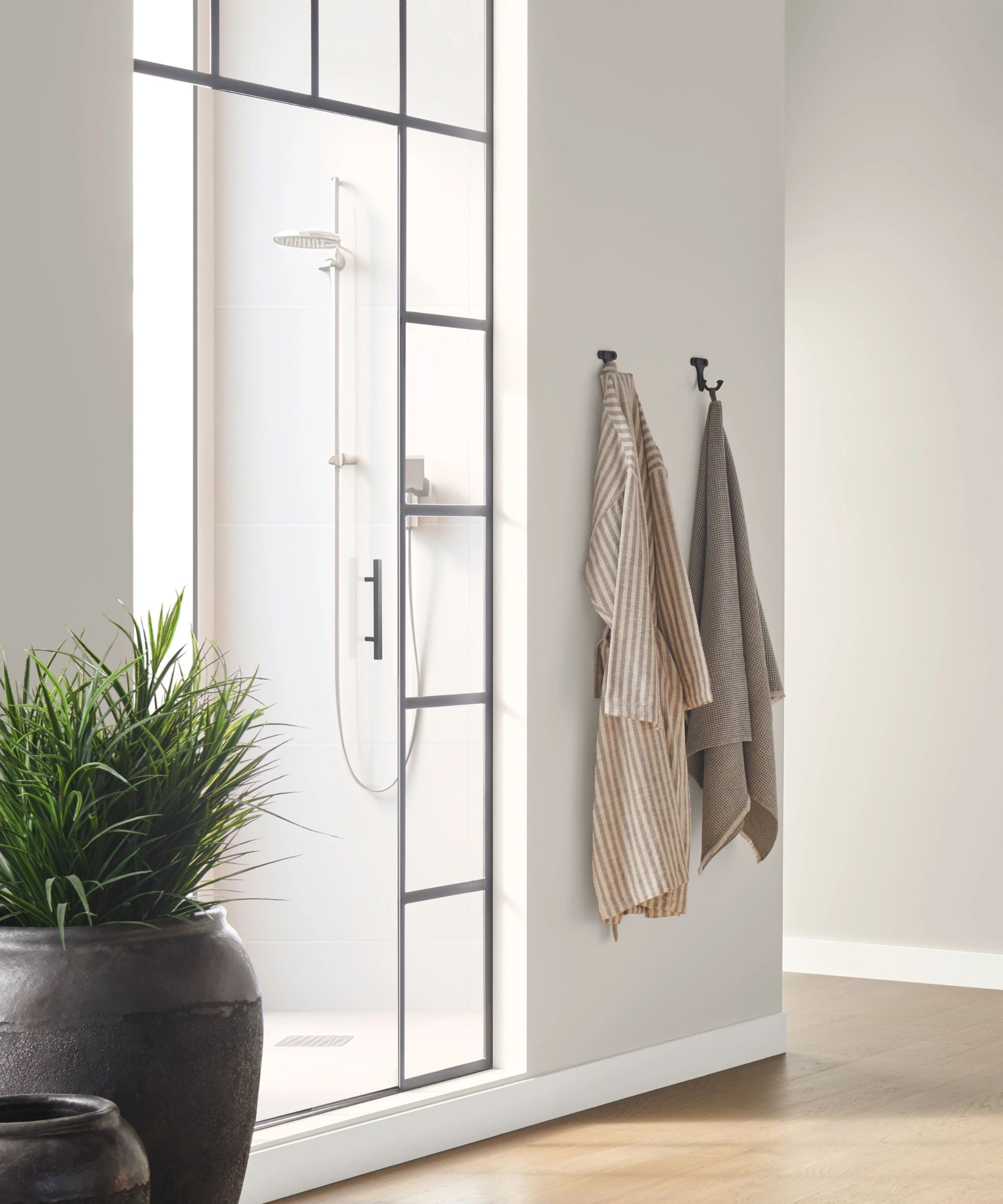
'Drift of Mist SW 9166 is an airy and inviting gray shade that I love for places lacking natural light,' says Sue Wadden, director of color marketing at Sherwin-Williams.
Not only was the hue selected as February's color of the month, but it was part of Sherwin-Williams' 2024 Colormix Forecast Anthology, a biennial rundown of trend-setting shades. Sue says the color has 'calming and minimalist qualities' that pair nicely with a neutral color scheme, or bold pops of color.
'It also pairs beautifully with ethereal blues and greens like our 2024 Color of the Year Upward SW 6239 or a deep dramatic dark like Carnelian SW 7580. Drift of Mist is ideal for creating a relaxing bedroom, a clean spa-like feel in a bathroom, or a soft retreat in a living room,' says Sue.
2. Pair with bold yet warm accent shades

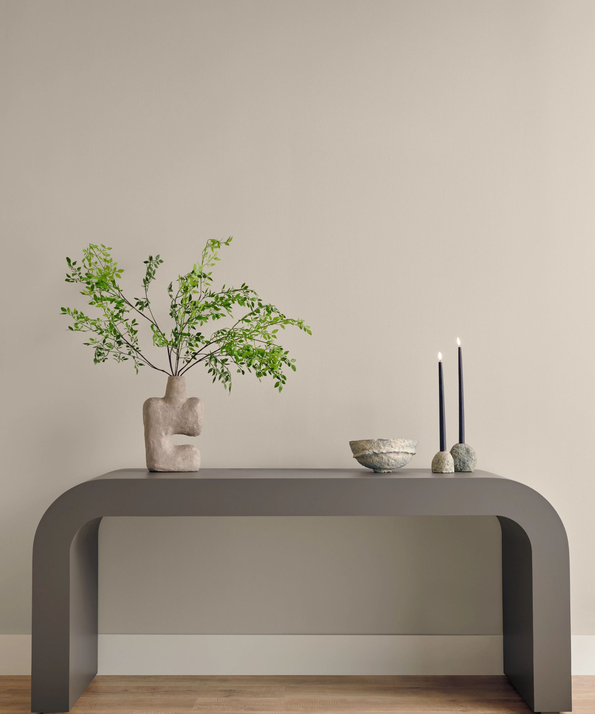
Audrey Scheck, interior designer and founder of Audrey Scheck Design, says that Drift of Mist 'adds the perfect hint of color' to a space, drawing the eye in without becoming overpowering. 'The warm undertones allow it to work seamlessly in nearly any space, as it evokes a welcoming feel,' says Audrey.
She suggests pairing Drift of Mist with accents that bring a similar level of warmth to a space, listing 'creamy beige, salmon and marigold' as appealing options. Opt for a full wall of Drift of Mist, and add pops of warm color with furniture, pillows, or throws.
3. Experiment with different paint finishes
Devin Kimmel, architect and managing principal of Kimmel Studio Architects, says part of Drift of Mist's enduring appeal is the predictable, reliable impact it has on a design scheme. The shade works for a wide array of design features, and can adopt diverse paint finishes depending on your space's style.
'Because of its flexibility, Drift of Mist is an easy neutral choice that doesn't unexpectedly create strange hidden hues like pink, yellow, or green. We see this tone continuing to be relevant in the design industry for many applications, including a wall color in a satin sheen, millwork selections in semi-gloss, and as an alternative to white for molding,' says Devin.
4. Test out how the shades changes in different lights
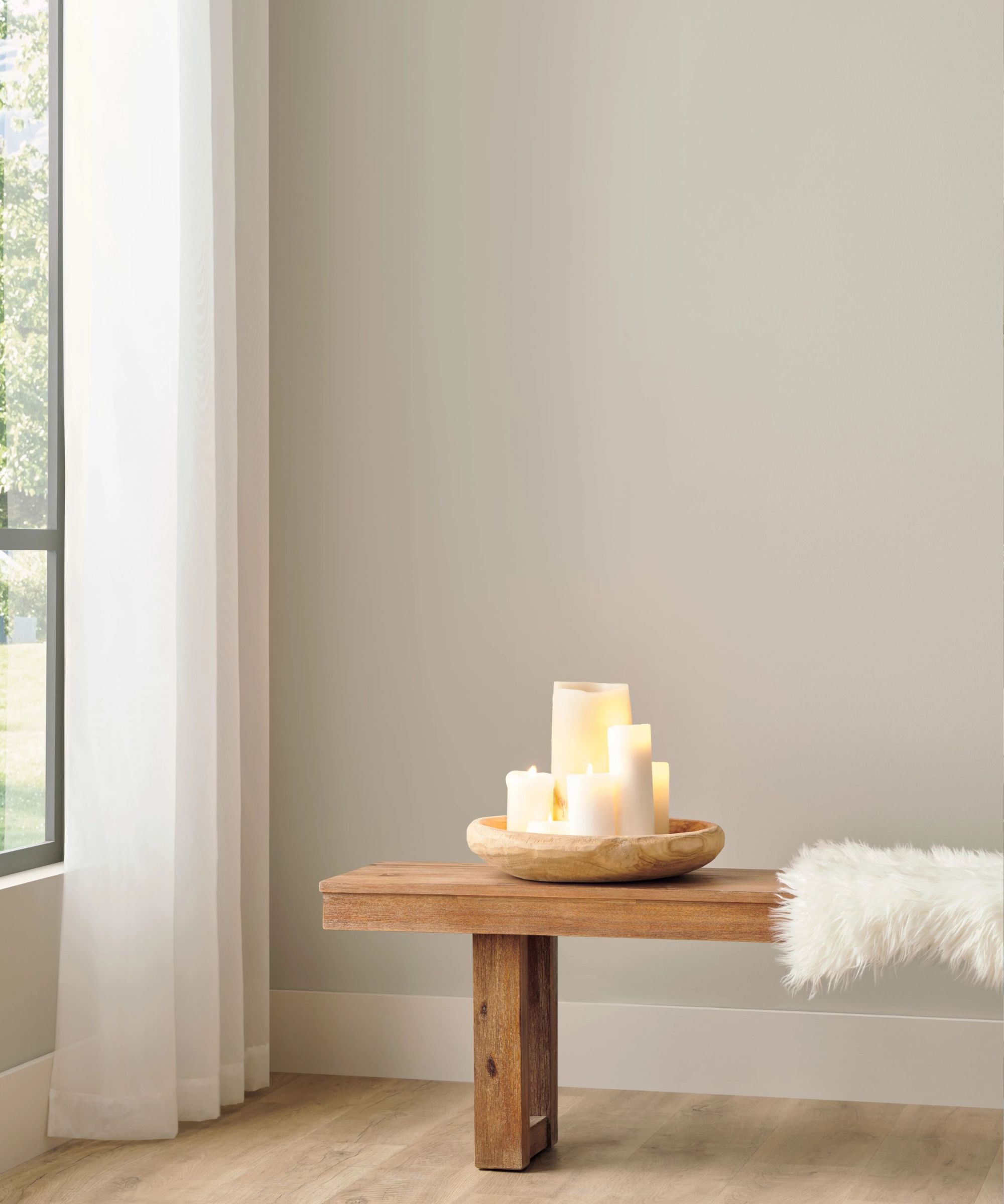
When deciding on a paint color, a room's lighting is often top of mind. Some paint colors don't mesh well with low lighting, and others are washed out when met with bright sunlight.
But when it comes to Drift of Mist, Dani Crawford – lead interior designer and senior associate of Kimmel Studio Architects – says the lighting of your space isn't a concern. She says Drift of Mist adapts to the room's light exposure, creating different atmospheres depending on intensity.
'Drift of Mist by Sherwin Williams is a great neutral for almost any installation as it lands in the middle ground between gray and beige, also known as "greige." It tends to pick up the tones of the surrounding design elements, and depending on light exposure, it may lean towards a cooler gray in northeastern light or with blue and white interior lighting. In south-facing rooms or ones with warm-dim interior lighting, it typically leans toward a warmer beige,' says Dani.
5. Use Drifts of Mist as the perfect neutral base
Apart from its ability to adapt to different lighting schemes, Drift of Mist also pairs nicely with a vast array of accent colors. Emma Beryl, interior designer and founder of her eponymous design firm, says it's a 'gorgeous warm neutral base' that opens up endless design possibilities. In a kitchen design, Emma suggests cabinetry painted with Drift of Mist, coupled with a 'cream-toned stone' for the countertops.
'I would then contrast the surrounding cabinets with a natural wood kitchen island in a dark stain with the same stone countertop. This will pick up on the warm tones from the paint color and make the space feel super cozy,' she says.
In a living room on the other hand, Emma says she would bring in natural, organic design elements to emulate the outdoors.
'I would paint the walls and ceiling in Drift of Mist or similar and I would pick furniture and decor that have natural wood tones, blush- and cream-toned fabrics, and then some art that is of a natural landscape so the room feels like a warm, sunny day,' she says.
6. Try out this greige paint on the millwork
Becky Shea, interior designer and founder of Becky Shea Design says she's 'absolutely drawn to Drift of Mists' subtle charm.' She says it's reminiscent of one of her go-to shades for millwork designs, Benjamin Moore's Baby Fawn.
'Pairing it with vibrant, eclectic colors for millwork counterparts like Pink Drab by Farrow and Ball creates a captivating visual contrast that adds personality and depth to any space. Drift of Mist boasts a warm, earthy tone that imbues a sense of coziness while maintaining an airy feel, making it a versatile choice,' says Becky.
For a kitchen design, she suggests pairing the warm gray hue with soapstone countertops and backsplashes to 'enhance the natural elegance' of the materials 'while infusing the space with a touch of serene sophistication.
'Overall, Drift of Mist presents endless possibilities for creating inviting, visually intriguing interiors that reflect your unique style and personality,' says Becky.
Drift of Mist brings a cozy, inviting atmosphere to any space, impressing interior designers with its warmth and versatility. It's clear that February's top color will make it a long way, lasting through 2024 and beyond.