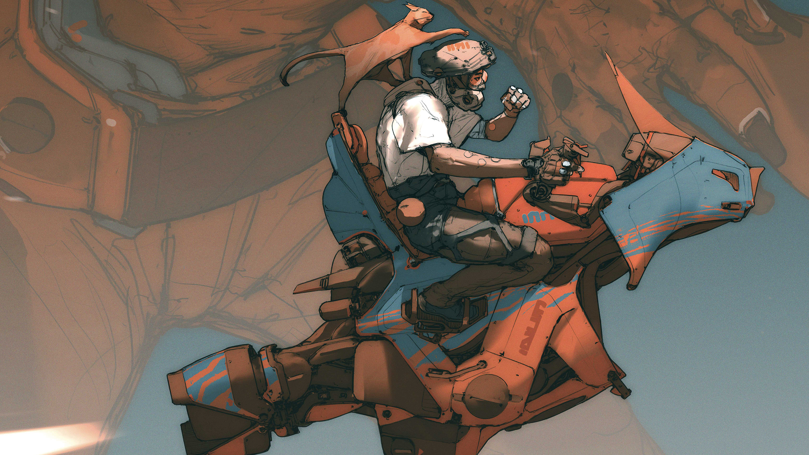
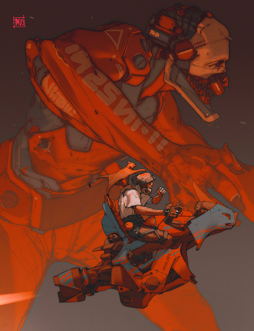
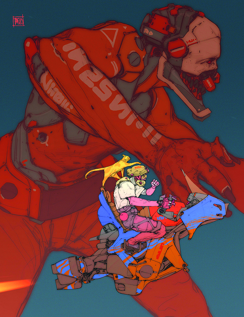
Want to learn to draw a cyberpunk illustration for sci-fi concept art on your iPad? My approach to creating an image isn’t always the same, but in this instance I started off with the profile of a character, who I knew needed a dynamic pose and a vehicle involved. I’ve always loved mechanical and vehicle design, and I wanted this bike to feel like a mixture of the 70 and 80s look coupled with a bit of the classic 90s sticker aesthetics.
Meanwhile, the background mech was an unusual decision for me, but I feel as though it gives a nice sense of scale compared to the main characters. I was inspired by the animes of the late 80s and 90s. I think that’s something that informs all of my work, so I wanted to create a piece that was both dynamic and detailed and had a cyberpunk meets space-Western feeling to it.
I use an iPad Pro with a paper-like protector for the extra sensation, as it slows the stylus gives and gives you greater control. You might want to see our guides to the best iPad for drawing or alternatively the best drawing tablets.
01. Begin with the sketch

My work relies heavily on line-art, as I love the freedom it gives me to create anything quickly. I usually sketch a couple of ideas and stick with the one that suits the project, although I do sometimes save the others for later. When you have a good flow it’s like a stream of consciousness.
While I’m doing my initial research, I always play soundtracks of movies or shows that I like and start thinking about what I want to make. I find this is a really nice way to approach a new personal illustration, as it helps me get in the right mood and gets my creative juices flowing. For me, that’s a key way to find the ever-elusive balance between relaxation and focus that helps me work at my best.
02. Form a composition
Once I have the basic line work, I block the silhouette and see how the shapes interact with each other. At this stage, I start thinking about the colours I want and play around with the different elements of the illustration, adding or removing detail here and there. This is when a composition starts to appear. Digital media is useful for this as you can rearrange the elements at any time.
03. Find the vibe
Once I have the overall feel and composition of the piece, I think about the final lighting and vibe. This is crucial, as it can help or hinder the illusion. I find myself spending more time at this stage now. I realise that I have to be involved as much as possible in every part of the process equally, as that’s when you actually learn. Some things come easier than others, but you won’t know unless you push yourself.
04. Figure out the light sources
This image uses several sources of light to convey a sense of drama. To assist in this dynamic, chaotic effect, the mech in the background is being illuminated from below, while the characters are illuminated from above. This wouldn’t be possible in a normal situation, but I’m happy to take that liberty in this scene. In my mind the light source below the mech could be something like an explosion, a search light, or an electrical line being torn out; this creates the effect of controlled chaos. Meanwhile, the rider and cat are illuminated by a more natural light source, such as a ray of sun that’s hitting the protagonists in the face.
05. Find a focal point
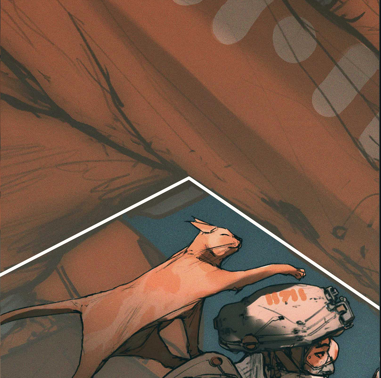
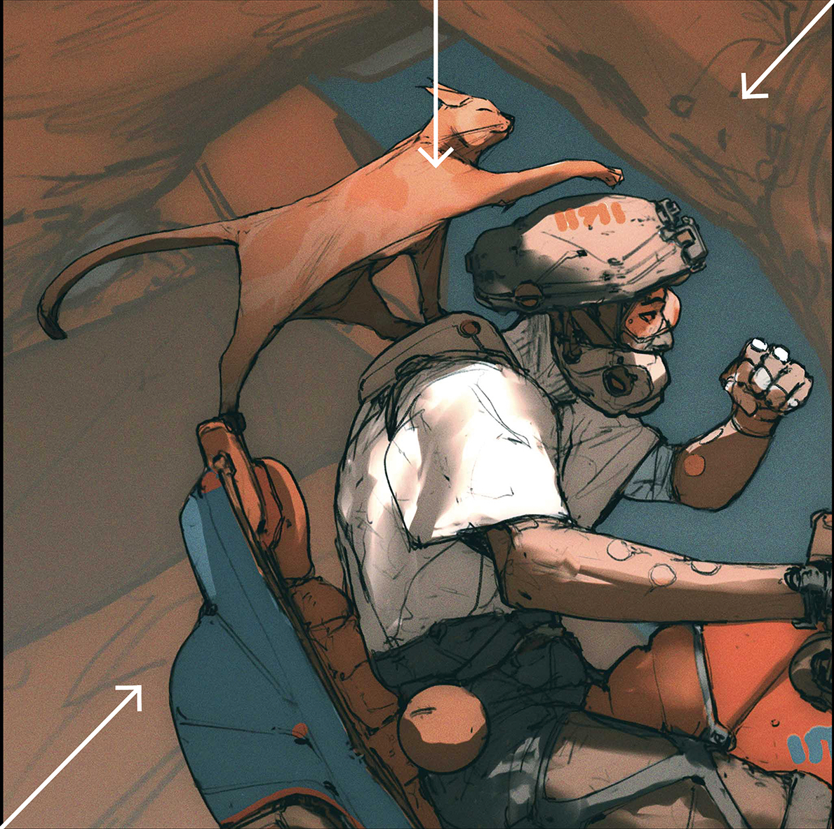
Another key part of any illustration is the composition. In my piece, you can see how the composition makes the focal point stand out and separates the subjects. Coupled with the lighting, your eye moves immediately to the centre of the image. You have to approach each illustration as if you’re giving your eye a trail to read the story behind it. For instance, if the cat and the rider were in any other place, the image wouldn’t be as strong.
06. Expressive characters
Adding expression to a character is extremely important for creating a sense of realism in the scene, while giving the viewer a hint of the personalities of the characters portrayed. Since the rider has a covering over his face, I decided to balance the image out with one of them having a crazy expression, so you can see that they’re having fun, even though there are darker undertones to what might me happening.
07. Explore the artwork’s mood
To wrap up the illustrations, I spend a couple of hours playing around with the feeling I’m seeking for the final image, which can make or break a piece. One bit of advice for getting this just right is to relax and let the work speak back to you while you’re hunting for the best combination of elements and composition possible.
More on how this image was developed
Contrasting elements
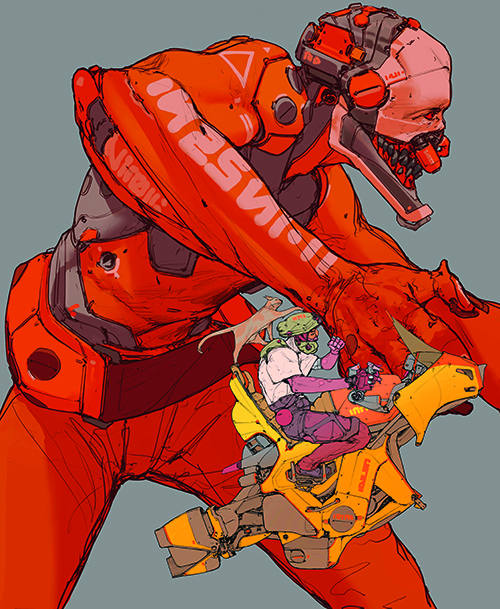
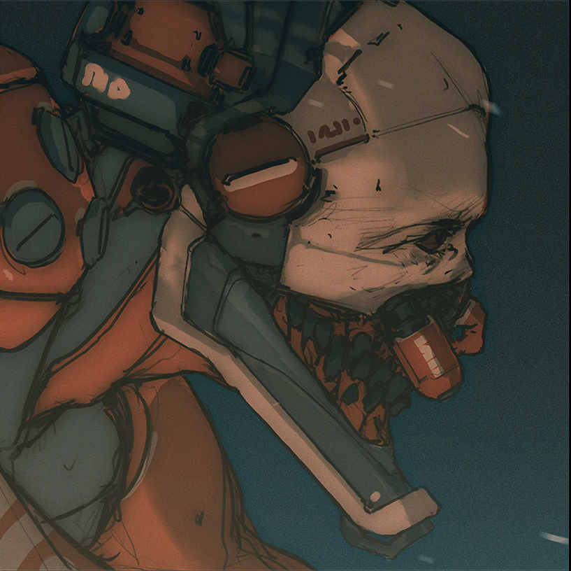
Developing contrast is an excellent way to create interest within an image. In this case, there’s the contrast between the mechanical design and crooked teeth of the mech, which juxtaposes mechanical and organic elements.
Decals and type
I like to put typography in my designs. Sometimes they can have meaning and other times they’re in a made-up language. Putting graphic design in the illustration is a good way to balance the image and put touches and patterns where you want to accentuate the overall feel of the character.
Adding fog for atmosphere
This is important to generate a believable atmosphere, as it shows the separation between the characters. With this, you’re imitating atmospheric interference that conveys the sense of distance, as well as adding dramatic effect.
Character
This guy is a relatively simple character, which is what I wanted. The scene already has a lot of elements in it and the scale of it demands this simplicity for good readability. Too many details are messy; feel and expression can be reached with simplicity and pose as well.
Bike influences
This bike is a mix of design languages I like. It has taken influences of Bosozoku bike gangs and the custom bike subculture from Japan in the 70s and 80s. The mechanical design work of Akira creator Katsuhiro Otomo and the mech animes of the 90s was also a factor, plus my own experience looking at engines and mechanisms; I just love how these functional shapes all interact with each other.
For more tips and tutorials, see our piece on how to draw an art style of Gorillaz artist Jamie Hewlett.
This content originally appeared in ImagineFX magazine, the world's leading digital art and fantasy art magazine. ImagineFX is on sale in the UK, Europe, United States, Canada, Australia and more. Limited numbers of ImagineFX print editions are available for delivery from our online store (the shipping costs are included in all prices).