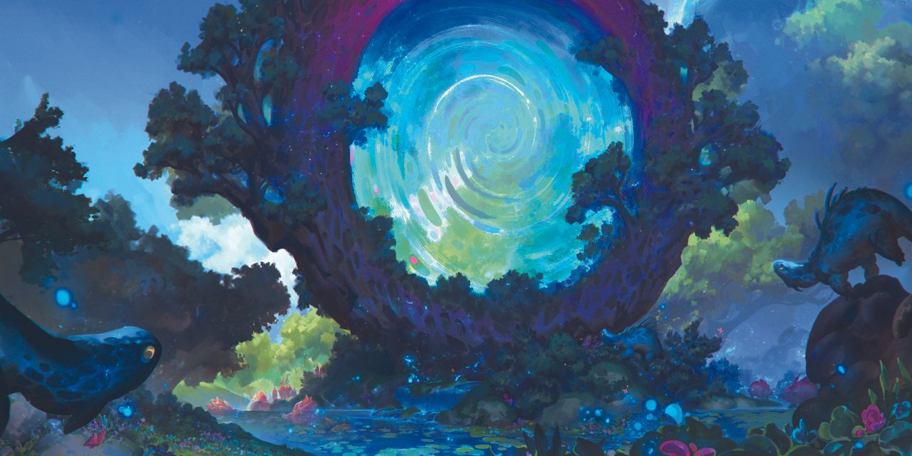
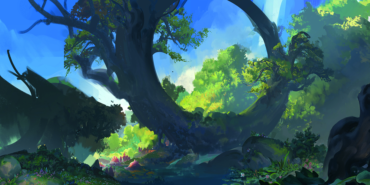
For this piece, I wanted to create a scene where a mysterious event was happening in the forest. It originally started life as an older illustration, where I decided to expand on the original composition to create a little more visual interest. Although I liked the original design I’d created, I felt as though the scene was too small and the characters didn’t have enough about them to occupy the space that I needed.
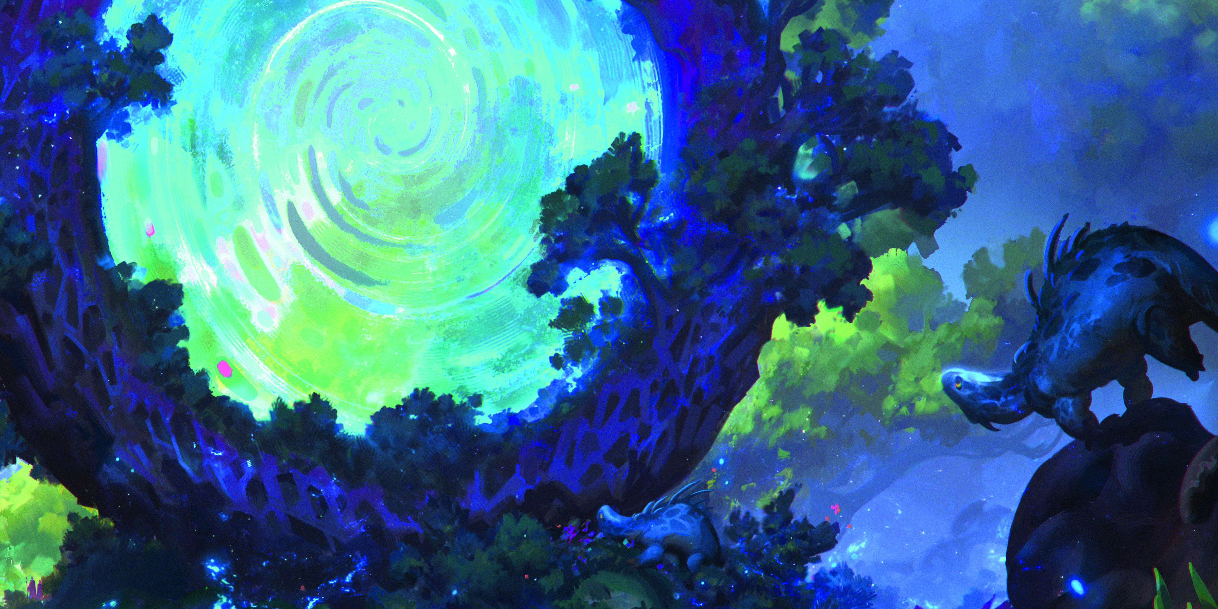
The answer was simple: let’s add a giant magic portal! It’s a great way to have a clear focal point and bring additional colour diversity into the piece, while also blending it with the scene using some vegetation growing out of the edges. I also added a few lizards as a contrasting element to the scene to create a more playful, whimsical vibe, plus some plants and insects for a sensation of calmness.
Every major element you see is in a state of near stillness, while almost all the movement is happening within the portal as it spirals, leaving the creatures in the scene transfixed. A running theme you can find in a lot of my artworks are these very centric compositions.
I enjoy finding ways to guide the viewer’s attention towards my main subjects. In my experience, the easiest way is using a variety of artistic techniques, including the shape design, colour, values, flow and so on. But there are advanced tools in Photoshop that can build the magic too (for more tips, see our general round up of Photoshop tutorials).
If you need new tools, see our pick of the best drawing tablets and the best laptops for drawing. In the meantime, here's my general process followed by the specifics on how to create the magic portal effect in Photoshop.
01. My initial ideas
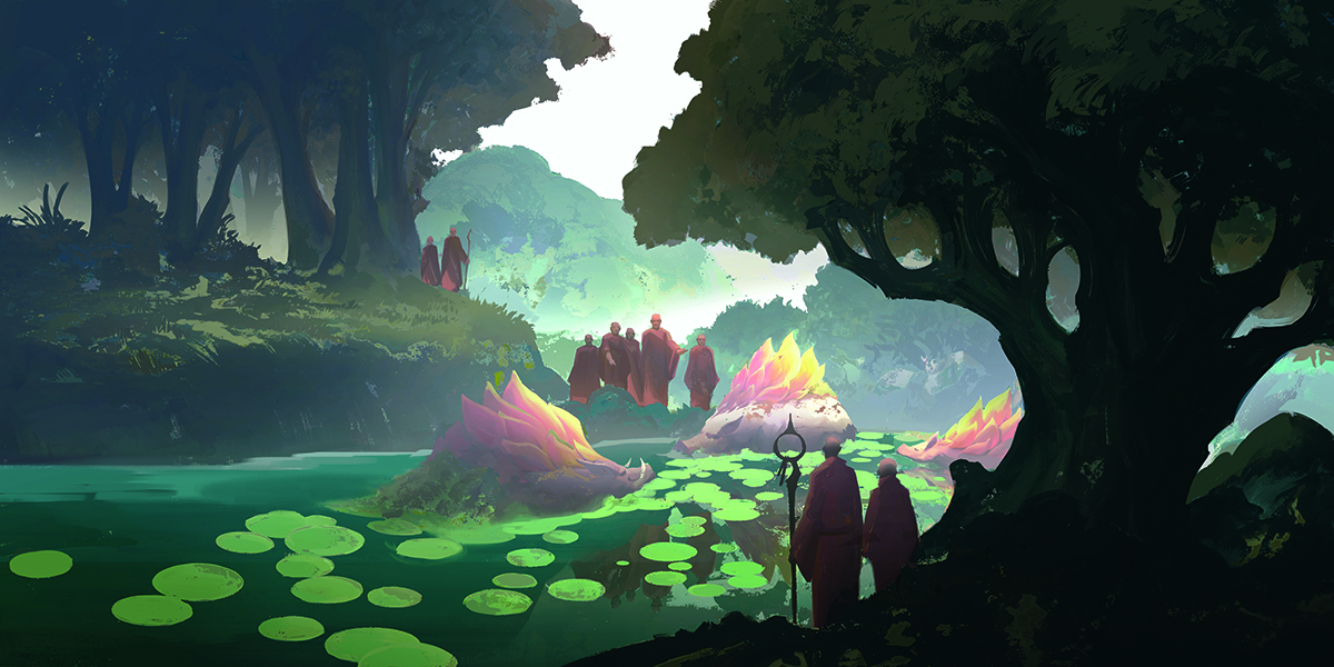
My starting point is often very different from the end, which a bad habit of mine. I start with a more muted palette and add colours for contrast and saturation as I progress. Here the people started out as monks, but later became more wizard-like as the scene began to get more fantastical while I developed the narrative.
02. Evolve the narrative
The story that I wanted to tell wasn’t clear from a narrative standpoint. Part of me liked the way the piece was with that feeling of ambiguity, though over time I felt a clear message was more appropriate and changed the composition.
I didn’t completely remove the story, but added to it, making some events in the scene more of a side story. The main narrative would be the portal, which was more simple and clear.
03. Choose a colour combination
At this stage, the final composition has been established. I pushed the colour saturation enough to not break the flow and picked an 80:20 ratio with my colour scheme, favouring an 80 per cent blue composition with small accents of violet and pink for more visual interest.
04. Thinking big and small
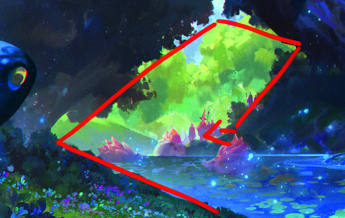
When creating a large-scale piece, it’s important to keep track of all the smaller elements used within the scene. Micro-composition can sometimes tell a story or serve as its own side narrative within a larger piece.
For this one, I created some visual framing by carefully placing elements around the scene to guide the viewer’s eyes into this smaller area of composition.
05. Distortion effects to create the magic portal
The spiral for the magic portal effect can be achieved by laying down an assortment of base colours. My choice was for complementary blues, which I adjusted to my liking with the Hue sliders.
Under the Distort tool, you can select Twirl to create the effect, while the haze was created with the Ocean Ripple filter. When you combine these distortions together, it can create plenty of unique effects, so experiment!
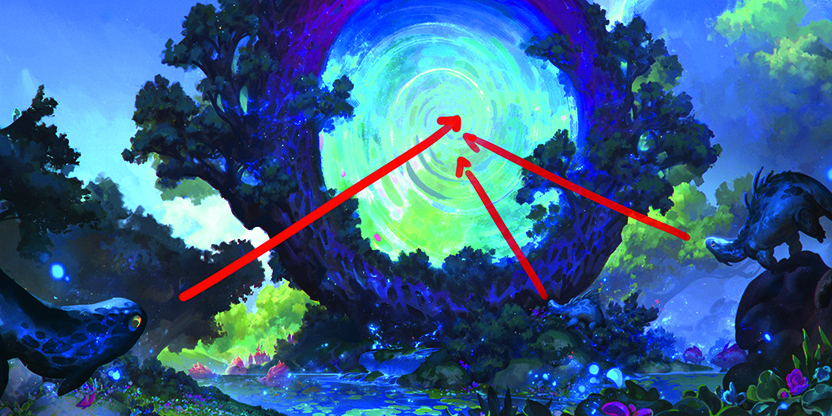
06. Create an organic feeling
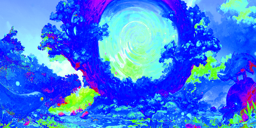
Play with your ratios so that they’re never 50:50 or 100 per cent. Having a bit of imbalance and imperfection can add to this effect. In the first image, most of the creatures and other elements are pointing towards the portal with a couple facing away, while in the second shot everything is mostly blue and green with bits of violet for contrast.
When your ratios become too even it gives a sense of balance and perfection that can make an image feel artificial. This isn’t necessarily a bad thing depending on what you’re going for, but keep in mind that nature is more organic and imperfect – why not play into that.
07. Dynamic dragon
This dragon is ready to jump while almost everything else is still. This is one more ratio to consider: the energy and movement within a piece. As the character is the only one jumping, it creates that sense of imbalance and also offers a hint of dynamism.
08. Shared elements
The textures on the lizard and the tree are from the same stamp brush. This can be used as a subtle way to show the relationship between the portal and the animals, as you can see on zooming out that only the lizards are really looking towards the portal.
For more tutorials, see our workshop on how to create glowing light effects in Procreate. For inspiration, see our features on indie game art and what is concept art?
This article originally appeared in ImagineFX. Subscribe to ImagineFX to never miss an issue. Print and digital subscriptions available.
For more inspiration, see our rounds ups of comic art resources and line art exercises.