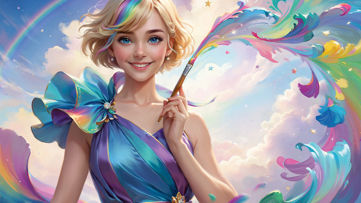
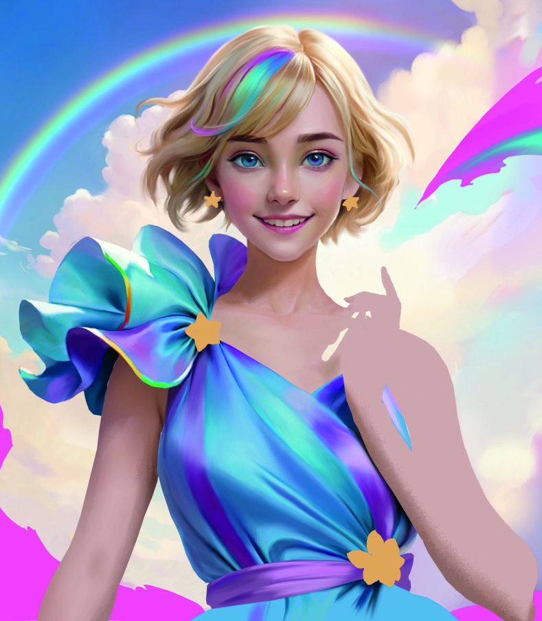
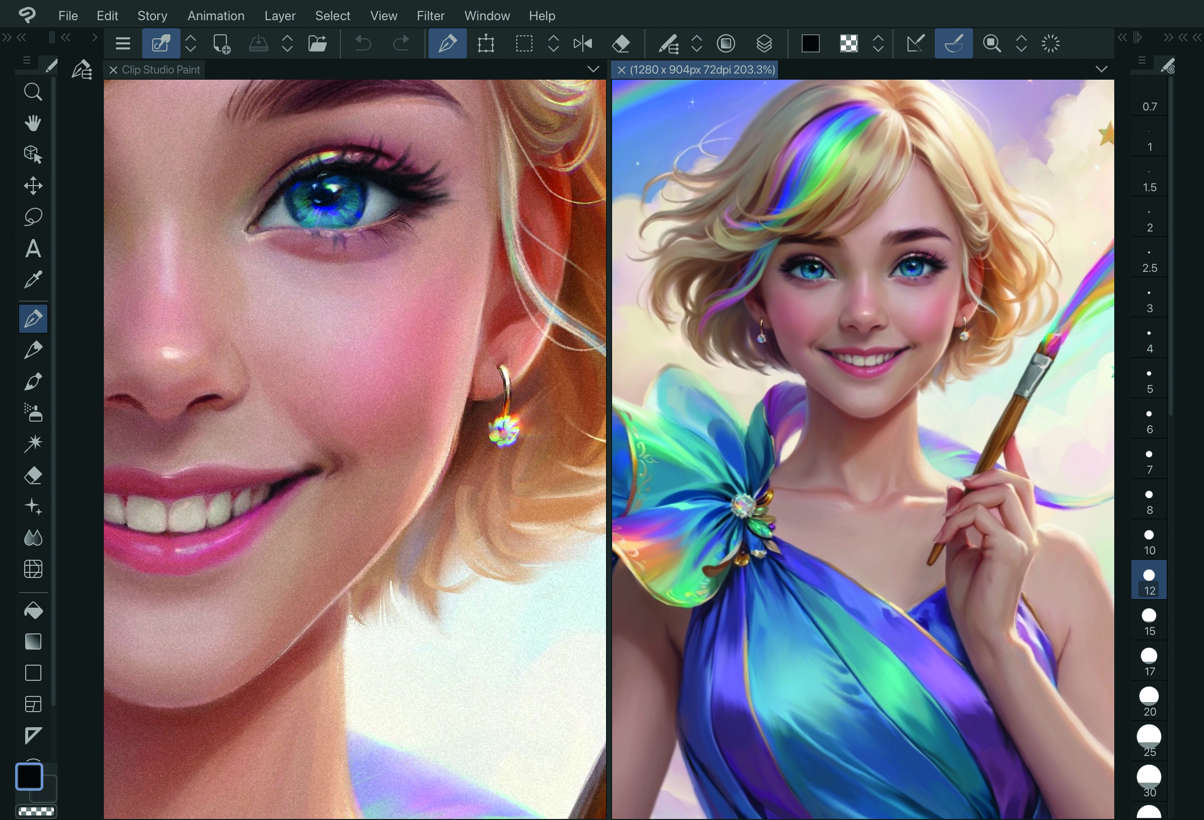
For this illustration, where I show my process for creating a character illustration in Clip Studio Paint, I was asked to create a fun, bright image with the theme of making artwork magical by the developers behind the digital drawing app Clip Studio Paint.
Although it was my first time painting with the software, I found myself completely immersed in the world of digital art from start to finish. It features a wide variety of brushes and I loved how the colours mix and blend just as they do when working in traditional media. (If you want to get started in digital art, read up on the best drawing tablets and best laptops for drawing.)
In this walkthrough, I’ll show you how to use Clip Studio Paint’s many features to make each stage of the painting process smoother, from the first sketches right the way through to the painting and making those final tweaks for the perfect image. Now I’ve tried the app, I can’t wait to explore more possibilities with it in my next artwork!
01. Creating some rough sketches
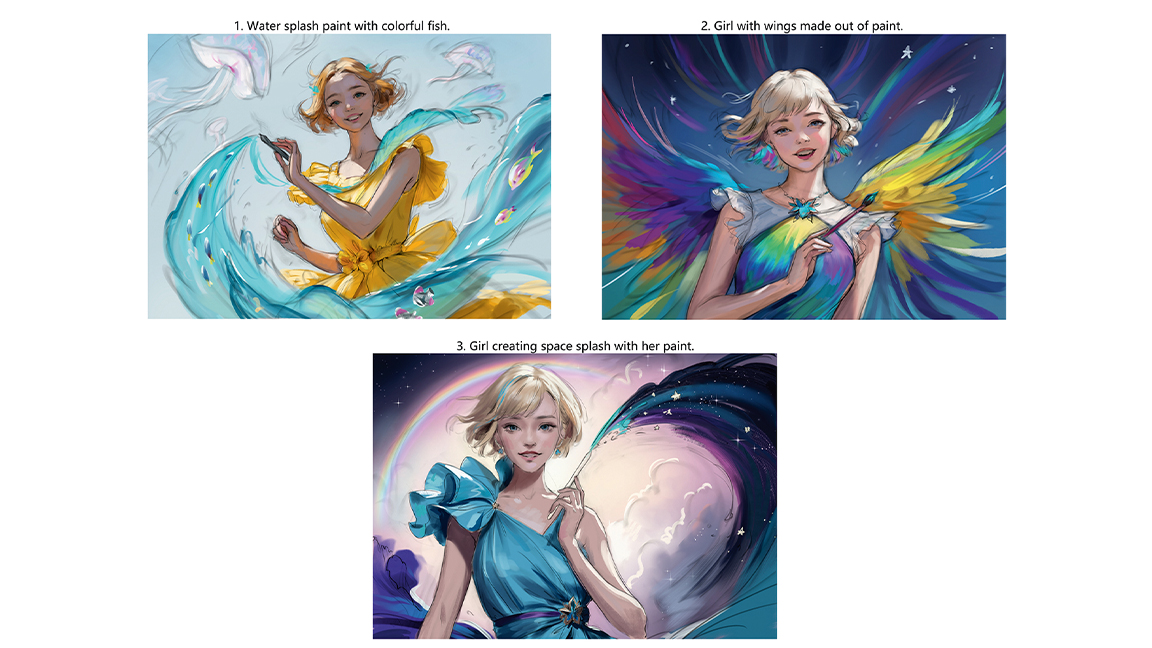
Start with a few rough colour sketches to meet the brief, aiming for simplicity. I like to keep lines and colours on separate layers so the painting process is easier later on. At this point, I avoid polishing any details, as the concepts are still fluid and subject to change. This allows me to focus on the overall composition and mood without getting distracted by any intricacies that may evolve.
02. Model exploration
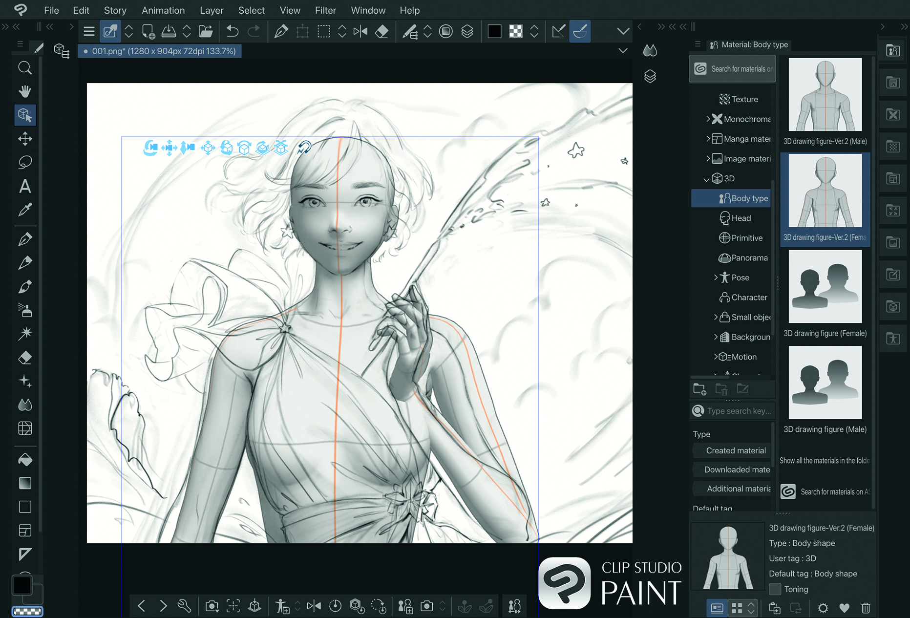
The 3D design models in Clip Studio Paint offer an easy way to explore various angles and compositions, and are good for getting accurate proportions and hand placement. With this tool, I adjusted the character’s pose for precision and realism. This guarantees the finished art is both natural and balanced.
03. Repainting the sketch
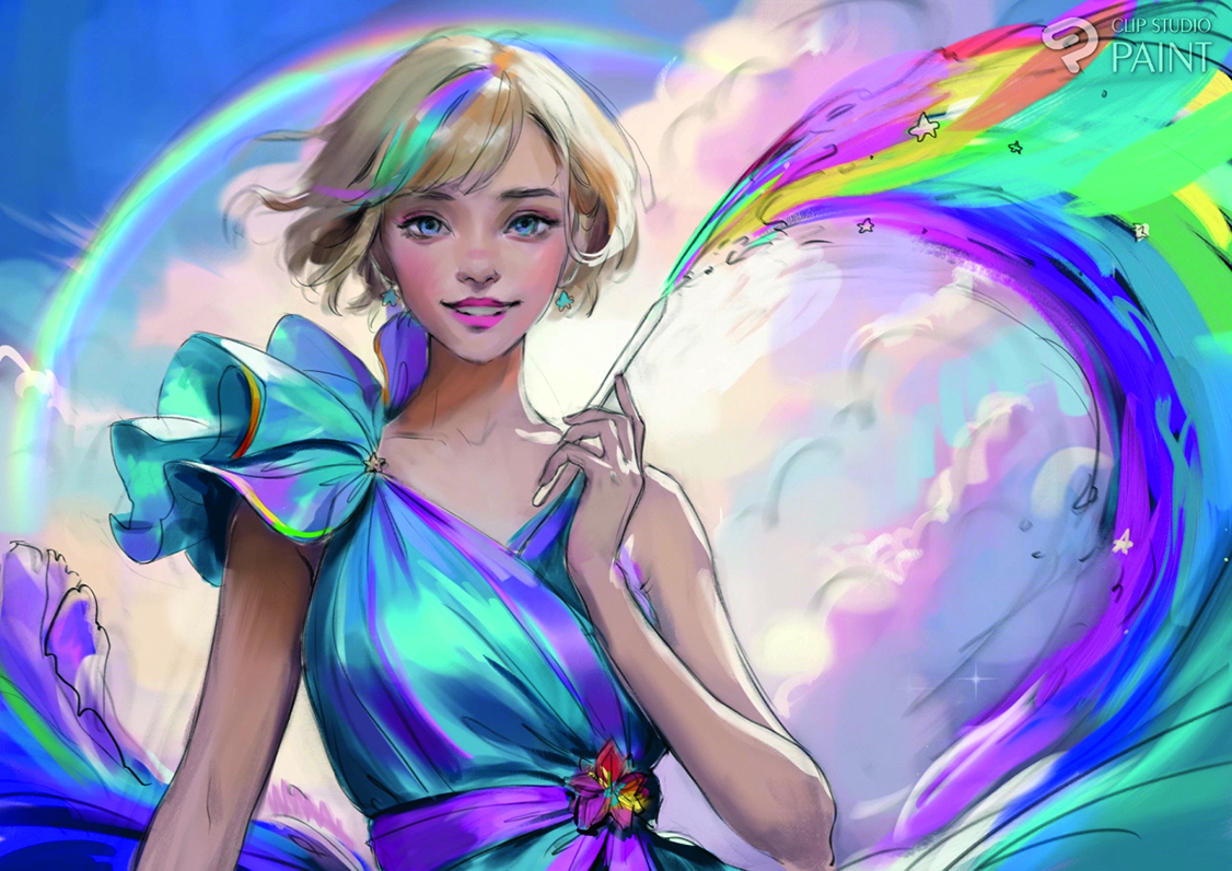
Once the sketch is approved, start to refine it. I embraced a shift from a galaxy to a rainbow theme, integrating a new background and reworking the brushstrokes to unleash a spectrum of colours, lifting the backdrop’s luminance and injecting a burst of vibrancy.
04. Refining the sketch lines
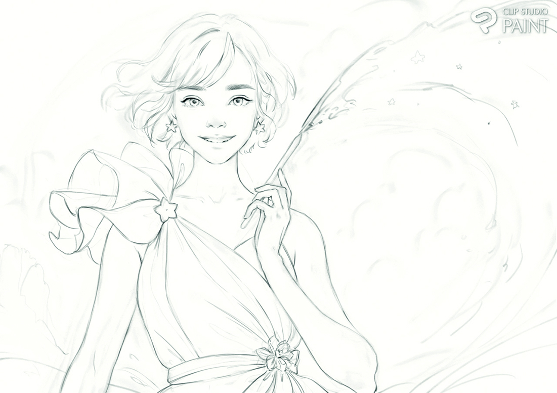
Hide the colour sketch layer, and refine or remove unnecessary details. During this process, I used fine line brushes found in the vast library of Clip Studio Assets. These tools enable precision when you’re defining contours and enhancing the clarity of the composition.
05. Blocking colour with the Lasso Fill tool
Block in the shapes of the skin, clothes, hair and paint splash on separate layers with the Lasso Fill tool and Alpha Lock each layer. As my sketch lines are loose with a lot of gaps, it’s easier to use the Lasso Fill tool to draw the outlines of the fill areas. If any areas need adjustments to the shape, go back in with the Lasso Fill set to transparency and adjust the shapes.
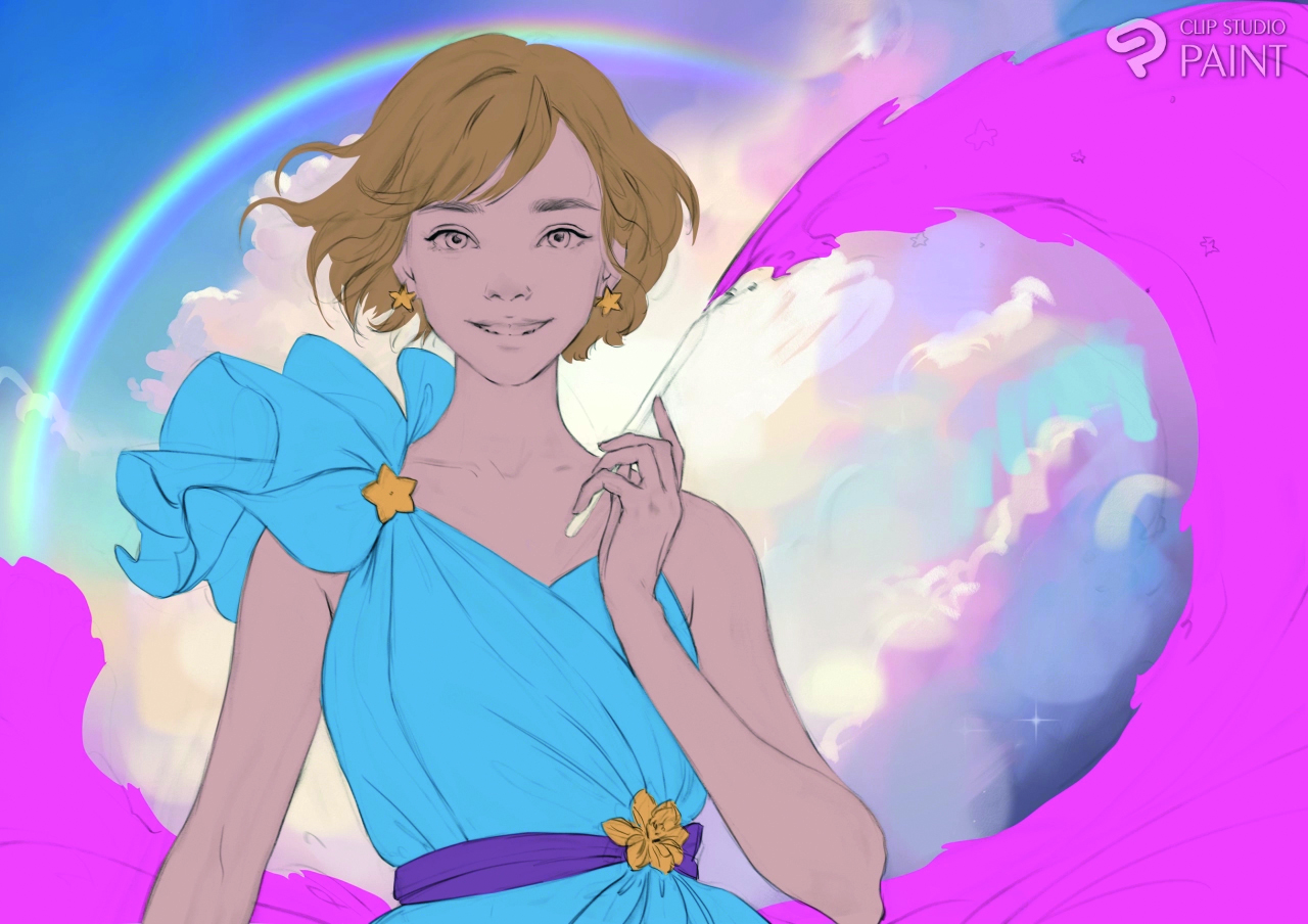
06. Building the 3D shapes
With the layers set to Alpha Lock, start to paint in shadows to make the shapes appear 3D. I prefer to start with the face, as it’s the focal point of this illustration.
Once there’s enough shape to the colours, hide your sketch lines layer and continue painting in more detail. For this illustration, I’m using the default thick paint brushes within Clip Studio Paint. I really like how well they emulate traditional media, which allows me to achieve the desired artistic look.
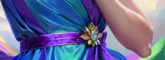
07. Painting the satin clothes
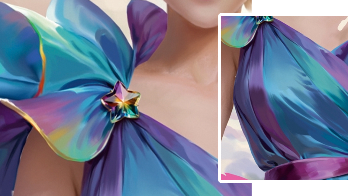
I decided on a glossy satin for the dress in this illustration to get a sleek and elegant look. Express the texture by combining sharp highlights and shadows in the fabric’s creases. I particularly did this around the brooch where the fabric is bunched together in small folds. On the larger areas of the fabric, blend softly and leave visible brushstrokes to represent the texture.
08. Switching the brooch
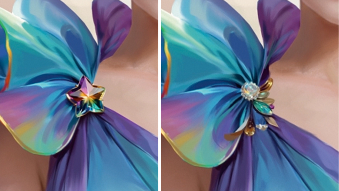
After painting the glass accessories from my sketch design, I decided to paint a new brooch that matched the elegant feel. I kept the layer with the original design and then used Layer Comps with different combinations to quickly compare how they came together, before settling on the new feathered design for the brooch.
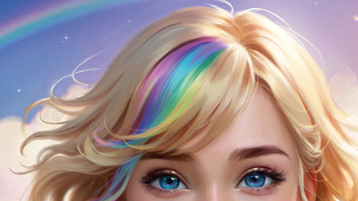
09. Painting shadows and light on the skin
While painting the skin, make sure to add warm tones in the shadows, as well as reflective rim lighting from the background. On the left of areas like her neck and arms I added subtle blue, which reflects atmospheric light from the sky and bounces onto her skin from the side opposite the sun, creating a balanced interplay of light. With a bounce light from her arm and clothes, these nuances add depth and realism.
10. Using the Liquify tool to make corrections
While painting, I often use the Liquify tool to fix the shapes, such as adjusting the belt and the fabric around it here. This tool is handy for small tweaks later on so I don’t have to repaint everything.
It’s super easy to use, which helps a lot when I need to change details that don’t look right. Using the Liquify tool often throughout my work makes it simple to keep everything looking just the way I want.
11. Developing background details
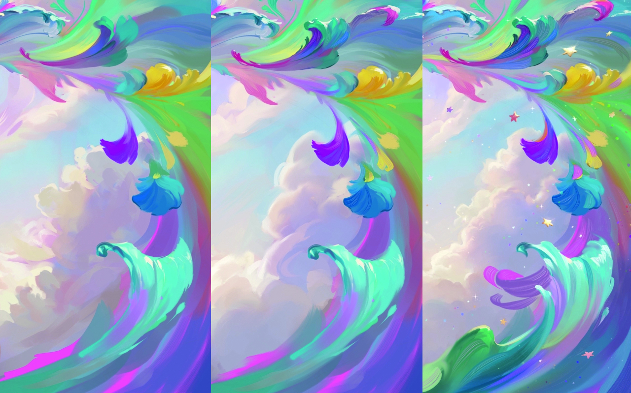
When you’re satisfied with the character’s rendering, add a little more detail to the background. For instance, I refined the clouds while keeping the shapes soft and painterly.
I tried a few variations of the design until I was satisfied with the soft and fluffy look, and then added some stars and sparkles to provide a little extra detail without being too distracting from the focal points of the image.
12. Colour adjustments using Overlay
Once the painting is done, I made some colour adjustments to brighten the image and add some more glow to the fabric and glass accessories, painting over on layers set to the Overlay and Soft Light blending modes.
13. Using filters for finishing touches
As a last step, I use the filters for Chromatic Aberration and Noise to soften the overall look. I apply Chromatic Aberration to the brightest parts of the image, such as the jewellery and highlights, to intensify the glow effect and make the scene more radiant. Lastly, I add a fine Colour Noise over the entire image, and adjust the opacity of these two layers until I’m happy.
This article originally appeared in ImagineFX. Subscribe to the magazine at Magazines Direct.