Neutral paint can be found in just about every home – it's versatile, reliable and sets the stage for a wide range of design styles. But picking out the right shade of white, beige or gray can prove much more complicated than first meets the eye.
Light can shift a painted wall's appearance, making something lovely look dull in an instant. So, whether you rely on multiple light sources, have a room that depends on the seasons for a natural glow or simply want to ensure you're making the best choice for a long-lasting style, it's important to choose the right neutral color.
The good news is that decorating with neutrals already offers quite a bit of flexibility, no matter the space. But certain hues are better than others for delivering everlasting appeal. We spoke with six interior designers to find out how they choose their neutral colors, plus which specific shades work best when lighting is up in the air. Here's what they had to say.
'Versatility is one of the strongest and, perhaps, the most attractive thing about neutral colors. These hues can dress themselves up with the season as they echo the warmth in the summertime and bring coolness in the winter months with natural sunlight,' says Hannah Yeo, senior manager of color marketing at Benjamin Moore.
How to choose a neutral color, no matter your lighting scheme
These colors look simple, but there's a lot to keep in mind when sorting through swatches. From keeping within color families to deciding between warm and cool tones, here's how designers get the job done.
1. Try out samples before committing to the whole room
Paint swatches exist for a reason, and it's always a good idea to bring a few of your favorites into the room you plan on transforming before making a full-space commitment.
Rushda Hakim, interior designer and founder of Rushda Hakim Design, says it's important to be flexible when it comes time to paint – just because you've come to like a specific shade doesn't mean it will work beautifully in your space.
'Keep in mind that the true essence of each color may vary in different environments. It's advisable to sample colors on various walls within your space before finalizing your decision, ensuring the perfect harmony with your specific lighting conditions,' she says.
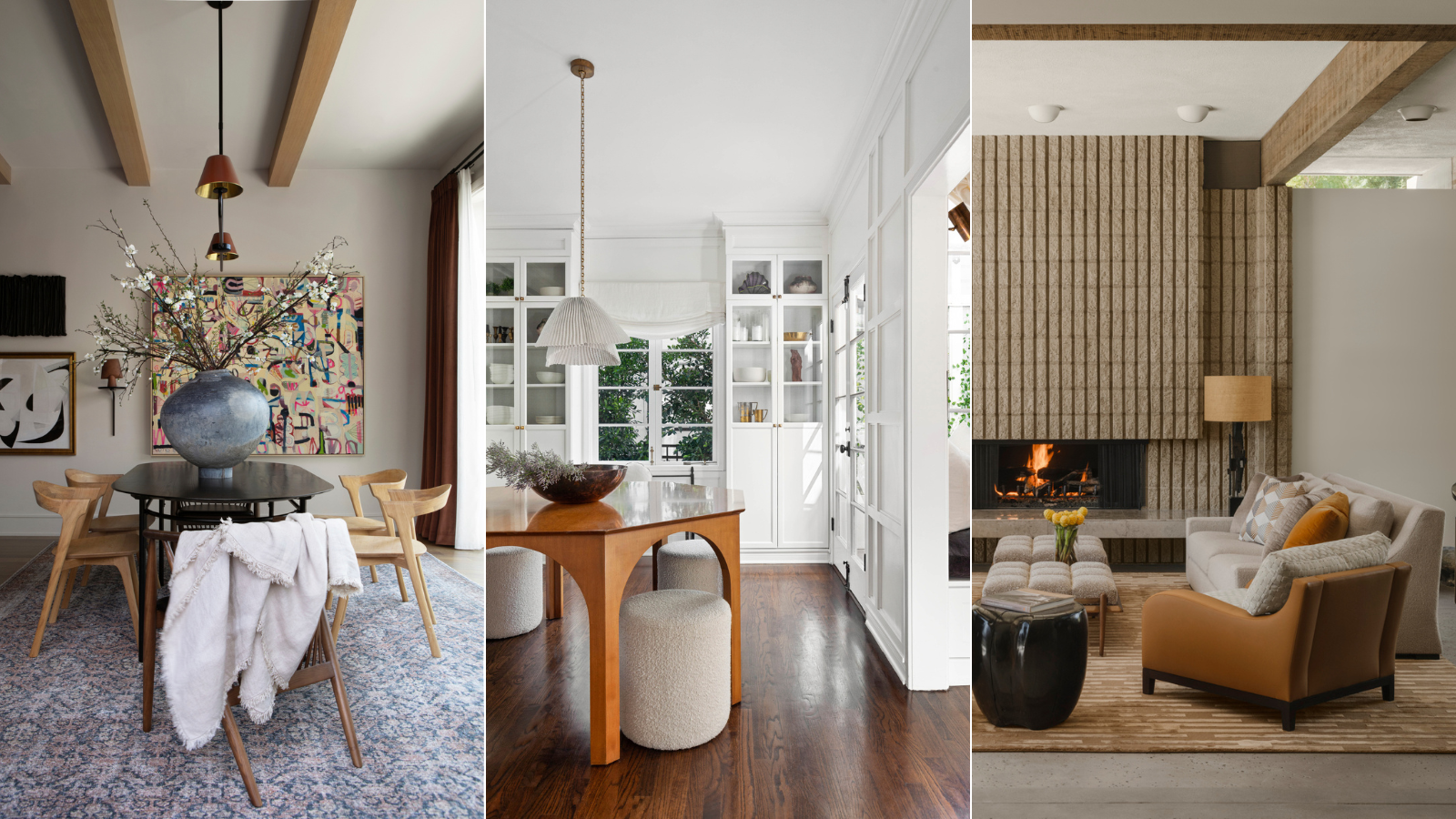
The designer says she's discovered several versatile shades that 'offer a warm and inviting ambiance,' though, explaining that the team at Rushda Hakim Design prefers a warm-toned palette with darker accents scattered sparingly throughout a space. Benjamin Moore's Ballet White, Balboa Mist, Light Pewter and Nimbus made the list of Rushda's personal go-to shades.
2. Treat paint like a blank canvas
Hannah Yeo, says that picking out a neutral shade is like choosing a blank canvas for the rest of your design scheme. She suggests three shades in particular, citing their versatile and timeless appeal, especially in rooms with difficult lighting.
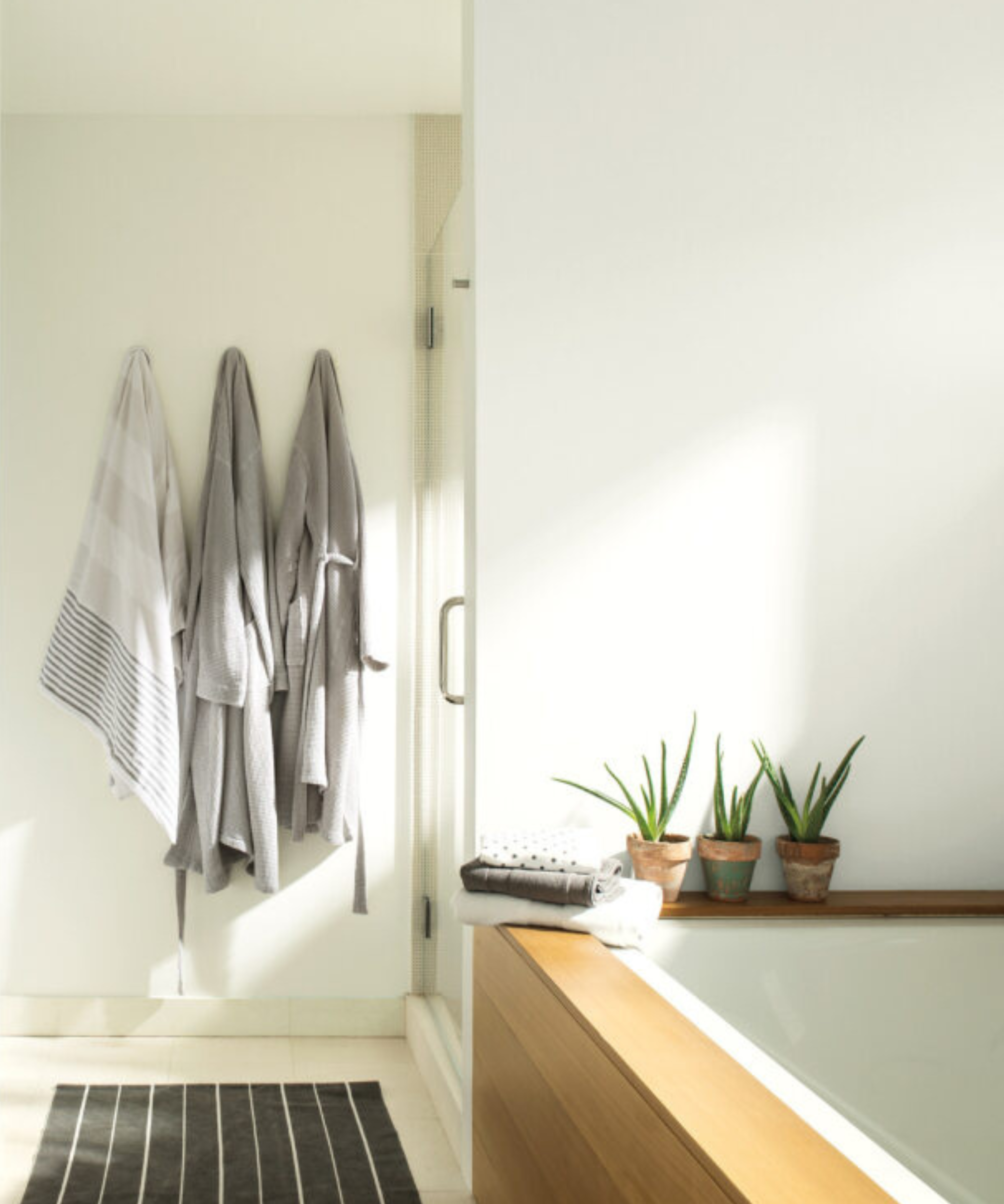
Chantilly Lace OC-65, pictured in this brightly lit bathroom, is 'one of Benjamin Moore's brightest and cleanest whites,' says Hannah. She adds that the shade pairs with a large selection of interior design styles and accent colors, working especially well for trim, doors, and ceilings.
Collingwood OC-28 is another favorite, providing the perfect balance between cool and warm – a true neutral. Hannah says that the hue warms up an otherwise cool-toned room, and offers balance in already warm spaces.
And if you prefer a slightly darker neutral, Kingsport Gray HC-86 is a rich hue that works wonderfully for the interior or exterior of the home, says Hannah.
'Inside of the home, this versatile neutral creates understated drama in a formal living room, dining room or bedroom. It’s also a great option to paint your vanity or kitchen cabinets. On the exterior, it works well with many different types of materials such as brick, stone and wood,' she says.
3. Consider if your home is north- or south-facing

Lighting doesn't just depend on the season, and the configuration of your home can have a big impact on neutral-toned walls. Holly Beazley, creative director of Elicyon, says that considering the natural lighting in each and every room is of utmost importance when picking out neutral shades.
'South-facing rooms will inherently be washed with warmer light, so cooler colors can be used more easily. Whereas warmer tones should be used in north-facing rooms to counterbalance the cooler light,' she says.
While keeping these rules in mind, Holly suggests opting for an understated hue of yellow, green or pink for a more colorful neutral base. She says these shades 'provide a perfect backdrop for a cozy feel within a well-lit home.'
When it comes to pairing neutrals, no matter which color you've gone for, Holly says to get creative with other mainstay hues, and add some depth with varied fabrics and materials.
'We love to work with natural hues and tones, often playing with different materials such as wood, metal, varying fabrics, and even textural plaster, pairing them with soft whites, warm greys, neutral beiges, greens and powdery blues, offering versatile choices that work well in various lighting conditions. These colors will adapt to changes in natural and artificial light, maintaining a consistent and pleasing appearance,' she says.
4. Focus on depth and dimension

After you've decided on white, gray or beige, pay attention to individual shades' depth and dimension. The right hue can add movement and character to a space, shifting with the seasons.
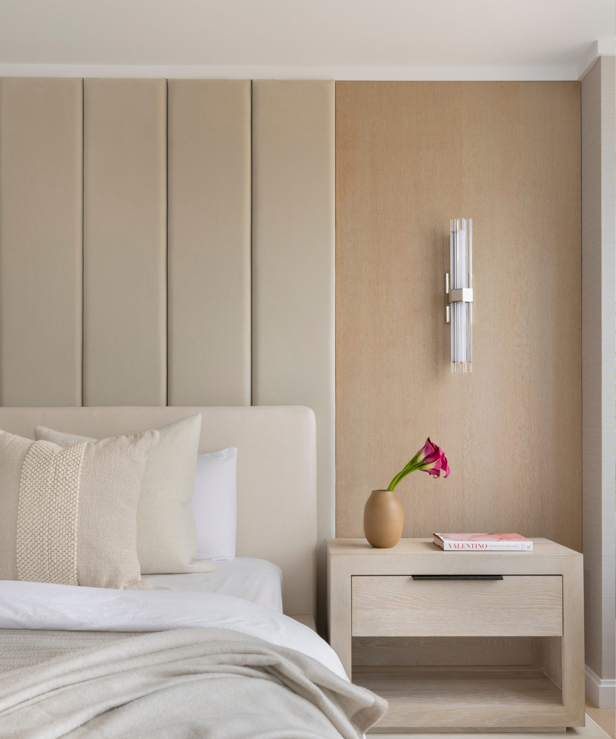
Victoria Holly, principal designer and founder of Los Angeles-based Victoria Holly Interiors, says that taupe is a classic solution. She suggests introducing interesting textures, materials and accent hues alongside taupe to fully appreciate its movement.
'It’s a sophisticated neutral with depth. It strikes a perfect balance between warmth and neutrality, offering a timeless aesthetic that can evolve with changing interior design trends,' she says.
But a basic bright white will do the trick as well, working well with just about any design style out there. Victoria says she adds a bit of extra interest to a classic white color by incorporating paneling or millwork, fixtures that 'keep your white walls looking rich instead of builder-ready.'
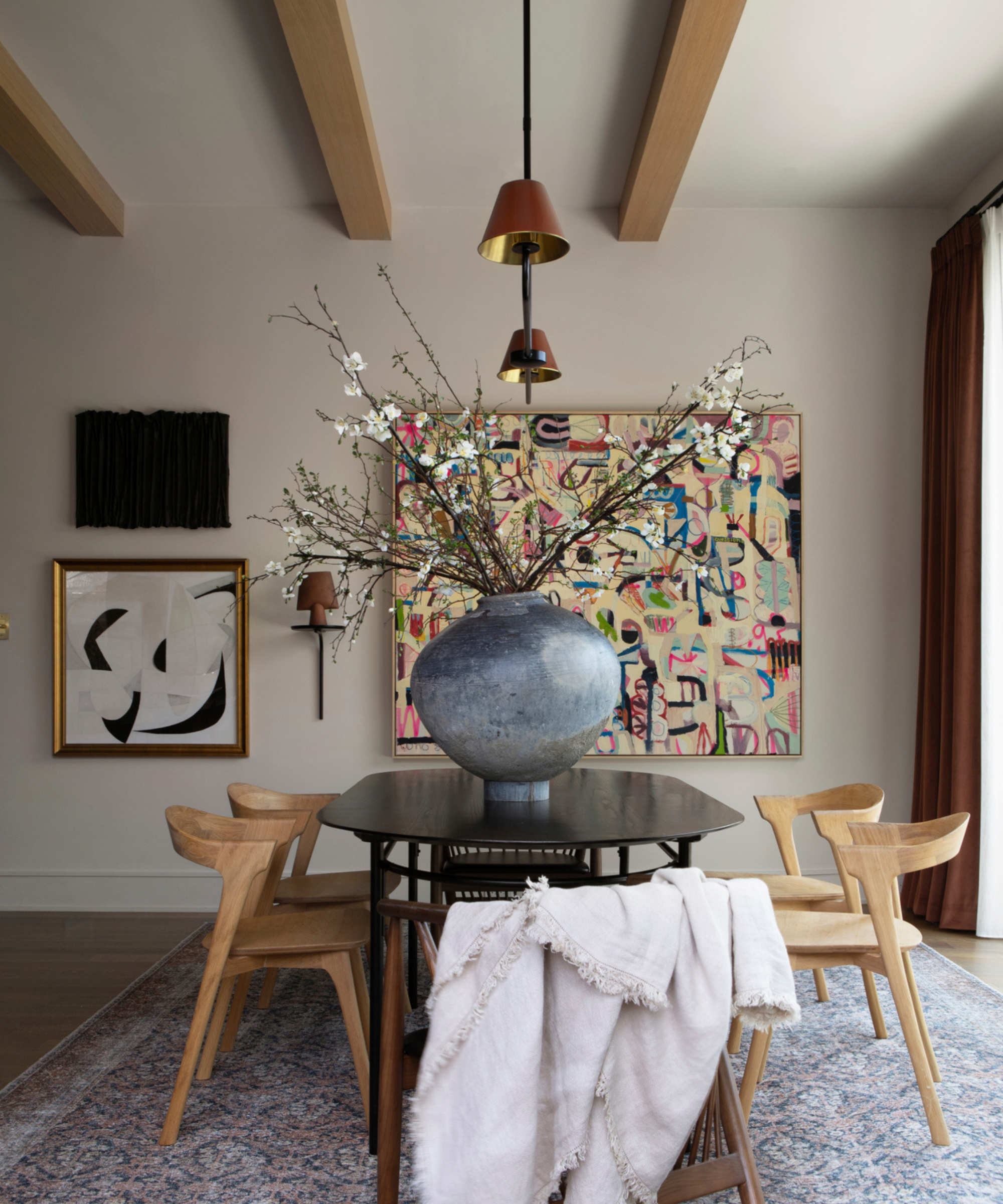
This sun-soaked dining room designed by Victoria showcases intentional molding and cabinetry, details that takes the white space to new heights.
5. Choose a color family and layer

If you're looking to transform your entire design scheme, layered neutrals create a cohesive and elevated interior space. Joshua Smith, principal designer and founder of Joshua Smith Inc, uses pairings of neutral tones to create calm and peaceful designs.
Joshua says that Benjamin Moore's White Dove, a beautiful white hue, has proven its versatility time and time again.
'I’ve used it more than any other paint color for over 10 years! In a flat finish, it can lean a tinge towards cream in sunlight, but as a satin on trim or the ceiling it’s the perfect shade to give a little age in the best way,' he says.
To fashion a layered look, Joshua gets creative with placement, using White Dove alongside other neutral standbys – Benjamin Moore's Cloud Cover works especially well.
'For example, the trim may be the lighter White Dove shade, but then the fireplace or cabinetry gets the shade darker and richer to add depth and dimension while staying within the white family. I also love Farrow & Ball Pointing for walls!' he says.
6. Look to taupe for a darker look
Whites, creams, beiges and grays often steal the show when it comes to neutrals, but more unique shades can really make a space shine. Ginger Curtis, CEO and founder of Dallas-based Urbanology Designs, says that taupe is a personal favorite.
'It is versatile, timeless and has an understated elegance that can really elevate a design. Taupe doesn't shout for attention; instead, it whispers sophistication. It plays well with other colors, allowing them to shine without stealing the spotlight; subtle yet warm, perfect for creating a cozy and inviting atmosphere,' she says.
Taupe doesn't just come in one shade, so be sure to consider its undertones before trying it out in your space – a warm-toned taupe looks much different than a cool-toned variety when lit well.
Ginger says that taupe works in a variety of spaces, but it's best to show the hue off in a brightly lit space, whether by sunlight or fixtures. This will allow the shade to showcase its warmth and undeniable depth.
When picking out colors for your next beige-toned space, keep these expert-approved tips and tricks in mind. By making intentional choices with paint, your space will be beautifully lit and inviting all year round.