The release of iOS 17 is just around the corner, and while there’s still time until the newest iPhone software launches alongside the reveal of the iPhone 15, I’ve been testing out iOS 17 Beta for a couple of months.
During my months of testing, I’ve had many phone calls, and not once did I worry about the placement of the end-call button. Until earlier this week, when mainstream media outlets like CNBC started to report that the end-call button on iOS 17 was in a different place than we’ve been so used to over the years. Like most changes to iPhone, it’s likely to cause a headache for a lot of people who are creatures of comfort, and it will probably cause your gran to say, “I don’t want to update, I like the way it used to be.”
Now when you’re on a phone call in iOS 17, the red end-call button isn’t in its usual place, and quite frankly, it might drive some of you mad. But why has it moved? And is it really that big of a deal?
Out with the old and in with the new
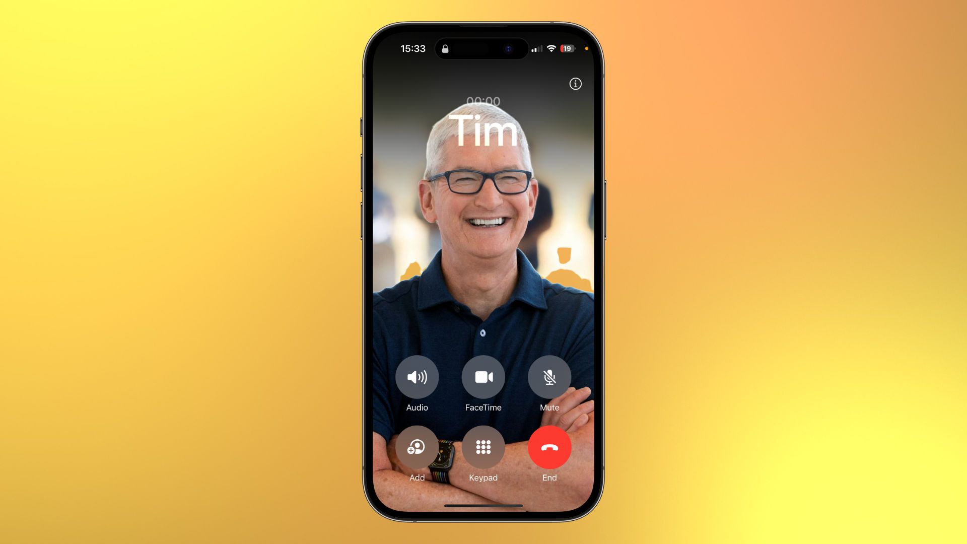
Essentially, Apple has moved the end-call button from the center of the screen below the other phone call controls on iOS 16 to the right and merged it with the rest of the controls in iOS 17. This allows you to see the beautiful Contact Posters of your friends without the in-call controls covering the full-screen images.
Honestly, after using iOS 17 Beta for months, I didn’t even notice the change. That’s how accustomed I’ve become to the evolution of small UI design choices across iOS releases. Yes, it’s in a different place, but no, it’s not going to cause you a headache, and if anything, you’ll appreciate the ability to use the new headline Contact Posters feature on iOS 17, which allows your phone calls and Phone app to look better than ever before.
Contact Posters allows you to design your own full-screen image that pops up when you phone a friend or family member and vice versa. It’s a feature that is at the core of the customization in iOS 17 and a much-needed fresh coat of paint to an app that we use every single day.
If using Contact Posters means moving some buttons around, then it’s well worth the change, and anyone that’s got an issue will likely have forgotten where the old end-call button was as soon as they create their own gorgeous full-screen contact card.