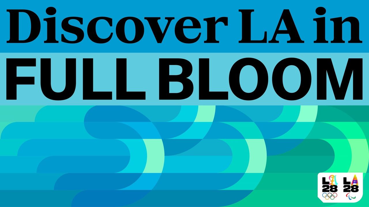
Olympic branding is rarely one and the same – it's a chance for the host city to flex its creative muscles and build a unique identity that stands for the spirit of its people. Redefining what an Olympic identity can be, the recently revealed LA 2028 Summer Olympics brand is a shining example of design with soul; a creative tapestry that weaves together the diverse stories nestled in Los Angeles.
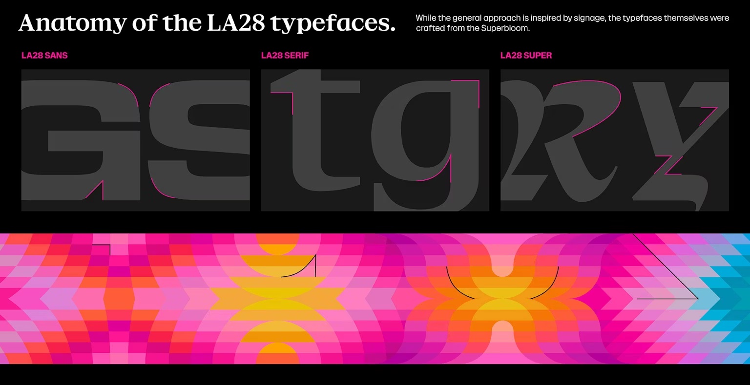
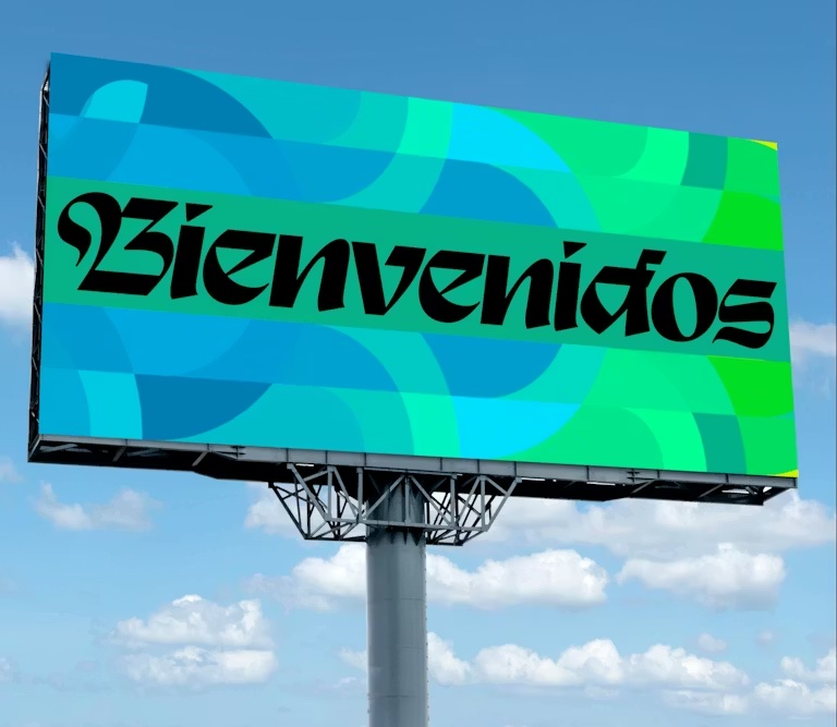
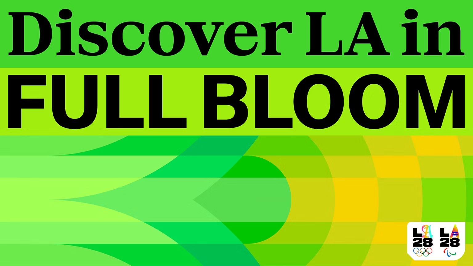
While the LA28 identity is impactful in many ways, it's the typography that brings the design to life. Inspired by the rich signage of the city streets, it captures a bold heritage spirit that transcends the confines of traditional typography trends. Delving into this transformative design system, I caught up with Monotype's senior executive creative director, Charles Nix, to discuss the underrated power of typographical design as a cultural preservative.
LA has a rich tapestry of culture – how does the LA28 identity reflect that?
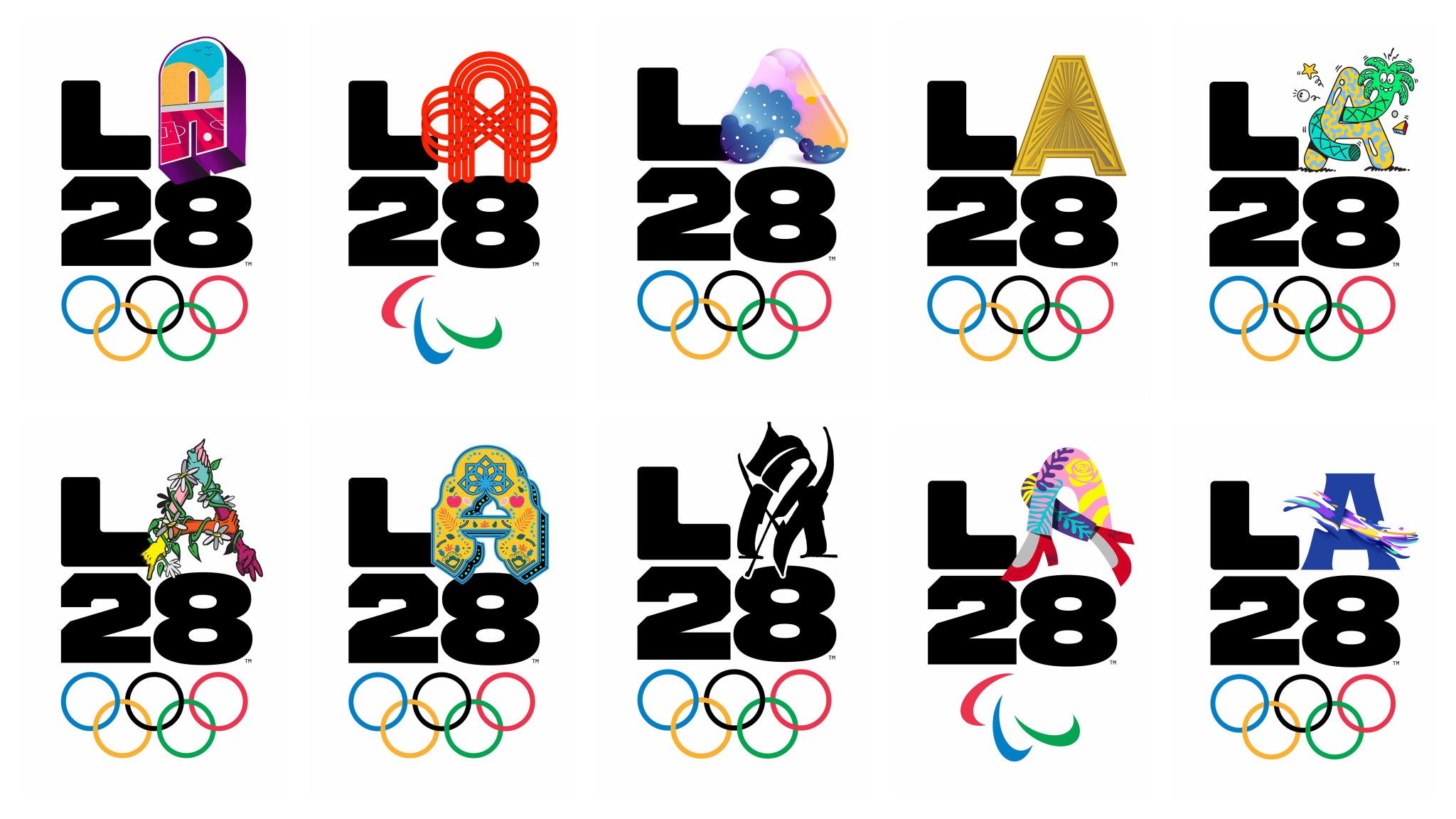
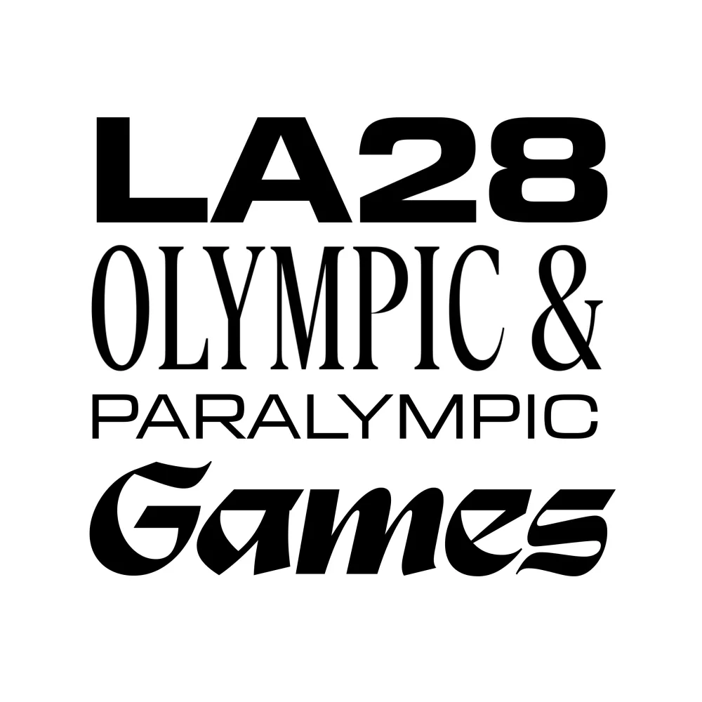
LA28 starts with the logo. The variable “A” turns a single glyph into a system, dozens of interpretations that feel much closer to how LA actually works. From there, the typography opens up into a mix of styles – neighbourhood by neighbourhood, sign by sign. In a city where the architecture often fades out, it’s typography that does the work – signage, tone, presence. That’s the key. The identity doesn’t try to unify it. It celebrates it.
What do you think the unique strengths of LA28’s typographic identity are?
LA28’s typographic identity works because it holds a tension: it’s systematic enough to scale, but specific enough to feel alive. It’s unapologetically type-forward – typography isn’t supporting the identity, it is the identity. That balance is what makes it effective. It can operate at a global level without flattening the city; it channels the variety and texture that define LA.
How do you transform the ephemeral and abstract into a functional design system?
You make the abstract usable by separating structure from expression. Build a system that sets the rules, then decide where to break them. LA28 does this well – a stable framework with moments where culture can show up more vividly. It keeps the system legible, but not dead. I think of it like a façade with a few open/active windows – there’s rhythm and clarity, but also life. If every part of the identity is expressive/varied, it turns into noise pretty quickly.
How can typography be a tool for cultural and urban preservation?
Typography is often described as the art that preserves all arts. Originally this referred to it as a functional container for language. That’s still true, but it now operates on two levels. It carries the words that document culture, and it has become a cultural artifact in its own right. In cities like LA, you see that clearly – typography isn’t just describing the place, it’s part of how the place is experienced, through signage, systems, and everyday use. It doesn’t just record culture; it reinforces and extends it. Over time, it stops being a layer on top and becomes part of the place itself.
What’s the benefit of using flexible typographic systems in place of single font identities?
The benefit is that the system becomes the container for expression, instead of chasing a single “ideal” form. A flexible typographic system assumes variation from the start – it doesn’t try to iron it out. That’s a shift away from the International Style, where neutrality and uniformity were the goal. A single font and grid can produce a clean artifact, but it also flattens things. A system like this can hold multiple voices and still feel coherent, which is much closer to how a city like LA actually works. That said, this system is a Hollywood version of LA expression – an imitation of diversity. That is, ironically, very on brand.
Creative Bloq is now easier to access than ever before with our on-the-go app, which brings you all the content you know and love from our website, but in a super-streamlined design.
Download the Creative Bloq app for iOS
Download the Creative Bloq app for Android