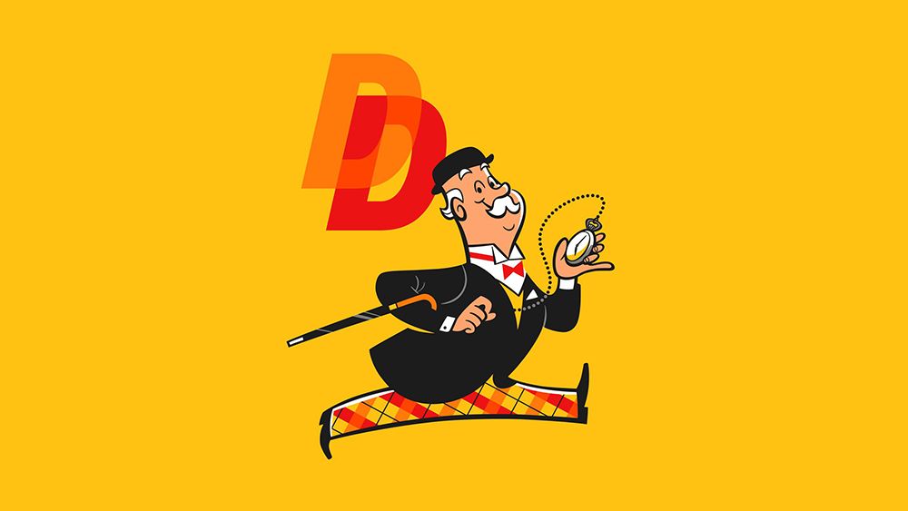
Retro vibes are everywhere in branding at the moment, particularly in food and drink, but bringing back a name that had been consigned to oblivion is a risk. Once famous brands often disappear for good reason, because they no longer resonated with customers or no longer had relevance amid changing tastes. But the surprising revival of classic British beer brand Double Diamond is winning a lot of attention.
First brewed in 1876 by Samuel Allsopp & Sons, Double Diamond was once one of the best-selling beers in the UK. It was everywhere from the 1950s until the ‘70s and hung on for a long time after that, until it gradually fell out of favour amid the rise of real ale.
It had disappeared from supermarkets by the start of the new century, but now it's back and bringing a lot personality with it (for more branding inspiration, check out the Brand Impact Awards 2025 winners.).
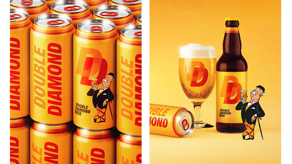
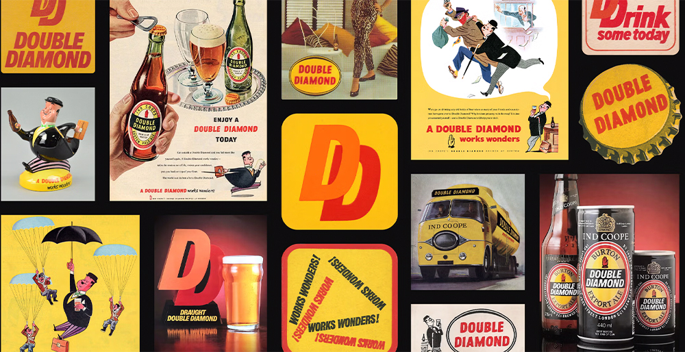
The new Double Diamond is more than just a rebrand. It's part of the broader revival of the Allsopp name, a mission undertaken by Jamie Allsopp, a descendant of Samuel, and Steve Holt of Kirkstall Brewery in Leeds. Using original recipes and yeasts, they've brought back several Allsopp beers.
Double Diamond is the most recognised brand, and the task of reviving it was given to the designer and lettering artist Alec Tear. He brought the illustrator Satoshi Hashimoto on board to revive the classic 'Little Man' mascot, who has been appropriately aged in recognition of his time away and has been given quite some trousers.
"I knew I had to double-back to its iconic design archive and restyle the very best of its past into something relevant for the beer drinkers of today," Alec says on his website.
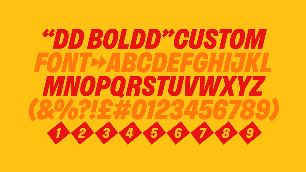
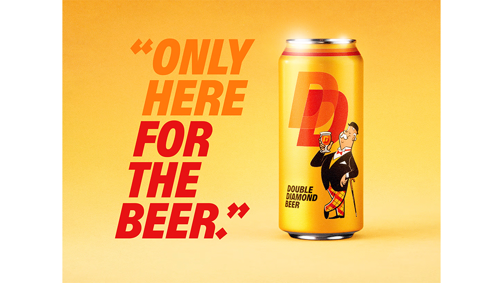
The rebrand retains the double 'D' logo and recreates Double Diamond’s striking italicised uppercase font. After being unable to track down the exact cut of the original brand font, Alec brought in Lewis MacDonald of Polytype to create a contemporary version of the type, now with diamond-clad punctuation to link to the brand name and create an even bolder impact.
Double Diamond is one of those rare brand revivals that manages to communicate its heritage value while still feeling contemporary. The new identity will transport those who remember the brand back to traditional British pubs with their carpets, dark-stained furniture, beer mats and the bell ringing for last orders.
For those new to the brand, the identity feels bold and vibrant with a fun nod to the authenticity and tradition that many crave amid the more recent trend for 'edgy' and alternative branding in craft beer. The identity is perfect; now things depend on whether the beer itself has been improved enough to appeal to modern drinkers with more sophisticated tastes.


