When a logo secret is discovered, we like to be front and centre for its unveiling. And a potential new offering for the Clever Logo Hall of Fame may have been discovered on Reddit in the form of the Honda offshoot car brand, Acura. We say may, because even our own team is split – so we'll be interested to know your thoughts.
So, Honda has a luxury brand called Acura it created in 1986. And its logo could be brilliant representation of its position as a relative to Honda. As noted by the Reddit community, it looks very much like the Honda 'H' logo flipped upside-down and tinkered with just enough to make it into an A. An A for Acura in fact. Is this smart design worthy of our best logos post, or is it a bit of a stretch?
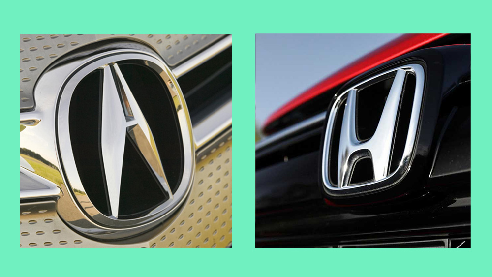
Acura is the luxury offshoot of Honda sold in North American markets. The Acura logo is a flipped Honda H with the tops pushed together to make it an A. from r/DesignPorn
"Acura is the luxury offshoot of Honda sold in North American markets. The Acura logo is a flipped Honda H with the tops pushed together to make it an A," says Frolicking Fox on Reddit. And we can totally see what they mean... well, most of us.
One member of our team wasn't so sure, asking just how much a logo can be altered before it feels like a stretch. Surely, he asked, the logo wouldn't have the sides shaved off to make it so pointed, but would be a replica of the rounded lines of the Honda logo. And it seems there is a reason for that.
Another comment on Reddit actually nails the true secret behind the design. "I thought it was calipers," a user challenged. "Well, damn... It could be that also, which would make the design all that much better," Frolicking Fox replied. So maybe it's both, right?
Well yes, apparently. Because according to logo design legend, the original logo was created without that small horizontal bar that joins up the two slanted lines. This version was subsequently dropped – in fact, Soichiro Honda destroyed 5,000 badges already made, including from 309 cars already in use – and was re-evolved into the shape of an A. Happily for Honda, it also looks a lot like the parent company's logo – but this similarity seems to be a fortuitous accident rather than originally intended.
The debate serves as a reminder that logos are always up for interpretation – and can be super divisive (as this week's new Google Fi Wireless logo proved – yikes).