What you need to know
- Google is reportedly working on a gradient color redesign for its app icons for Maps and Photos.
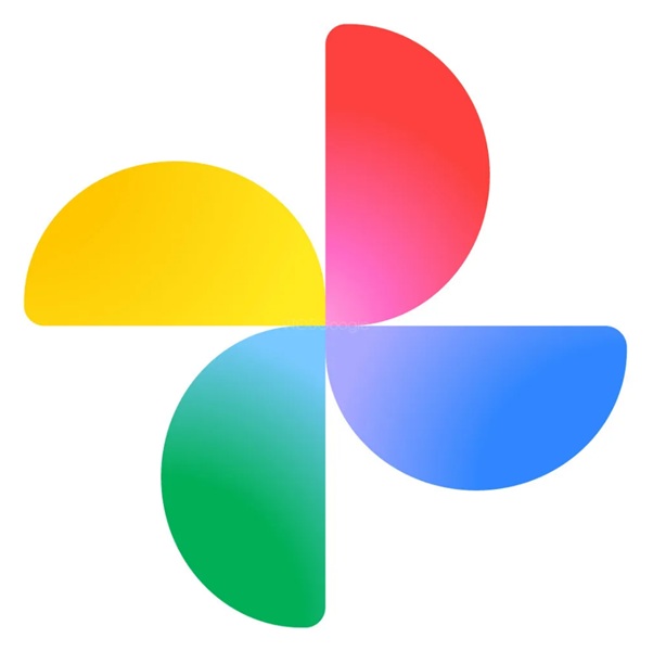
- While the Photos' app change is more minimalistic, it seems that the individual petals are a little wider.
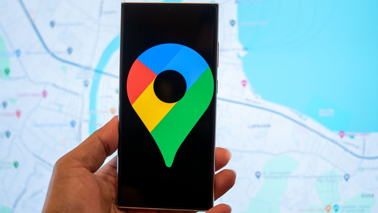
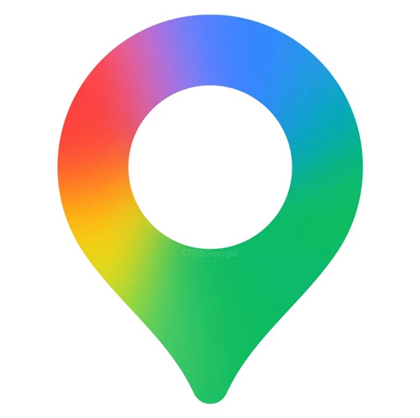
- The Maps icon sees a bigger change, as it appears a little more stout, and as it adopts that seamless blend between hues.
Enjoy our content? Make sure to set Android Central as a preferred source in Google Search, and find out why you should so that you can stay up-to-date on the latest news, reviews, features, and more.
Google's doing a little house cleaning as we get into fall, revamping the icons of apps you might reach for daily.
Google has been rocking its four-color classic (red, blue, green, and yellow), but that's undergone some small, more modern changes as of late. In a report by 9to5Google, it looks like the company's preparing to bring those same adjustments to a couple of popular apps. Via an unnamed source, the publication states Google is working on revamping the logos for Maps and Photos.
Regarding the latter, the Photos icon redesign is much simpler. It looks like Google will make the individual petals a little wider, and really embrace the rounded mindset. However, when it comes to the gradient, the Photos app doesn't hit quite as hard. The redesign looks like there's more of a bright spot in the center that tries to invoke that gradient, which only comes through modestly.
You can faintly see how the colors slowly shift between the hues, but perhaps, once it's on our phones, we'll see it in a better light.
For Maps, Google's changes are more evident, as it opts to increase the pin's center, and smooth the colors, so they seamlessly merge into one another. It's easy to see how the colors blend into each other, going from yellow to orange to red and to purple. The Google Maps icon is a little more stout, too, because the empty center is a little wider.
Nothing's appeared just yet, but it seems that we should at least expect these icon redesigns to arrive sometime in the future.
Google's looking vibrant
Google's started refreshing its on-device app logos, and even logos present elsewhere, since May. During Google's spring of Android announcements, the company revealed its newer, vibrant "G" logo. Much like what's been reported about Maps and Photos, the Google app got refreshed with a gradient color effect.
The updated icon was first spotted on the Apple App Store, ahead of its expected arrival on the Play Store. This change was just a prelude to something bigger, which ended up becoming reality late in September. The "G" logo's change shifted in line with the company's AI advancements and tools, like Gemini. The logo's change marked a notable shift, as Google moved more into its AI models and the like, bringing the gradient shift across its entire brand.
We've been expecting the gradient changes to hit even more apps, and it seems we can at least expect it for Maps and Photos in the future. The only wonder now is whether or not Google Chrome will see a similar change, considering blue sits right in the center of the browser's icon.