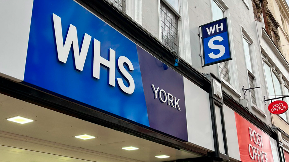
In a late contender for the least popular rebrand of 2023, UK newsagent WHSmith revealed a new logo at the end of December, adorning a handful of its stores with simplified 'WHS' branding. The clinical looking wordmark drew immediate comparisons to the NHS logo, and left pretty much everyone baffled.
The brand later explained the move, telling Creative Bloq it was testing the new signage as a "pilot" at a "small number of locations". Even so, it managed to make a huge splash online, with customers and design experts alike weighing in on the new look. One of the best logos of all time, this ain't.
Part of the the latter camp is Lee Rolston, chief growth officer, at creative agency JKR, who recently shared his views on the 'WHS' branding with Creative Bloq. "A successful rebrand is built on a foundation of business evolution," he said. "By shifting your brand positioning, you have the potential to alter perceptions, reach new audiences, and attract different buyers. However, the trial rebrand of WHS lacks clarity in terms of its business objectives. What is the WHS trying to suggest WH Smith now is? Is it a convenience store? A travel store? Books and Newspapers? What is different to the WHSmith we know? WHS doesn’t symbolize or inform us what is different and as such, doesn’t mean anything."
"If WHS intended to test a new brand format, why not draw upon the distinctive and ownable symbols and wordmarks that are true to them? History has shown that brands can find remarkable success by leveraging their heritage to navigate a new course. Burger King, Co-op, National Rail have proven to move brands forward by reigniting distinctive legacy assets. Why not WHSmith?"
Should’ve gone the Burger King nostalgia route and modernised the classic branding. https://t.co/scUarrEjNV pic.twitter.com/qVx9UxjNmeJanuary 2, 2024
Rolston is right to pick up on brands taking design cues from their own heritage – indeed, we've seen a notable number taking a leaf our of their own history books in recent months, from Pepsi to Burberry, via the aforementioned Burger King. And as social media users have pointed out (above), WHSmith's legacy branding has the kind of charm that would lend itself to a very 2024 'retro rebrand'.
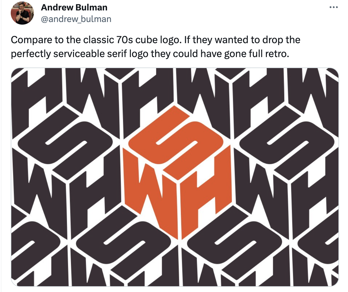
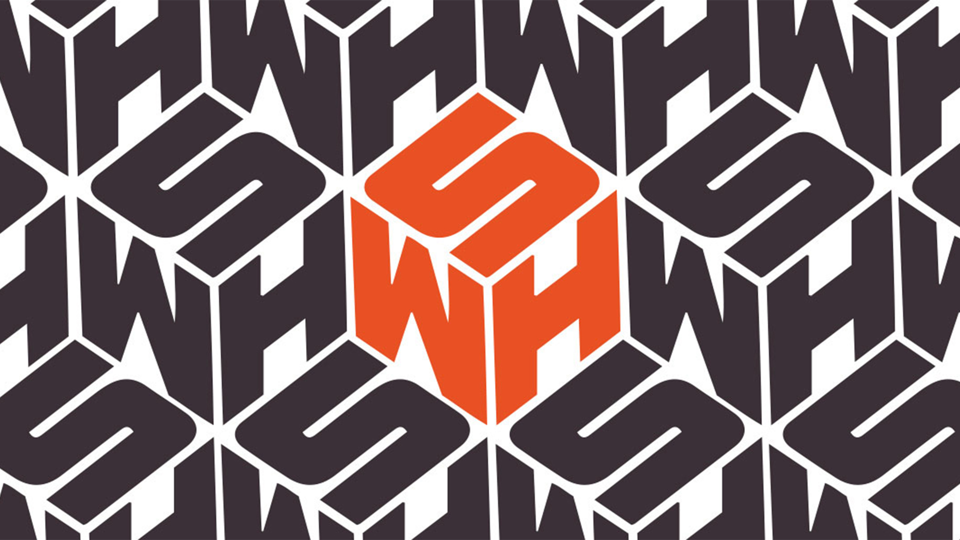
Even WHSmith itself is a fan of the old 1970s 'cube' logo. In a 2017 blog post, the brand describes the design as "a symbol of nostalgia for many of us who remember popping into WHSmith in our younger days and is one of the most fondly remembered logos from the British highstreet."

At least it's only a pilot – judging by the response online, we wouldn't be surprised if WHSmith opts against rolling 'WHS' out at further locations. Guys, there's still time to go the way of Kodak, Co-Op et al and bring back the old design.