Reddit has been described as the heart of the internet, so when design firm Pentagram was tasked with rebranding the site, it was undoubtedly no mean feat. As a frontrunner in the design sphere, Pentagram naturally approached the rebrand with methodical precision, intending to capture the playfulness of Reddit while refining the core of its identity.
With a new 3D logo, refined typography and fresh brand motifs, Pentagram's rebrand extracts the essence of Reddit's internet legacy. As part of our How We Made series, we caught up with Pentagram partner Natasha Jen who led the project, to discuss the meticulous efforts to dissect and rebuild Reddit's visual identity. The result is a characterful, concise and creative rebrand that expertly captures the diverse world of the Reddit community.
How did you initially approach the rebrand?
Reddit has amassed a very large audience base, and it's a very playful brand. This sort of sense of playfulness is always in the brand itself, but the issue with the brand over time is that they accumulated a lot of brand materials, particularly on the visual side.
It's a very expressive and prolific brand in terms of creating content so when you look at the brand from the outside – the sort of top-down view – you realize that there isn't a very clear foundation. So Reddit's desire was to look at what I call this 'pile' and help them to first of all clean up because it's very cluttered but also to figure out what we can optimise and what we can actually build upon.
The project has two sides to it. One side is to clean up, but that doesn't mean that we had to take out everything. The other side is to keep what's really valuable for Reddit and tweak it, reconfigure it, and optimize it in a way that they can become really strong brand foundations. That's the gist of the project, sort of like somebody has a hoarded house and they've said "help us clean up and reorganise ourselves". That was the assignment.
Were there particular elements of Reddit's previous identity that inspired the initial design?
Reddit has several, very critical differentiating features that define them. First of all, the upvote-downvote system is very different from likes. When a piece of content gets a lot of upvotes, the content ranks up, so it's a totally democratic process that is not tempered by any algorithm. Within a subreddit, what goes up and what goes down is entirely determined by these Redditors. There's a democratic element to it, so that upvote or downvote is very important.
The other thing that is central to Reddit and the experience is the conversations that people have within a subreddit because each subreddit is interest-based. That conversation is really different from any other social media where they tend to be short posts and a lot of shitposting. Reddit is about people talking to each other, so conversation is critical but it wasn't amplified in a brand design.
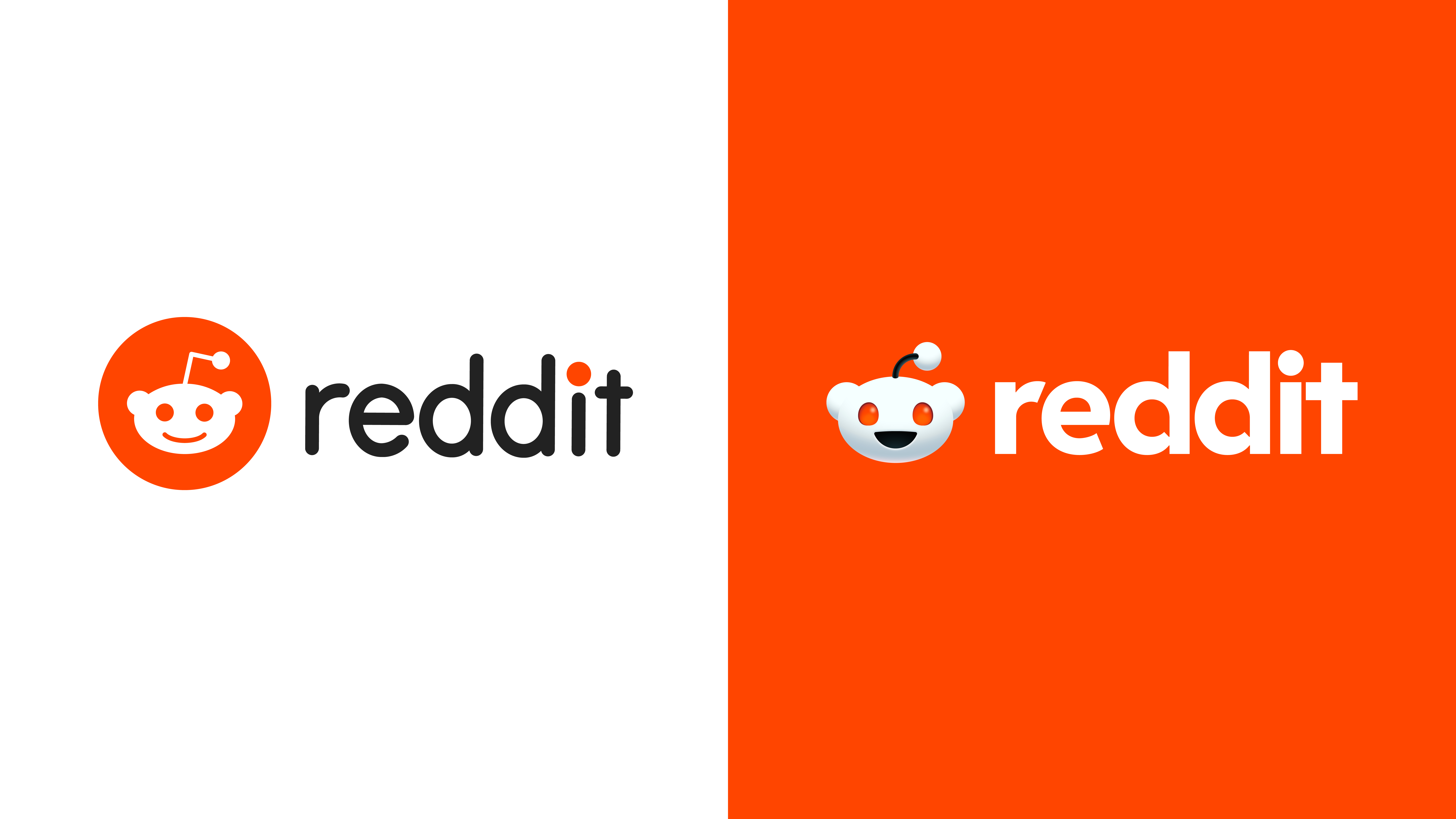
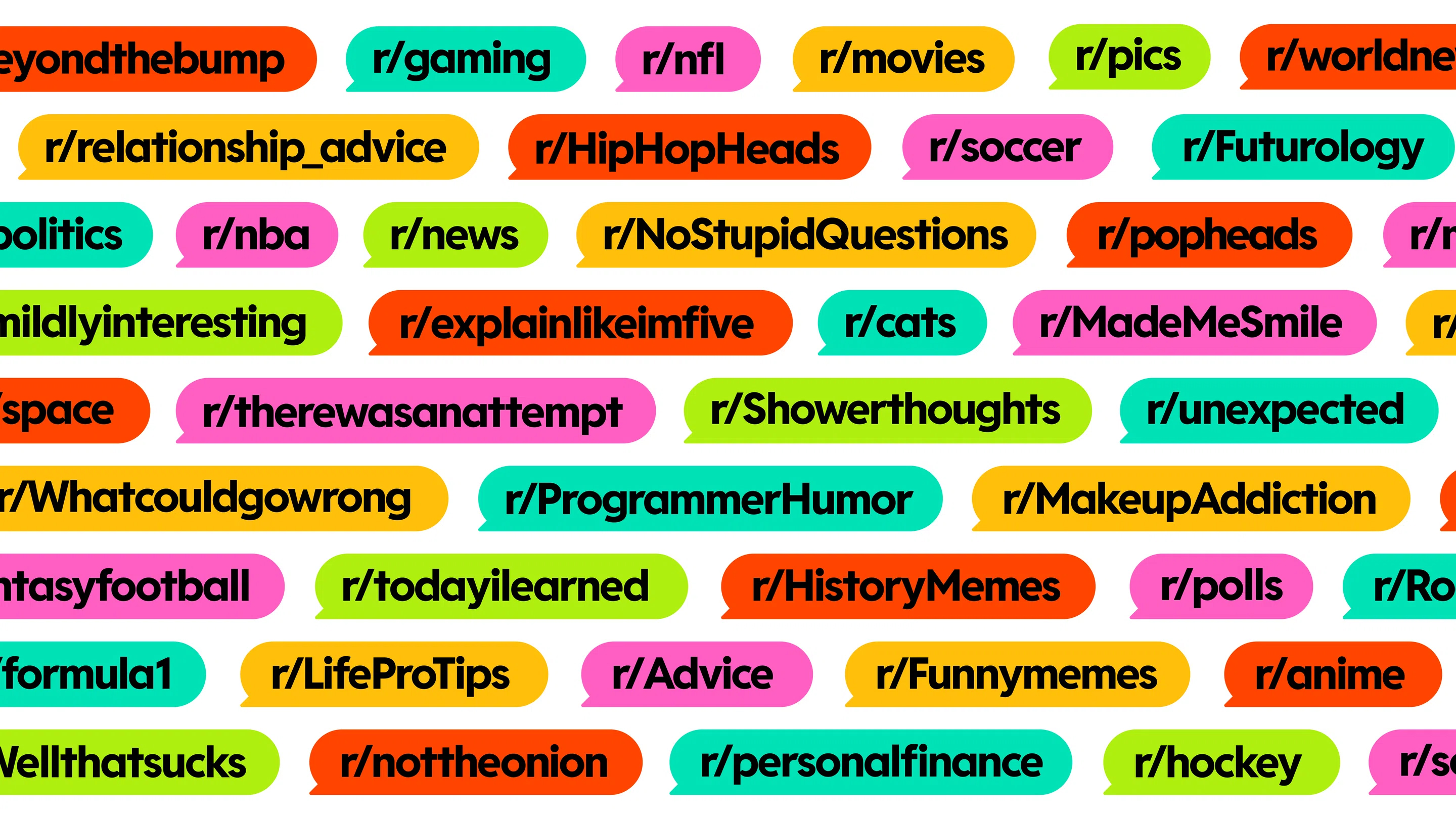
To amplify that, if you think about conversations graphically, you think about the speech bubble, right? We took the speech bubble and we looked at the logotype of R.E.D.D.I.T, and we recognised that the lowercase D's have two circles inside that can easily embed speech bubbles into. The geometry of the speech bubbles became these very expansive and elastic containers. They can expand, they can contract, they can contain different types of content, from messages to images, and they can actually have motion behaviours – everything was designed based on conversations.
Were there any elements of Reddit's community that inspired the design?
When we were developing colours we wanted to look not only through a branding lens, but also through a kind of utility lens that can help discipline the communities a little bit. Each subreddit is created by users and Reddit is pretty hands-off in terms of branding. Each subreddit has the liberty to create their own banners and a lot of subreddits also designed their own page in a way that's very unique. That was the thing that Reddit was trying to reconcile with.
When we're looking at the colours, we want to make sure that we're still using red, which has always been their colour, that's very recognisable. We wanted to keep that but we also wanted to develop a set of colours that can complement it. The set of colours ranges from green to pink so on and so forth, and these colours can also be utilized by the different subreddits so that they have some design materials to work with. There's a kind of user-centric thinking that we worked on closely with the Reddit team.
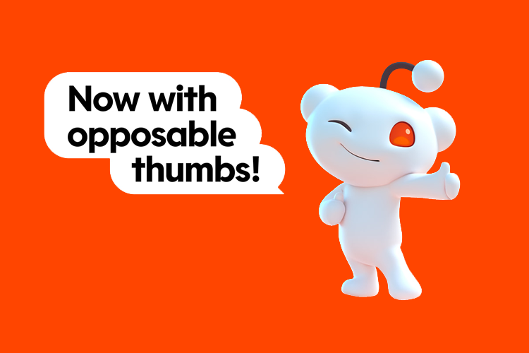
How did you develop Snoo into this more prominent figure in Reddit's identity?
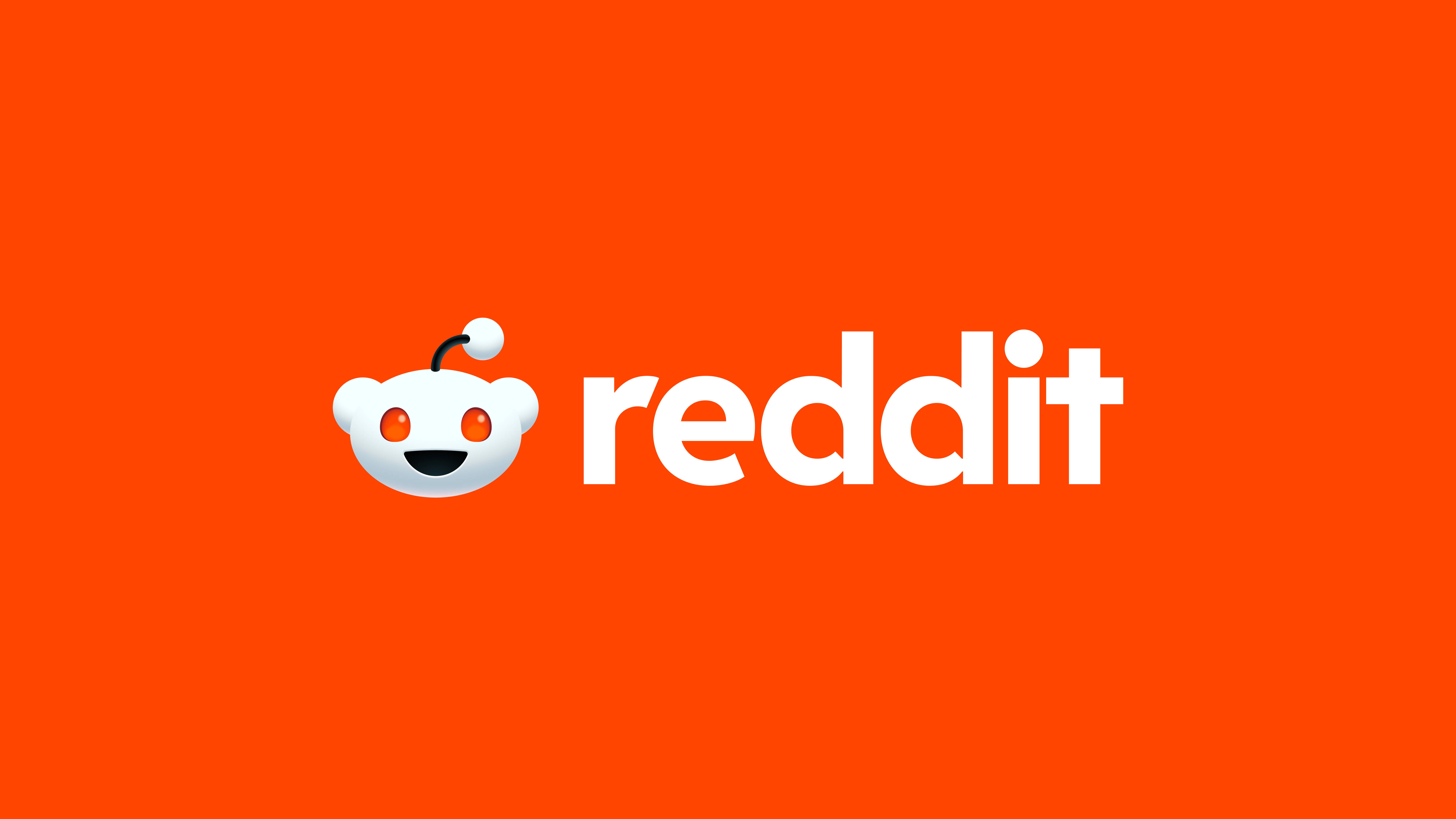
We started with one geometry that can be used in both 2D and 3D. Reddit was doing 3D Snoos as well, but not in a very methodical way. We recognized that there's an opportunity to really push 3D as the unifying style for Snoo but also to bring it from just an app icon to a full-on character that has a lot of spirit and can do things that can carry out content. Starting out, we thought let's create one unifying geometry. The second step is bringing it to life.
We worked very closely with the Reddit team on that and they were really into the idea of making Snoo 3D because they were thinking about making Snoo a more lively character. They had their own 3D team that was already doing different experiments to see where they could go with it.
We entered that process and of course, what we brought in was a more disciplined approach, meaning that we started to look at the facial features very rigorously. Basic features down to say, the distance between the eyes or the articulation around the eyes, how deep does it go? We developed this sort of rigour into that process, which was a really good marriage because Reddit's team was very expressive and very free at that time, and we kind of brought in this rigid, disciplined branding eye to it. We created the 3D Snoo together and it was a kind of back-and-forth process.

How did you go about creating the new typography Reddit Display?
Whenever we work on a pretty large scale we always look at typography very closely. We have to go through our own evaluation process about whether the current typography works right at these different levels or do they need a new typeface. If so, do we pick an existing typeface, or do we do a custom typeface and what are the pros and cons of that?
Reddit already had a typeface that had different weights from the really bold to the regular to the round and it was named all uniquely, like Reddit vanilla or Reddit chocolate, for example. They already did a lot of work and there's no reason to throw it away. In that typeface, the different weights were also used in different expressions so that's a very valuable property. The question is, what do we do with it? We wanted to marry the typeface with the speech bubble as a way to rejuvenate the existing typeface but to also marry that with a very iconic brand element.
Were there any challenges you faced during the rebrand?
There were some challenges, but they were all very enjoyable challenges, unique Reddit challenges. One of the biggest challenges was to decipher this massive pile of things in terms of what they are and what they're supposed to do. That's something that we call brand architecture.
So imagine you have a lot of stuff here and you have to figure out a way to group them, to organize them and to label them to clarify what is what very clearly. Reddit was already doing it on their own but we helped them to comb through their portfolio to organize this whole pile of things and create very clear verticals. We gave each a very clear definition and that was hugely helpful because that creates clarity in thinking and clarity in what we label them. Once you have clarity in their names, you then have very clear clarity in design and that was a really enjoyable body of work.
Which touch point was most fun to design?
The metaphor that I use for doing a brand program is very similar to putting out a banquet. We wouldn't isolate a dish, right? You wouldn't say, Oh, well, the appetizer tastes a little bit better than the entree. You want to make sure that the entire menu is well thought out. I have to say it was really the entirety of it, that was really enjoyable. Of course, each element had its own process, its own back and forth with the client, its own nuances. I think it was the totality of it that made it super enjoyable.
How have Reddit's users responded to the rebrand?
Every time you launch new branding on an existing platform that has a very large user base, people will react. It's always during the first week of your launch when people have very intense responses. There were always naysayers and they always have reasons why they don't like certain things. Some people will say "That type is so overdone", or "The 3D Snoo looks like the Pillsbury Doughboy", but I was very pleasantly surprised by how many positive comments were out there.
Is there a particular element of the rebrand that you're really proud of?
The Snoo has been the brand's logo since day one. Since the very creation of the brand it had a very whimsical story to it but it wasn't optimised in a way that had a singular presence to it. To see it having one singular presence and become a lively character was really gratifying.
Find out more about the Reddit rebrand via Pentagram's website.