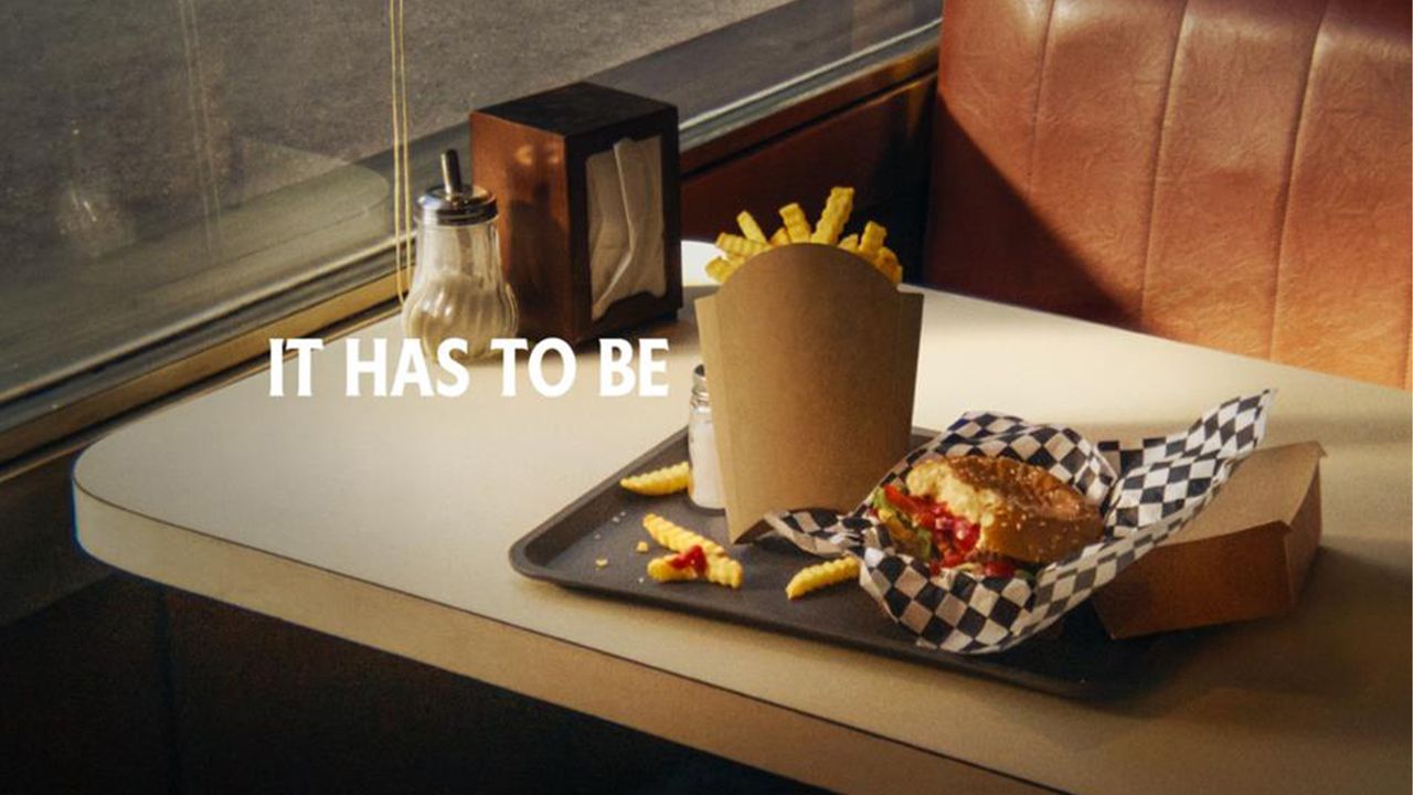
Condiment brand Heinz is known for its clever branding, often embracing the playful side of advertising. Its latest campaign might be its cheekiest yet, proving that Heinz ketchup is the perfect pairing, by design, for the humble French fry.
The best adverts often shine in their simplicity, and Heinz's new ads are no different. Making ingenious use of brand recognition and packaging design, the subtle yet clever ads are a testament to a less-is-more approach for brilliant branding.
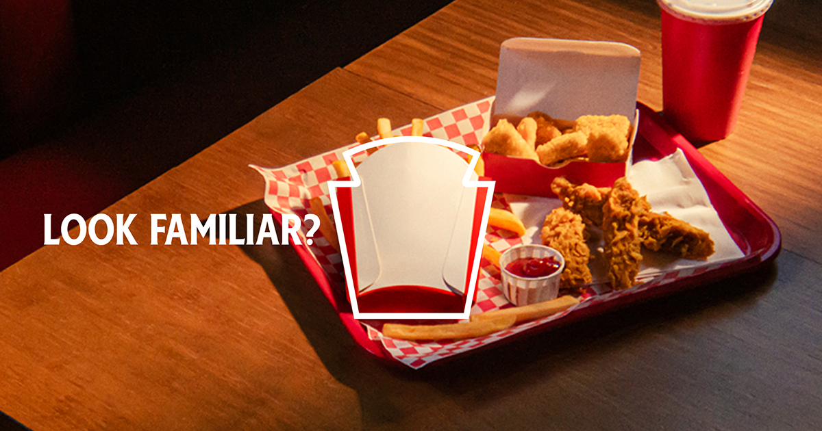
The “Looks Familiar” campaign features various shots of mouthwatering fast food meals. Acting as a visual fill-in-the-blank, the "It has to be" slogan is replaced by a French fry box, highlighting its striking similarities to the iconic Heinz logo. With only a silhouette and its signature typography as identifiers, the ad radiates Heinz's confidence in its brand recognition.
It might seem like a cardinal sin for a brand to ditch its logo, but it's a trend that we're increasingly seeing in the advertising world (it's not even the first time Heinz has embraced the trend). Turning simple adverts into an interactive guess-who experience, it's a bold and refreshing ad trope that marks a creative invigoration for branding.
For more excellent examples of the logo-less trend, take a look at Tesco's logo redesign billboards or check out Kellogg's latest striking campaign.