It goes with the territory that in my role, I speak with a lot of interior designers regularly to chart the emerging trending colors and get the inside scoop on the best paint brands and colors on the market. The color that crops up time and time again, always seeming to win over the hearts and minds of designers, is Portland Stone by Little Greene.
Unless you’ve been in a time capsule since 2015, you will have noticed that the tide has most definitely turned against the once-essential neutral colors of the recent past. Once, cool whites and graphite grays were the dependable, go-to staples in any home renovation project. There has been a hiatus from cool-toned colors, though, and we have seen a shift toward earthier, more organic hues, and neutral paints have become the new go-to shade. As these color trends shift a gear, the market follows suit, and it has become saturated with different iterations of beige paint.
So, just as the question on every homeowner’s lips ten years ago was ‘what is the best gray paint?’, now, ‘what is the best neutral paint?’ is the new interminable debate. Here, we look at Portland Stone by Little Greene, which has long been loved by British designers, and since the brand launched in the States in 2023, American designers are starting to realize how perfect this paint is too.
Most of us want to steer clear of that dreaded lifeless look of all magnolia paint, plasterboard, and beige carpet. So many of us have been there, in a bid to avoid this uninspiring look, and found that picking the best neutrals and beige paints is surprisingly difficult and riddled with complexities.
I asked Ruth Mottershead, the Creative Director of Little Greene, why this particular Little Greene shade is so popular. 'The move to warmer, more natural colors often termed the ‘new neutrals’ sees earthy, stonier tones becoming increasingly popular, providing a more restful alternative to cooler choices,’ she told me. ‘We are seeing a definite move away from stark, bright, cold whites, towards gentler, softer whites such as our 'Slaked Lime' and warm neutrals such as Portland Stone.'
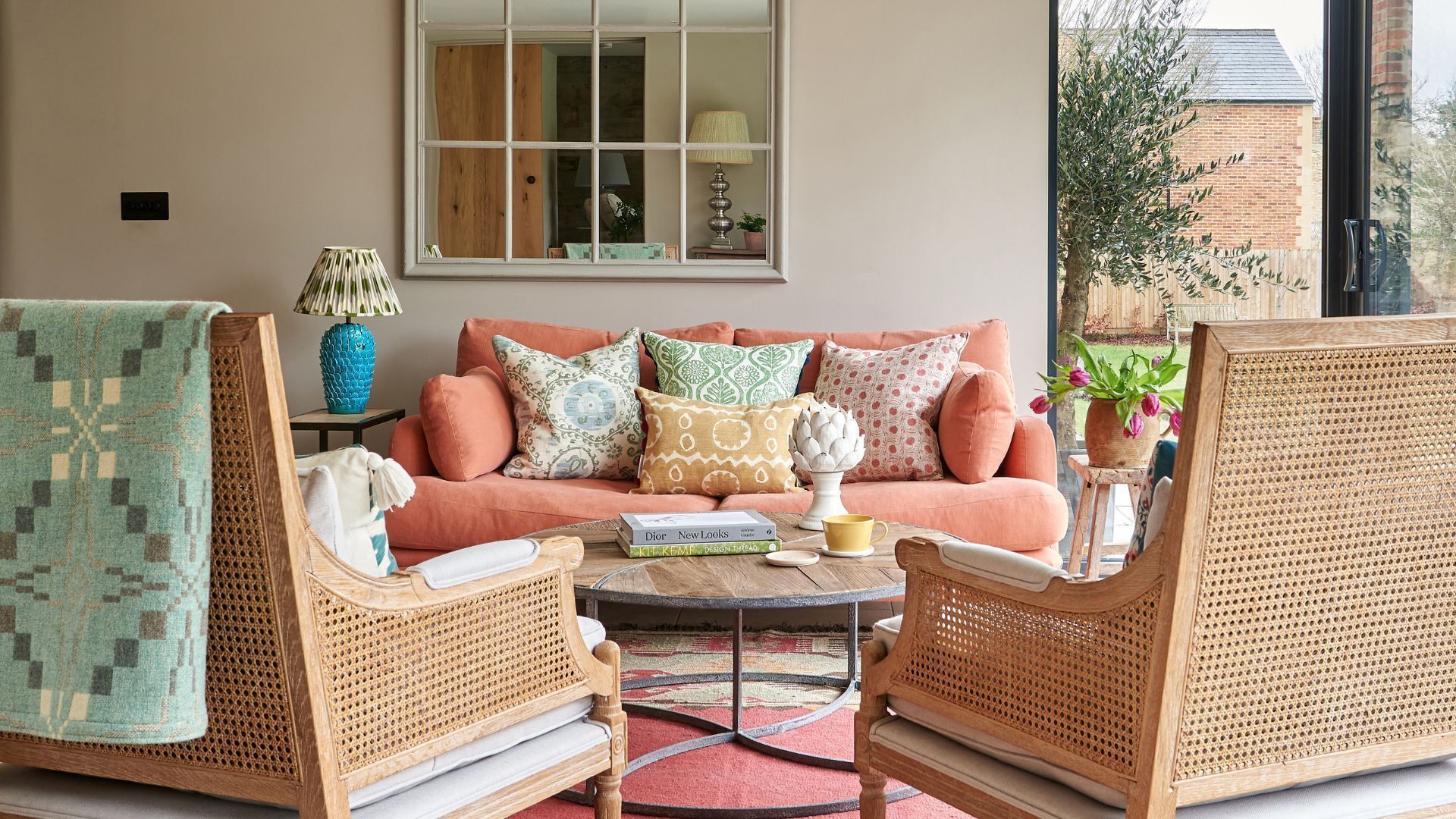
‘Portland stone is much, much loved. It’s a slightly earthy putty color with bags of character. Working as an alternative to white, Portland Stone is far cozier whilst still feeling expansive, fresh, and uplifting,' she explains.
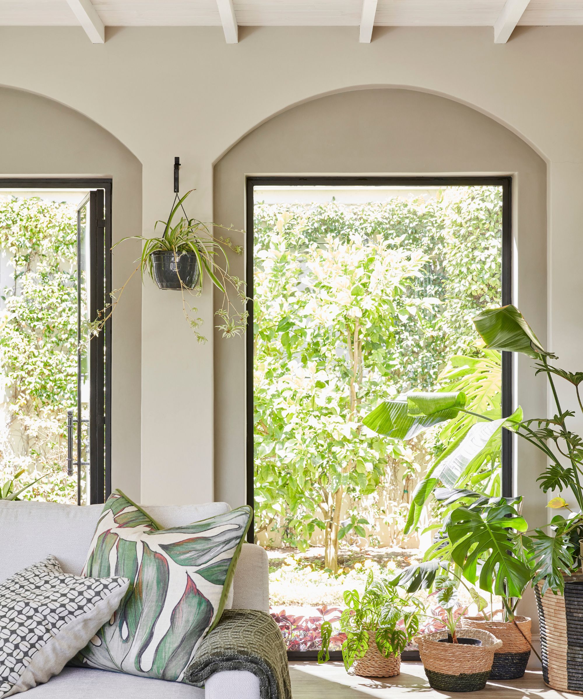
It is not a white paint, it isn't even an off white paint, but remarkably, it manages to retain a fresh, breezy, and light disposition, never feeling heavy or too toasty, despite its slight warmth. It's the perfect paint for beautiful, not bland, beige rooms.
UK-based interior designer Caroline Borgman, who often works with the bones of period properties, uses this color time and time again.‘We love Portland Stone as it adds a distinct layer of warmth. It is one of my go-to neutrals. Part of its seduction is that it just works with so much,’ she explains.
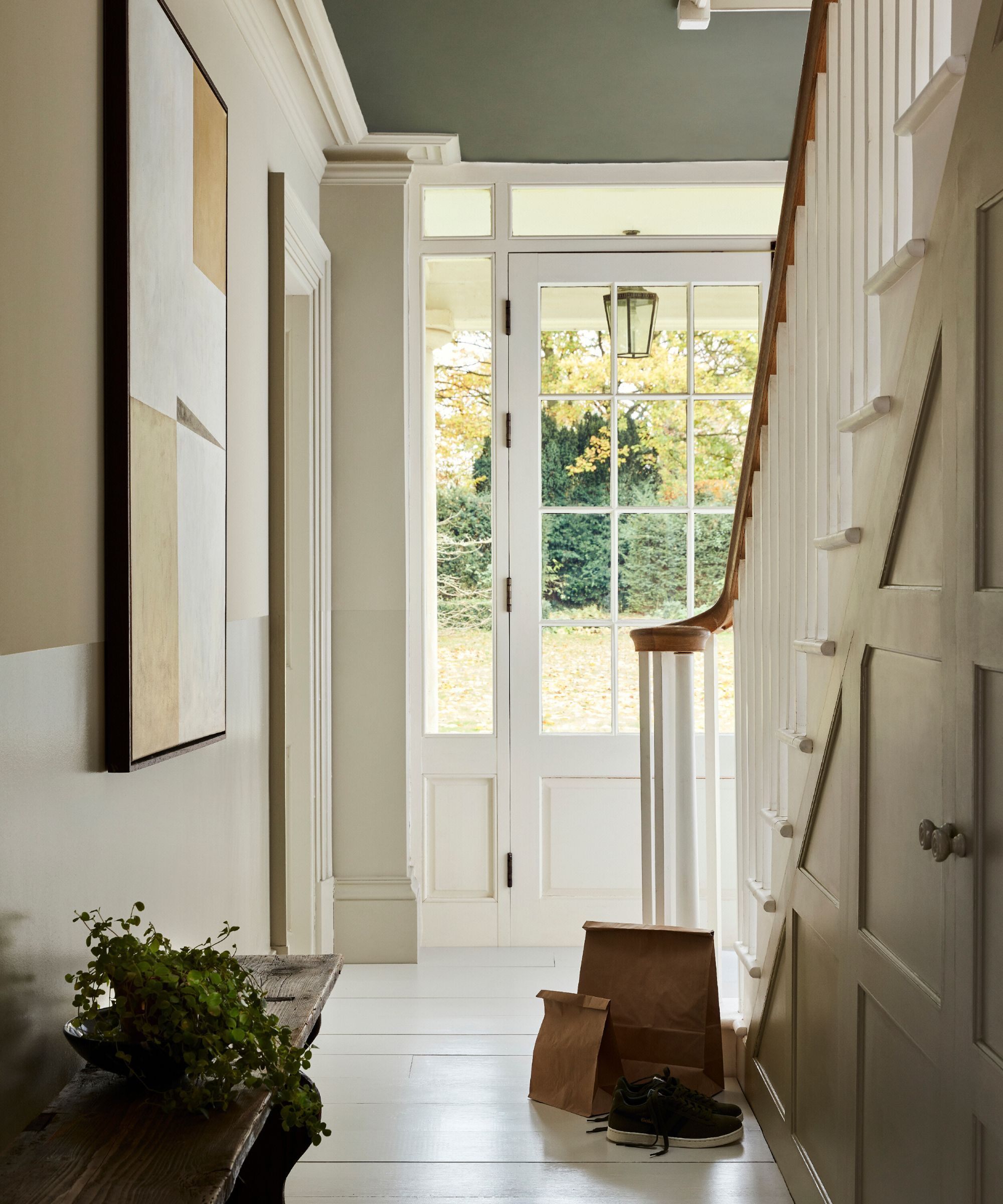
I asked Caroline where Portland Stone works best within the home. ‘I often use it as a backdrop for a room as it’s a great warm beige that suits all rooms, from entryways to living rooms. If I’m looking at a tonal beige scheme, I would pick out any cabinetry in a stronger level, such as Portland Stone Dark, or I might use a lighter shade, such as a ceiling in Portland Stone Light,’ she continues.
‘It also works beautifully when teamed up with colorful furniture and soft furnishings, and I use it a lot with blues and greens, or warm rusts and burnt oranges.'
As Caroline mentioned, when Little Greene developed Portland Stone, they also made two sister neutrals, Portland Stone Light and Portland Stone Dark, which are very similar, although, as befits their names, one is slightly lighter and the other slightly darker, but all three are designed to work in perfect harmony with one another.
‘This trio of shades of Portland Stone can be used in all areas of the home, adding warmth, as well as a complementary canvas for fabrics, wallcoverings, and furnishings from all genres,’ explains Ruth.
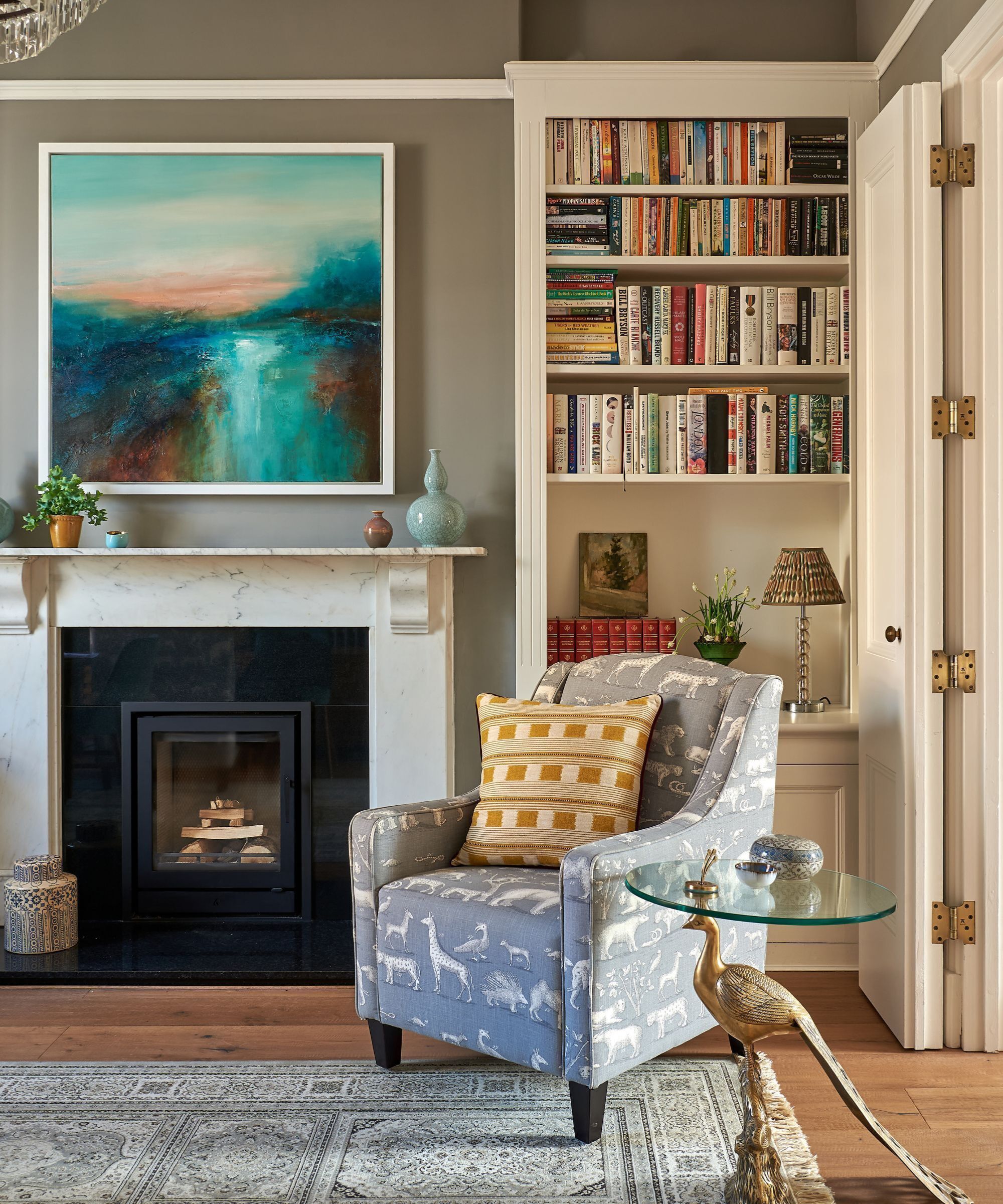
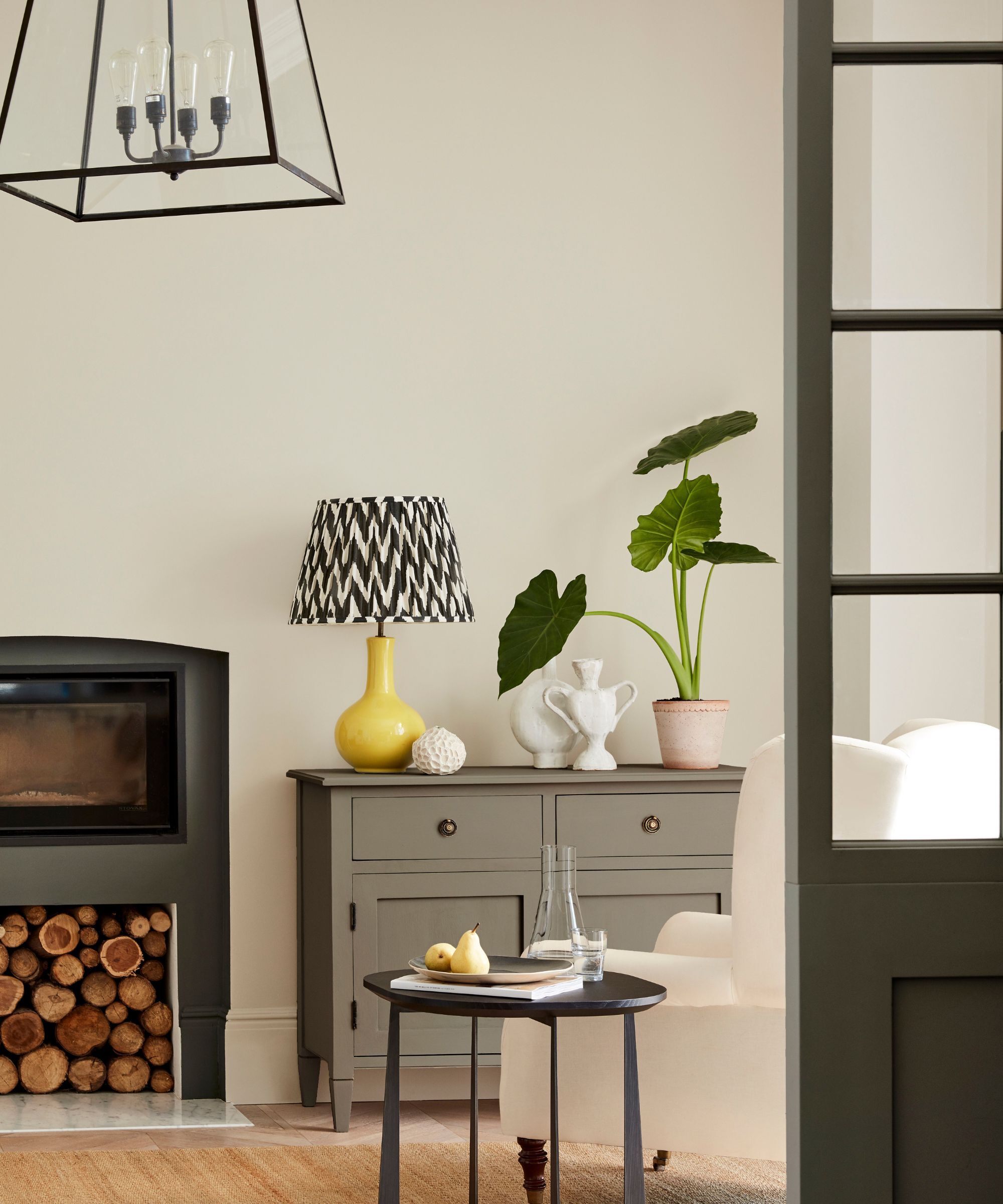
Much of this color's appeal seems to lie in its ability to recede when necessary, without feeling drab or boring. It is not necessarily the protagonist in any room, a much moodier hue would be necessary for that, but it is more of a supporting cast to the main features of the room.
'It paired magnificently with natural materials like linen, stone, and wood,’ notes California-based interior designer Jaime Zhener, renowned for her easy breezy California style interiors. 'It is so skilled at creating a layered, lived-in warmth. Whether on walls, cabinetry, or even trim, it envelops a space in an inviting, organic softness that feels incredibly calming.’
‘It’s also a great exterior paint color,’ Caroline notes, ‘I’ve recently finished a project where we have used Portland Stone on the exterior and Portland Stone Dark on the front door, and it looked dazzlingly handsome.’
‘White walls can be a timeless backdrop, but in some cases, they do more harm than good,’ explains Jaime Zehner of JZ Interiors. ‘A few years ago, I think everyone got a little bit too into the ‘light and bright’ aesthetic in design, and therefore, spaces started all feeling the same and oftentimes, fell flat. Portland Stone is the perfect antidote to that, especially if you want to retain the clean crispness of a pale shade.'
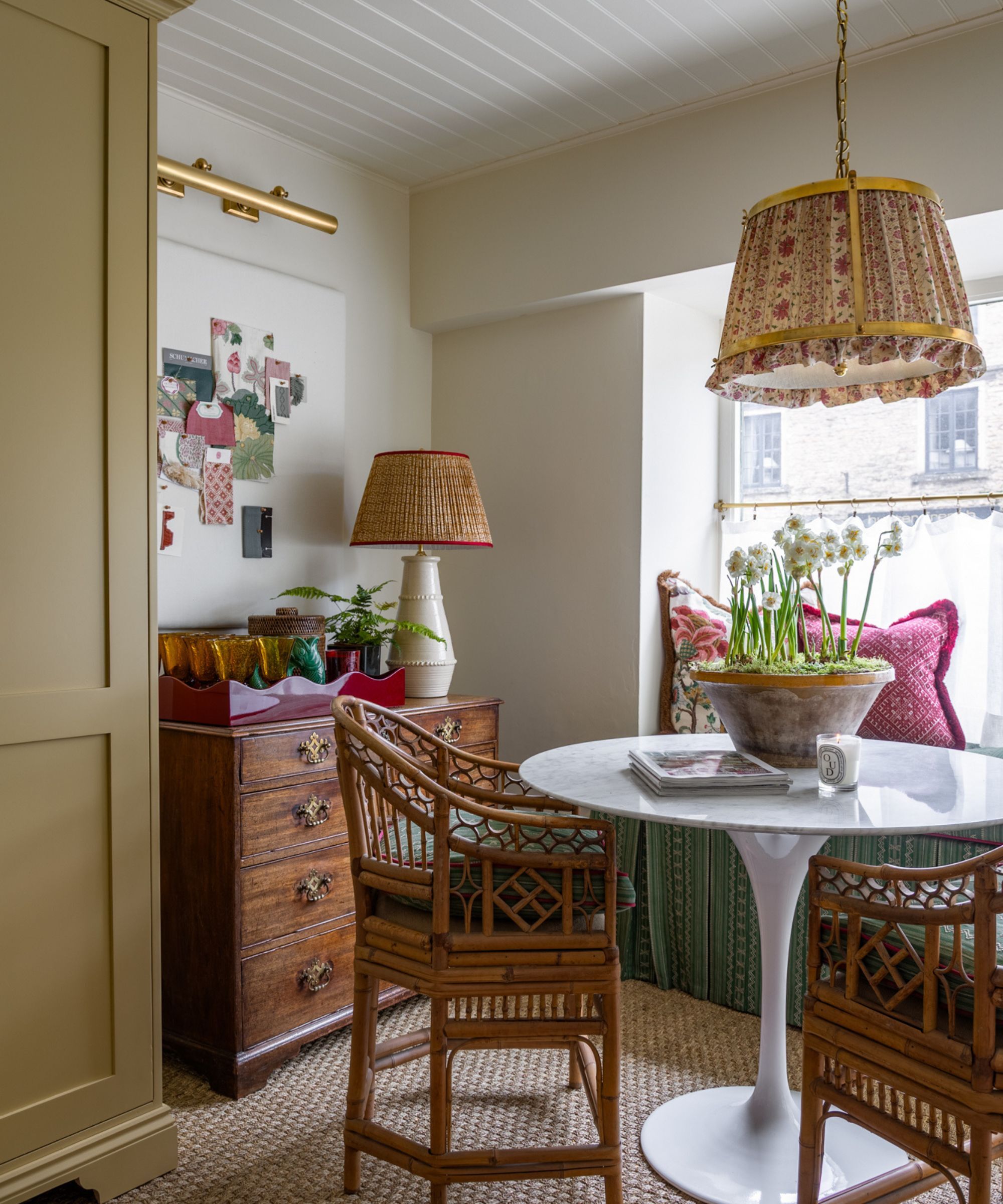
Love this perfect beige, but not taking on a paint project any time soon? These are my decor picks for bringing this soft and gentle shade into your home.
Piglet in bed is a purveyor of some of the best linen bedding, and this color is too irresistible for words.
These glasses, and the case that holds them, are so beautiful, it's almost a piece of art. Who knew biege glassware could look so much chicer than it sounds?
Almost identically colored to Portland Stone, this lamp has serious cool girl energy. On a work desk, side table, or studio, it will always stay on trend.
This heavenly throw is made of 100% cashmere – it's certainly an investment piece to treasure forever, but as with all Brunello Cucinelli's creations, it is a thing to behold.
I have two of these in my hallway, topped with enormous church candles, and without fail, I always get complimented on them. This iteration by Bunny Williams is inspired by the curves of an antique corbel.
So many tablecloths and runners are in increasingly vivid colors and busy floral prints. This is a much more grown-up, simple, down-to-earth tablecloth made from 100% linen, so it will always look unerringly chic.
Portland Stone is a perennially popular Little Greene paint color, but it's worth bearing in mind that it will look different in different contexts, so be sure to swatch it with similar hues to get the right color for your space.