Guardian Camera Club: fran purdy's portfolio review
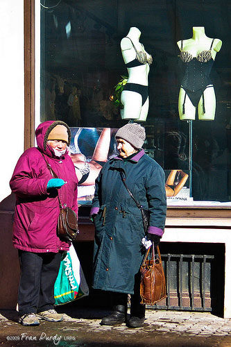
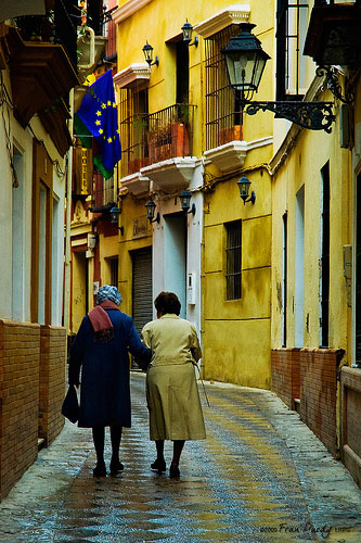
Brighton: The shapes and colours in this picture are great - it probably doesn't need quite as much colour saturation to still be a striking image. The mother and daughter pulling in slightly different directions, but still holding hands, forms the core of the photograph, with all the other details (the two umbrellas, stripey socks) adding up to a rich imagePhotograph: fran purdy/flickrFashion: Couldn't resist this quick snap of these two lovely ladies in Tallin. More of a visual joke than a great photograph with the two women being echoed by the shop dummies. Probably snatched quickly, the quality isn't very good, with harsh sunlightPhotograph: fran purdy/flickrLadies of Seville: Another rear-view, but there's something in the yellow/blue colour combo which is good especially with the wet flag-stones reflecting more colour. However it would have been good to see the ladies' faces, the picture would have been much more alive and humanPhotograph: fran purdy/flickr
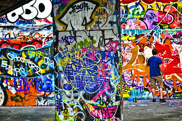
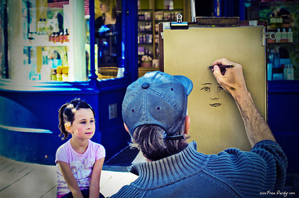
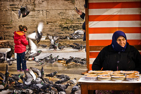
Southbank: This time the extreme colour has worked, but you should be mindful of the skintones if there is a person in the picture. Other than that the three 'strips' that make up the image are very graphic, like the subject!Photograph: fran purdy/flickrThe Brighton Artist: A simple picture well executed - the overall blue theme working well against the pink child's face and the cream of the drawing paperPhotograph: fran purdy/flickrThe bird food seller of Istanbul: A nice picture with a good depth, but I think the over saturation is a bit crude and lets down a good piece of travel photographyPhotograph: fran purdy/flickr
Sign up to read this article
Read news from 100’s of titles, curated specifically for you.